
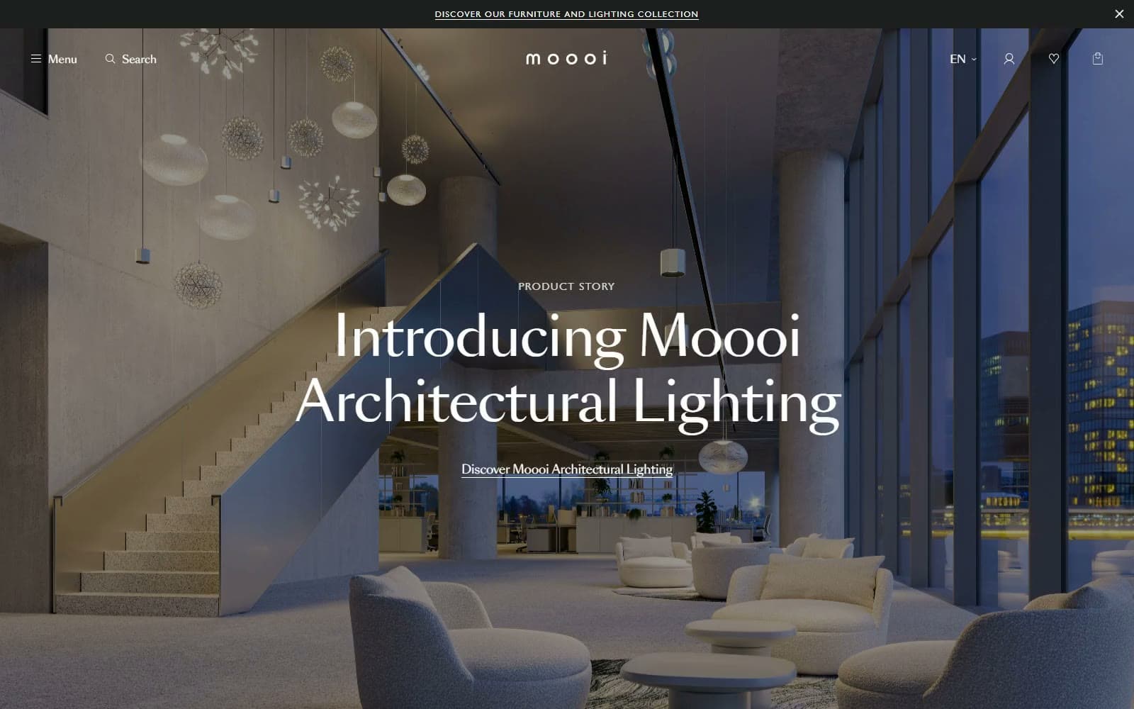
Moooi. Midnight showroom, cream plinth.
- Commerce
- Mixed theme
- 14 colors
- 4 typefaces
Moooi is a Dutch design house whose storefront behaves like a darkened gallery with a very quiet shop attached. The home page stacks 1000px full-bleed scenes, each carrying a centred SangBleu Sans 76.8px/400 headline in white, broken once by a Paper category rail and once by a Tokyo Blue #2b3e7b split panel. Past the menu, the catalogue flips to Paper #ffffff, with objects cut out on Plinth Cream #f7f4ef and tiny tracked Gill Sans MT captions. Showroom Graphite #1f1f1f carries nearly all text and every primary button; Linen Sand #e3d9c6 marks only the active filter. Depth comes from image and scrim, with soft shadows reserved for pills and the floating buy card.
Moooi design system

Brand1
Catalogue text, Contact and View-products buttons, wordmark and icons — a soft black that stays gentle beside cream
Accent3
Text half of the playing-card split panel on home — the only large saturated field, borrowed from the deck itself
Active All Stories filter pill and selected-swatch rings — a warm mark of selection instead of a bright accent
Eyebrow caption on the Tokyo Blue panel — a blue-tinted white that lets the small label recede
Neutrals10
Film and image scrims, promo strip, and the fill behind full-bleed scenes while media loads
Site footer field below the last film — an almost pure black closing the page in one block
Secondary catalogue spans and supporting metadata beside Showroom Graphite body text
Breadcrumb links and de-emphasised headings on the white catalogue pages
Small legal links and icons on the footer, plus the 1px inset ring of outlined filter pills
The single 1px rule dividing main and secondary links inside the Menu drawer
Thin 1px outline on small colour dots under product cards, so a white finish stays visible
Borders on spec rows and the floating buy card, plus a pale panel behind split-layout images
Product-card media fill, category-tile hover and filter badges — the signature warm gallery plinth
Catalogue and product canvas, Menu and Filter drawers, film pills, and all type on dark scenes
Try a pairing
Pick any two colors from the palette to check whether text stays readable on top.
Aa
Paper on Showroom Graphite
16.48 : 1 contrast
- Body textPasses AA 4.5
- Large textPasses AA 3
- StrictPasses AAA 7
More DESIGN.md files. Same web, different personalities.
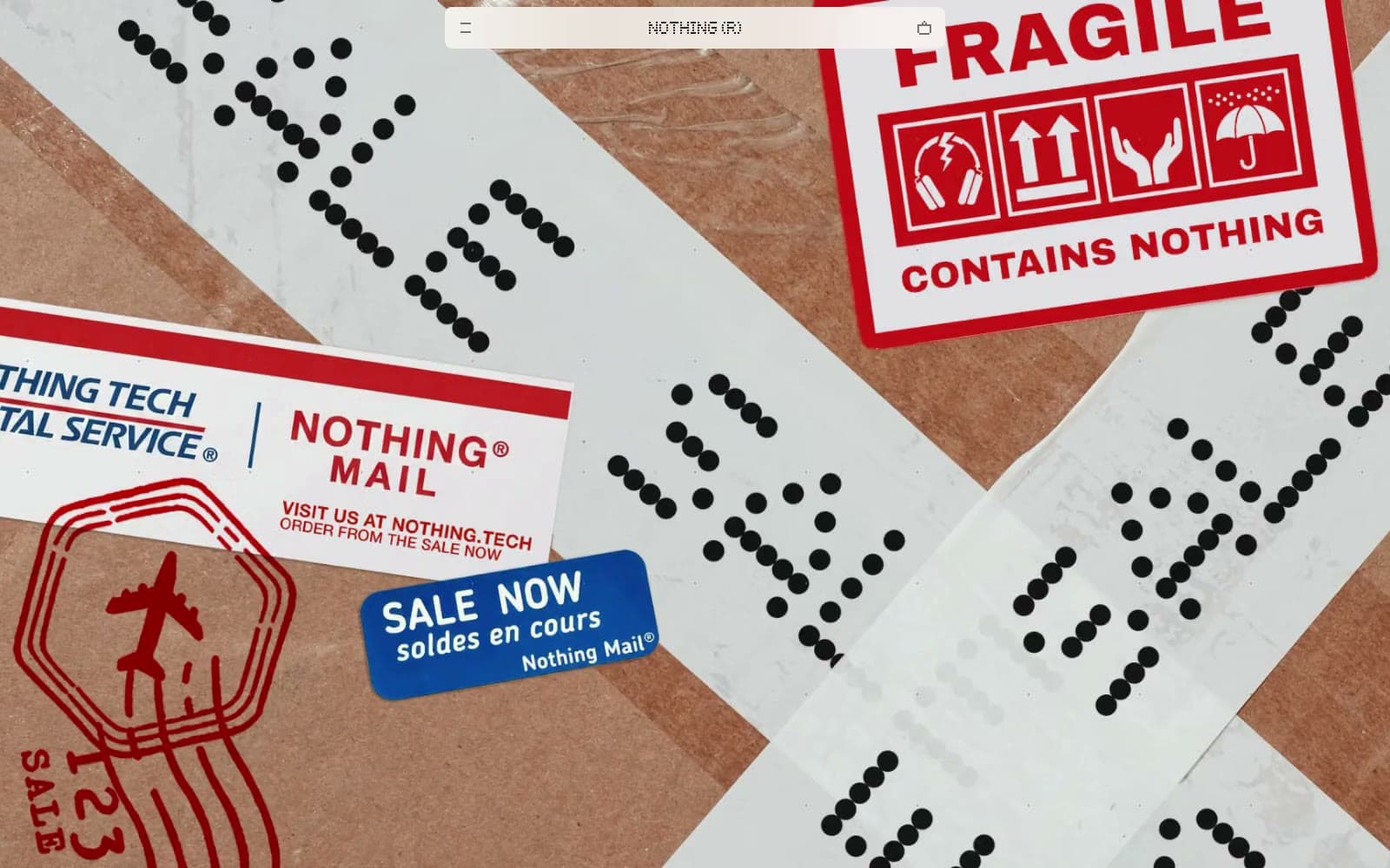
Nothing
Commerce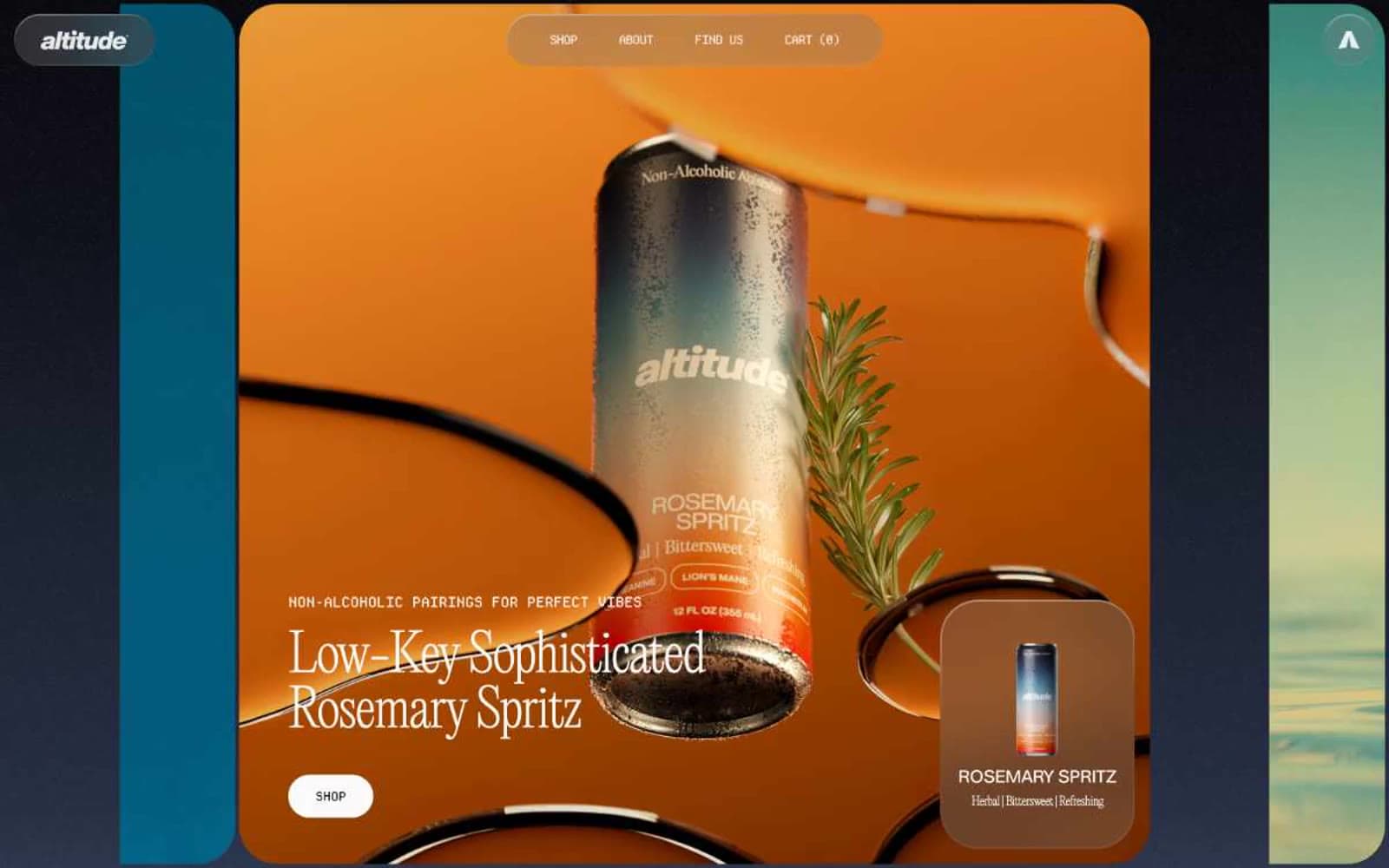
Altitude Beverages
Commerce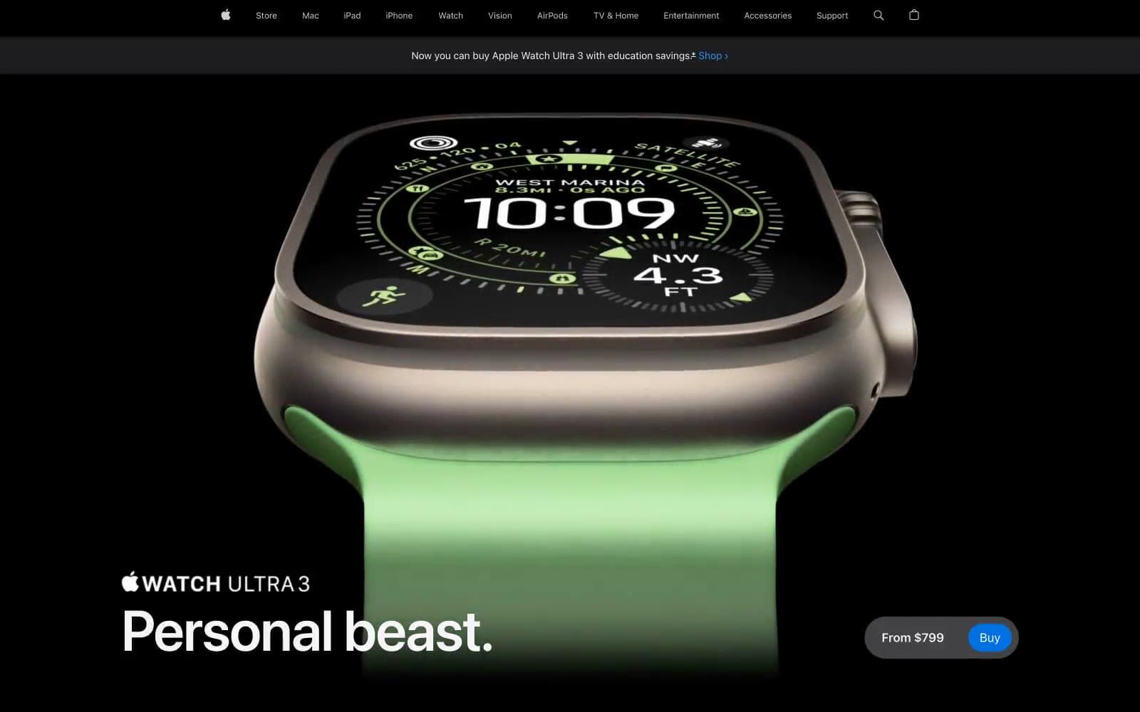
Apple Watch Ultra 3
Commerce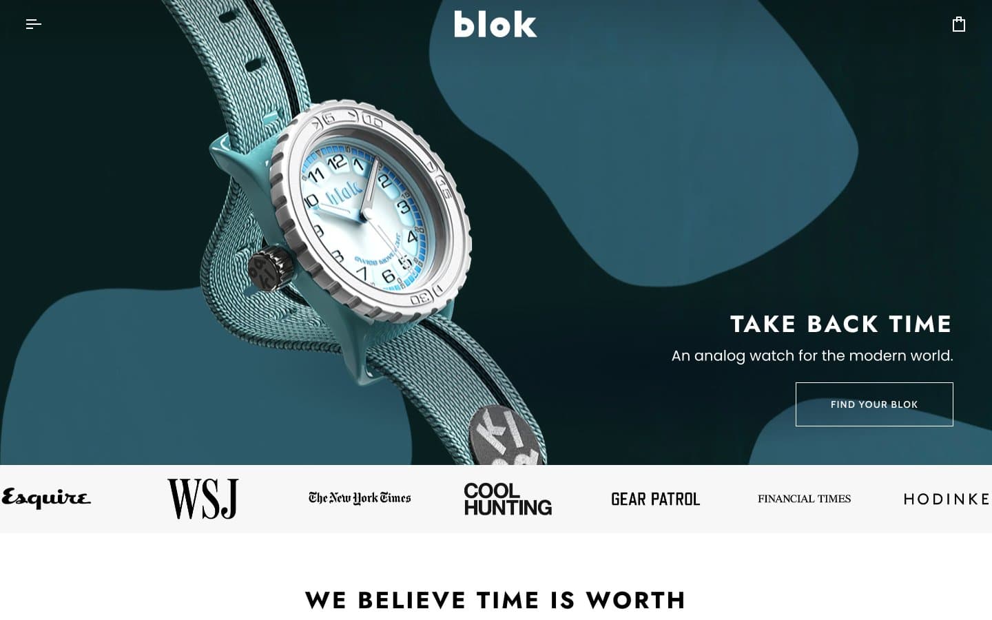
Blok
Commerce
Busy Bee Honey
Commerce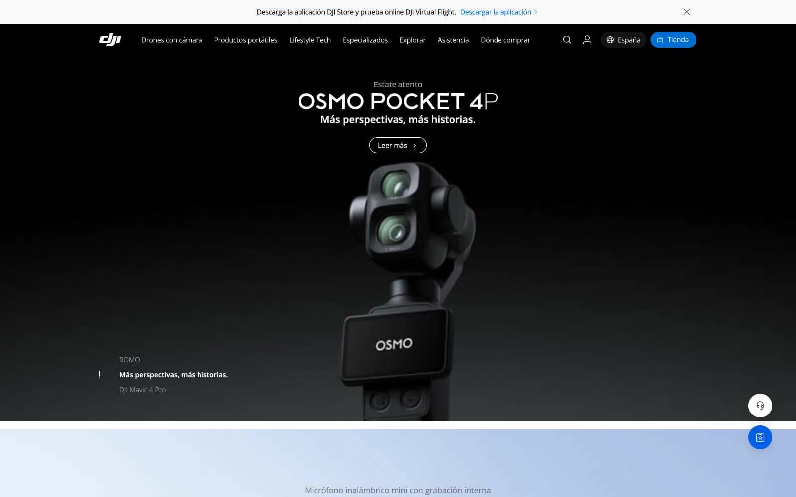
DJI
Commerce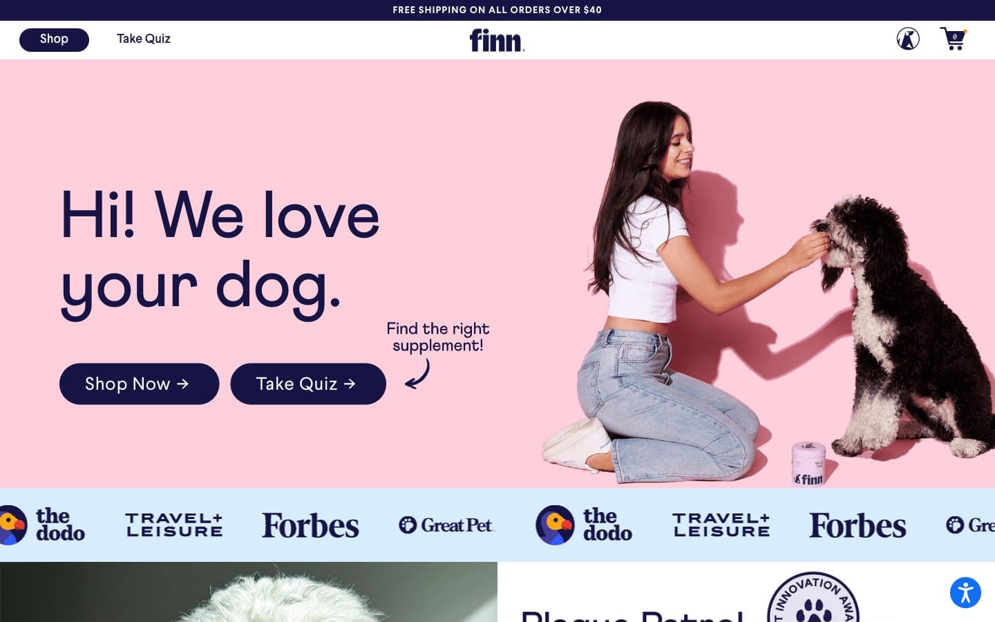
Finn
Commerce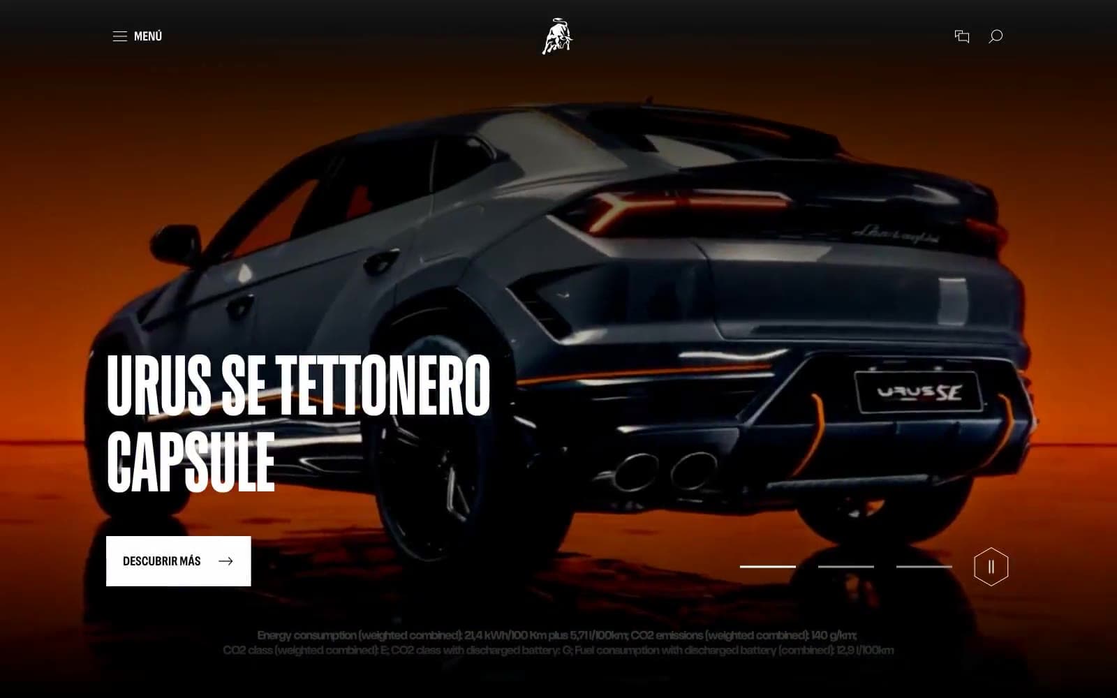
Lamborghini.com
Commerce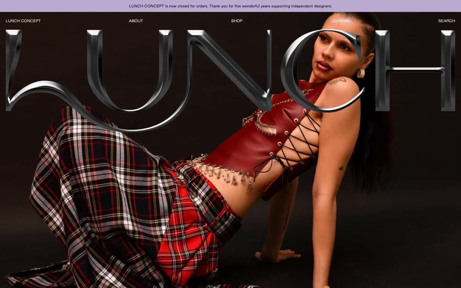
LUNCH
Commerce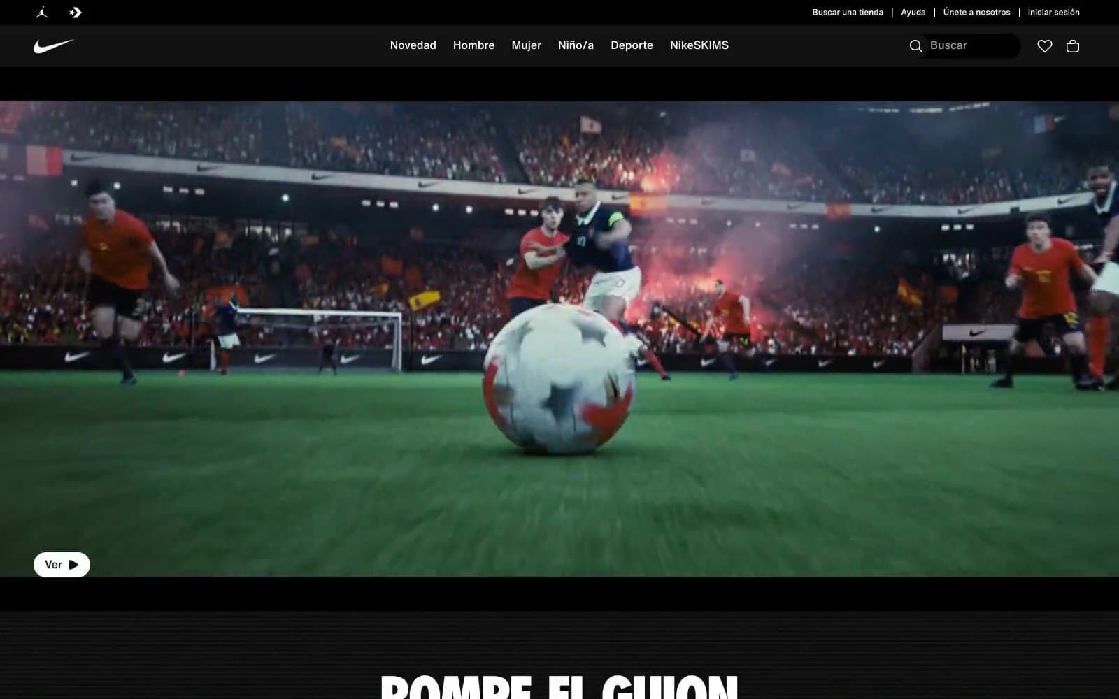
Nike.com
Commerce
Peloton
Commerce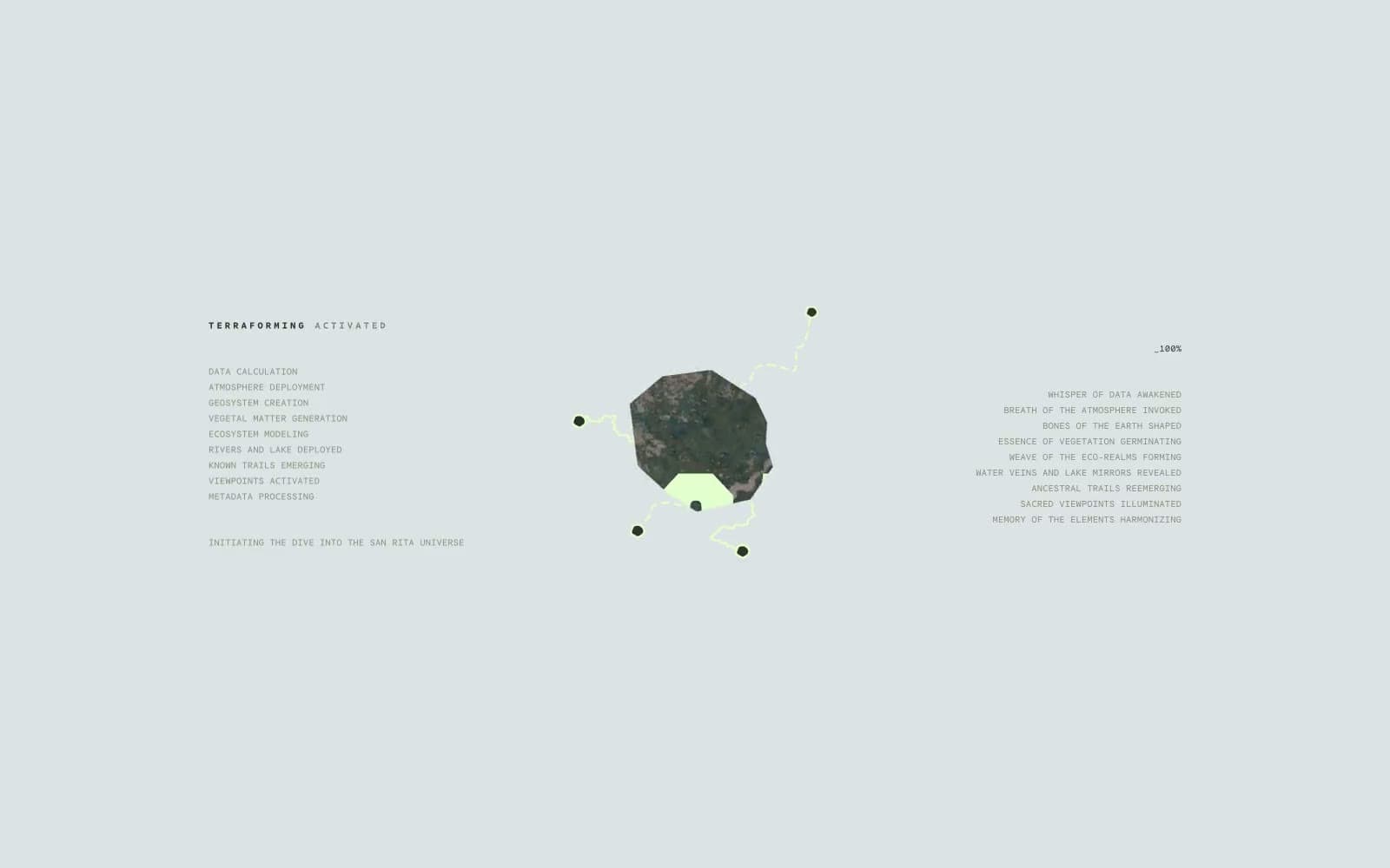
San Rita
Commerce


