
San Rita. Alpine field guide on sage paper.
- Commerce
- Mixed theme
- 6 colors
- 3 typefaces
San Rita reads like a field journal for an outdoor boot brand: expansive landscape photography, a single pale mint accent that pops like highlighter on topo paper, and a custom condensed display face that turns section openers into landscape-blocking statements. The visual rhythm alternates between bright, full-bleed imagery and near-black (#161b13) dark bands where tilted Polaroid-style photos scatter across the canvas like a fly-fishing logbook. Typography is utilitarian and small for everything except the display moments — mono caps handle UI chrome while a single massive 300px+ display line carries each section's identity. Components stay flat and unembellished: thin outlined buttons, no shadows, no rounded corners to soften the edges. The whole system feels like topographic map meets adventure zine — confident, outdoorsy, and deliberately raw rather than polished SaaS.
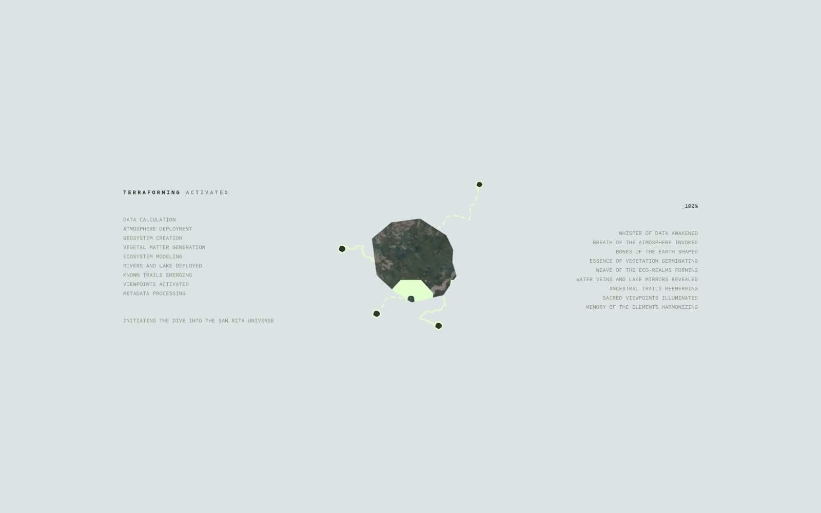
San Rita design system

Brand1
Primary brand accent — display text, nav links, button labels, icon fills. The signature color; reads as highlighter pen on topo map
Neutrals5
Icon strokes, link underlines, high-contrast accents where maximum punch is needed
Dark section backgrounds — near-black with the faintest green undertone, anchors the dark bands of the page
Mid-dark text and borders on light sections — softer than pure black, keeps the green-warmth consistent
Muted secondary accent — subtle background washes, subdued UI elements where Highlighter Mint would be too loud
Light section backgrounds, card surfaces, hairlines — the base canvas for light bands
Try a pairing
Pick any two colors from the palette to check whether text stays readable on top.
Aa
Pure Black on Highlighter Mint
19.41 : 1 contrast
- Body textPasses AA 4.5
- Large textPasses AA 3
- StrictPasses AAA 7
More DESIGN.md files. Same web, different personalities.

Nothing
Commerce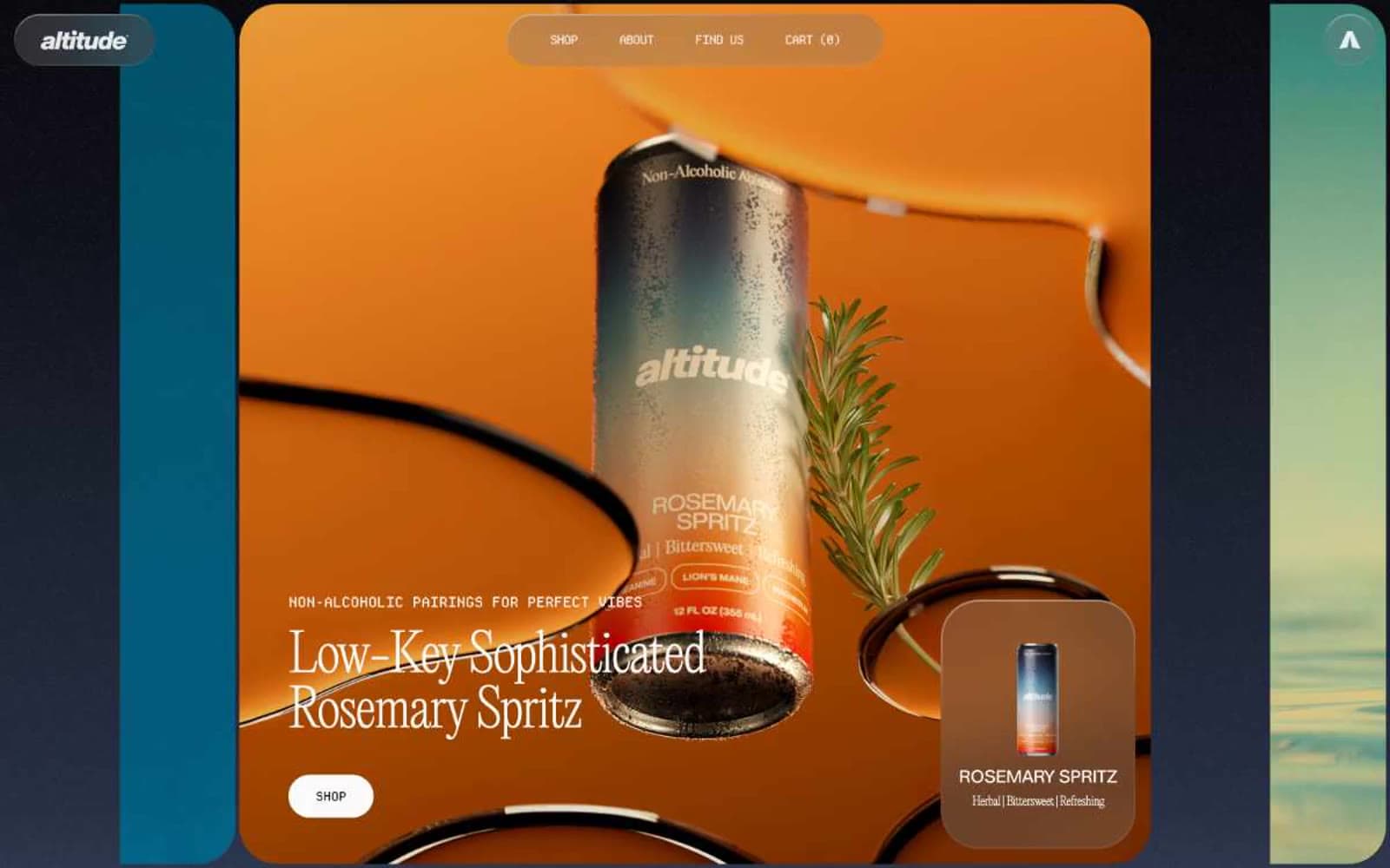
Altitude Beverages
Commerce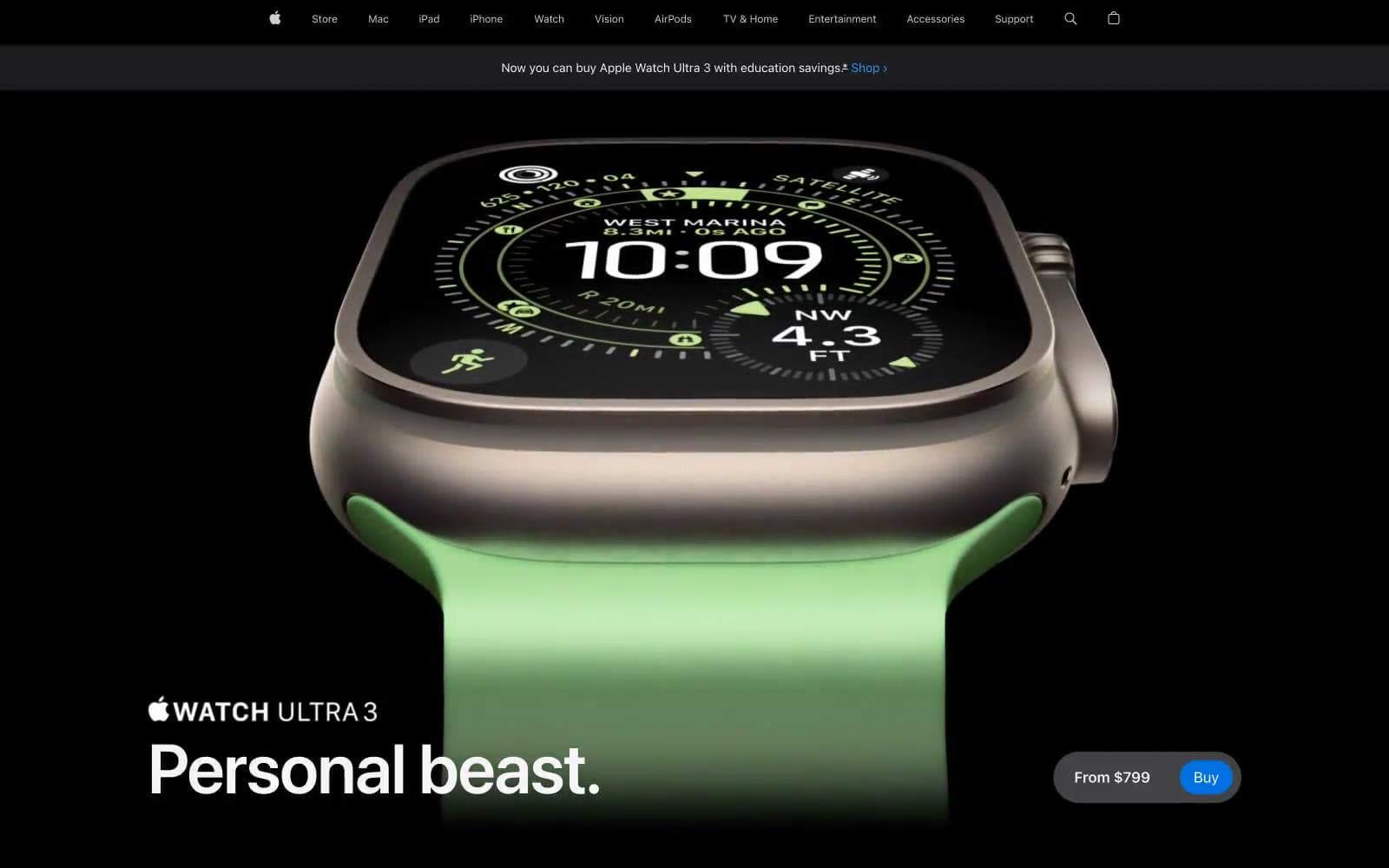
Apple Watch Ultra 3
Commerce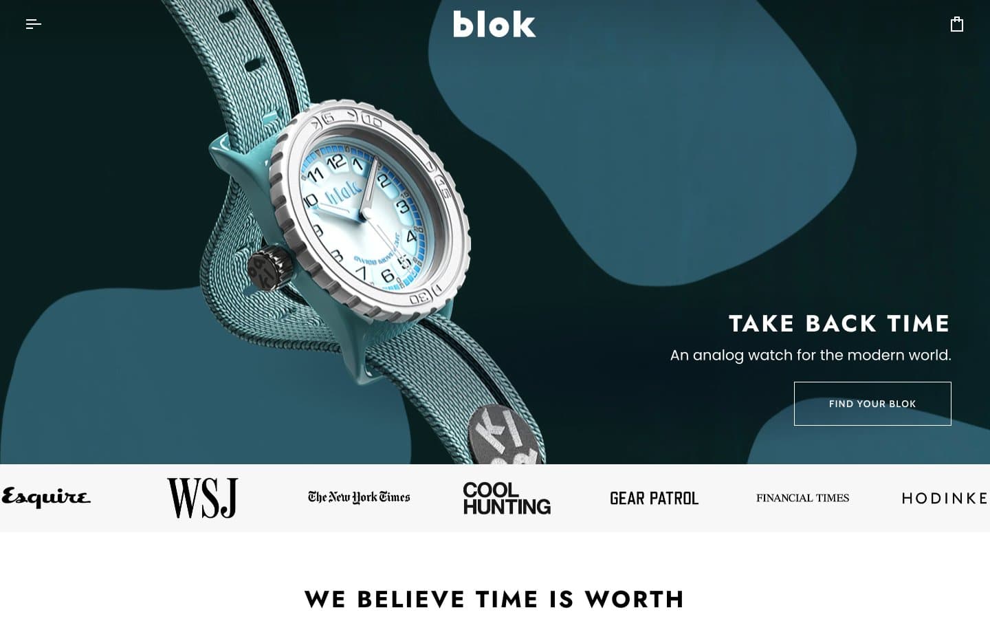
Blok
Commerce
Busy Bee Honey
Commerce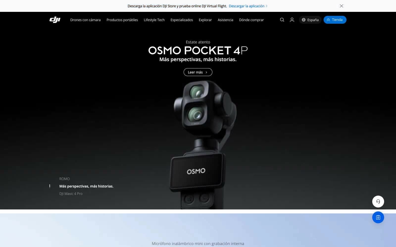
DJI
Commerce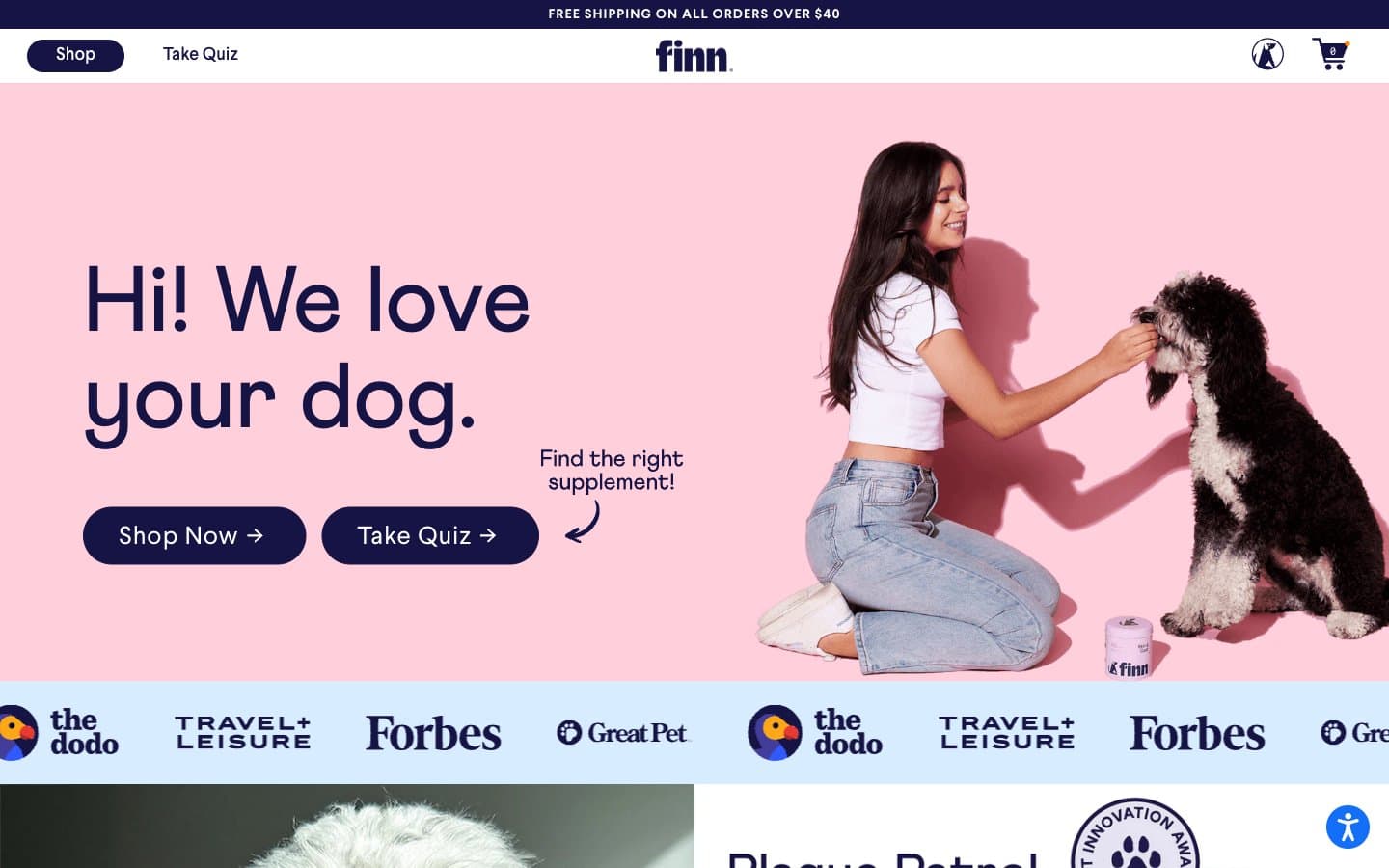
Finn
Commerce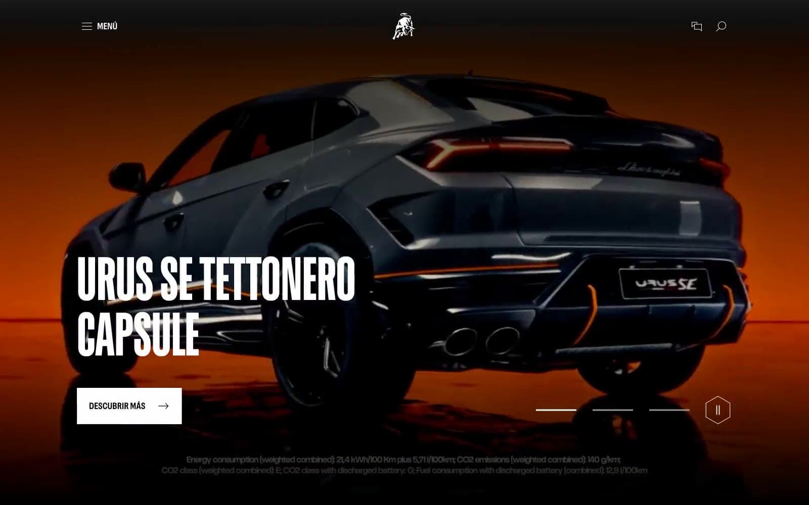
Lamborghini.com
Commerce
LUNCH
Commerce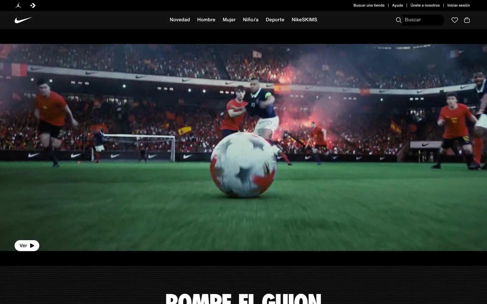
Nike.com
Commerce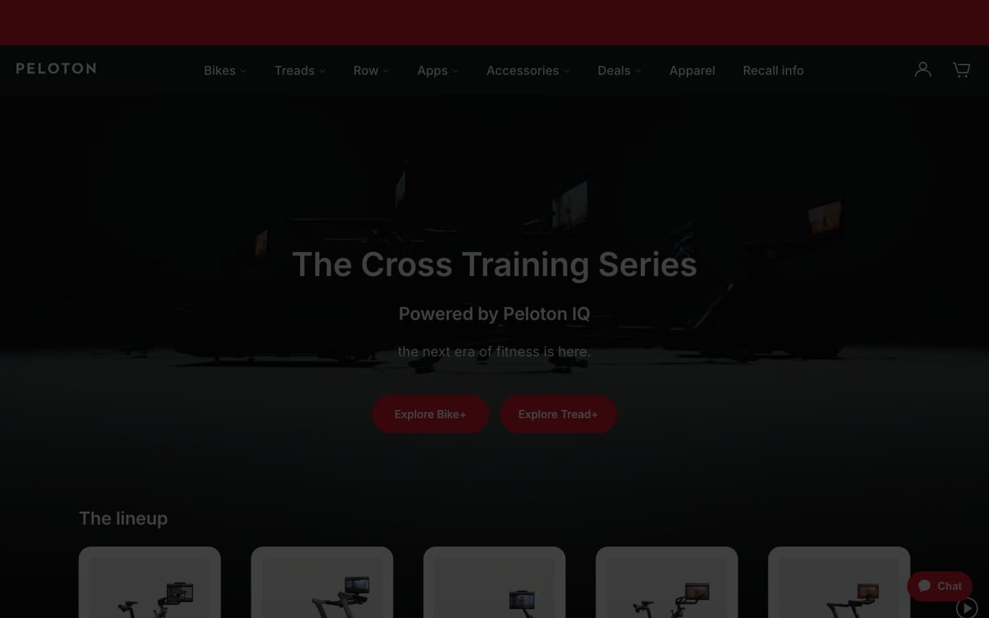
Peloton
Commerce
SwimClub
Commerce


