Finn. Warm puppy-kissed comfort.
- Commerce
- Mixed theme
- 10 colors
- 3 typefaces
Finn is a warm, approachable pet wellness brand that feels like a friendly neighborhood vet clinic: cozy without being clinical. The interface rests on a white canvas with generous breathing room, anchored by a deep warm-brown #321004 used for nearly all type — unusual for modern e-commerce, where near-black dominates — and one decisive navy-violet #161345 that powers every button, dark section, and brand mark. Sections alternate between white card surfaces and full-bleed color washes (blush pink, sky blue, teal) that match the product flavor, giving each product line its own atmospheric room without diluting the brand voice. Typography pairs a humanist geometric (Larsseit) for body and UI with an extra-condensed display face (Athletics) for big headlines, the latter carrying wide tracking that gives the page editorial confidence. Components feel light and friendly: pill-shaped buttons at 60px radius, 20px-rounded cards with no visible borders, thin 1px gray hairlines, and almost no shadow — the system trusts color blocks and whitespace to separate layers rather than elevation.
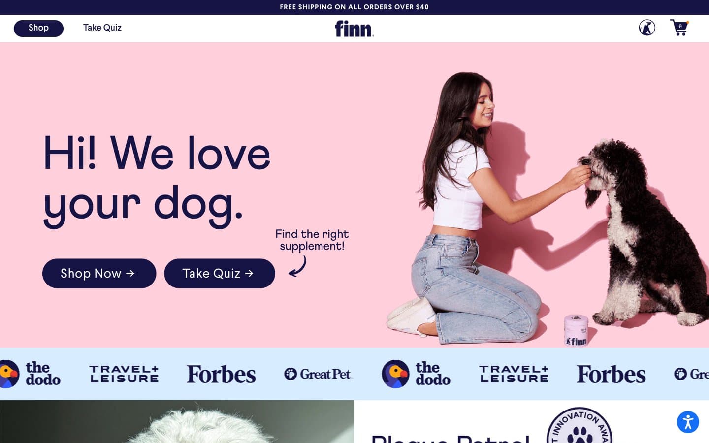
Finn design system
Brand2
Primary brand navy — CTA buttons, dark section backgrounds, active nav, logo wordmark. Filled pill buttons carry white text on this surface; dark testimonial/footer bands use it as the full-bleed canvas
Primary text and headline color across the entire site — body copy, navigation, product names, prices, and the hero headline. This warm near-black replaces the typical neutral-black and gives the brand its human, non-corporate feel
Accent4
Vivid accent for product highlights, badge borders, and select link underlines. Used sparingly as functional punctuation — never as a full surface — to draw the eye to a specific callout without competing with the navy CTA
Hero section background and product-line wash. Sets the emotional tone for the first screen — warm, soft, pet-friendly. Returns in lighter tints for cards and decorative strips
Press/logo bar background and alternate section wash. Cool counterpoint to the warm blush — gives the page rhythm as sections alternate pink and blue bands
Calming-aid product accent and tertiary section wash. Closes the trio of pastel section colors (pink, blue, teal) that map to the product SKUs
Neutrals4
Muted helper text, secondary labels, and disabled-state chrome. Never the primary text color
Hairline borders, dividers, input outlines, and subtle icon strokes. Always 1px. The system uses this in place of shadow to separate layers
Card and product-tile background. One shade below the white canvas — enough to lift a card off the page without a border or shadow
Page canvas and card surface base. The default background; also the inverse color for text on navy buttons and dark sections
Try a pairing
Pick any two colors from the palette to check whether text stays readable on top.
Aa
Cloud White on Midnight Ink
17.31 : 1 contrast
- Body textPasses AA 4.5
- Large textPasses AA 3
- StrictPasses AAA 7
More DESIGN.md files. Same web, different personalities.

Nothing
Commerce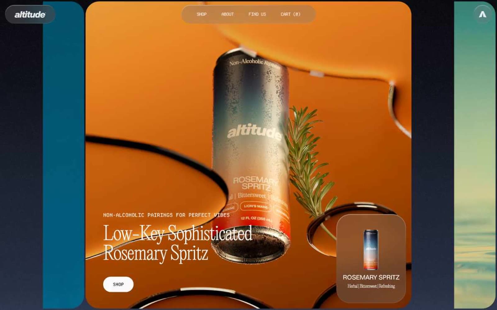
Altitude Beverages
Commerce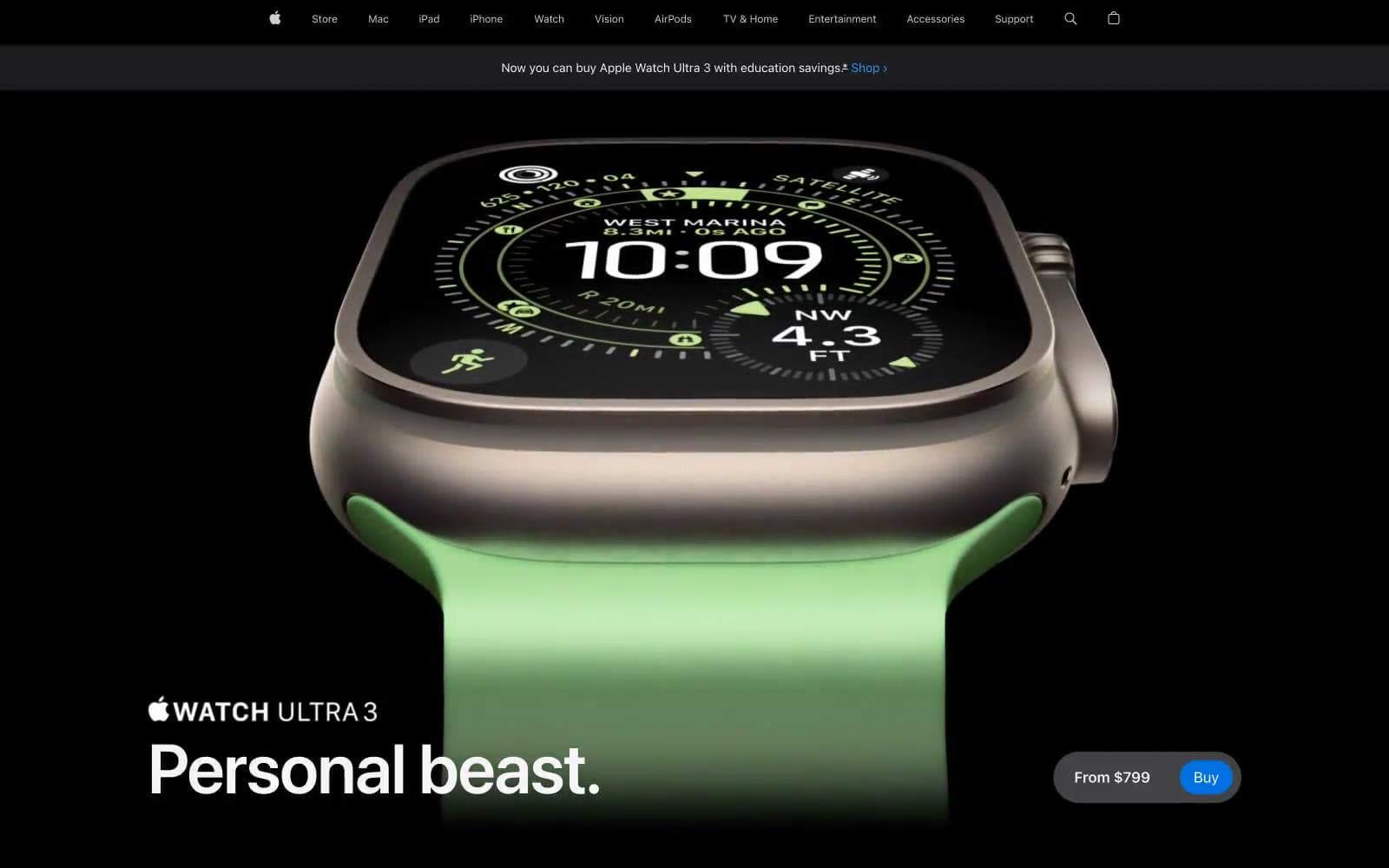
Apple Watch Ultra 3
Commerce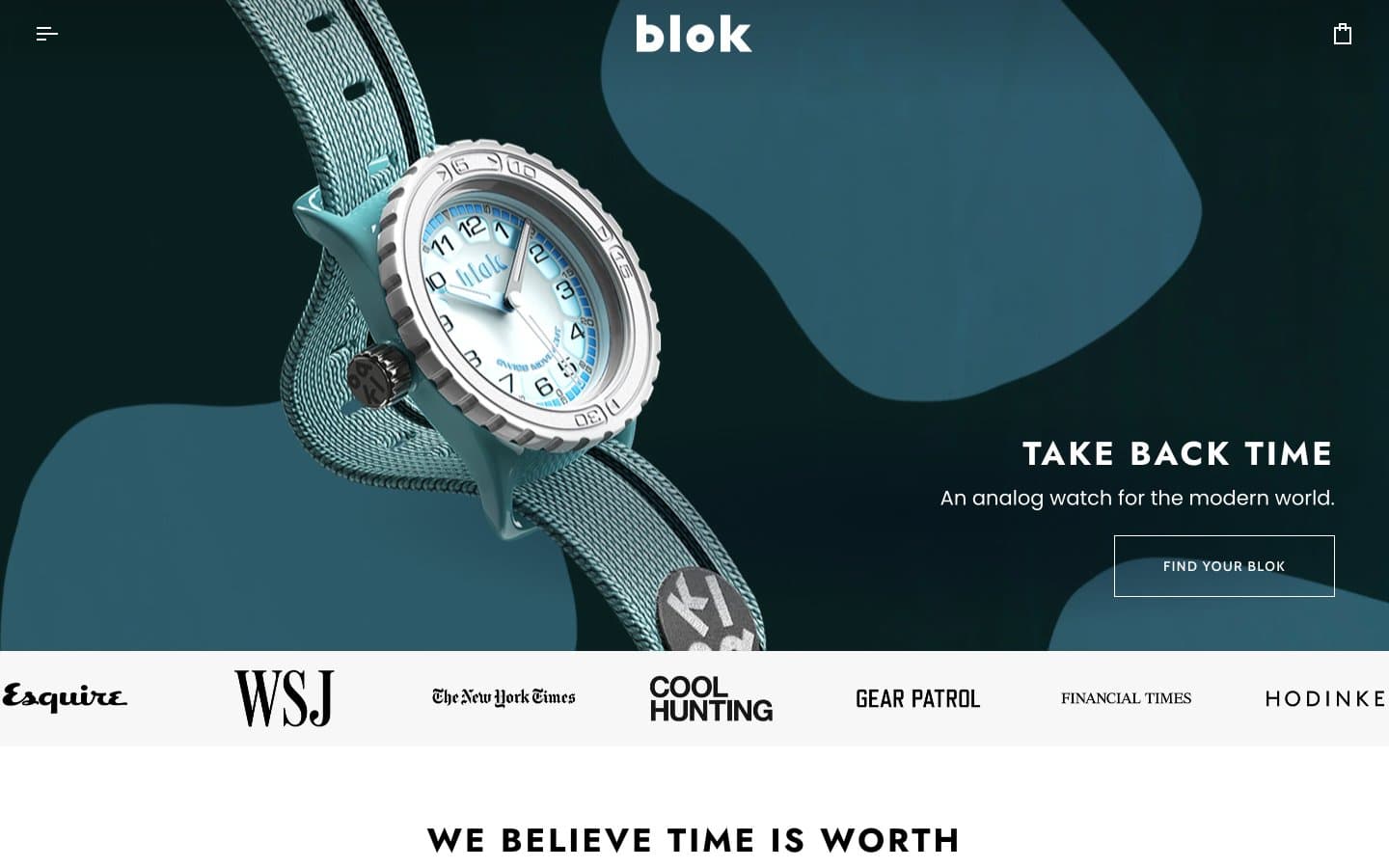
Blok
Commerce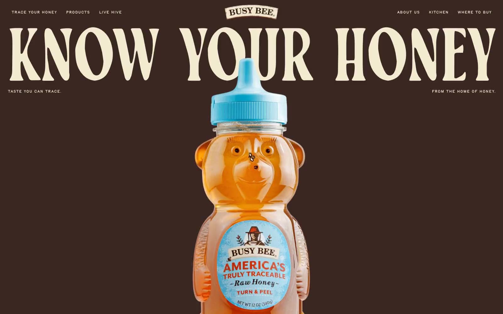
Busy Bee Honey
Commerce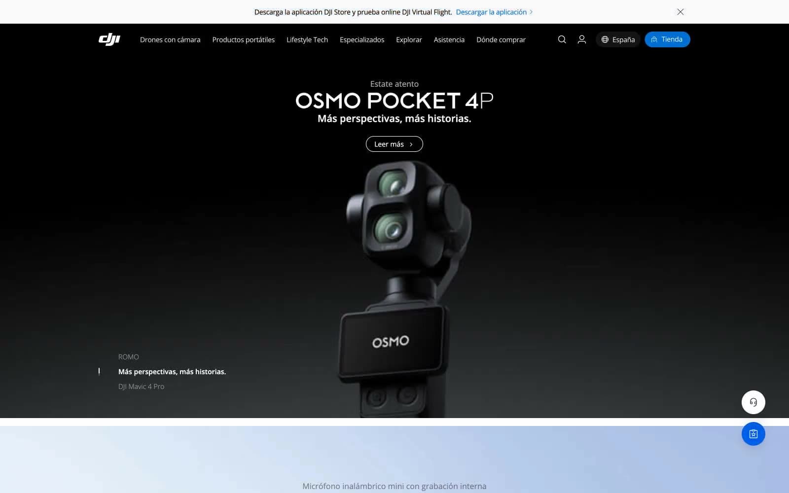
DJI
Commerce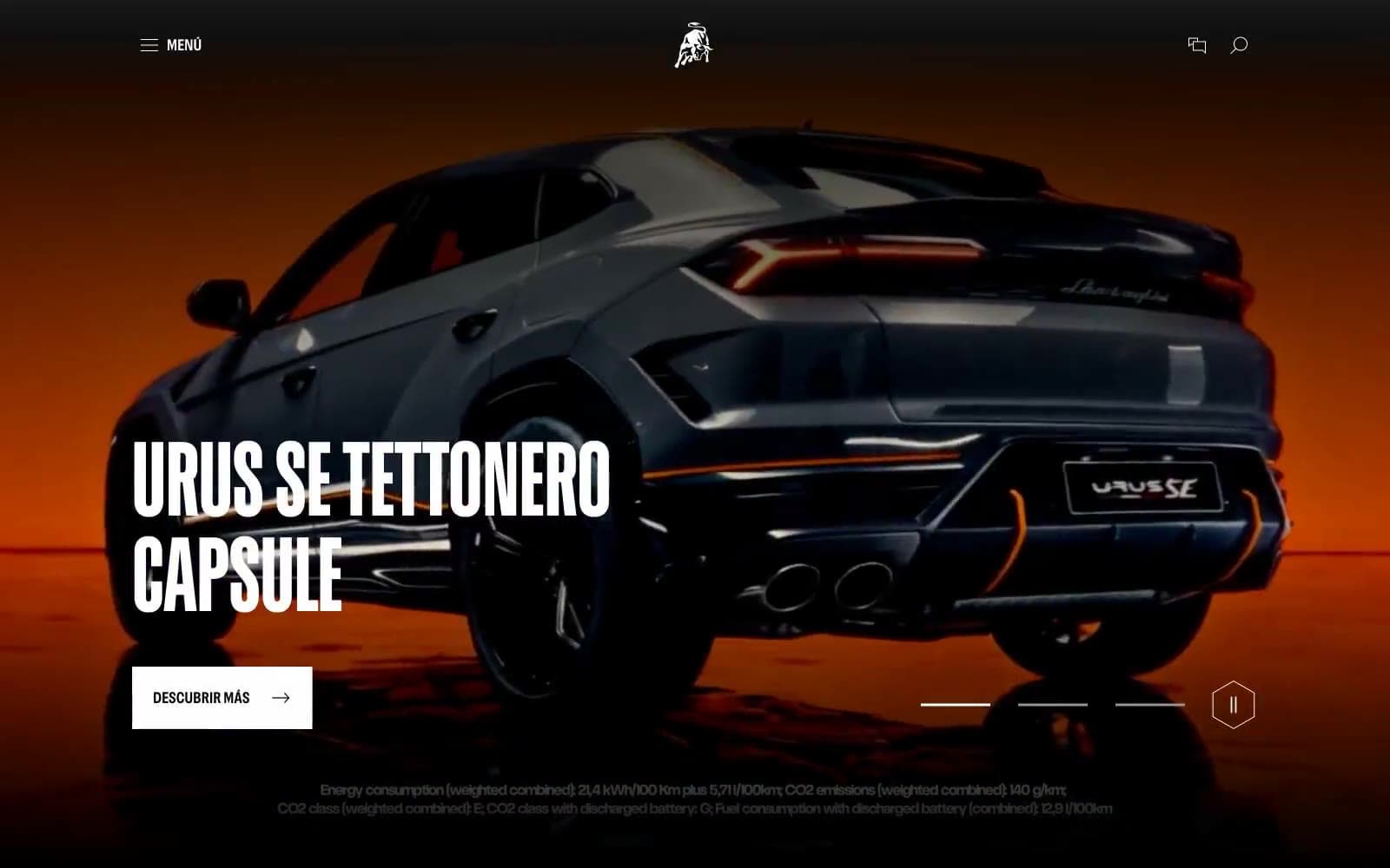
Lamborghini.com
Commerce
LUNCH
Commerce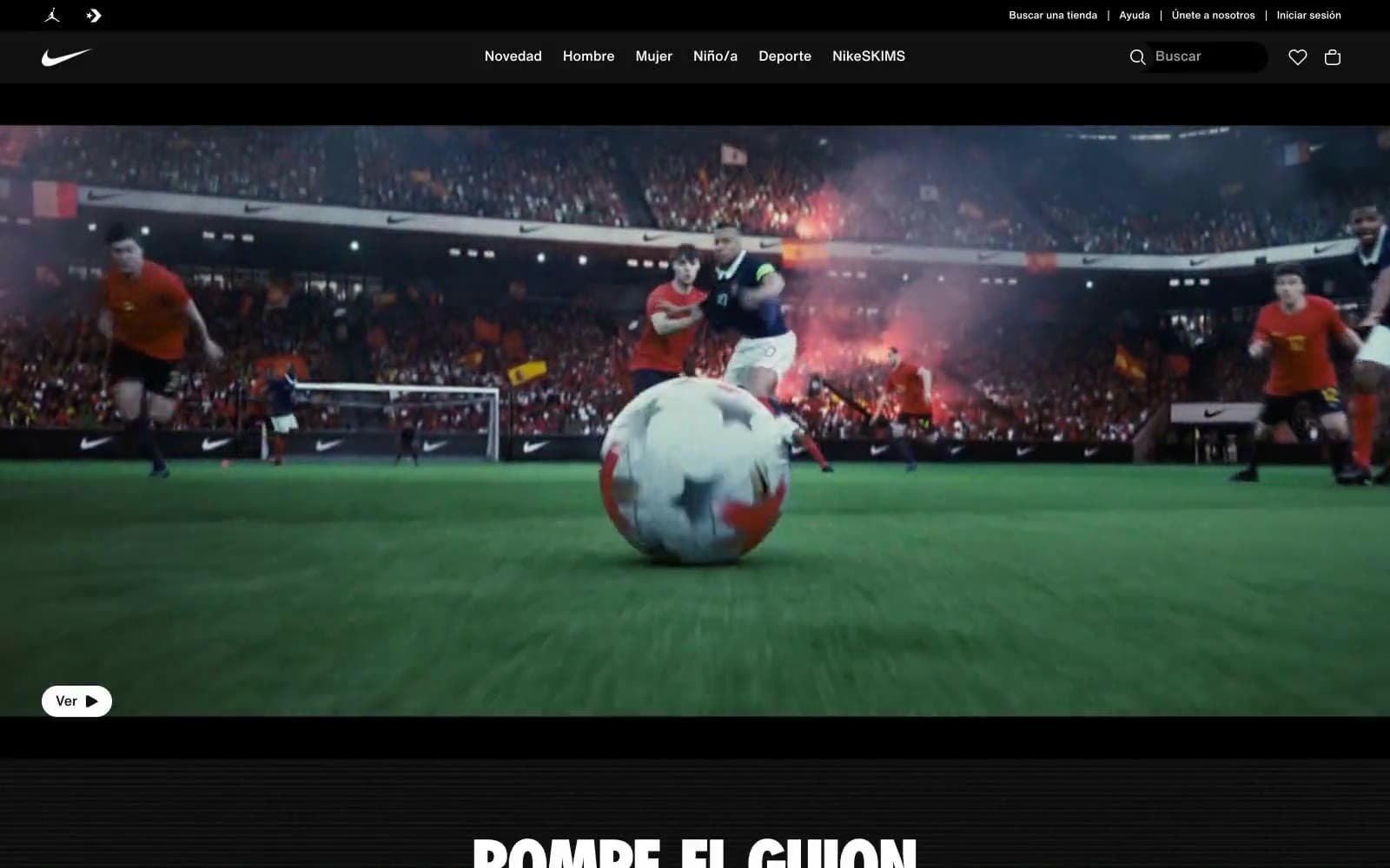
Nike.com
Commerce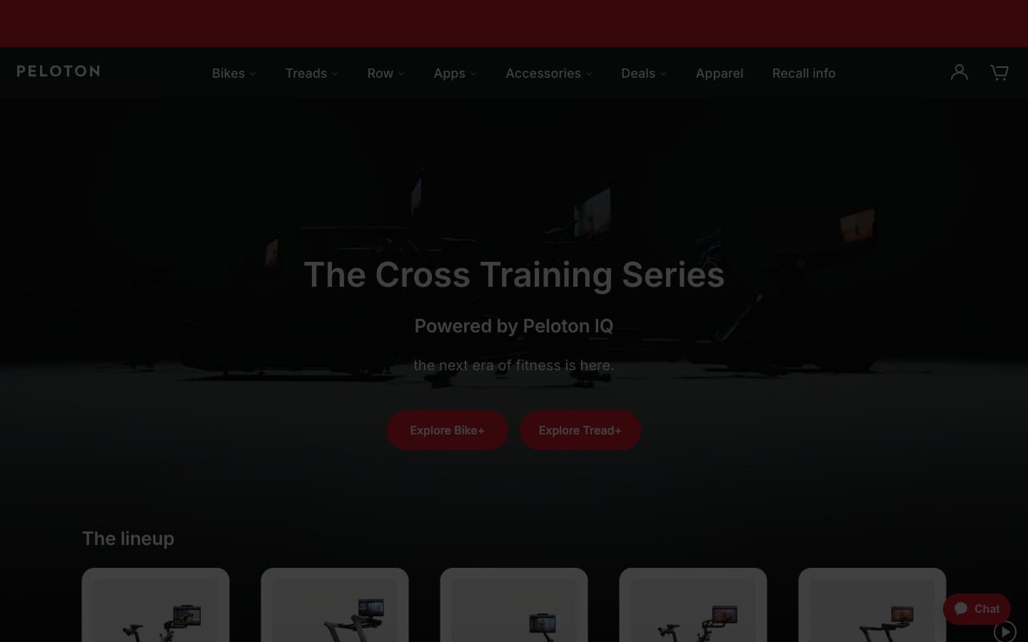
Peloton
Commerce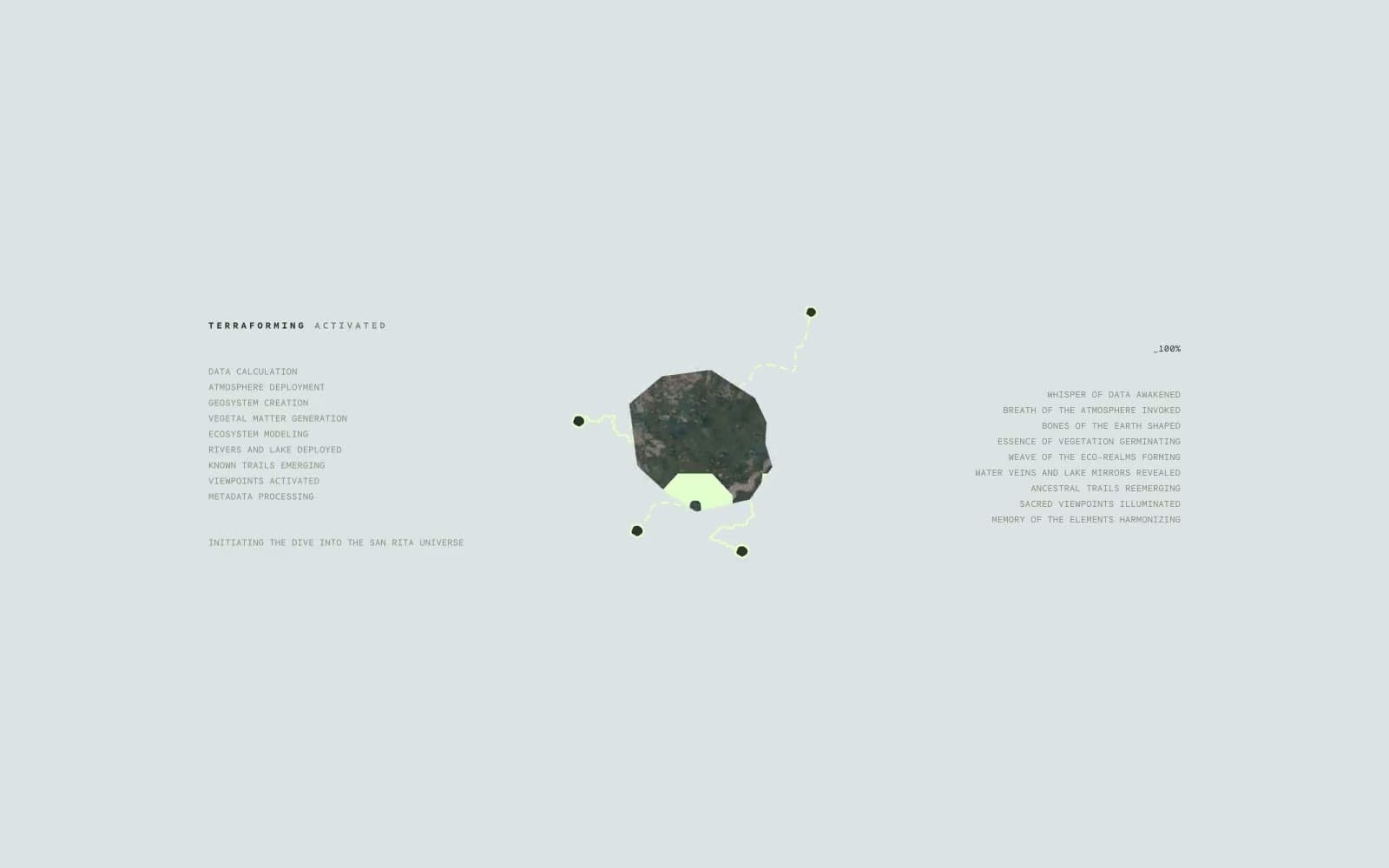
San Rita
Commerce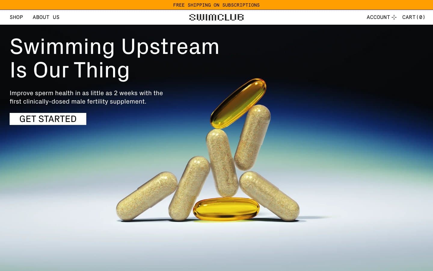
SwimClub
Commerce


