
Busy Bee Honey. Dark cocoa, gold, and blue stacked like a vintage billboard.
- Commerce
- Mixed theme
- 7 colors
- 6 typefaces
Busy Bee Honey speaks in a roadside-Americana voice: full-bleed bands of dark cocoa, honeycomb gold, and cornflower blue, each separated by a scrolling marquee strip. Display headlines are enormous — up to 238px — in a condensed display serif with aggressive 0.80 line-height and slight negative tracking, so words like 'KNOW YOUR HONEY' loom like painted barn-side lettering. The product (the bear-shaped bottle) is the visual anchor: centered, unframed, full-bleed, no card chrome around it. Color blocks are flat, unshadowed, and contiguous — the design relies on brutal color contrast and type scale to create rhythm, not on elevation or container surfaces. Pills are the only shape language; everything else is rectangular and sectioned. The feel is less 'ecommerce product page' and more 'printed honey label folded into a billboard'.
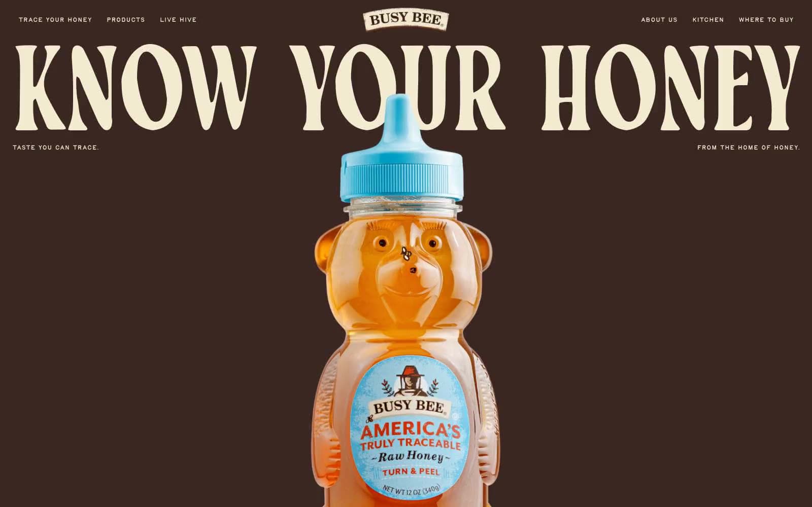
Busy Bee Honey design system

Brand2
Filled CTA buttons on dark sections, full-bleed section canvas, nav fill — the most chromatic and warmest surface, used as functional punctuation against the brown
Red outline accent for tags, dividers, and focused UI edges.
Accent2
Marquee band background, secondary nav fill — the sky/honey-sky blue used as a thin chromatic strip between full-bleed color blocks
Subtle accent strip alongside the blue in marquee/decorative bands — an herb-garden green that keeps the blue from feeling isolated
Neutrals3
Hard-edge text and fine borders where absolute contrast is required
Primary canvas for hero/header, body text on light surfaces, structural borders, dark CTA fills — the most-used chromatic color in the system, carrying 80%+ of text and border weight
Light canvas for alternate sections, text on dark canvases, hairline borders, card surfaces — the warm off-white that makes the dark cocoa feel like printed kraft paper
Try a pairing
Pick any two colors from the palette to check whether text stays readable on top.
Aa
Charcoal on Honeycomb Gold
13.82 : 1 contrast
- Body textPasses AA 4.5
- Large textPasses AA 3
- StrictPasses AAA 7
More DESIGN.md files. Same web, different personalities.

Nothing
Commerce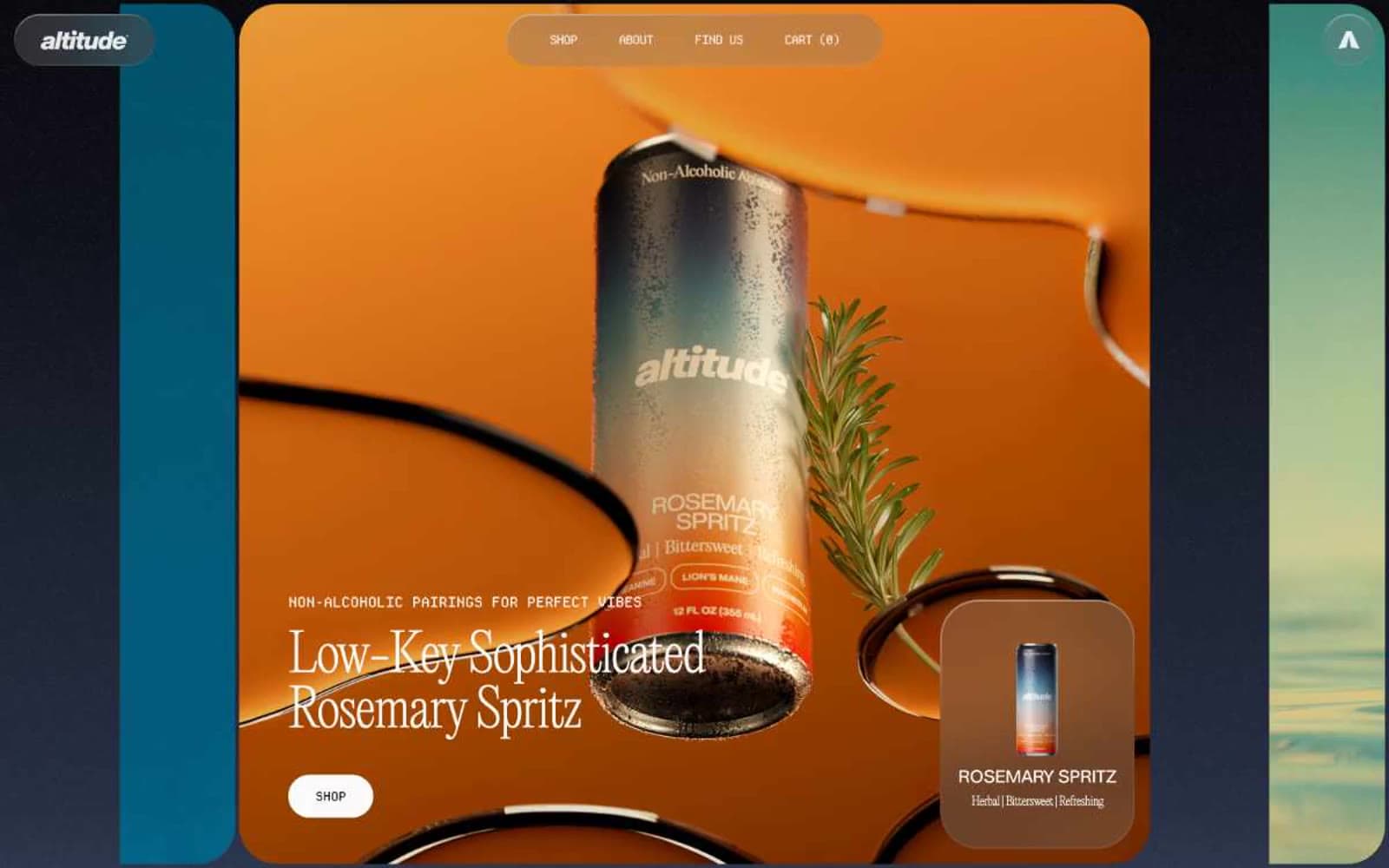
Altitude Beverages
Commerce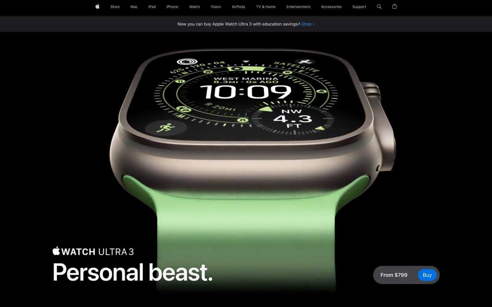
Apple Watch Ultra 3
Commerce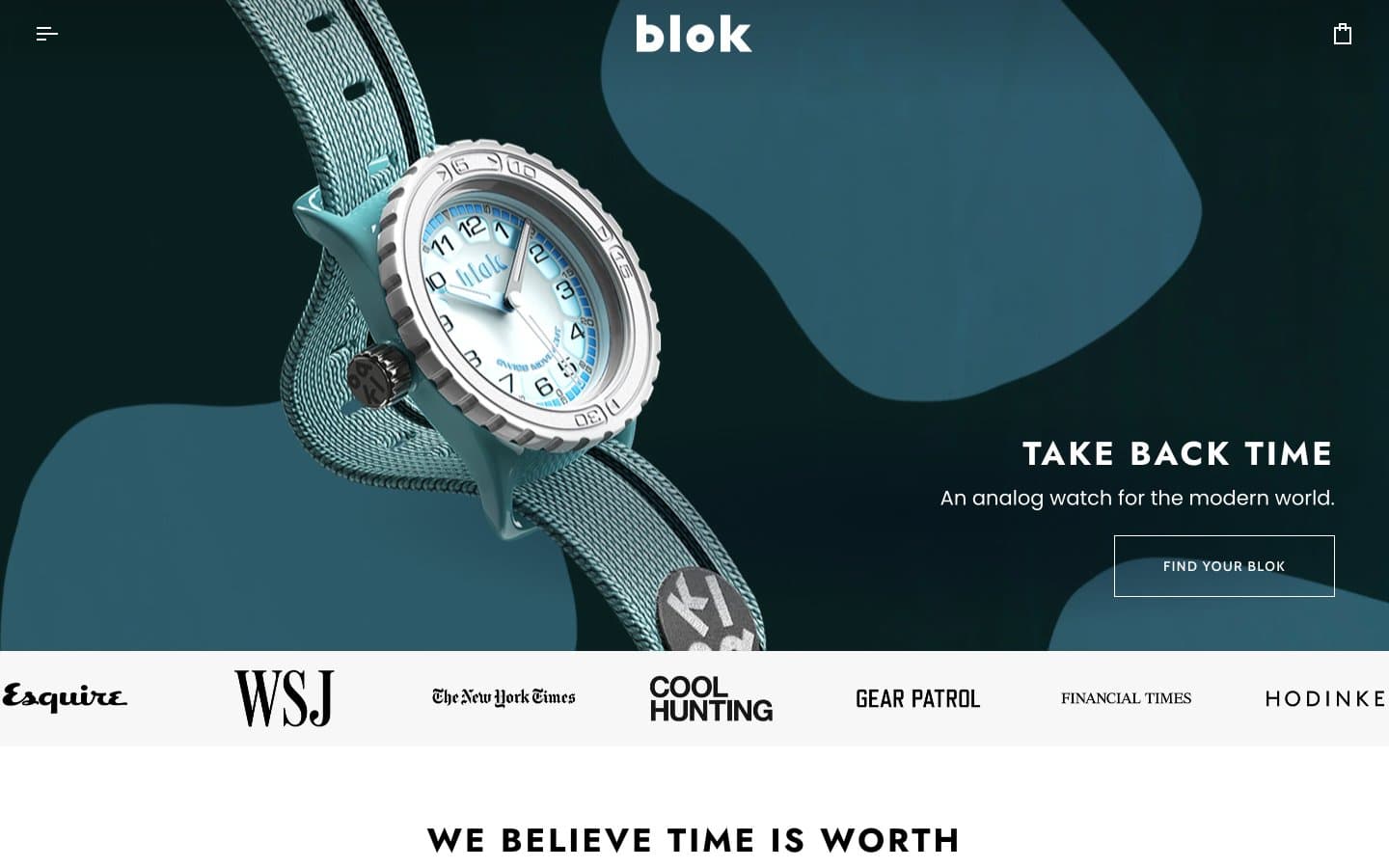
Blok
Commerce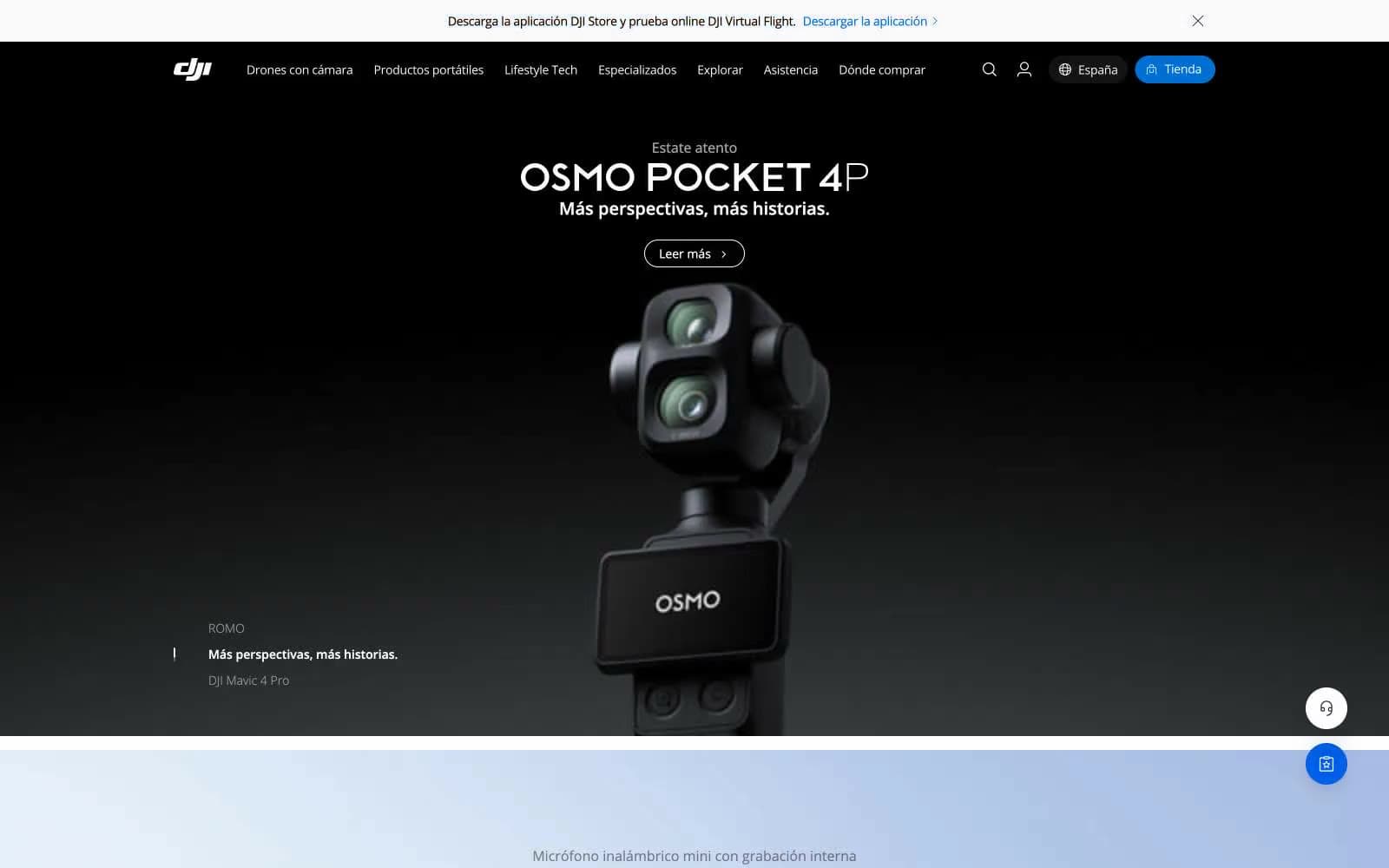
DJI
Commerce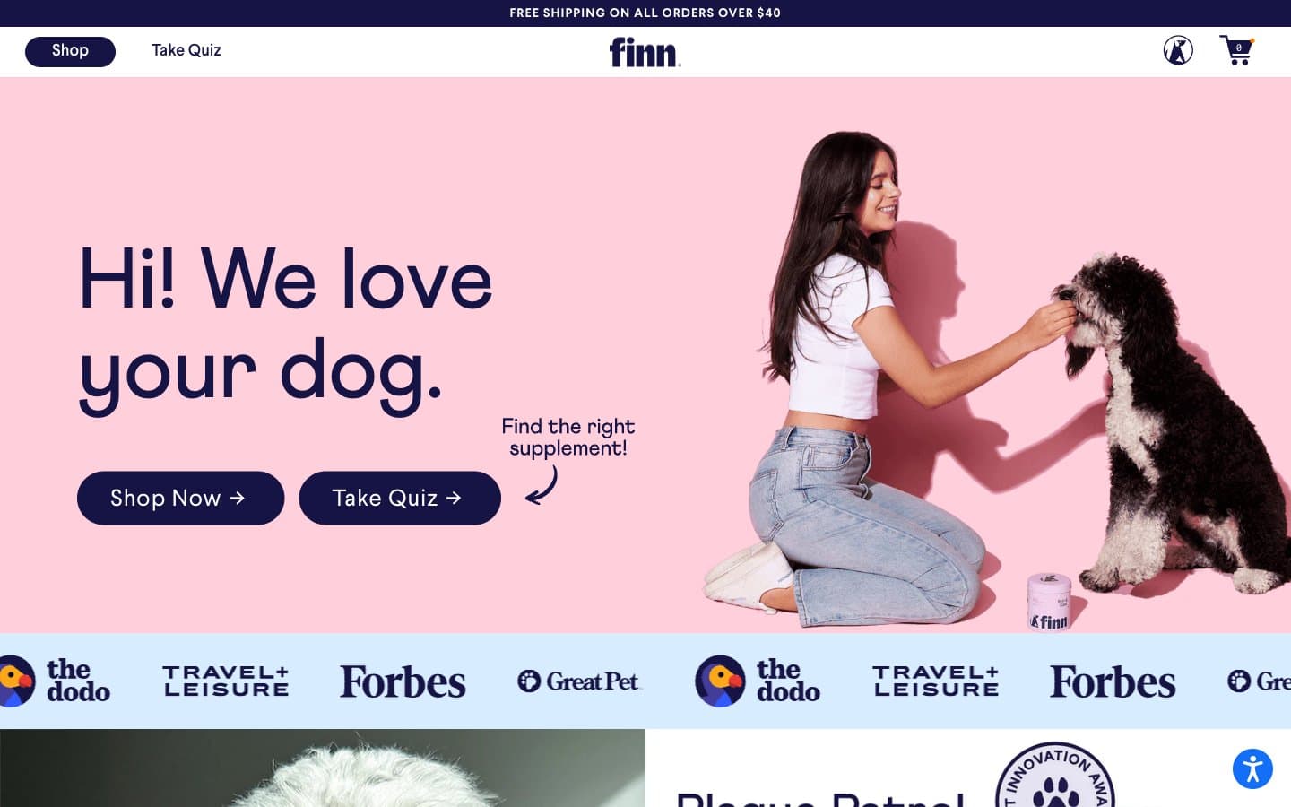
Finn
Commerce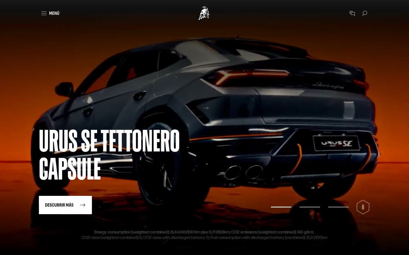
Lamborghini.com
Commerce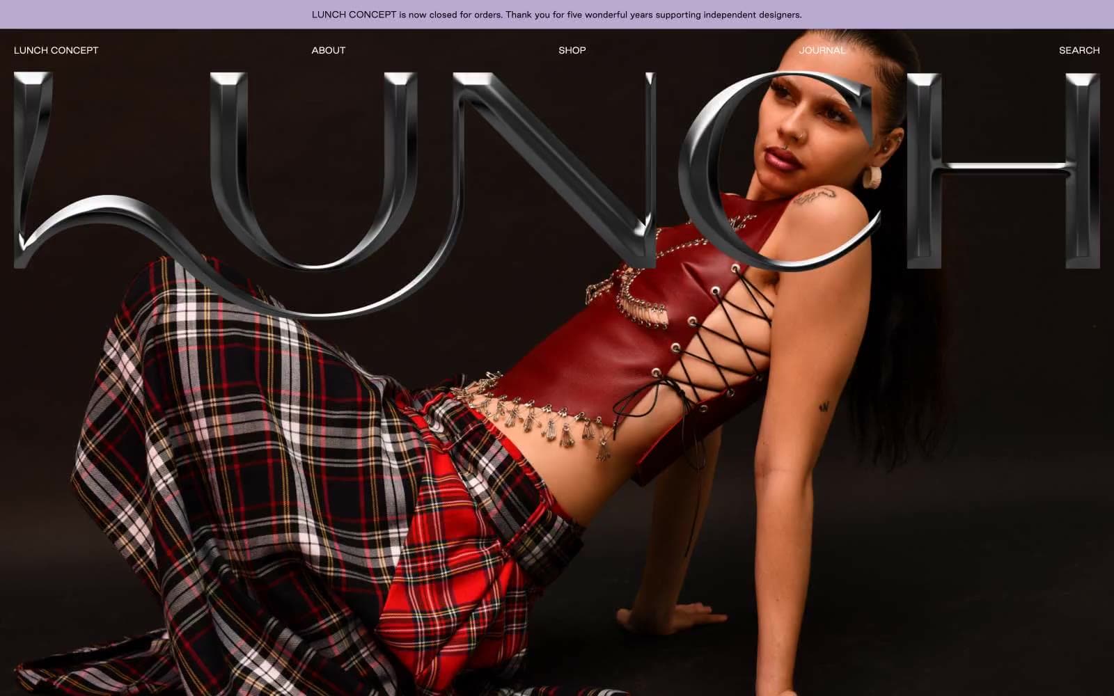
LUNCH
Commerce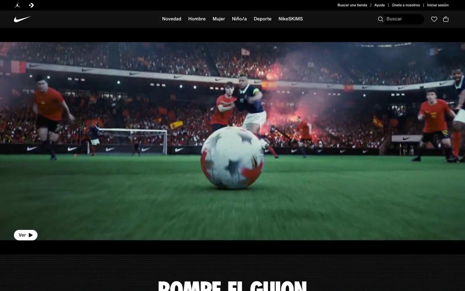
Nike.com
Commerce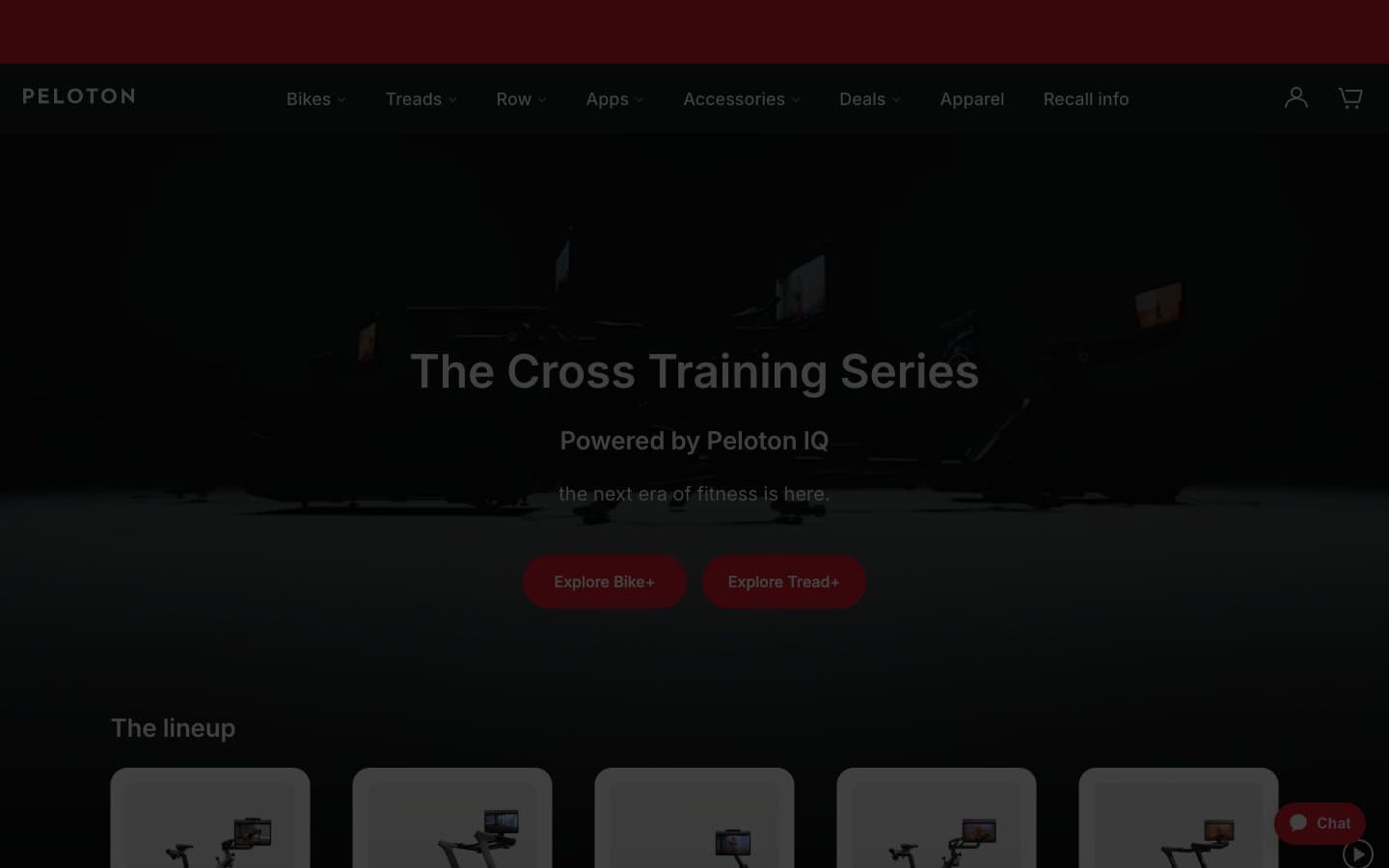
Peloton
Commerce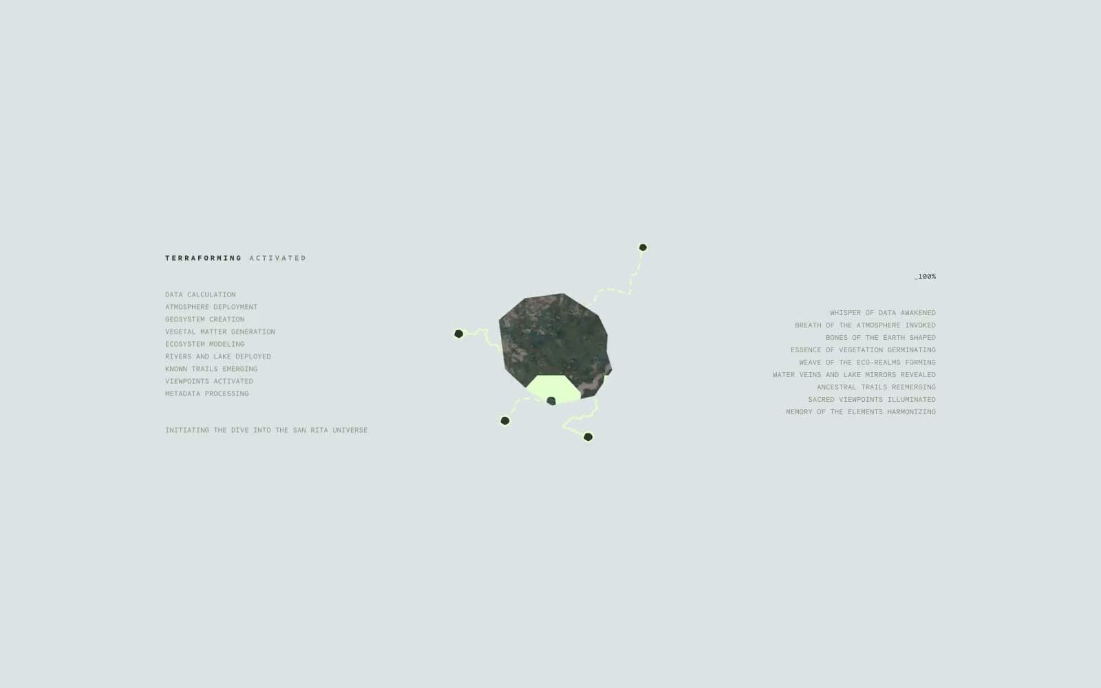
San Rita
Commerce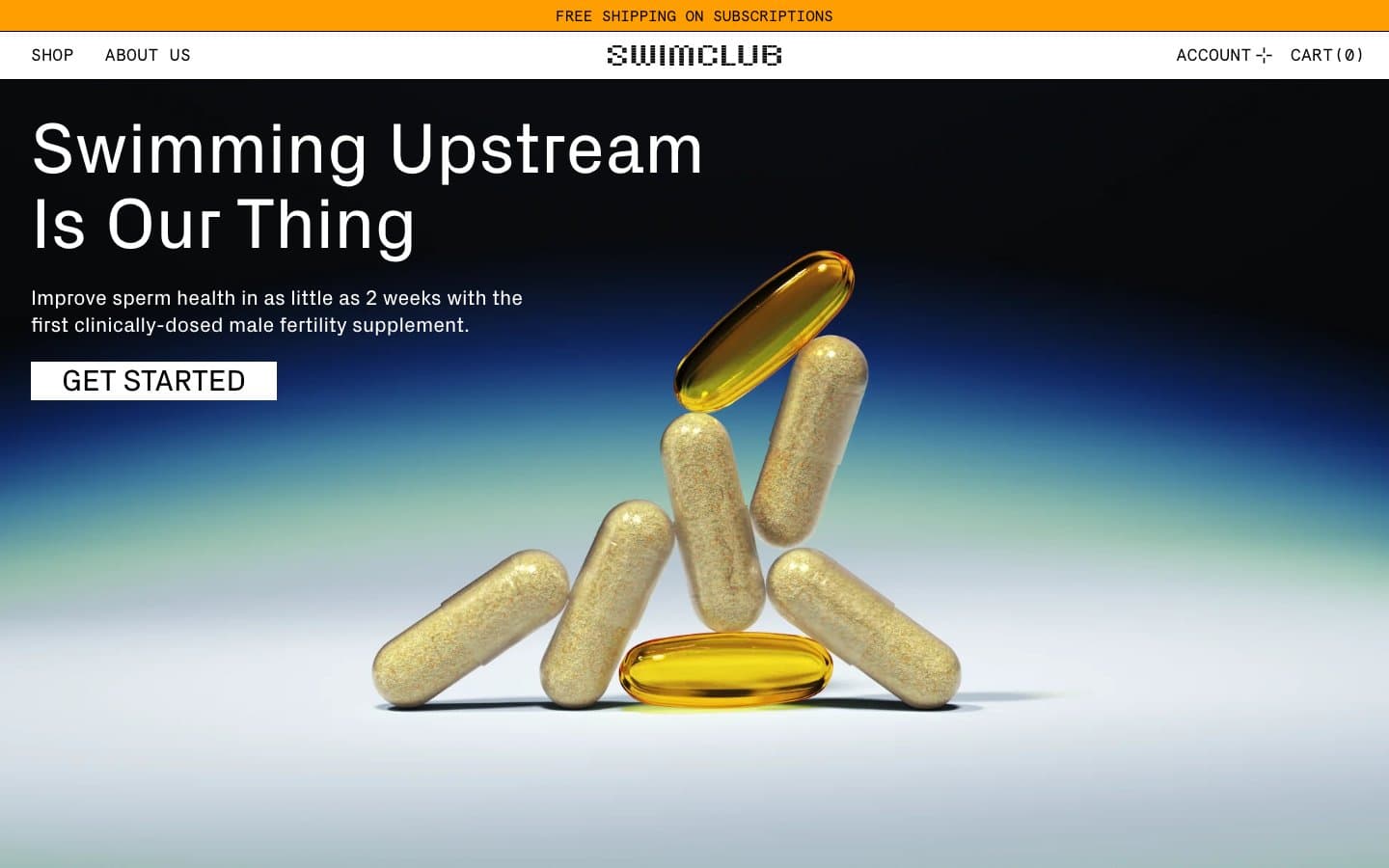
SwimClub
Commerce


