
Lamborghini.com. Showroom black with one yellow car under spotlights.
- Commerce
- Mixed theme
- 11 colors
- 2 typefaces
Lamborghini's design language is automotive theater: a cinematic dark stage where Giallo yellow punctuates an otherwise black-and-white world. The interface alternates between full-bleed dark hero canvases (where video and product photography dominate) and quiet light-gray content surfaces (where editorial storytelling takes over). Typography is the loudest element — an industrial custom sans-serif (LamboType) spoken only in UPPERCASE, scaled aggressively to 80–120px for hero statements. Components are minimal and structural: no rounded cards, no soft shadows, no decorative gradients — just hard-edged surfaces, hairline rules, and one vivid yellow action button. The overall feeling is gallery-grade restraint interrupted by a single confident color hit, the way a matte black showroom is broken by one yellow car under a spotlight.
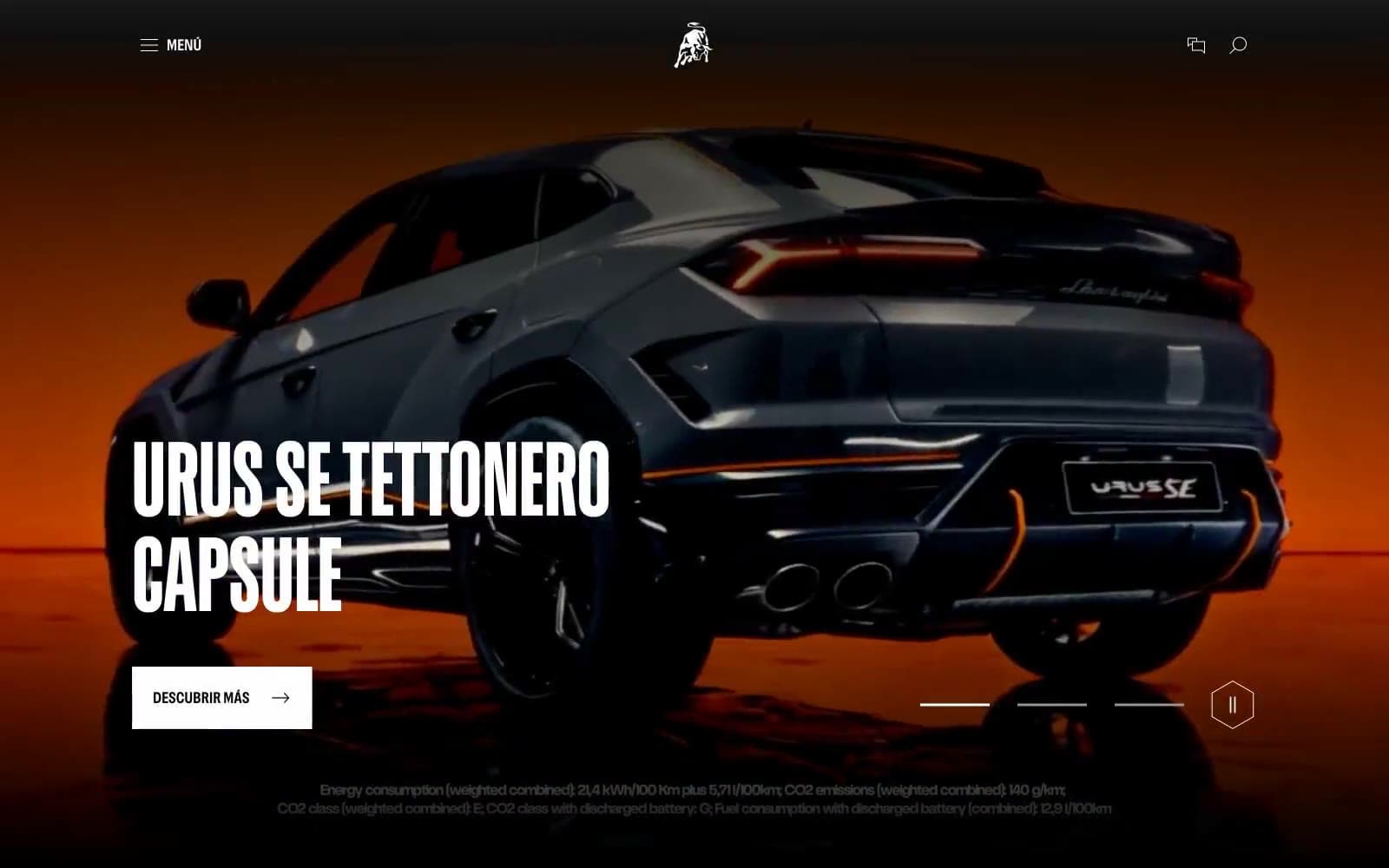
Lamborghini.com design system

Brand2
Yellow supporting accent for decorative details and low-frequency emphasis. Do not promote it to the primary CTA color
Hover or secondary yellow state, list markers with brand accent — darker mustard variant of the primary
Neutrals9
Body copy, footer ink, icon strokes on light surfaces — maximum contrast text and absolute dark
Headline color on light surfaces, dark surface variant, link ink — slightly warmer alternative to pure black
Primary text, dark hero canvases, navigation bar — the workhorse near-black used at 1400+ occurrences
Body copy variant, dark border accent — sits between Carbony Black and deeper neutrals
Section dividers, link ink on light backgrounds, mid-weight borders
Button border outlines, secondary link text, muted UI chrome
Light borders, disabled states, tertiary dividers on white surfaces
Alternate section background, body container fill, badge surface — the off-white that breaks up the white-white rhythm
Page canvas, light card surface, button text on dark, hero text overlay — dominant light surface
Try a pairing
Pick any two colors from the palette to check whether text stays readable on top.
Aa
Pure Black on Giallo Vivo
12.79 : 1 contrast
- Body textPasses AA 4.5
- Large textPasses AA 3
- StrictPasses AAA 7
More DESIGN.md files. Same web, different personalities.

Nothing
Commerce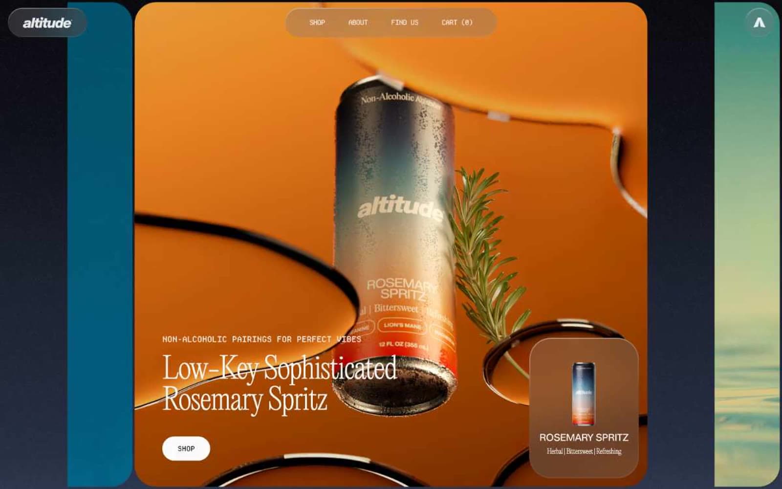
Altitude Beverages
Commerce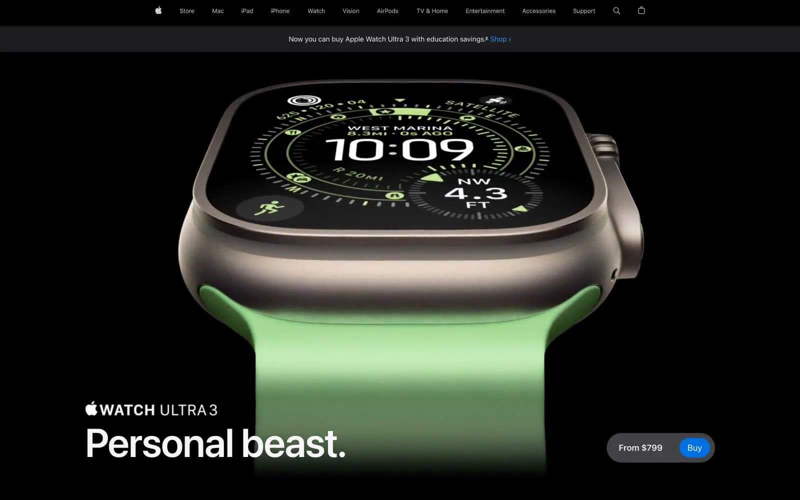
Apple Watch Ultra 3
Commerce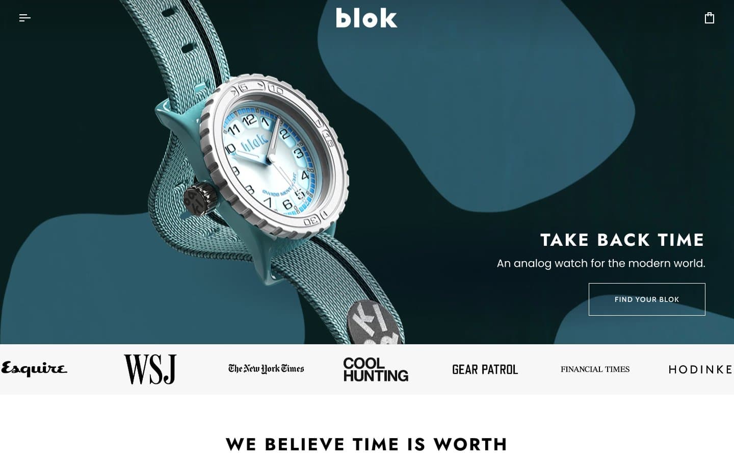
Blok
Commerce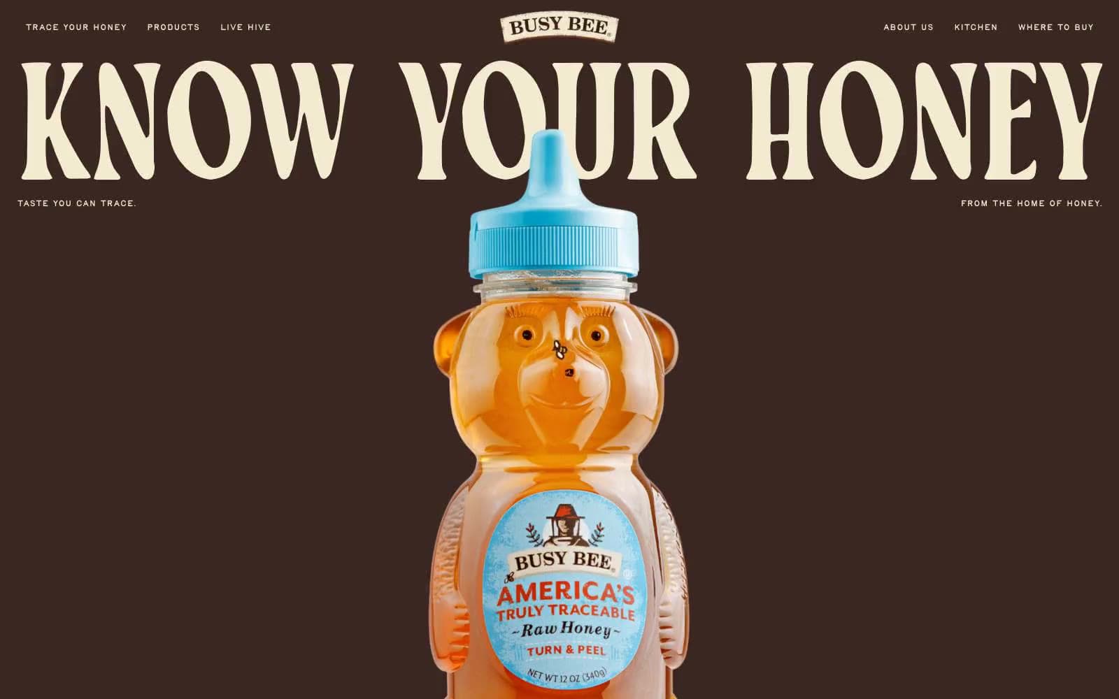
Busy Bee Honey
Commerce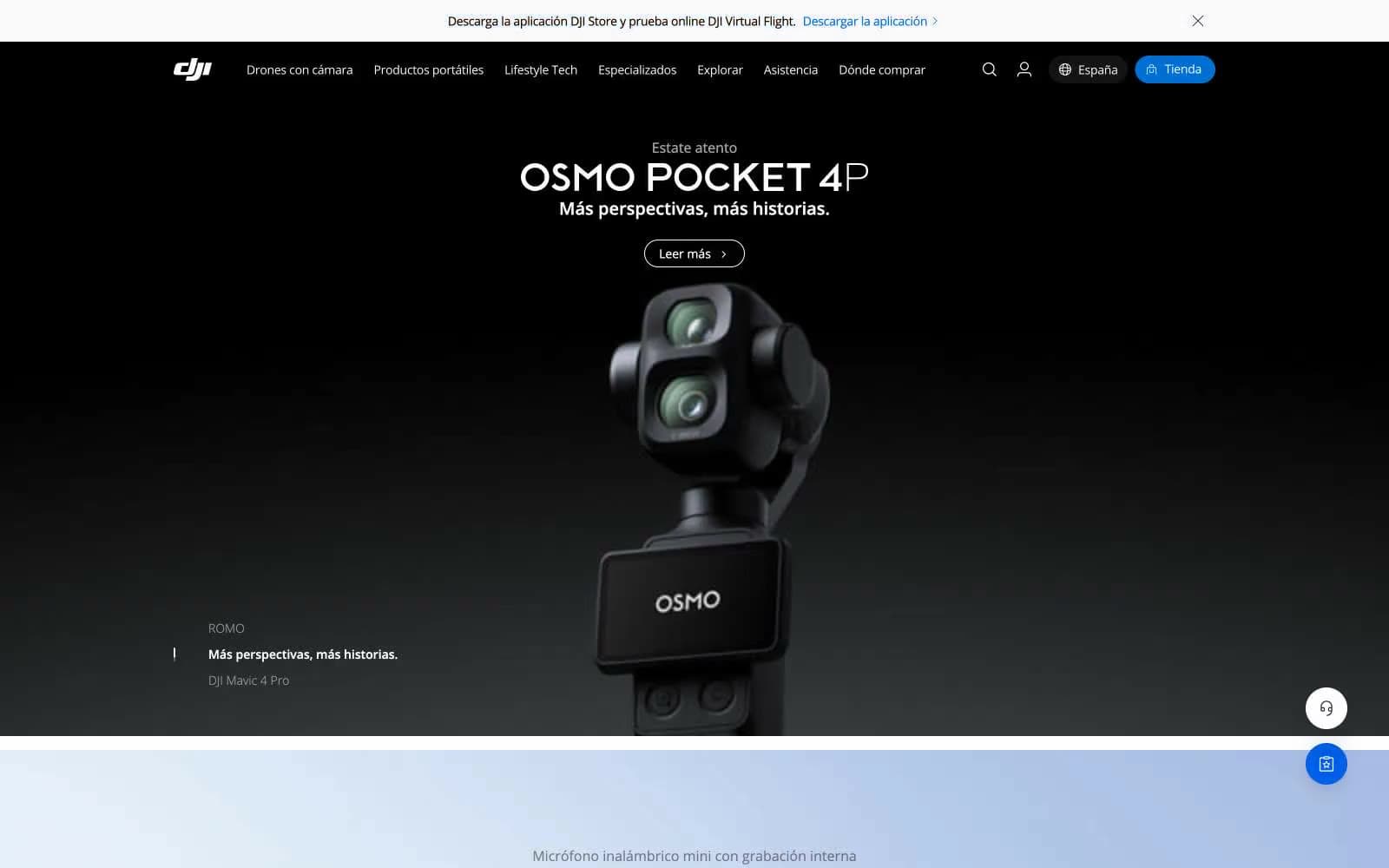
DJI
Commerce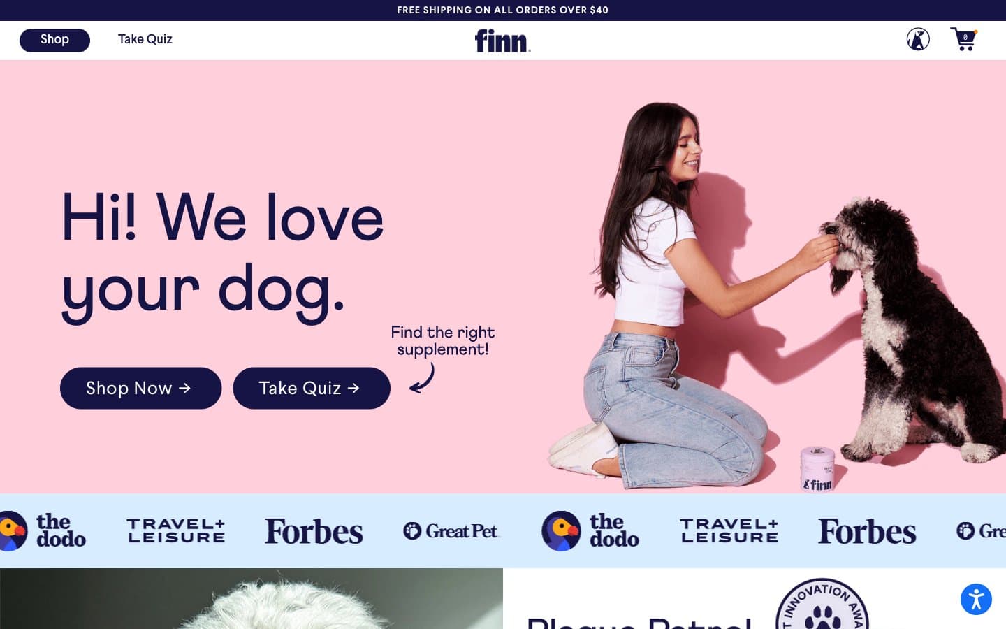
Finn
Commerce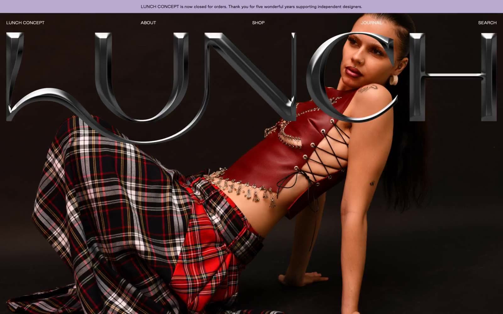
LUNCH
Commerce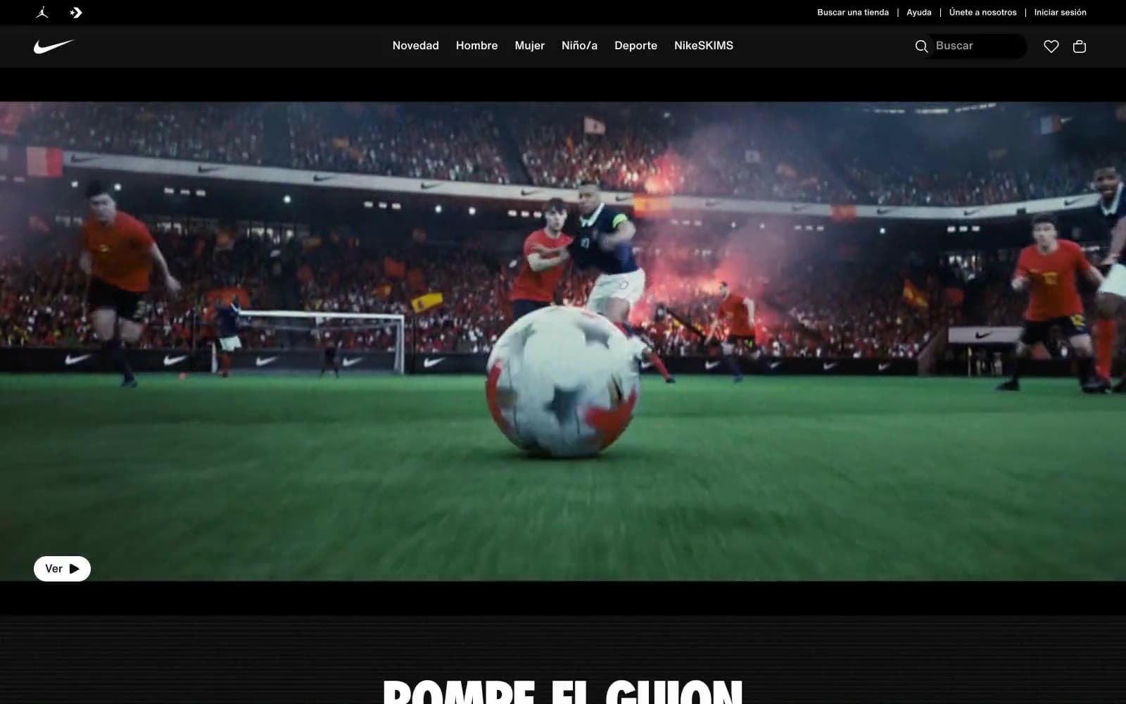
Nike.com
Commerce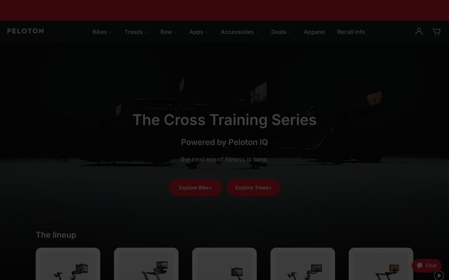
Peloton
Commerce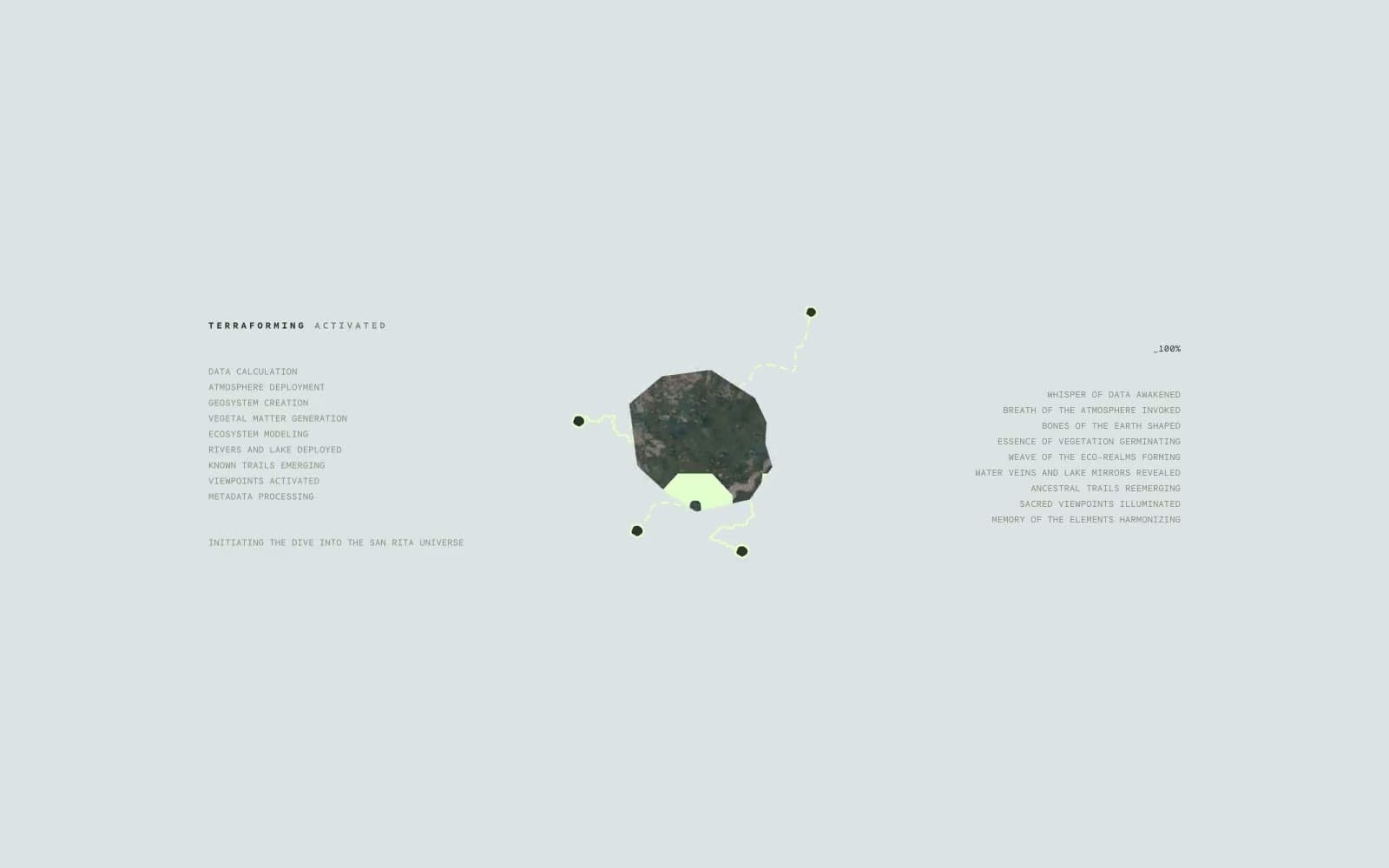
San Rita
Commerce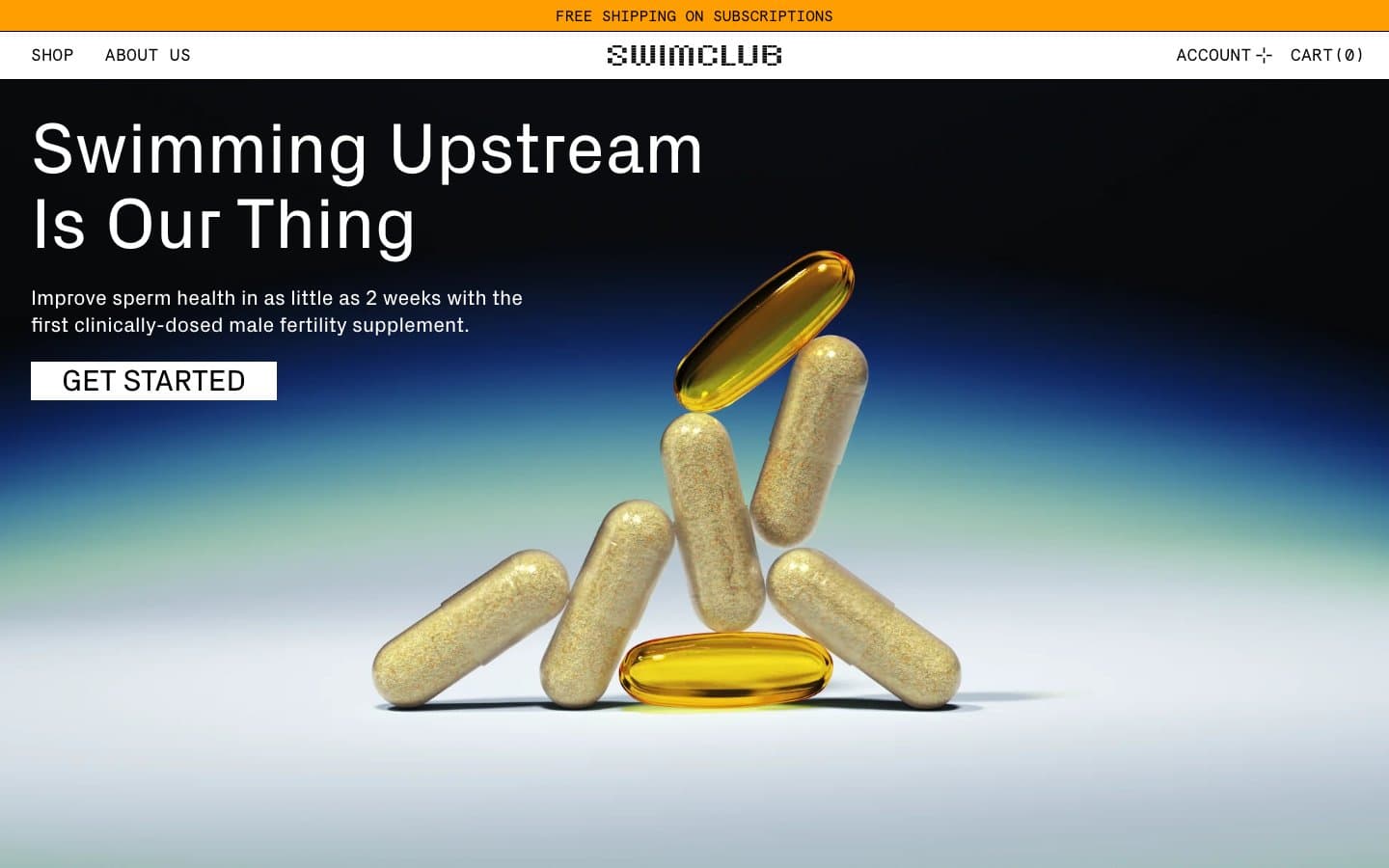
SwimClub
Commerce


