
Nike.com. White walls, product as art, chrome dissolved into the background.
- Commerce
- Mixed theme
- 6 colors
- 6 typefaces
Nike.com operates as a product-first monochrome gallery: the UI stays nearly invisible so product photography can carry every screen. The entire interface is built from black, white, and three tints of gray — no accent color, no decorative gradient, no warm brand chrome. The Nike identity lives in the swoosh and the photography, never in the UI itself. Typography is compact and utilitarian, leaning on a custom Helvetica Now family at 12-20px with one oversized Nike Futura ND moment at 76px for hero headlines. Components are minimal: pill-shaped buttons at 30px radius, flat product cards, hairline borders, and almost zero elevation. The page alternates between pure white product surfaces and dramatic full-bleed dark editorial hero sections, creating rhythm through contrast rather than ornament.
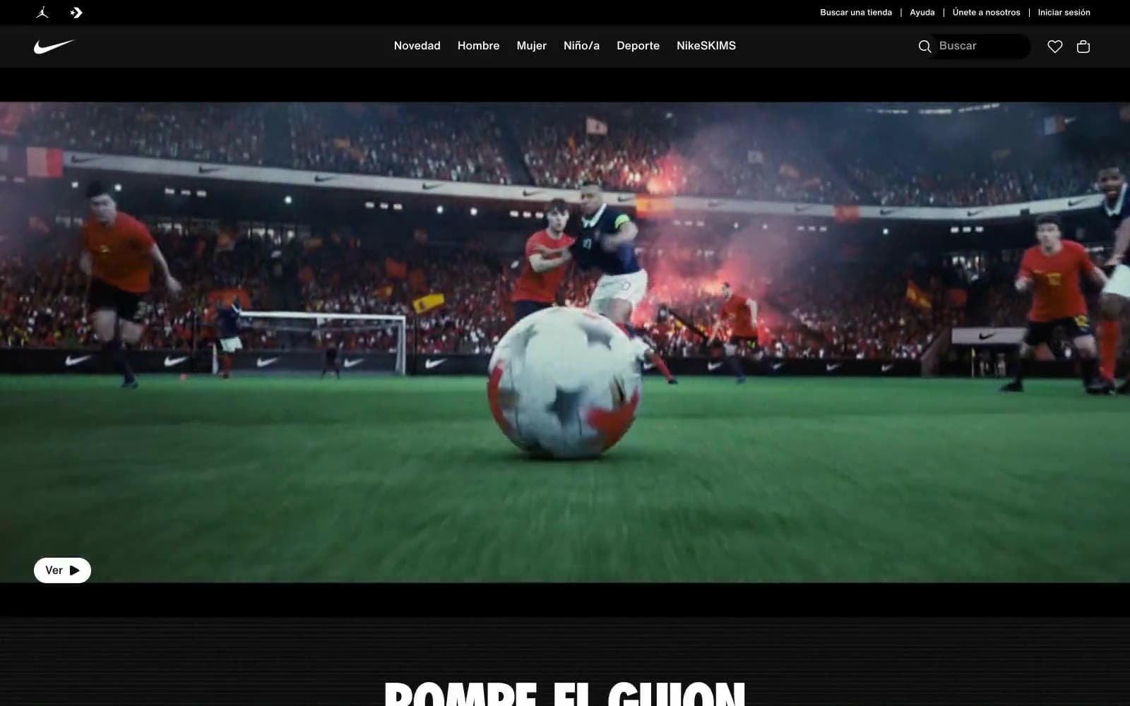
Nike.com design system

Neutrals6
Dark supporting neutral for text, icons, and strong contrast. Do not promote it to the primary CTA color
Secondary text, muted helper copy, icon outlines at smaller sizes, breadcrumb labels, footer link separators
Disabled icon strokes, tertiary UI affordances, lowest-emphasis borders
Borders, dividers, hairline separators between grid sections, subtle input outlines
Subtle background tint for secondary surfaces, nav search field fill, tag backgrounds
Page background, card surface, button text on dark fills, icon strokes — the default canvas for product grids and category sections
Try a pairing
Pick any two colors from the palette to check whether text stays readable on top.
Aa
Paper White on Obsidian
18.88 : 1 contrast
- Body textPasses AA 4.5
- Large textPasses AA 3
- StrictPasses AAA 7
More DESIGN.md files. Same web, different personalities.

Nothing
Commerce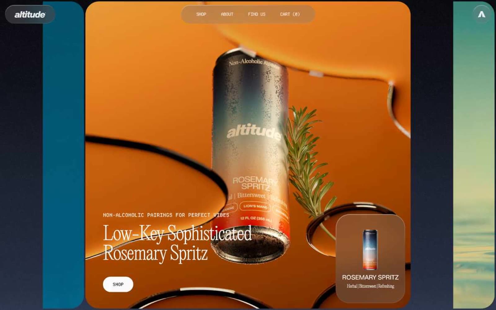
Altitude Beverages
Commerce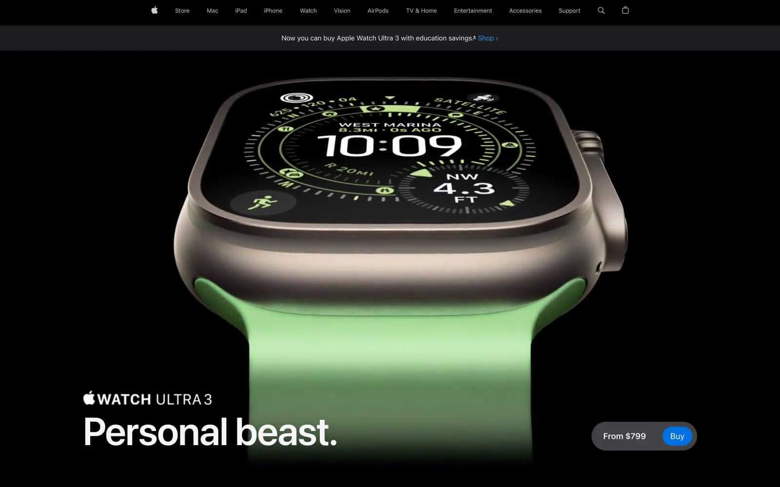
Apple Watch Ultra 3
Commerce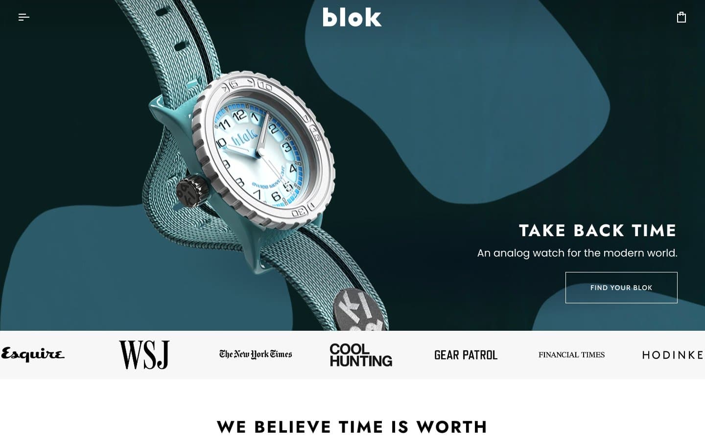
Blok
Commerce
Busy Bee Honey
Commerce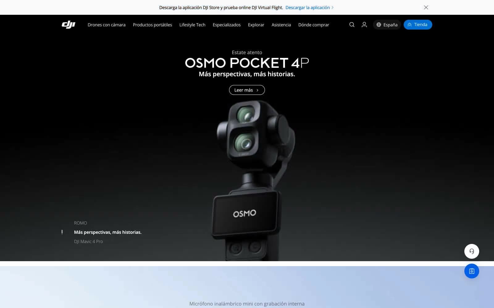
DJI
Commerce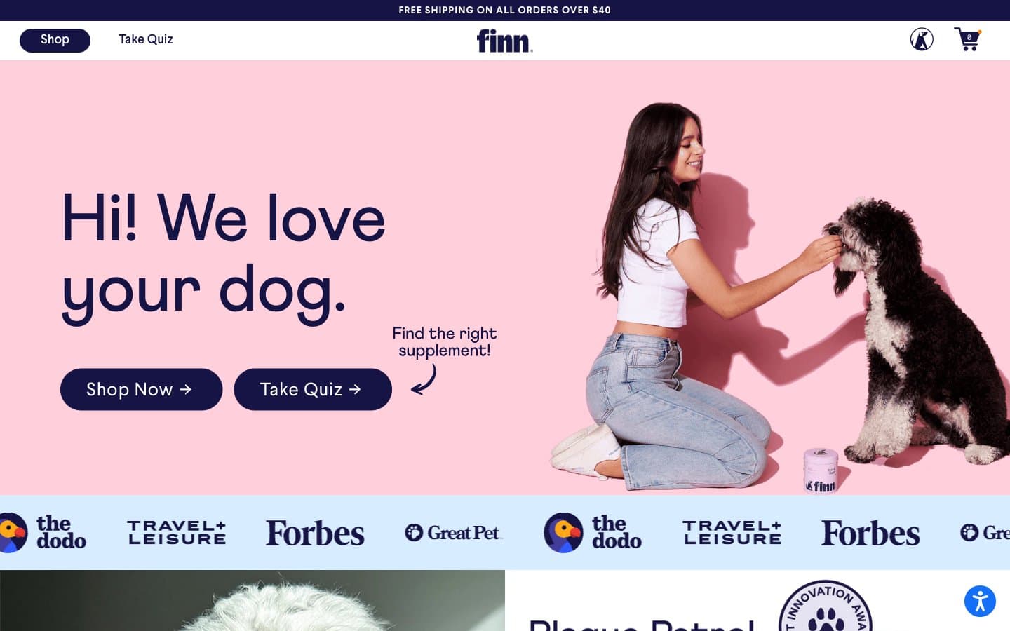
Finn
Commerce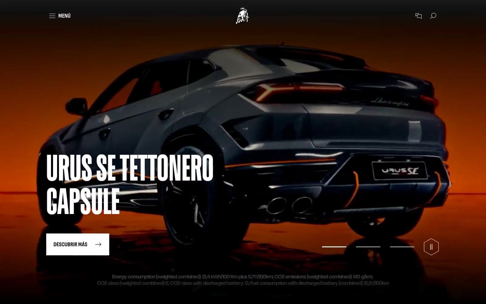
Lamborghini.com
Commerce
LUNCH
Commerce
Peloton
Commerce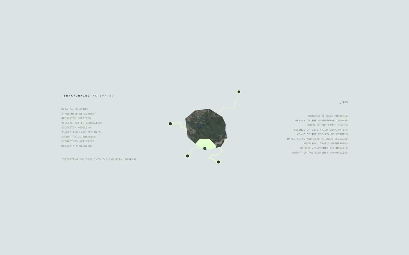
San Rita
Commerce
SwimClub
Commerce


