
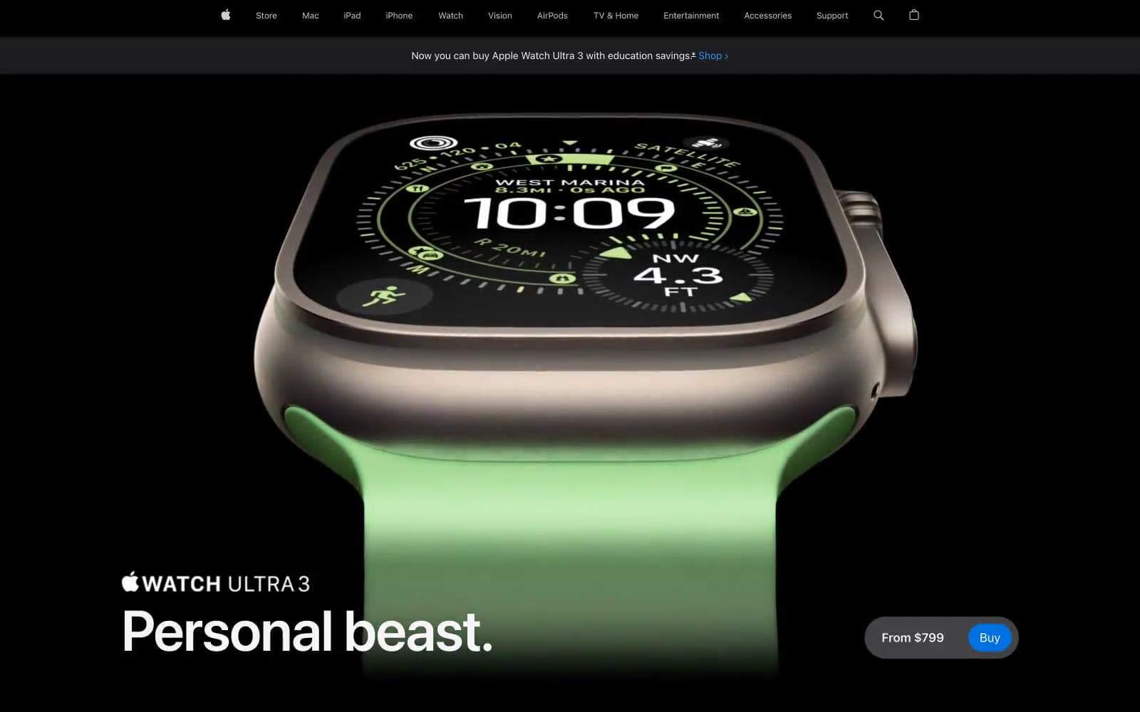
Apple Watch Ultra 3. A dark showroom where a single titanium object glows against pure black.
- Commerce
- Mixed theme
- 15 colors
- 2 typefaces
Apple's product page is a cinematic dark-stage that lets hardware speak first: full-bleed near-black canvas, a single hero product floating in negative space, white SF Pro Display headlines at massive scale, and one vivid blue Buy button as the only saturated action color on the page. The page alternates between black feature stages and white detail bands, using generous 28px card radii and 36–980px pill buttons to feel premium and tactile. Color is used as functional punctuation: orange for category eyebrows, blue for links and the single CTA, violet/teal for other product categories. Typography is the only chrome — heavy negative letter-spacing, tight line-heights, and weight contrast between SF Pro Text body and SF Pro Display headlines carry all the hierarchy.
Apple Watch Ultra 3 design system

Brand3
Primary CTA fill (Comprar button), primary action background — the single filled chromatic button color on the page, vivid saturated blue against black creates unmistakable tap target
Text links, inline link text, Learn more arrows — deeper than Apple Blue, optimized for readability on white
Lighter link variant, accent text on dark backgrounds, secondary link color — brighter blue for dark-surface legibility
Accent3
Orange outline accent for tags, dividers, and focused UI edges. Do not promote it to the primary CTA color
Secondary category accent, alternate product-line color coding — used sparingly to differentiate categories from the orange-tagged ones
Tertiary category accent, alternate product-line color coding — cool counterpoint to the warm orange/iris palette
Neutrals9
Deepest dark canvas for hero and feature stages, footer background — used where absolute darkness amplifies product photography
Elevated surface above black, badge backgrounds — sits one step lighter than pure black for subtle layered depth
Primary dark canvas, card surfaces on dark sections, primary text on light backgrounds — the signature near-black that defines Apple's product stage
Subtle elevated surfaces, secondary button backgrounds, nav dividers — quiet structural tone between obsidian and black
Hairline borders, low-contrast dividers on dark sections
Muted body text, secondary descriptions, subtitle lines, caption text — the conversational gray that recedes behind primary copy
Nav borders, button outlines, inactive UI chrome — the lightest neutral that still reads as structural rather than decorative
Primary text on dark backgrounds, light section surfaces, subtle dividers — slightly warm white that softens contrast against pure black
Light section backgrounds, button text on dark fills, icon fills — the bright counterweight in alternating dark/light page rhythm
Try a pairing
Pick any two colors from the palette to check whether text stays readable on top.
Aa
Paper White on Apple Blue
4.70 : 1 contrast
- Body textPasses AA 4.5
- Large textPasses AA 3
- StrictFails AAA 7
More DESIGN.md files. Same web, different personalities.

Nothing
Commerce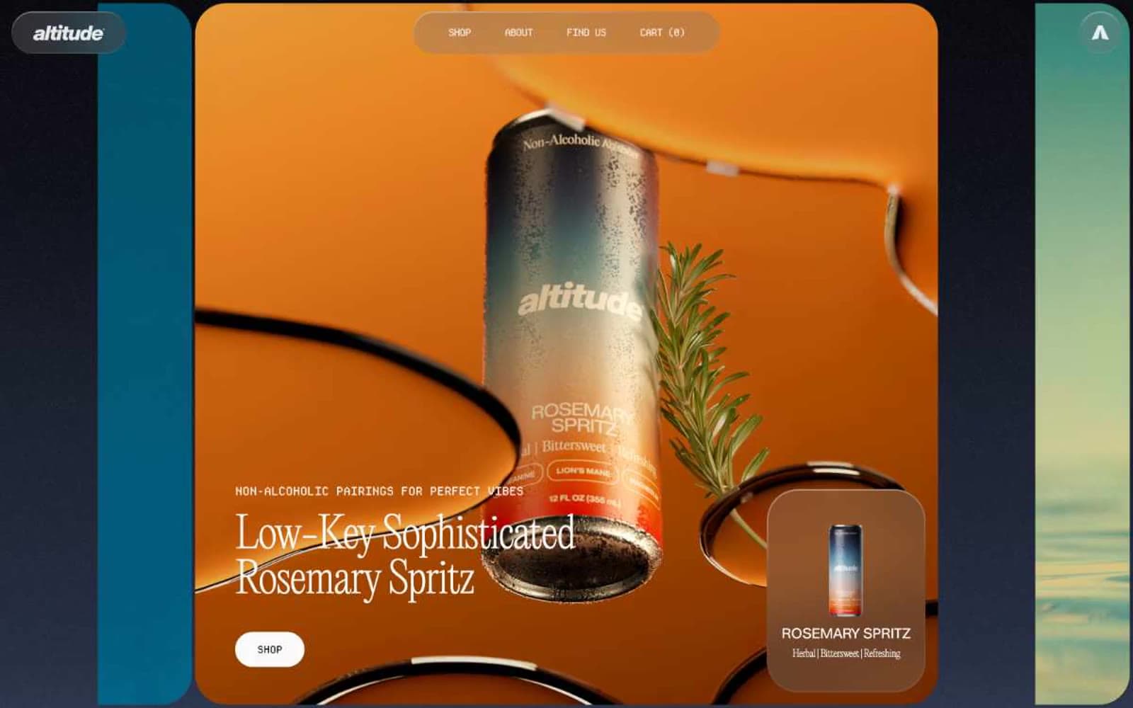
Altitude Beverages
Commerce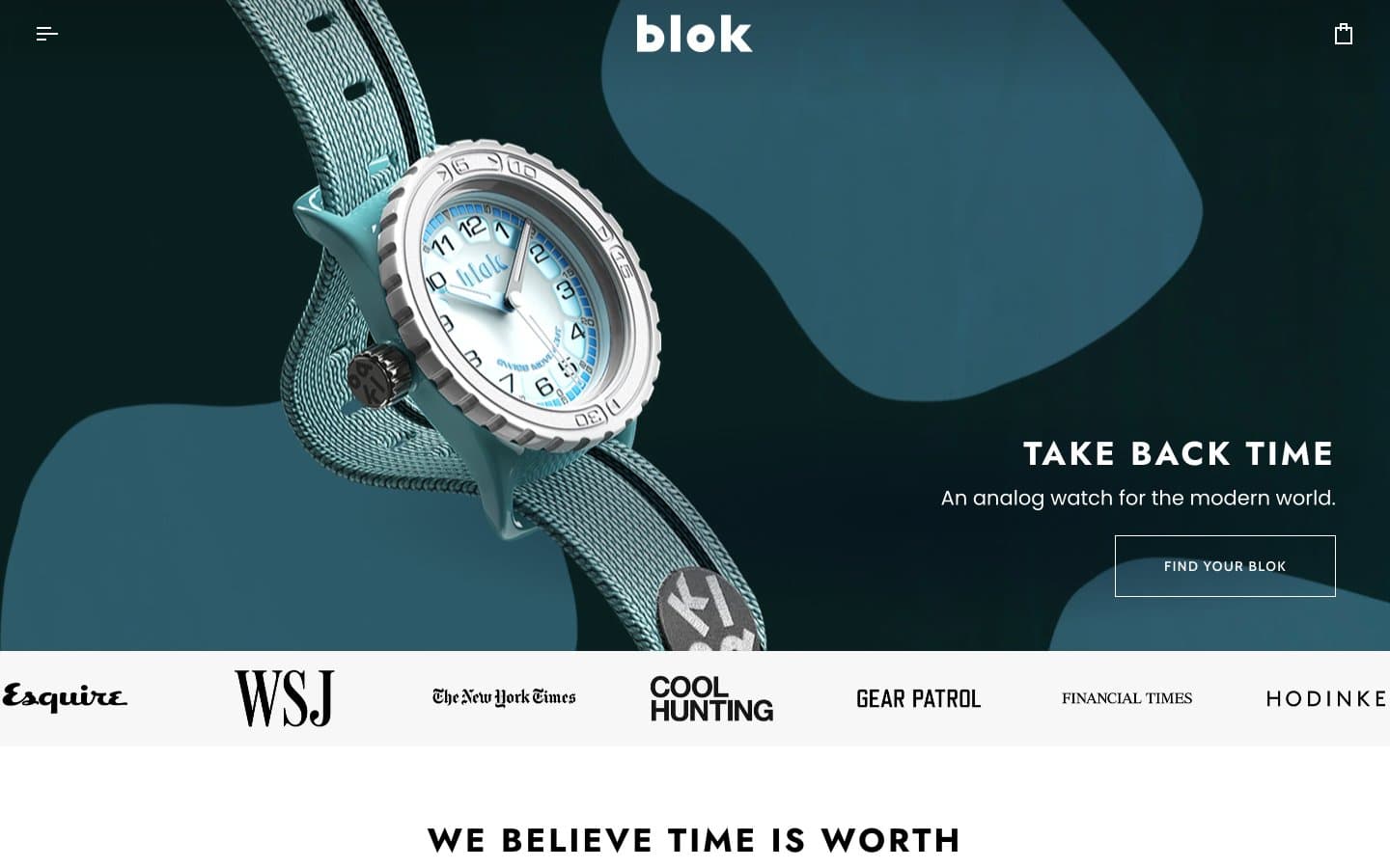
Blok
Commerce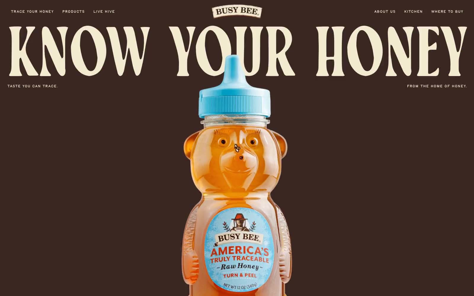
Busy Bee Honey
Commerce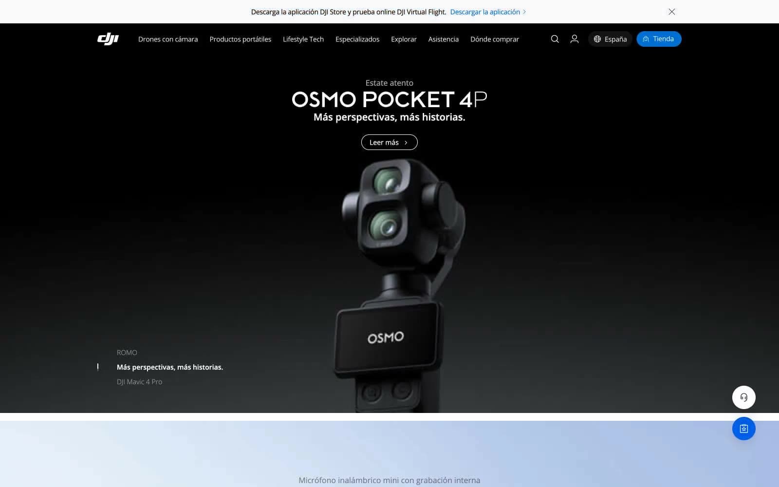
DJI
Commerce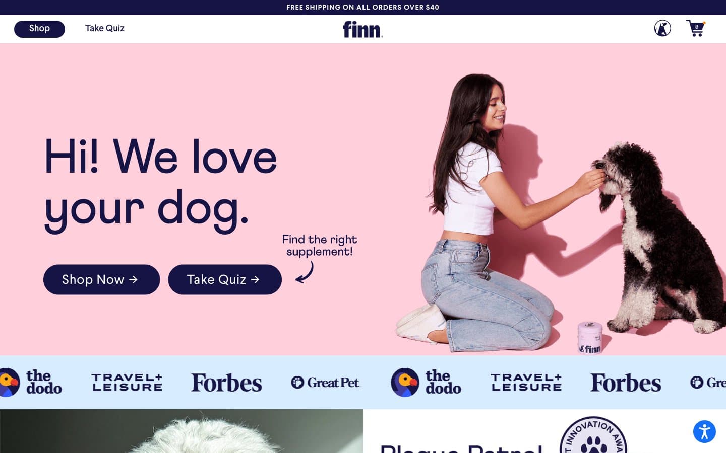
Finn
Commerce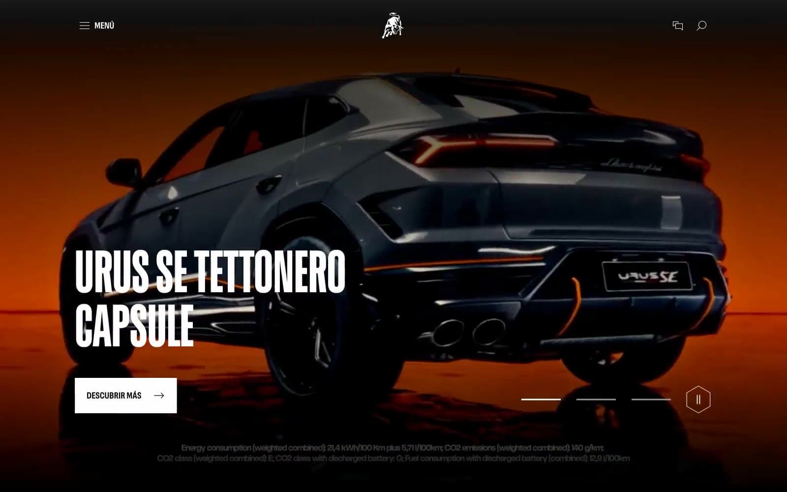
Lamborghini.com
Commerce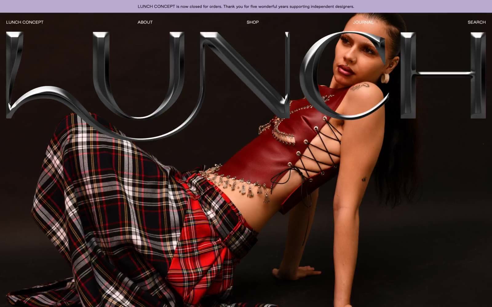
LUNCH
Commerce
Nike.com
Commerce
Peloton
Commerce
San Rita
Commerce
SwimClub
Commerce


