
MUBI Notebook. Poster wall, broadsheet column.
- Media
- Light theme
- 14 colors
- 1 typeface
MUBI Notebook is a daily film publication that reads like a printed broadsheet with a cinema lobby attached. Paper #ffffff pages carry a four-column grid of square-cornered stills, each under a Riforma 24px/500 headline at -0.6px tracking, and every word on the site is Riforma. Colour belongs to the films: posters and stills are saturated while the interface stays Ink #000000, Screening Gray #323232 and Byline Gray #9b9b9b. Marquee Blue #001489 is kept to the newsletter button and inline article links, and Issue Red #d71b1d appears only on the print magazine page. Tag pages shift to a Wall Gray #eaeaea field hung with split poster cards, and the Explore index opens as a dark Screening Gray panel.
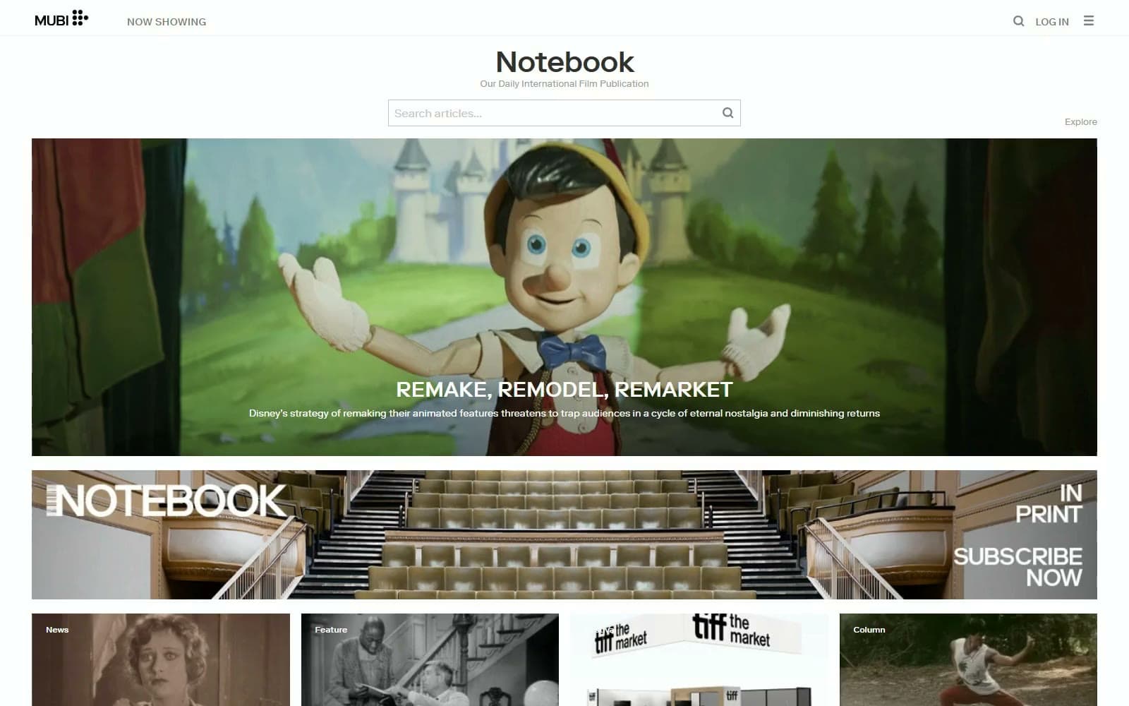
MUBI Notebook design system

Brand1
Join button and inline article links — a deep ink blue that marks the few things to act on inside gray prose
Accent1
Subscribe Now button and 15px borders around issue numerals on the magazine page — print sales get their own colour
Neutrals12
Article H1, home card headlines, wordmark and bylines — pure black reserved for the loudest words
Fill behind the 732x374px Featured stills while they load, so a slow image reads as a dark frame
Article body text, the Notebook masthead, poster-card titles, the 4px quote bar and the Explore overlay field
Outlined Show More button and pager numerals — quiet controls that stay behind the editorial text
Now Showing and Log In labels, search and menu icons in the top bar
Dates, poster-card authors, article decks and the Notebook half of two-tone page headings
The 1px outline of search and email inputs, a touch darker than the page rules
Tag-page field behind poster cards, the footer block and 1px hairlines under the nav and article header
The single 224px full-width newsletter band that breaks the home grid
Page canvas, poster-card text panels, card badges and type over images
Top wash on card images so the white category badge holds on any still
Foot wash under the lead feature capitals, darkest at the bottom edge
Try a pairing
Pick any two colors from the palette to check whether text stays readable on top.
Aa
Paper on Marquee Blue
14.37 : 1 contrast
- Body textPasses AA 4.5
- Large textPasses AA 3
- StrictPasses AAA 7
More DESIGN.md files. Same web, different personalities.
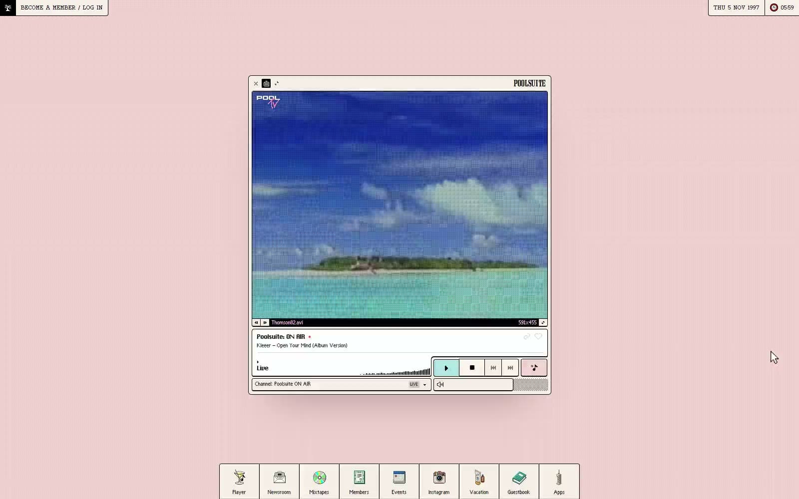
Poolsuite
Media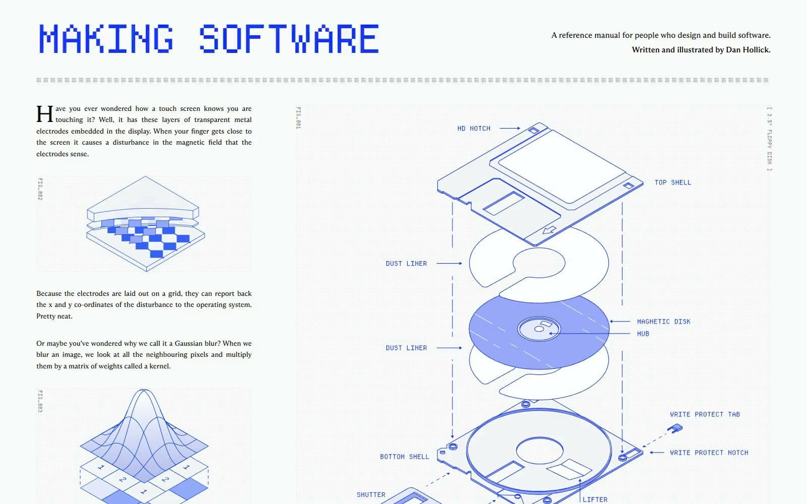
Making Software
Media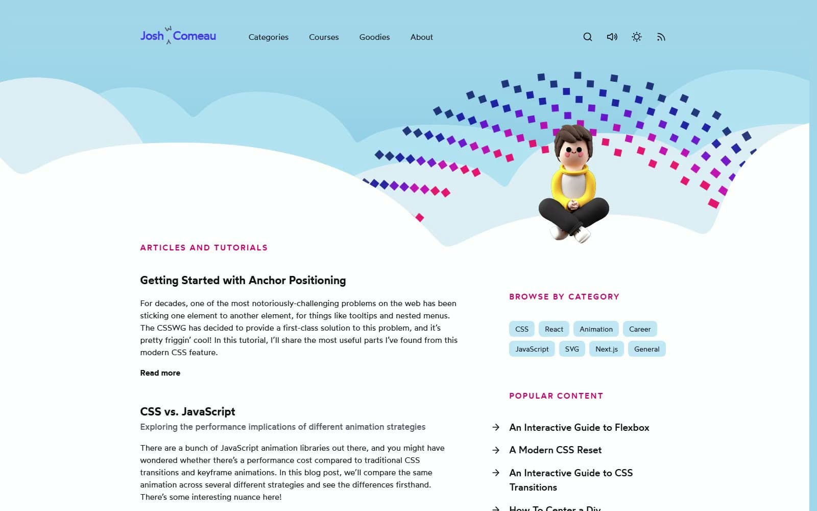
Josh W. Comeau
Media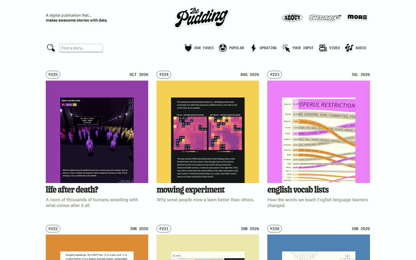
The Pudding
Media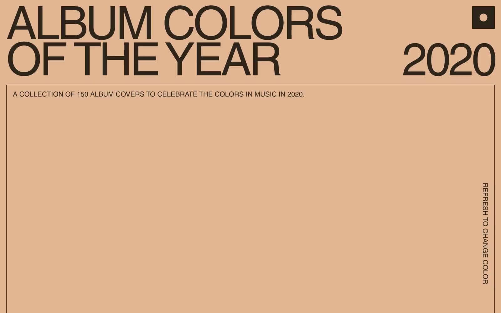
2020
Media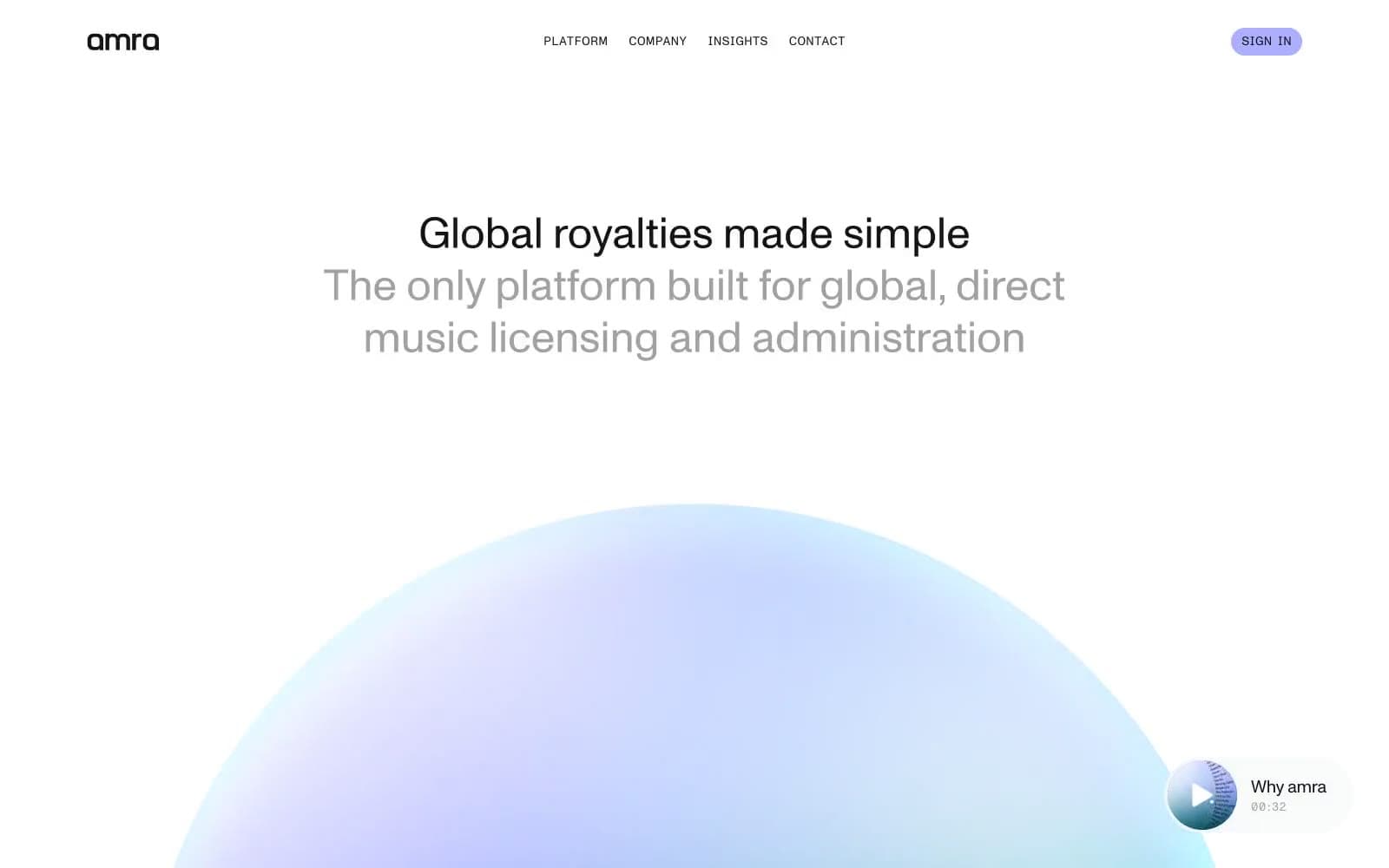
amra
Media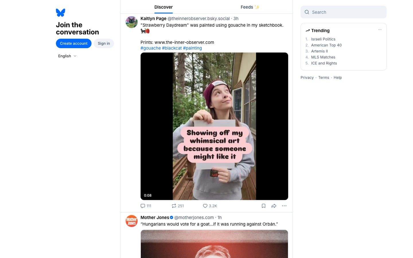
Bluesky Social
Media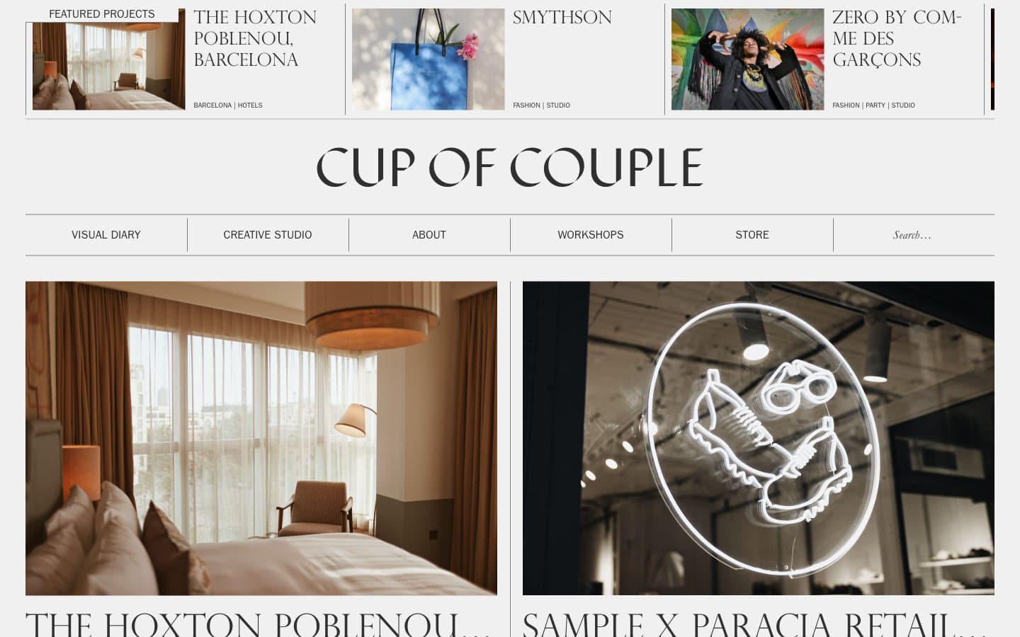
Cup of Couple
Media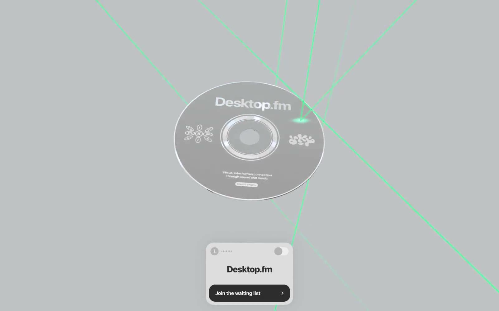
Desktop.fm
Media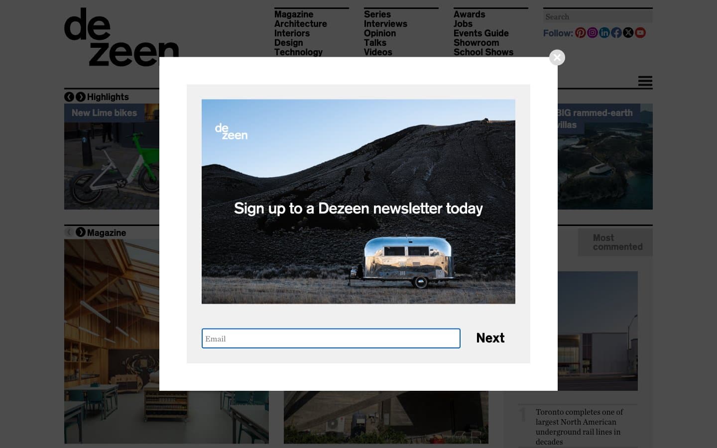
Dezeen
Media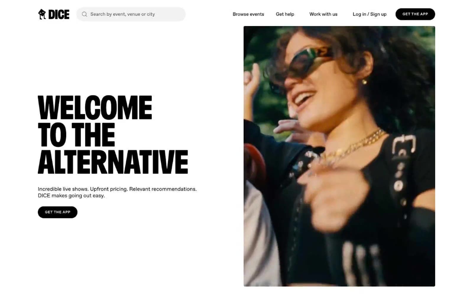
DICE
Media
Epidemicsound
Media


