
Altitude Beverages. Monochrome editorial spread.
- Commerce
- Mixed theme
- 6 colors
- 4 typefaces
Altitude Beverages reads as a monochrome editorial spread: a near-white canvas (#fafafa) carrying oversized typographic statements while saturated product photography provides the only chromatic energy. The system oscillates between two extremes — an airy, gallery-like light surface with a massive 160px display headline and pill-shaped monospace navigation, and a dense charcoal-to-slate gradient section that functions as a cinematic counterpoint. Every UI element is reduced to its bare geometry: pill buttons, hairline borders, no shadows, no decorative ornamentation. The typographic cast — light-weight serif (EditorialNew) for editorial flourishes, ultra-bold display sans (HelveticaNowDisplay) for hero impact, and a monospaced label face (DepartureMono) for navigation — is the actual identity system; color and components deliberately recede so the type and photography can perform.
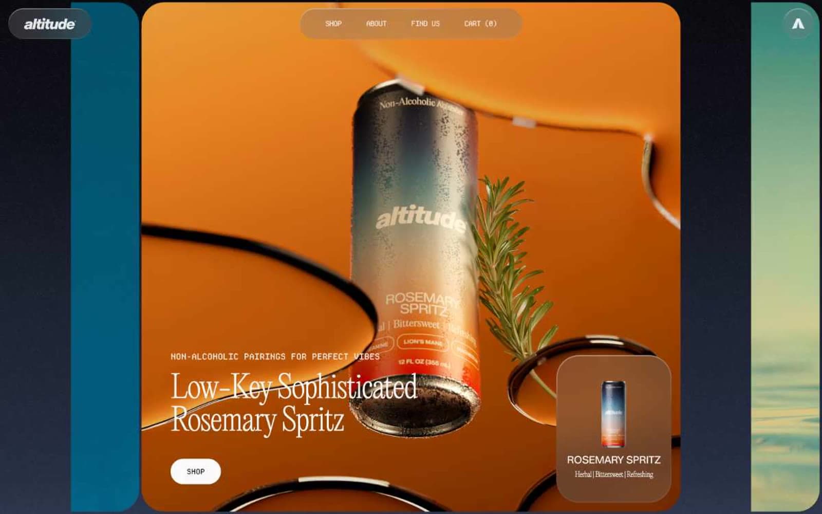
Altitude Beverages design system

Accent1
Faint cool-tinted accent on borders and fills — a barely-perceptible icy wash that adds micro-contrast without breaking the monochrome discipline
Neutrals5
Navigation borders and secondary text accents — used sparingly where a slightly harder edge is needed
Primary text, button labels, heading copy — a near-pure black with a faint blue undertone for maximum contrast against the warm canvas
Hairline borders, link underlines, and divider lines — sits between canvas and text to create structure without weight
Elevated surface backgrounds for cards, buttons, and nav pill container — a warm gray one step darker than canvas for subtle layering without shadows
Page background, card surfaces, primary canvas — the dominant near-white that lets photography and type carry all visual weight
Try a pairing
Pick any two colors from the palette to check whether text stays readable on top.
Aa
Pure Black on Glacial Mist
19.44 : 1 contrast
- Body textPasses AA 4.5
- Large textPasses AA 3
- StrictPasses AAA 7
More DESIGN.md files. Same web, different personalities.

Nothing
Commerce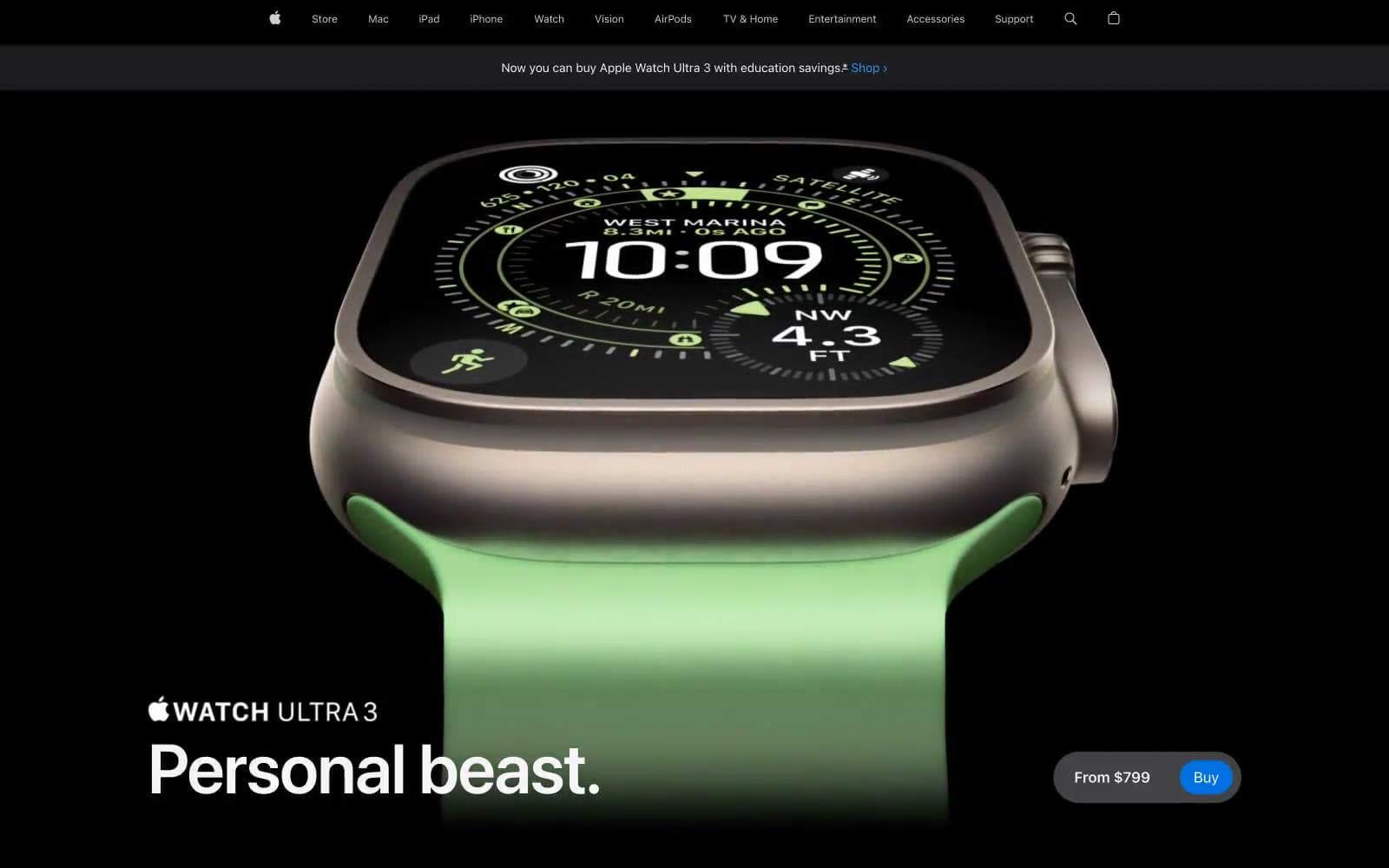
Apple Watch Ultra 3
Commerce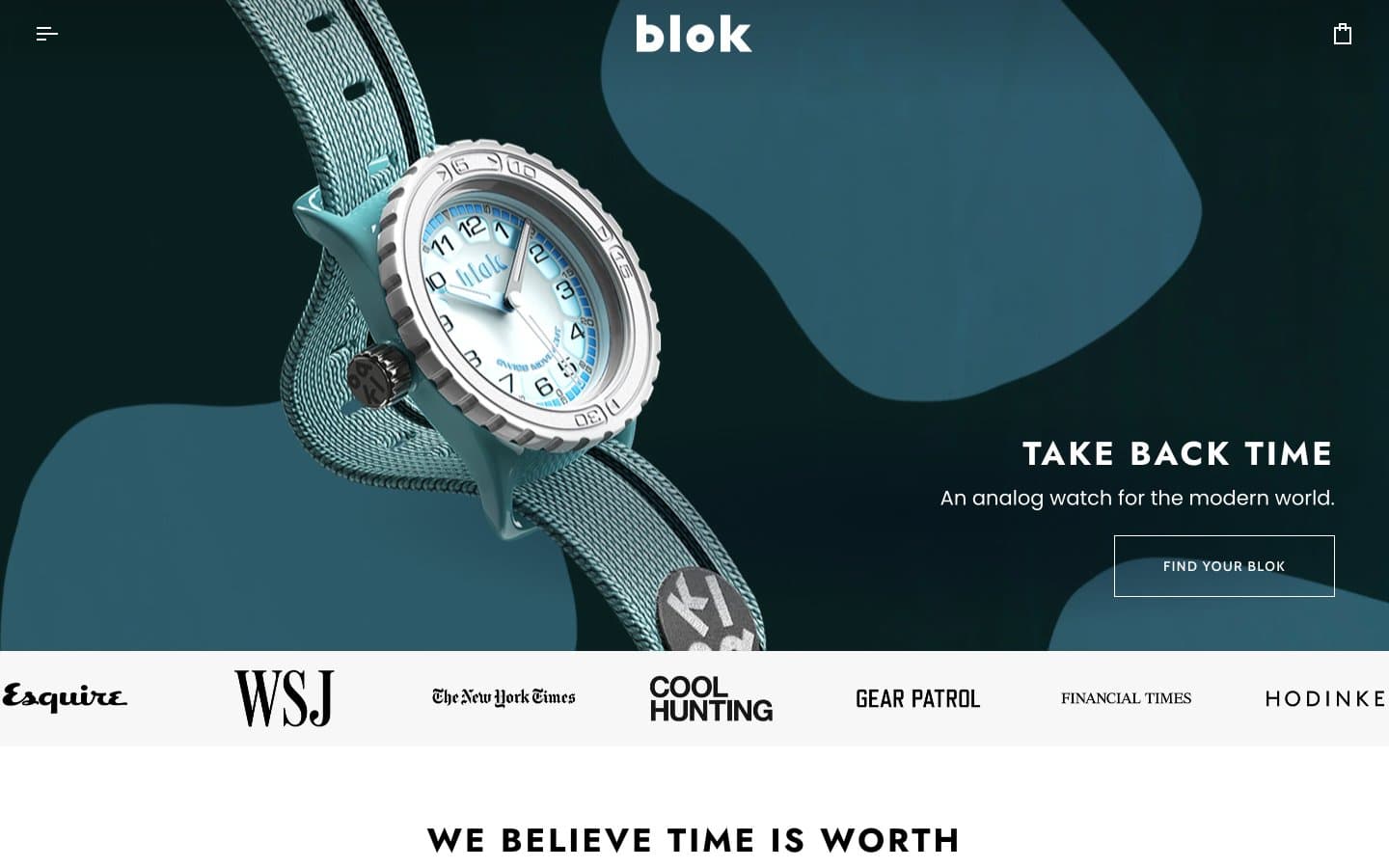
Blok
Commerce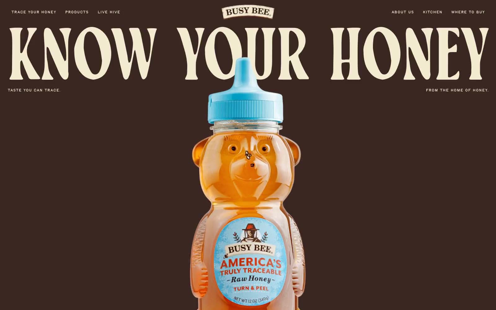
Busy Bee Honey
Commerce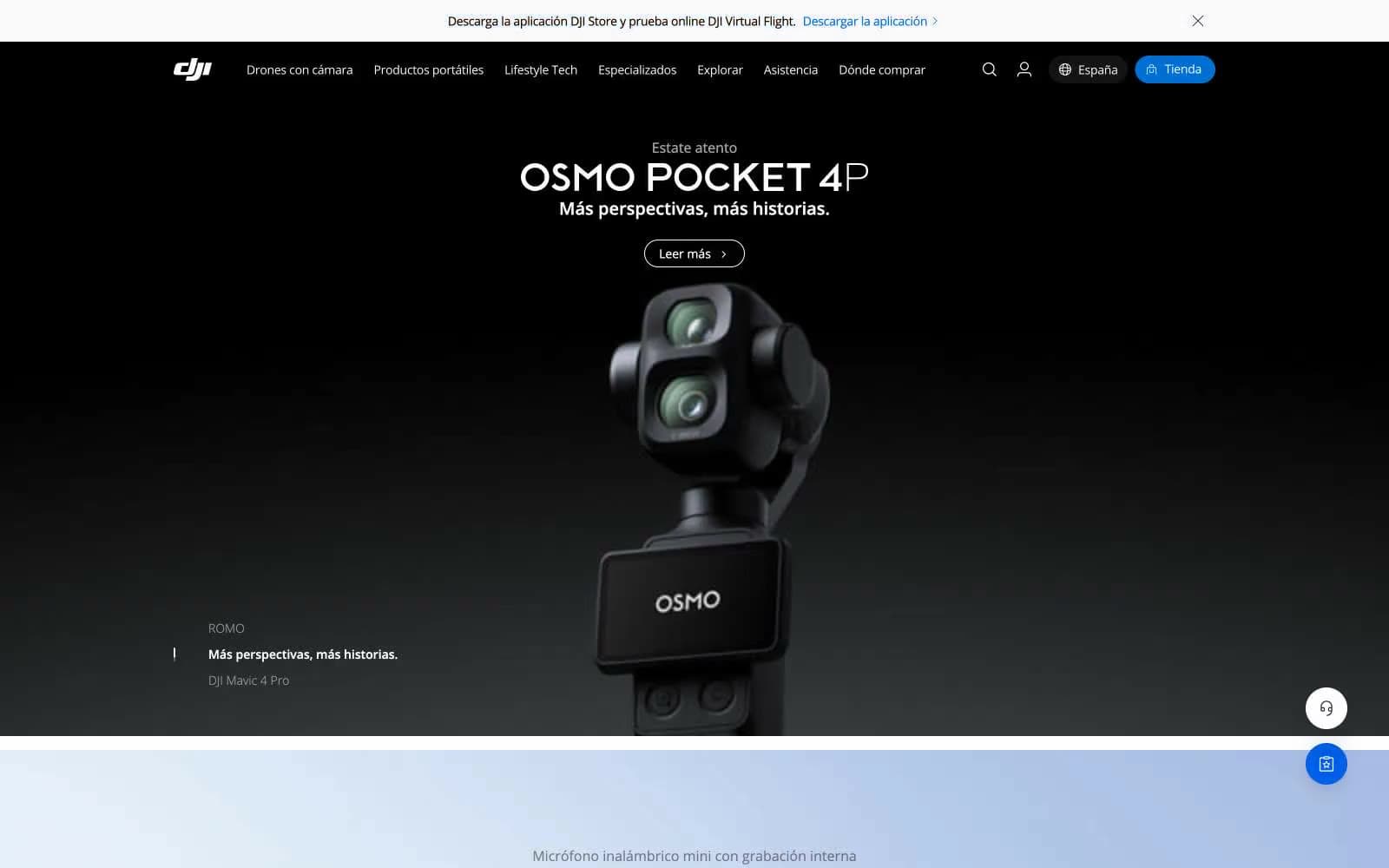
DJI
Commerce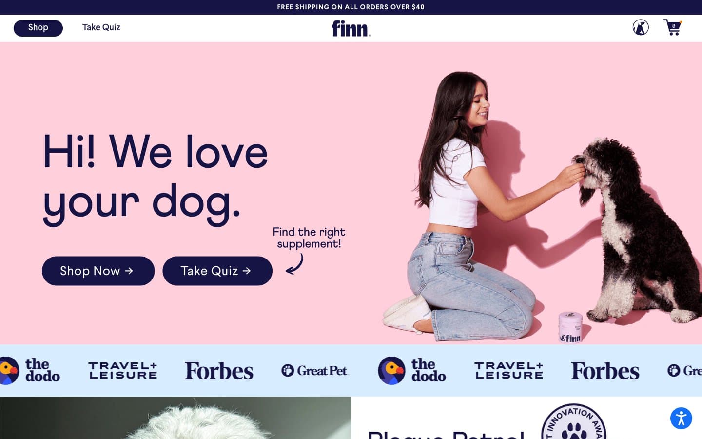
Finn
Commerce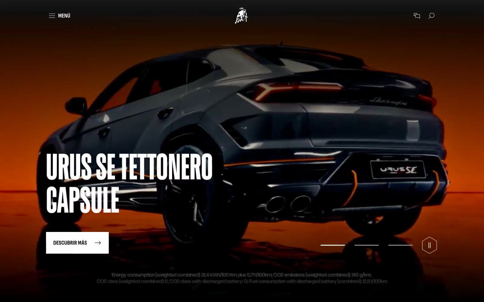
Lamborghini.com
Commerce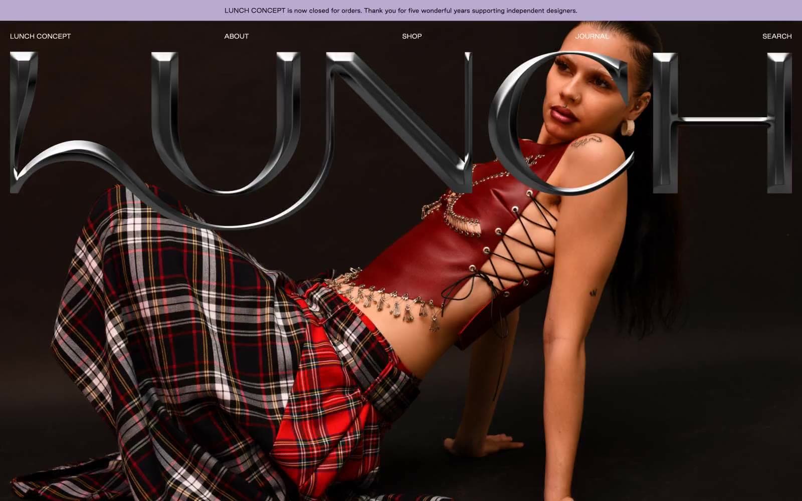
LUNCH
Commerce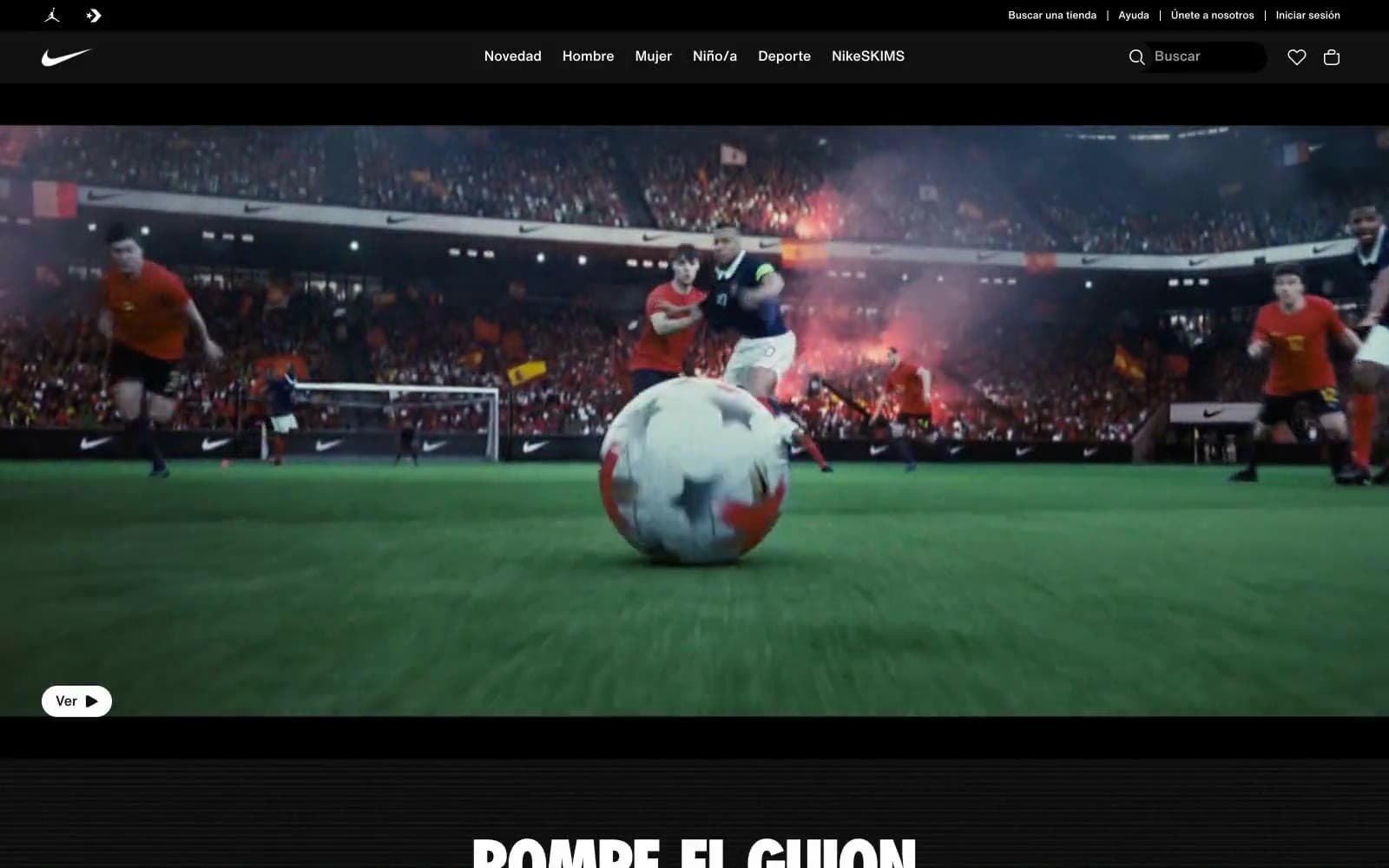
Nike.com
Commerce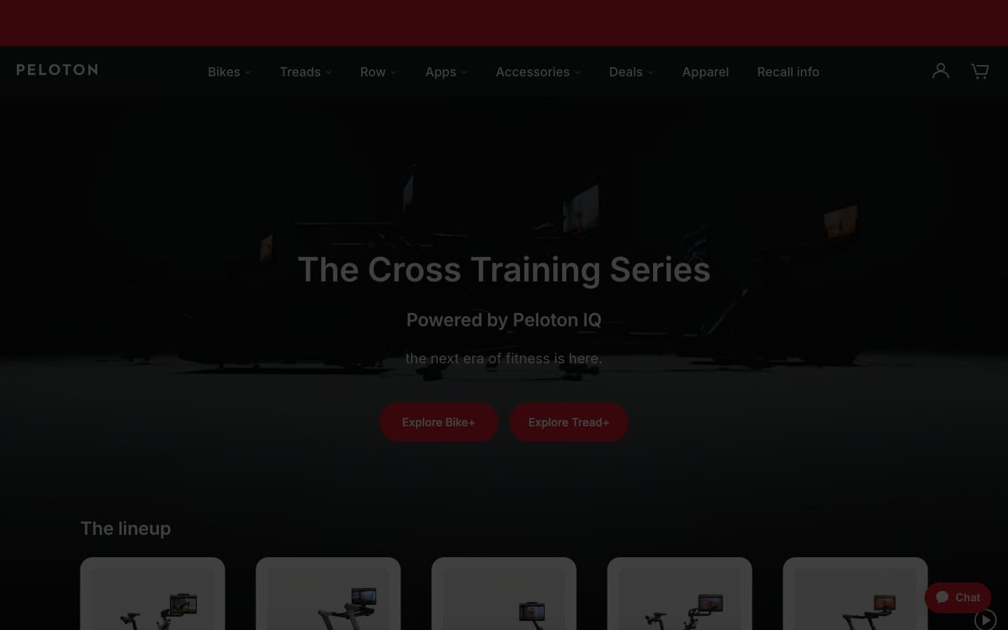
Peloton
Commerce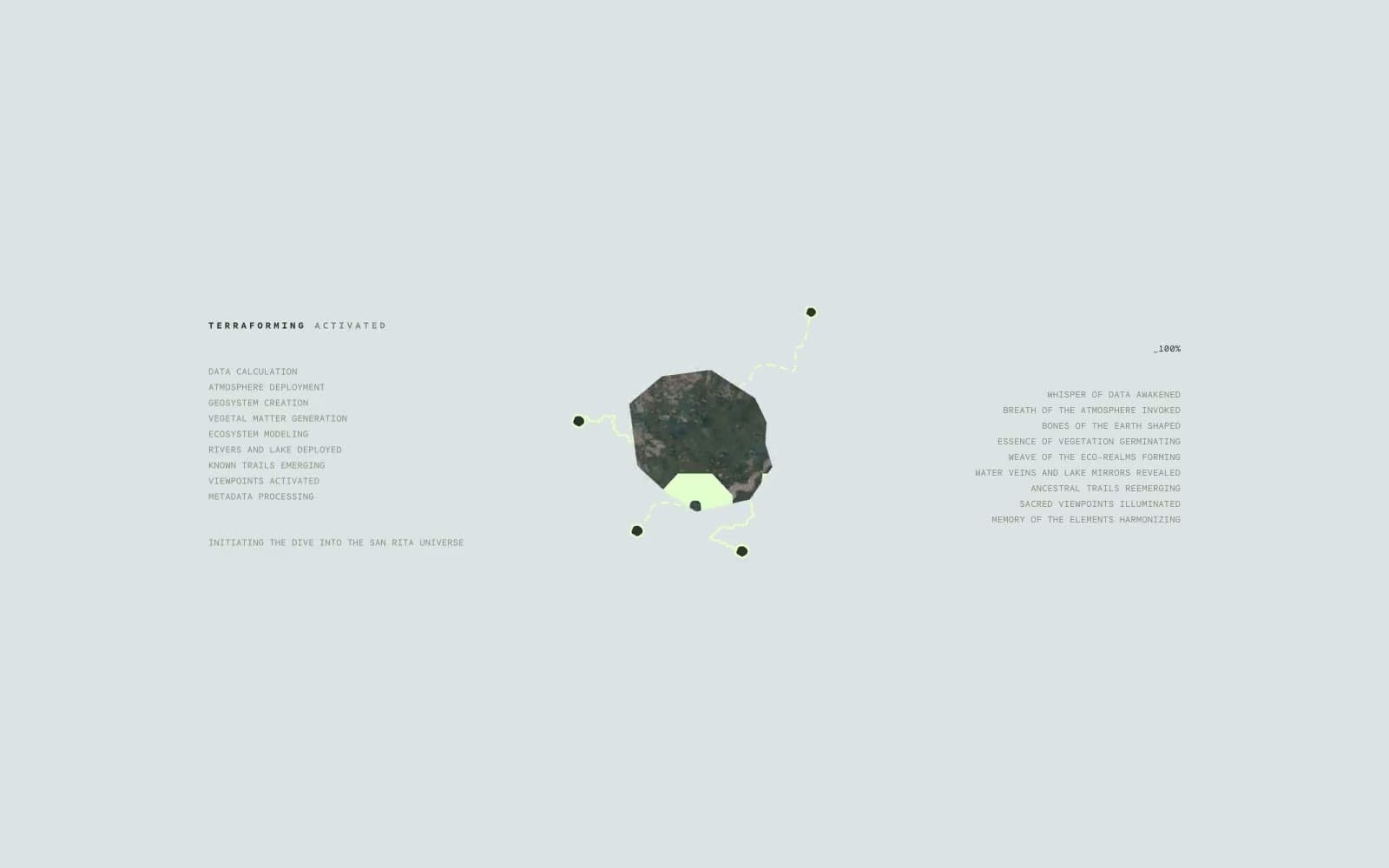
San Rita
Commerce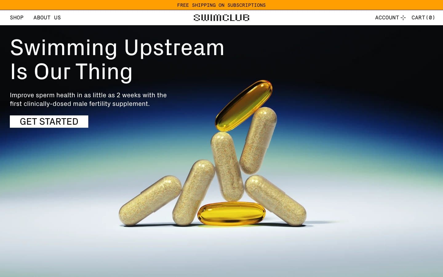
SwimClub
Commerce


