
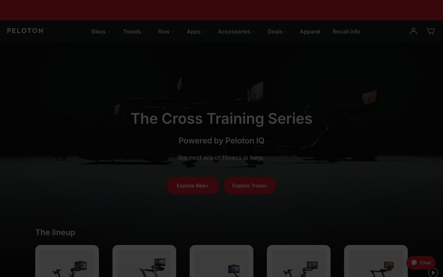
Peloton. Red beacon on charcoal runway.
- Commerce
- Mixed theme
- 10 colors
- 1 typeface
Peloton runs a disciplined two-mode visual system: cinematic charcoal hero surfaces that make product photography glow, followed by bright white product grids that let the merchandise speak. The palette is almost entirely achromatic — gunmetal, white, and warm grays — with one vivid red accent that acts as the only chromatic punctuation on the page, reserved exclusively for primary actions, brand marks, and the persistent chat widget. Inter carries the entire typographic voice at a wide range of weights, from whisper-light 300 display headlines to confident 500 nav labels, creating a calm, premium fitness-retail atmosphere. Components are generous: 28px pill buttons, 6px inputs, 24px image corners, and minimal elevation — surfaces do the structural work, shadows stay absent or near-invisible.
Peloton design system

Brand1
Red supporting accent for decorative details and low-frequency emphasis. Do not promote it to the primary CTA color
Neutrals9
Headings on light surfaces, logo, strong emphasis text, icon strokes on light backgrounds
Primary text color, dark hero surfaces, navigation bar, footer backgrounds, heading color — the structural anchor of the entire system
Secondary body text, nav link default state, helper text, metadata, breadcrumb separators
Input borders in default state, secondary borders, subtle structural lines
Supporting neutral for secondary UI, dividers, and muted labels. Do not promote it to the primary CTA color
Tertiary text, placeholder text, subtle icon fills, inactive form labels, decorative icon strokes
Hairline borders, dividers between sections, card outlines, disabled surface fills, icon background washes
Page canvas, subtle section backgrounds behind product grids, alternate band separator
Light supporting surface for subtle backgrounds and section separation. Do not promote it to the primary CTA color
Try a pairing
Pick any two colors from the palette to check whether text stays readable on top.
Aa
Pure White on Peloton Red
4.83 : 1 contrast
- Body textPasses AA 4.5
- Large textPasses AA 3
- StrictFails AAA 7
More DESIGN.md files. Same web, different personalities.

Nothing
Commerce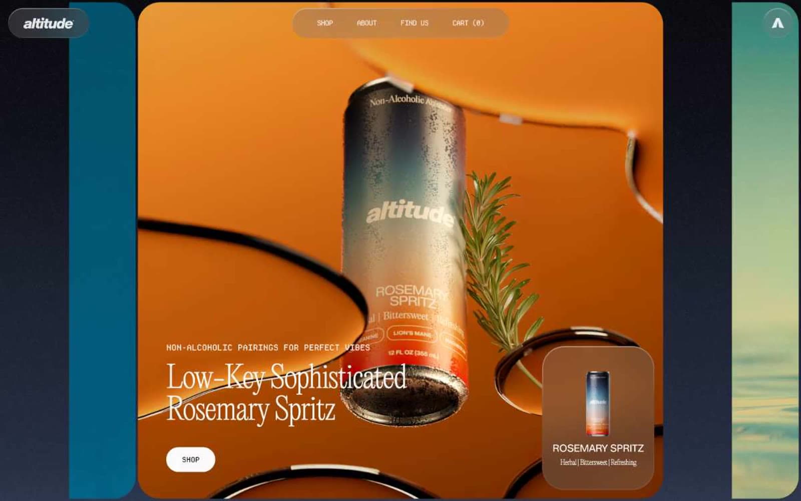
Altitude Beverages
Commerce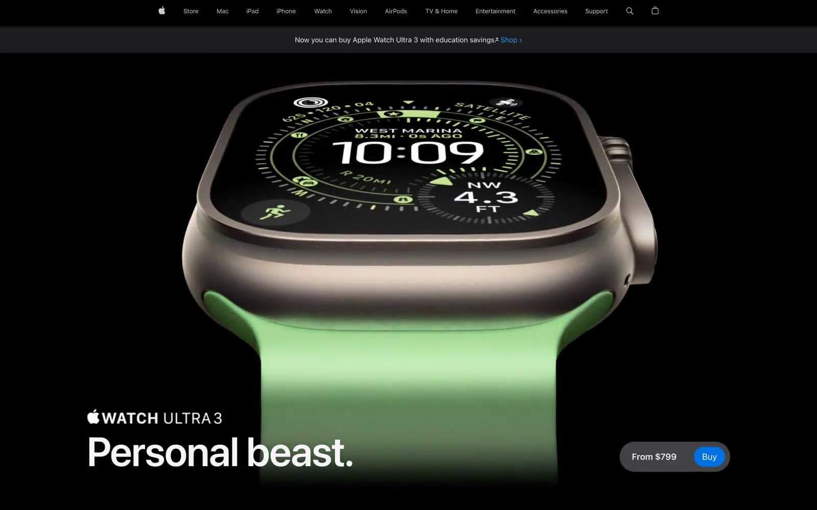
Apple Watch Ultra 3
Commerce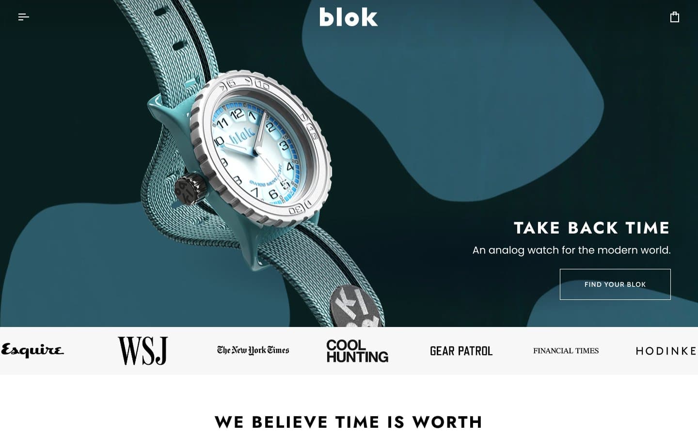
Blok
Commerce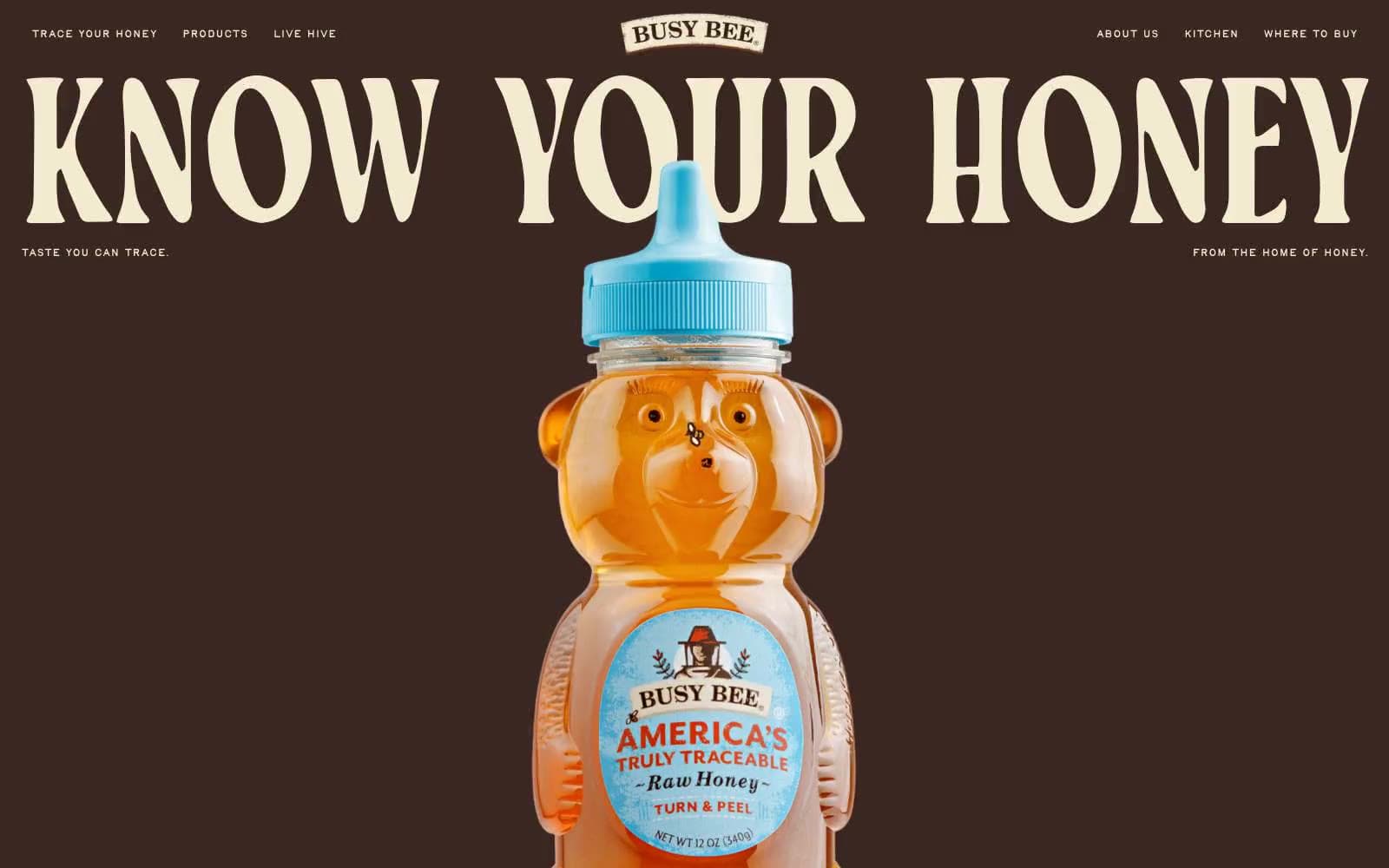
Busy Bee Honey
Commerce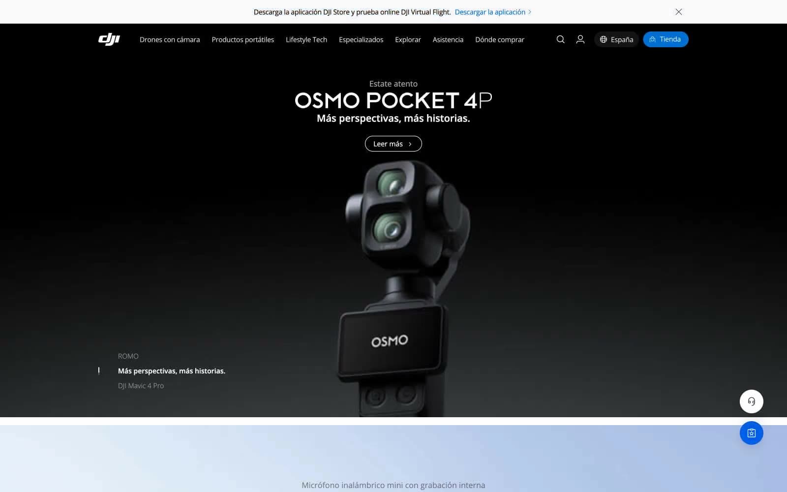
DJI
Commerce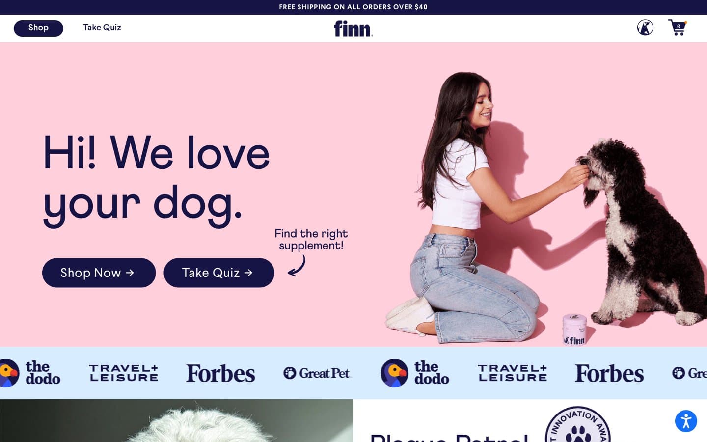
Finn
Commerce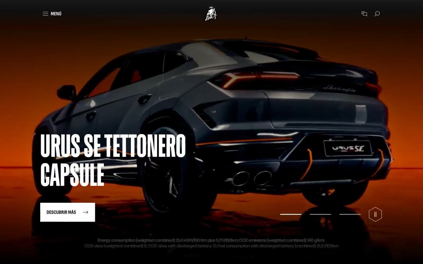
Lamborghini.com
Commerce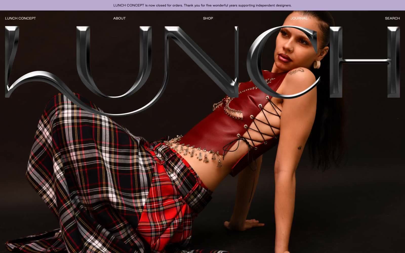
LUNCH
Commerce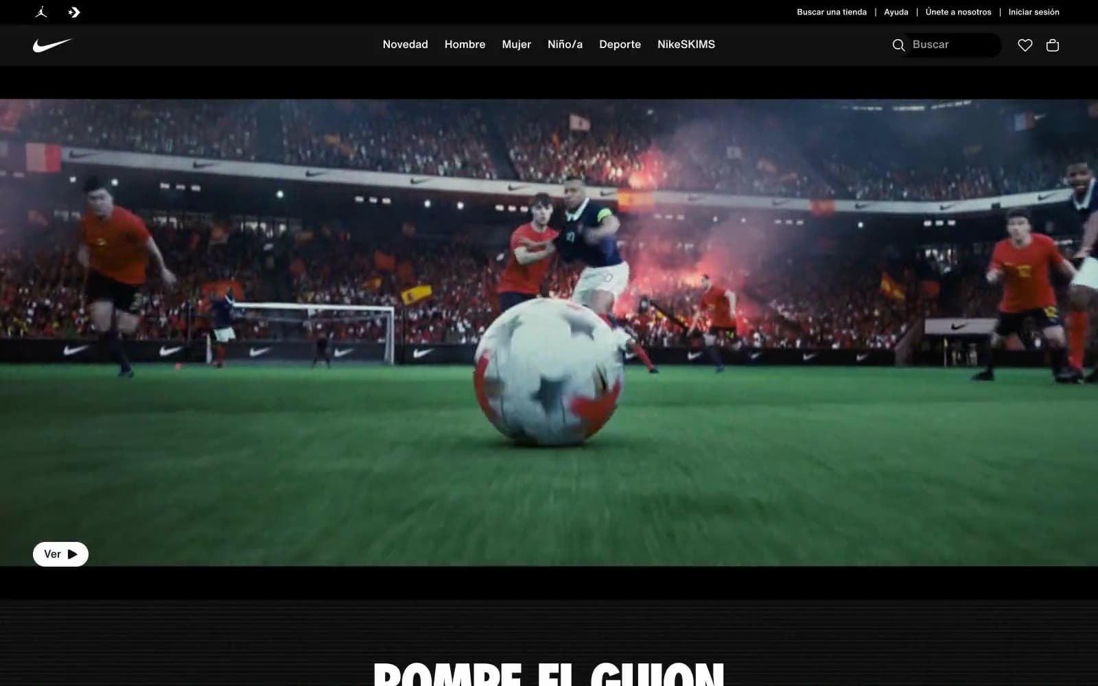
Nike.com
Commerce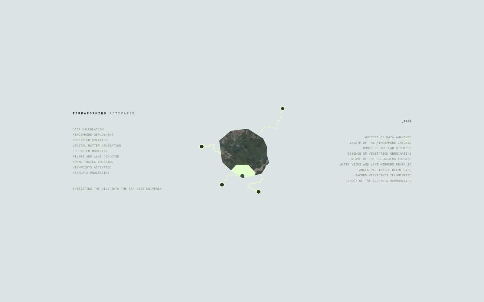
San Rita
Commerce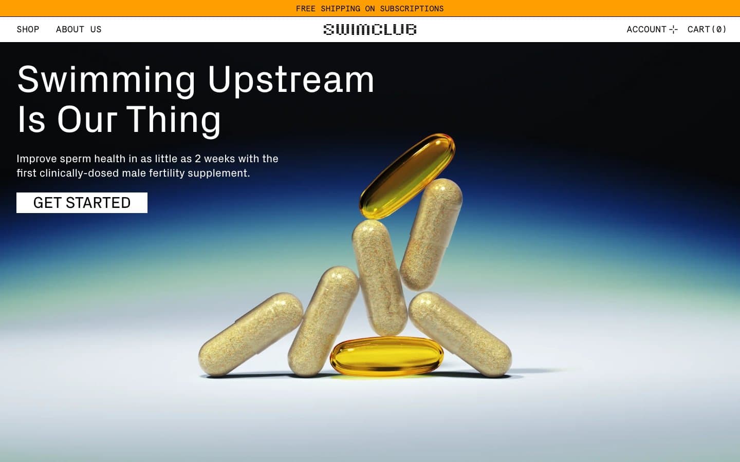
SwimClub
Commerce


