
Blok. Swiss showroom on teal-tinted paper.
- Commerce
- Mixed theme
- 9 colors
- 4 typefaces
Blok is a premium analog-watch brand that treats the product page like a gallery wall: generous white space, sharp-cornered cards, and typography that leans on wide tracking to feel considered rather than loud. A single vivid teal — #1dd8e1 — does all the accent work, threading through button strokes, text links, and product dial highlights, while the rest of the palette stays architectural in dark navy-blacks and warm off-whites. Headlines are set in a heavy, wide-tracked Jost that feels almost industrial-luxe, contrasted against the rounded Poppins used for body and UI. Layout is centered, max-width-contained, and product-first: a dark hero with organic teal shapes gives way to white product grids, a single light-gray press band, and flat-light product detail pages. Components are flat, hairline-bordered, and almost shadeless — confidence comes from type scale and spacing, not elevation.
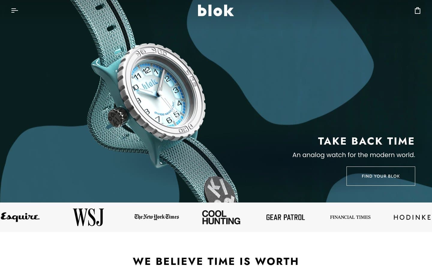
Blok design system

Brand1
Primary action buttons, link text, product dial accents, active tab indicators — the only chromatic color in the entire system, carrying every interactive moment on its own
Neutrals8
Body borders, heading text — the hardest black in the system, used sparingly for maximum edge definition
Primary text, product page borders, body type — the near-black that carries the entire brand voice in type
Secondary text and icon strokes — slightly cooler than Carbon Ink, used where pure black would feel too heavy
Neutral form states, badge text, and quiet UI feedback where color should stay understated.
Input borders, subtle dividers — hairline neutral that only shows on form elements
Footer surface only — one step deeper than Bone to separate the footer from the body
Alternate section background, subtle card wash, press-logo band — the warm off-white that breaks up white-on-white without introducing a color
Page canvas, product card surface, button text on dark — the base everything sits on
Try a pairing
Pick any two colors from the palette to check whether text stays readable on top.
Aa
Onyx on Signal Teal
11.96 : 1 contrast
- Body textPasses AA 4.5
- Large textPasses AA 3
- StrictPasses AAA 7
More DESIGN.md files. Same web, different personalities.

Nothing
Commerce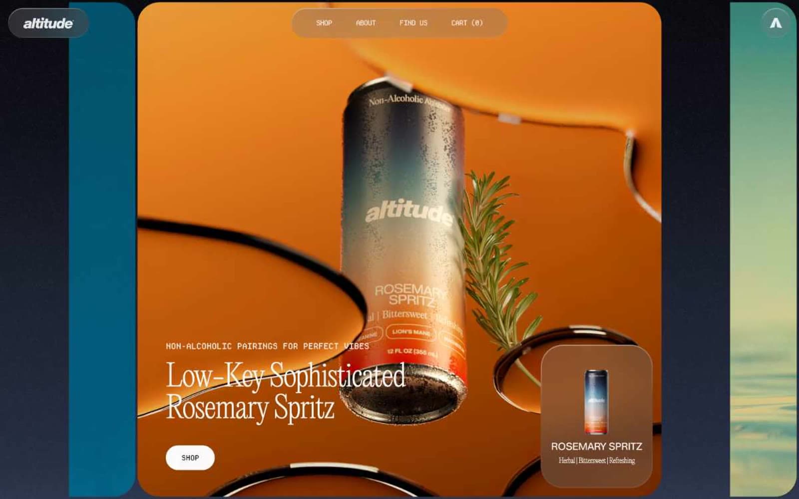
Altitude Beverages
Commerce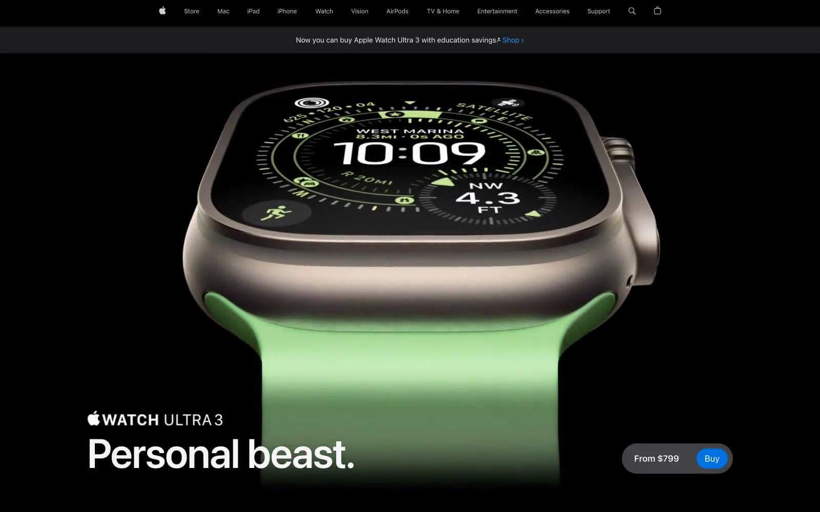
Apple Watch Ultra 3
Commerce
Busy Bee Honey
Commerce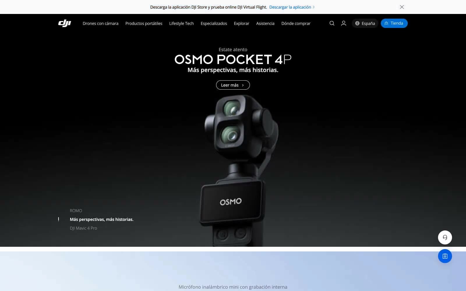
DJI
Commerce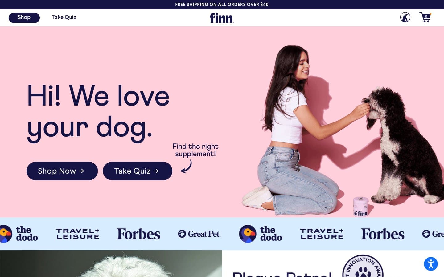
Finn
Commerce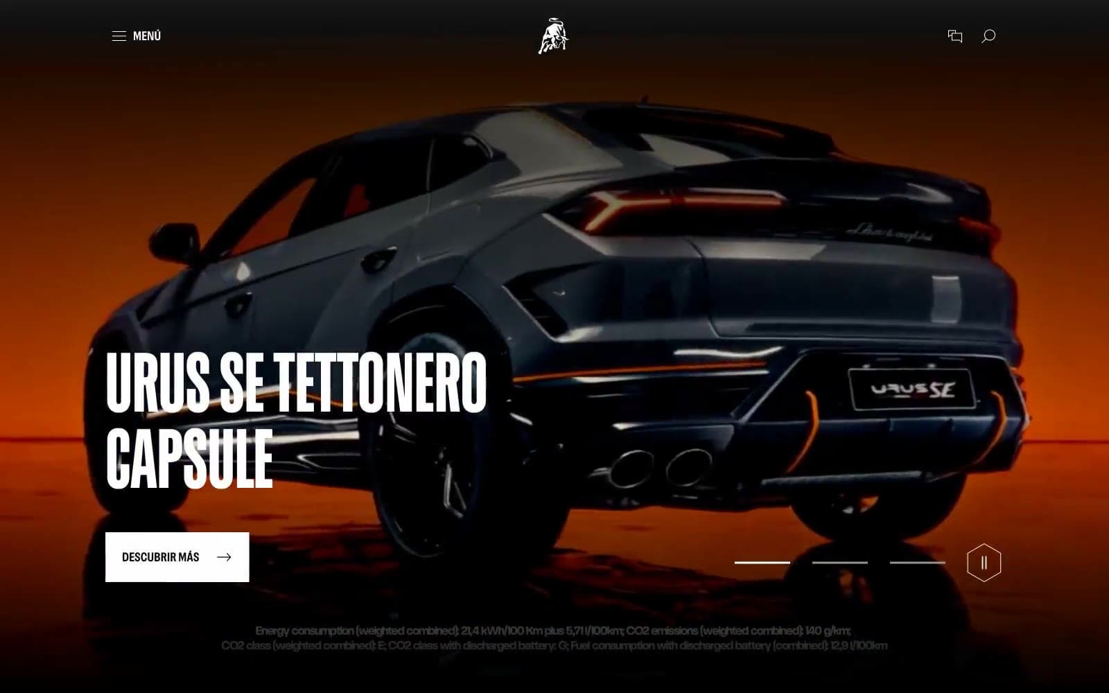
Lamborghini.com
Commerce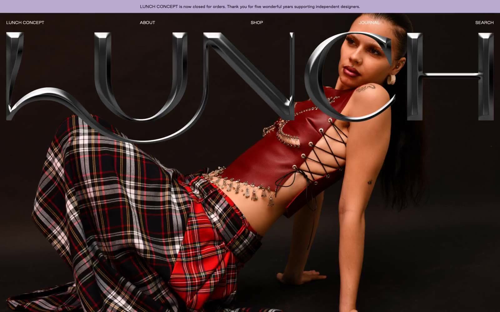
LUNCH
Commerce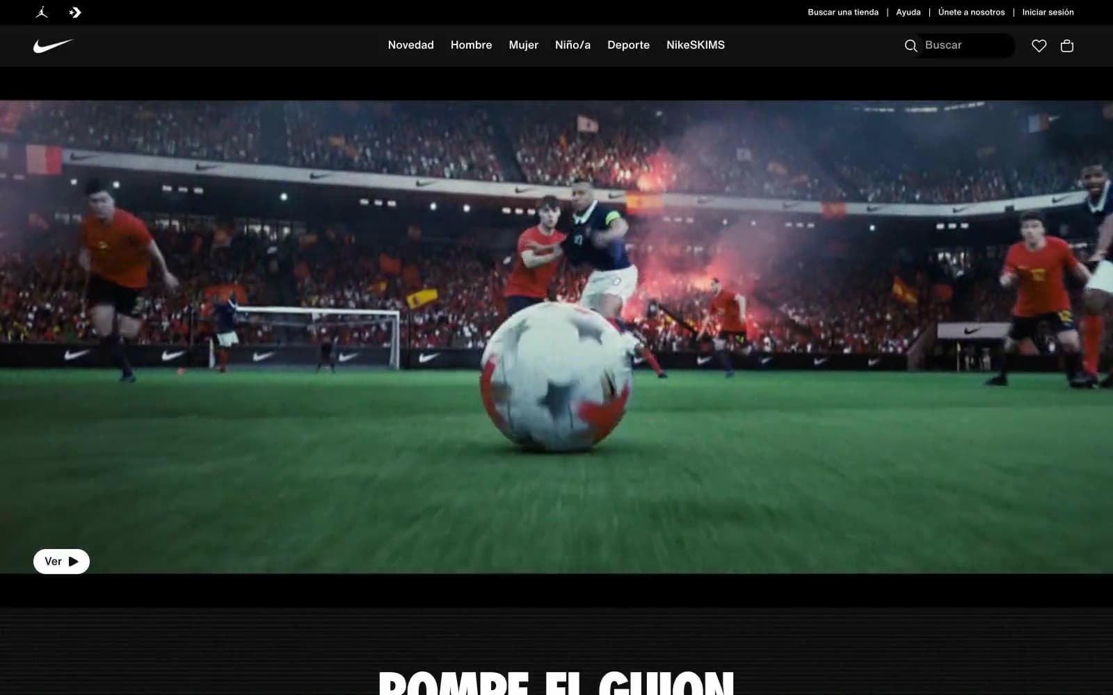
Nike.com
Commerce
Peloton
Commerce
San Rita
Commerce
SwimClub
Commerce


