
Nothing. Dot-matrix tape on a grey test bench.
- Commerce
- Mixed theme
- 10 colors
- 6 typefaces
Nothing runs its store like a product lab: a pale Lab Gray #f4f4f4 floor, product cutouts on faint 5% grey trays, and full-bleed black video stages that drop the page into darkness between shopping rows. The voice is split three ways — NType82, a light low-contrast serif at 48px/400 with no tracking, carries every headline; Ndot's dot-matrix capitals stamp eyebrows and the giant footer menu; Geist Mono uppercase runs the buttons and links. Colour is almost absent: Dot Black #040404 and Paper do the work, and a single Signal Yellow #ffc700 sign-up bar is the only hue the interface itself owns. Corners stay small (4px controls, 8px tiles) and nothing casts a shadow.

Nothing design system

Brand1
Headlines, filled shop buttons, video stages, the newsletter panel and footer — a near-black that carries the whole monochrome identity
Accent1
The newsletter sign-up bar only — the one interface hue, held dimmed until the consent box is ticked
Neutrals8
Page canvas behind every light section — a cool off-white that makes product cutouts read as studio shots
Category tiles and the benefits band, painted as 5% Graphite Copy over Lab Gray rather than a separate fill
Headlines and labels on black stages, plus the white Discover buttons that sit on video
The translucent 80% white store-locator bar floating over the hero image
Geist body paragraphs, underlined category links and pixel icons — the only grey text on light sections
Underlined privacy and terms links inside the black newsletter panel
Email input and checkbox fills on the black newsletter panel, a 60% grey wash over Dot Black
Footer utility rows (Support, Newsletter, Store) — a 5% white lift off Dot Black instead of a border
Try a pairing
Pick any two colors from the palette to check whether text stays readable on top.
Aa
Paper on Dot Black
20.50 : 1 contrast
- Body textPasses AA 4.5
- Large textPasses AA 3
- StrictPasses AAA 7
More DESIGN.md files. Same web, different personalities.
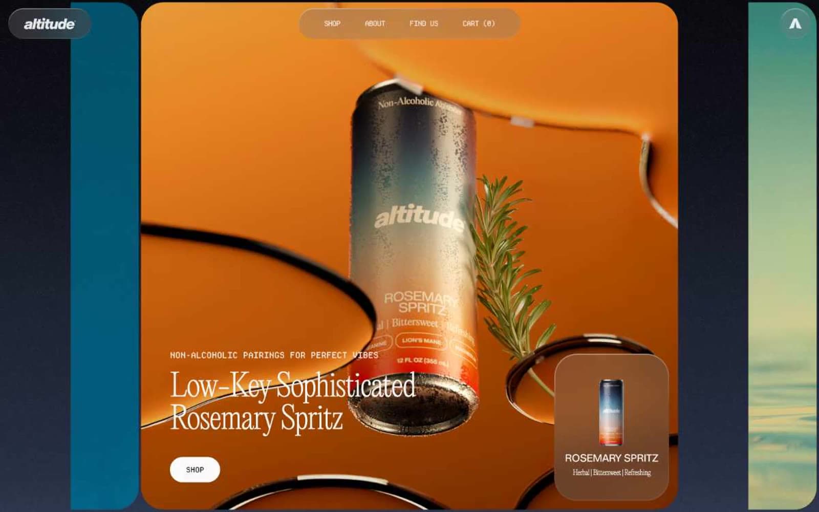
Altitude Beverages
Commerce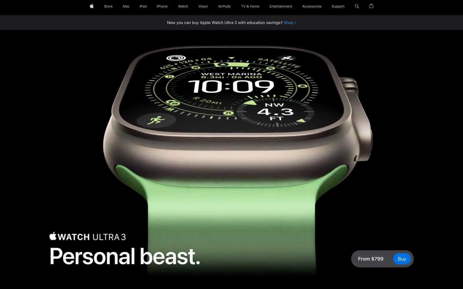
Apple Watch Ultra 3
Commerce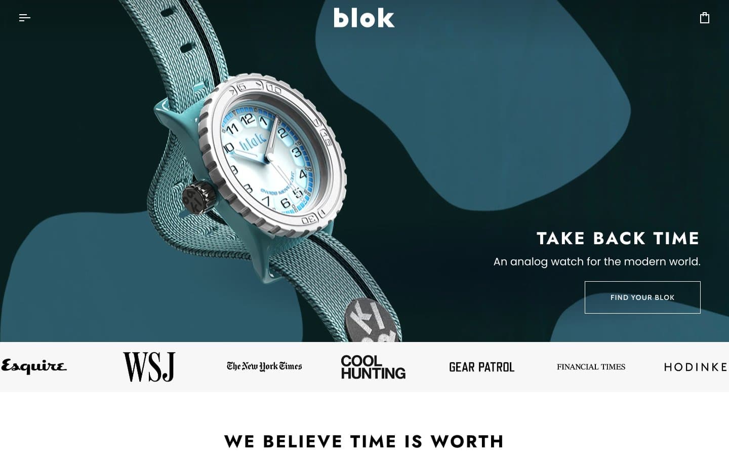
Blok
Commerce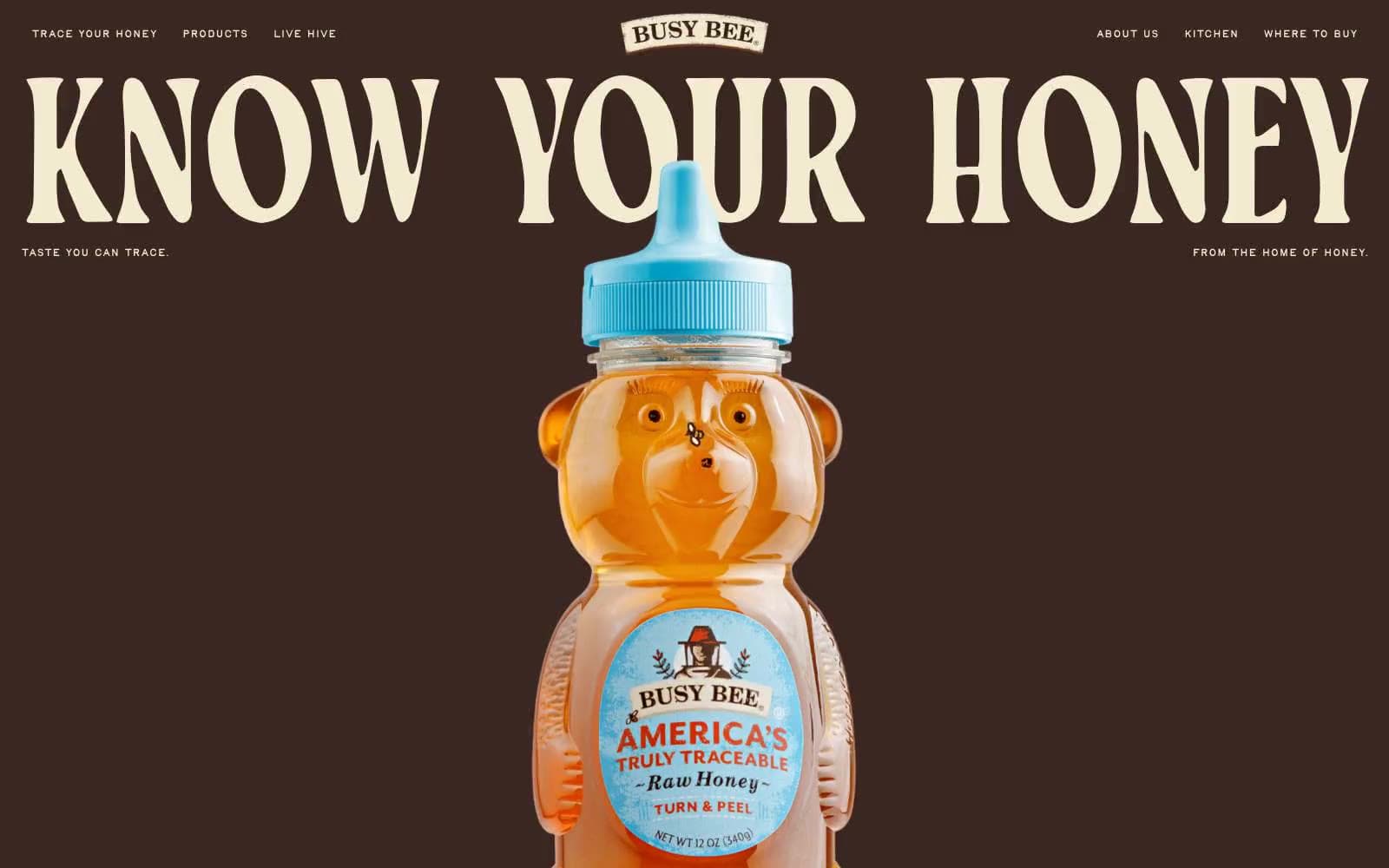
Busy Bee Honey
Commerce
DJI
Commerce
Finn
Commerce
Lamborghini.com
Commerce
LUNCH
Commerce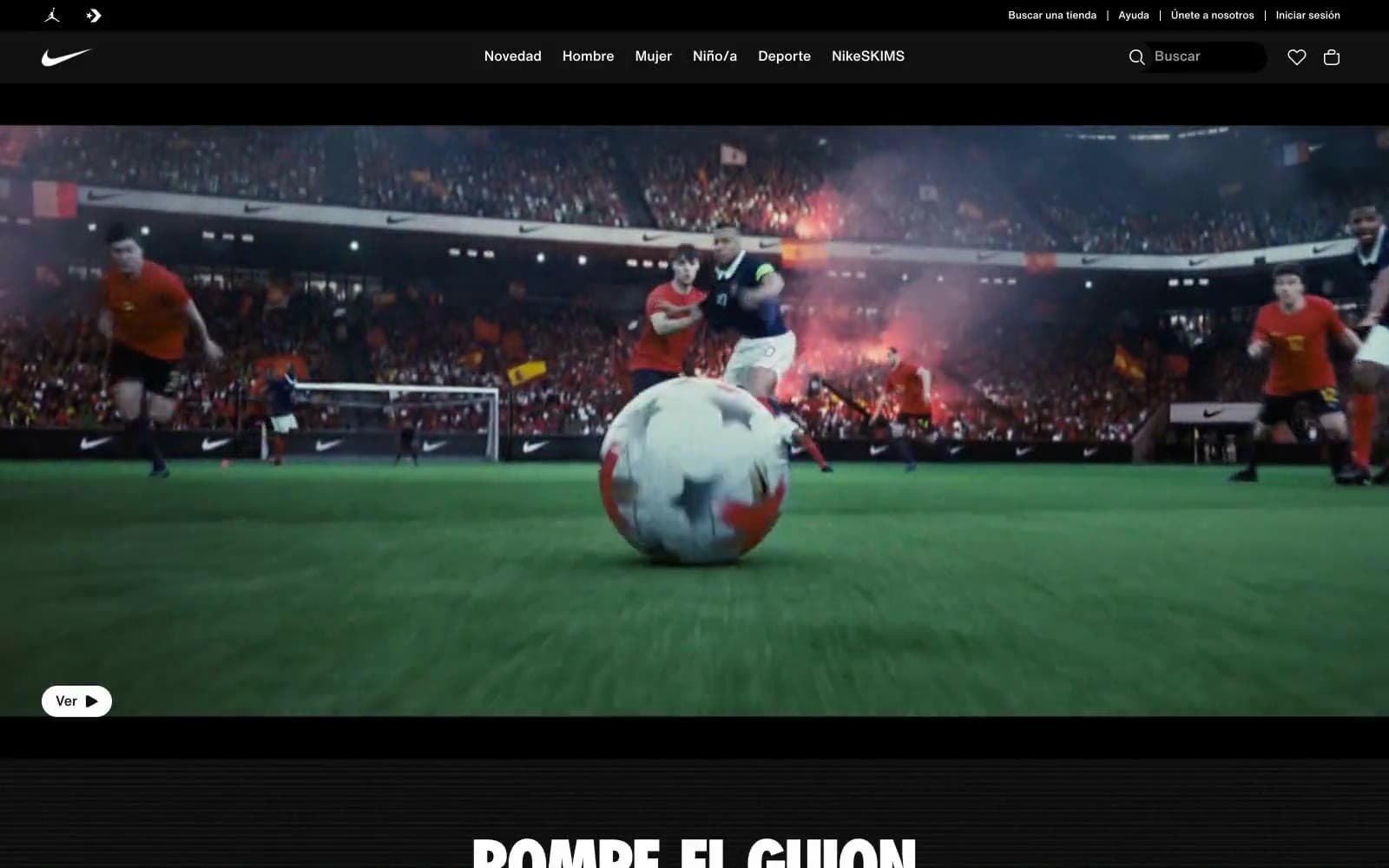
Nike.com
Commerce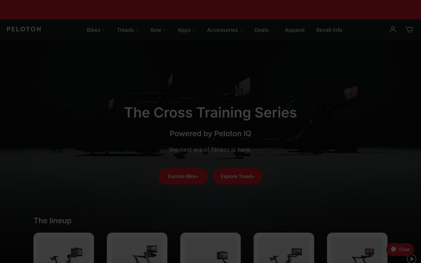
Peloton
Commerce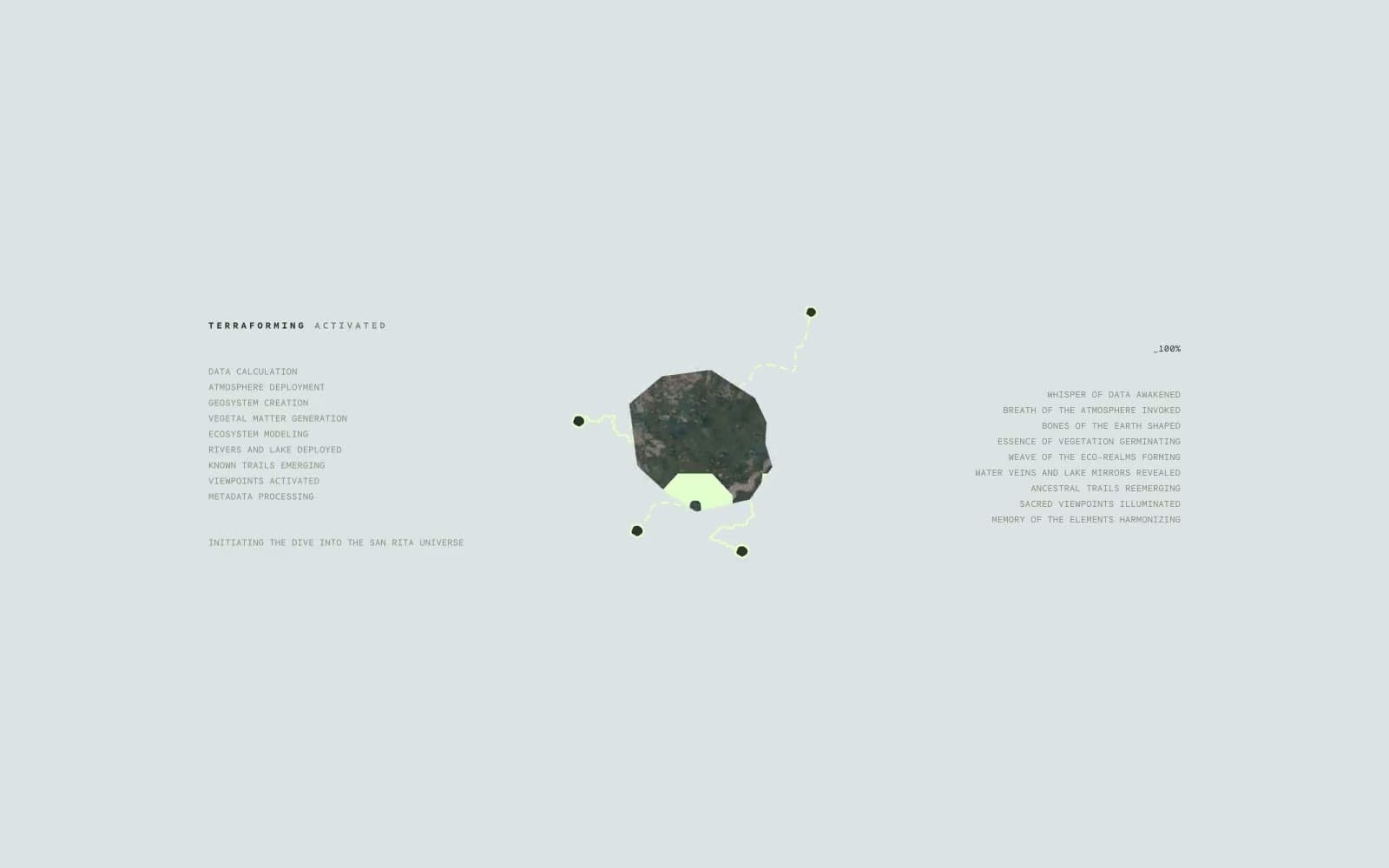
San Rita
Commerce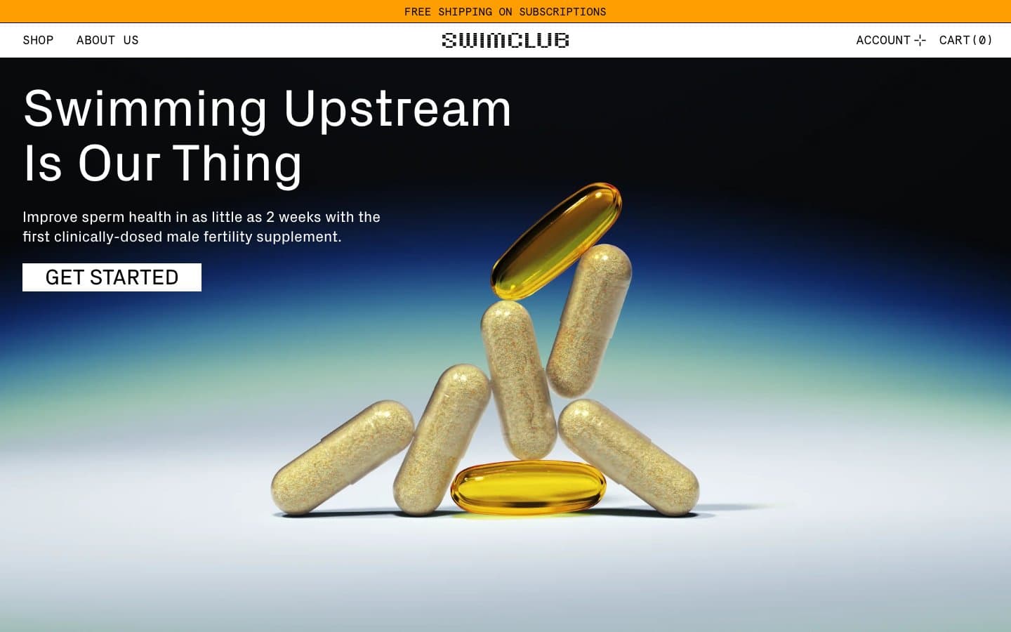
SwimClub
Commerce


