
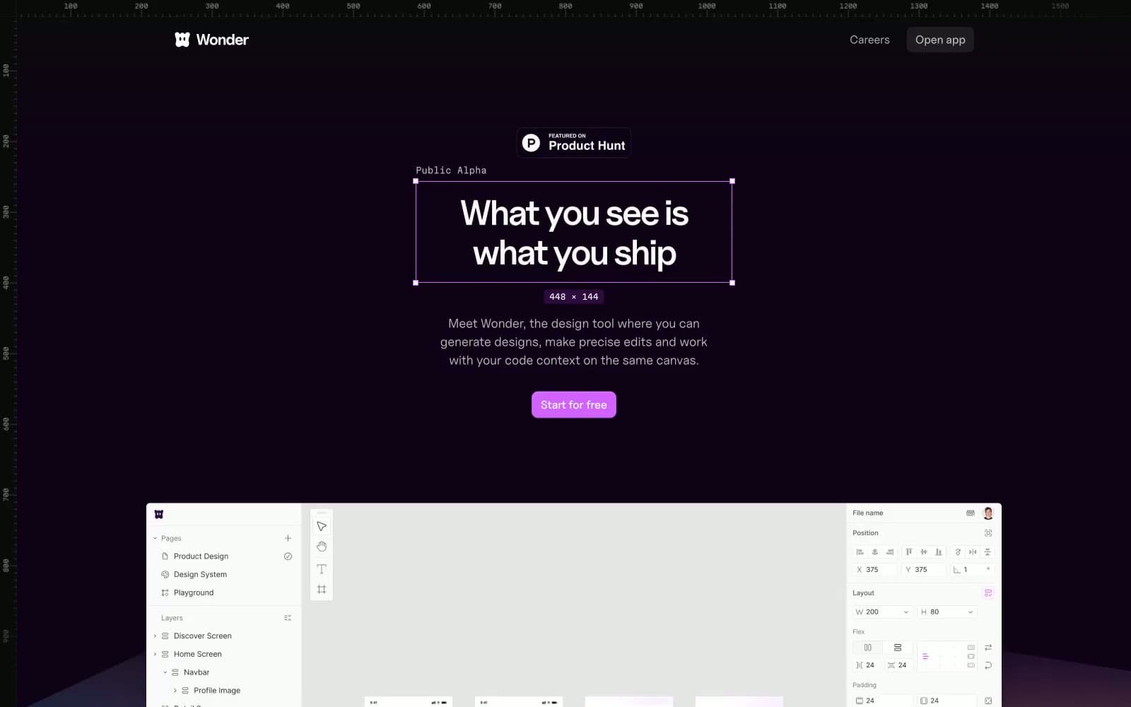
Wonder. Deep plum darkness pierced by a single laser-purple light source.
- Design tools
- Mixed theme
- 16 colors
- 3 typefaces
Wonder operates as a dark-first design cosmos: a near-black violet canvas (#0f0217) creates the immersive backdrop for the brand, punctuated by a single vivid violet accent (#d262ff) that makes actions feel switched on and a muted purple-gray (#44374a) that does the quiet structural work of every border and divider. The system alternates between full-bleed dark atmosphere sections and bright white content panels, creating rhythm through contrast rather than ornament. Typography is led by Uncut Sans Variable — geometric, wide-tracked at small sizes, tight-tracked at display sizes — paired with Martian Mono for all technical metadata, dimensions, and annotation. Surfaces are flat with hairline borders instead of heavy shadows; the few elevated cards use a barely-there 1px border and large radius (14px) to feel like floating glass plates rather than solid panels. Components are sparse and confident: pill-shaped badges, 8px-radius buttons in either filled violet or ghost outline, and very few decorative flourishes beyond a hand-drawn squiggle motif.
Wonder design system

Brand4
Primary action button fill, focus rings, and the brand's signature accent — vivid electric purple against the dark void creates urgency without aggression
Decorative stroke accent for gradient mesh backgrounds and atmospheric purple lighting
Deep heading color and surface tint for accent cards in light sections
Dark section heading color and dramatic text accent in light-mode areas
Accent1
Warm secondary accent for highlights, callout dots, and emphasis on light surfaces
Neutrals11
Elevated card and panel surface — one shade deeper than the canvas, used for floating UI elements against the dark backdrop
Page canvas and primary dark surface — the near-black violet base that absorbs the whole immersive hero and footer bands
Badge fills, icon stroke accents, and dark section surfaces on lighter contexts
Dominant border and divider color across the entire system — every hairline, card edge, and UI outline uses this muted purple-gray
Muted helper text and low-priority iconography — the quietest of the violet-tinged grays
Secondary body text and metadata labels against the dark canvas
Mid-priority text, generic icon strokes, and light-section muted copy
Tertiary text, inactive nav items, and icon fills at low emphasis
Surface fill for nested elements and subtle dividers in light sections
Warm off-white for light content section backgrounds — subtly cream against the pure white of inner cards
Primary text on dark surfaces, light section backgrounds, and the brightest highlight color
Try a pairing
Pick any two colors from the palette to check whether text stays readable on top.
Aa
Eclipse Black on Laser Violet
6.72 : 1 contrast
- Body textPasses AA 4.5
- Large textPasses AA 3
- StrictFails AAA 7
More DESIGN.md files. Same web, different personalities.
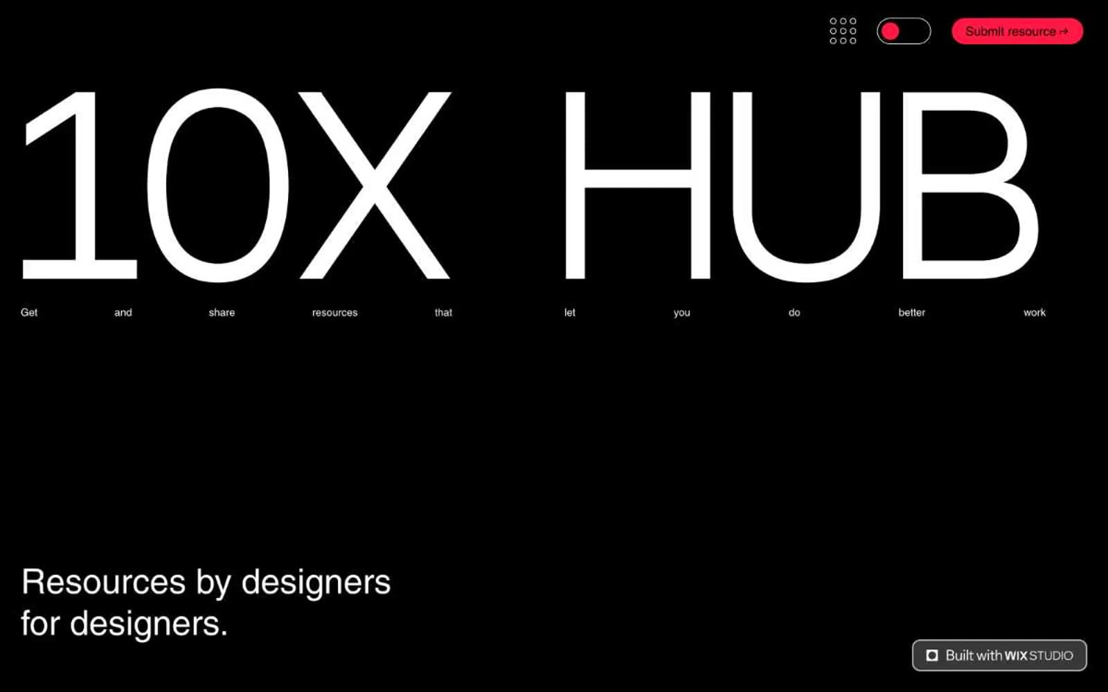
10X HUB
Design tools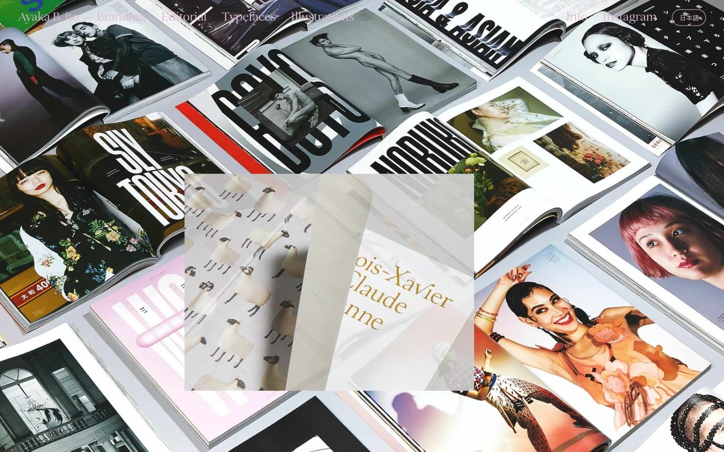
Ayaka B. Ito
Design tools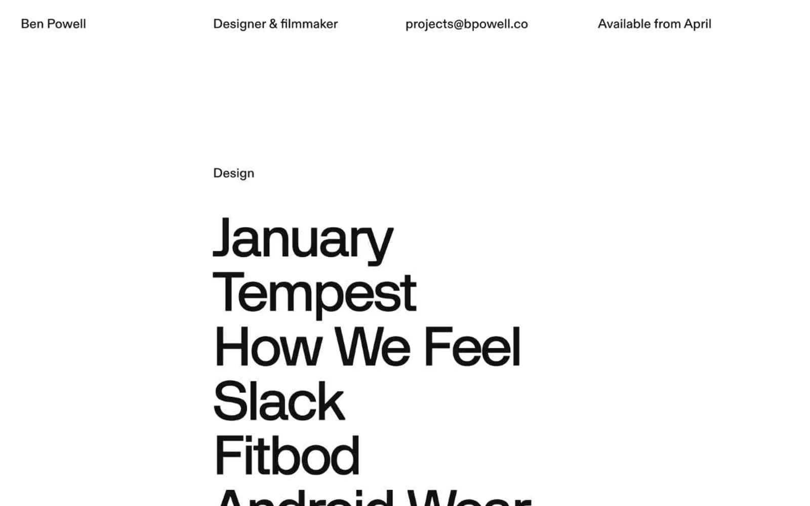
Bpowell
Design tools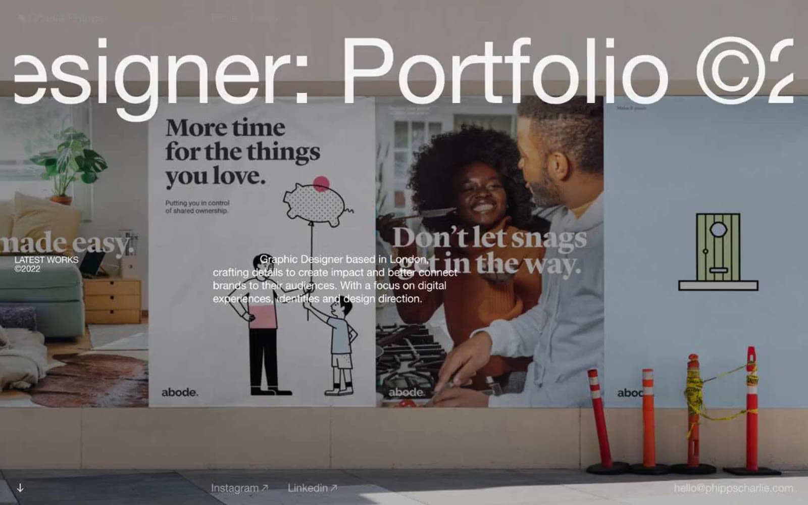
Charlie Phipps
Design tools
Contract
Design tools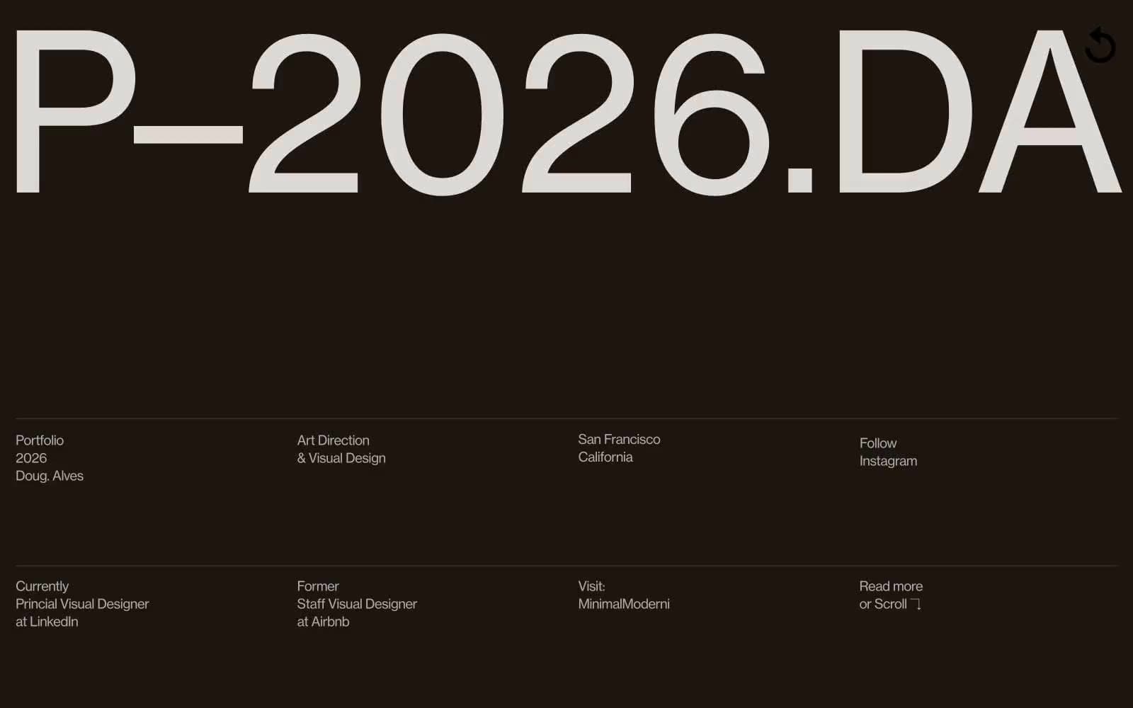
Doug–Alves
Design tools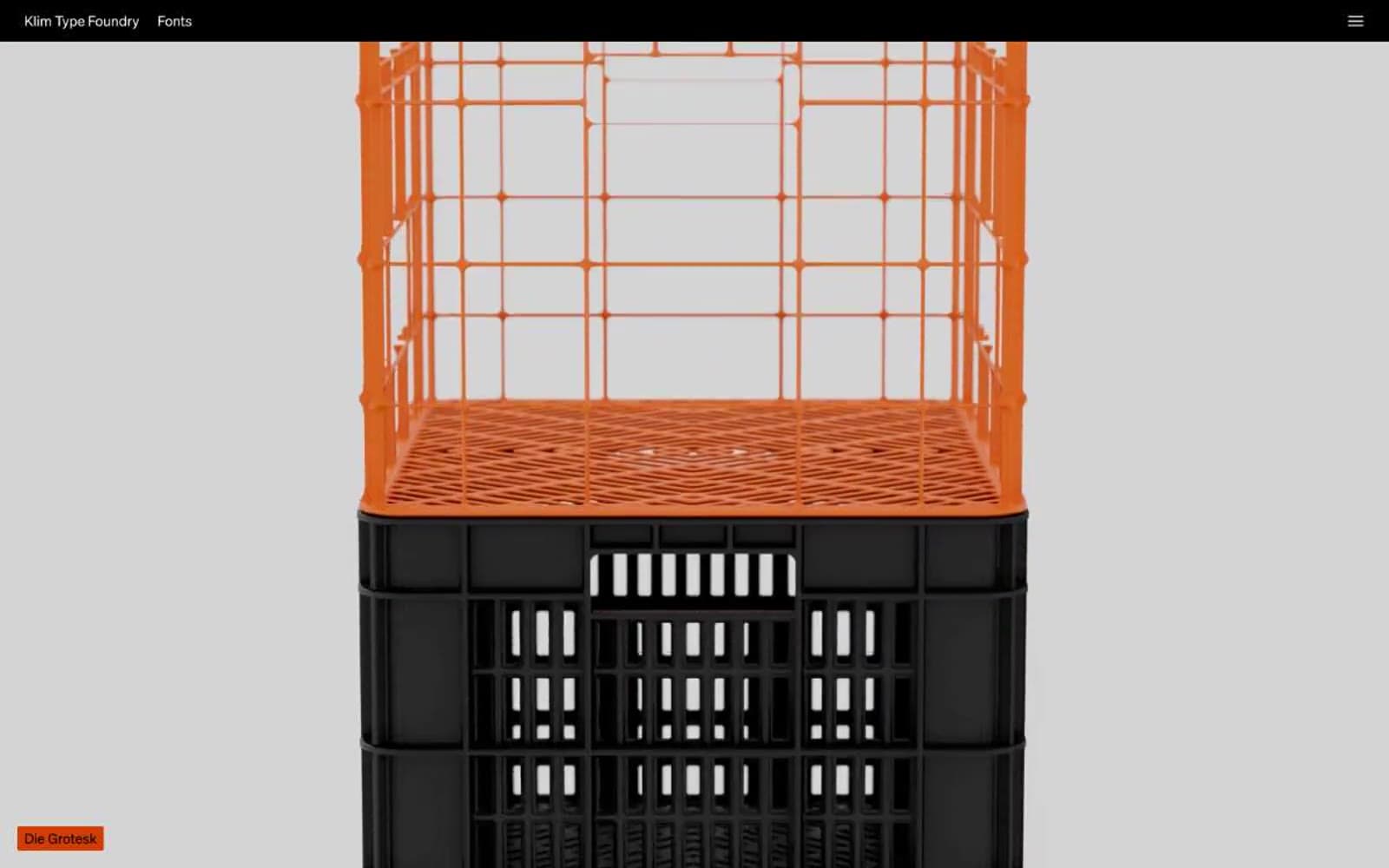
Klim
Design tools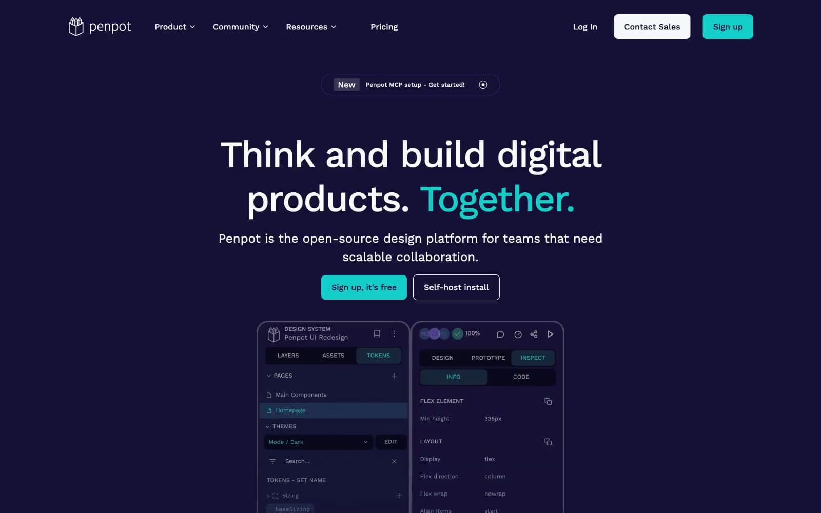
Penpot
Design tools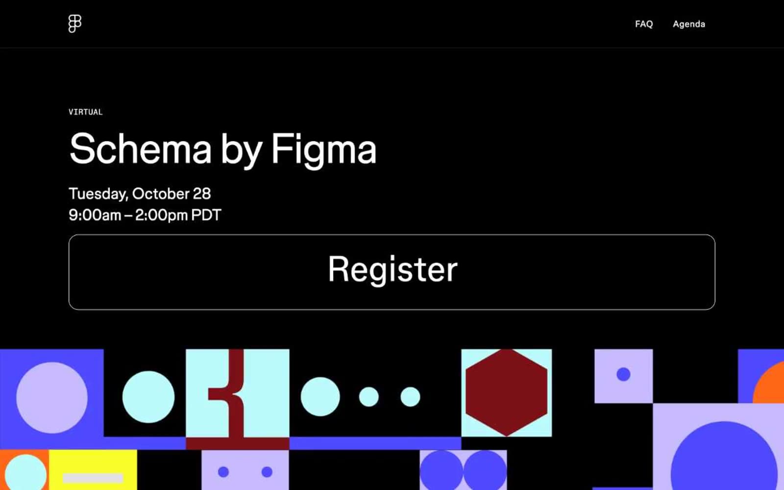
Schema
Design tools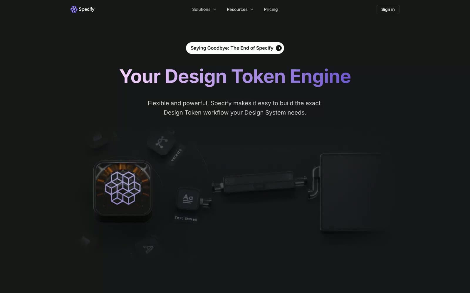
Specify
Design tools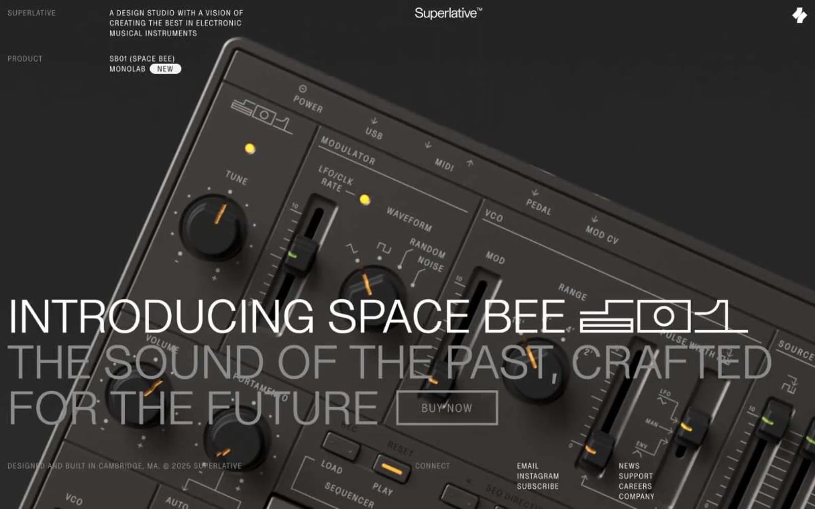
Superlative
Design tools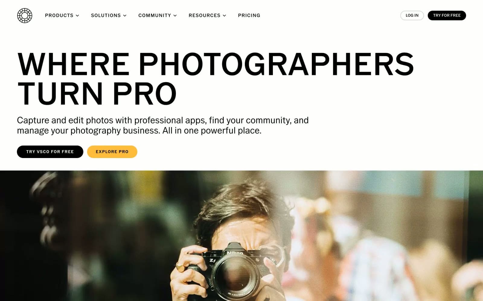
VSCO®
Design tools


