
Ayaka B. Ito. Editorial spread on warm linen paper.
- Design tools
- Mixed theme
- 19 colors
- 2 typefaces
Ayaka B. Ito presents an editorial portfolio language: full-bleed warm-toned pages flipping between a dust-pink cover collage, a terracotta-rust intro spread, and oversized serif display panels. The system reads like a printed magazine — flat color planes, hairline rules, and one custom display serif that swells to extreme positive tracking on hero copy. Color is used as whole-page atmosphere rather than UI accent: terracotta, olive, teal, gold, and dusty pink each take over entire sections to signal project boundaries. Components are reduced to their editorial primitives — a top bar of bare category links, tiny parenthesized section tags, and pill-shaped language toggles — with no shadows, no cards, and almost no raised surfaces. The page breathes with generous vertical rhythm and lets typography do all the structural work.
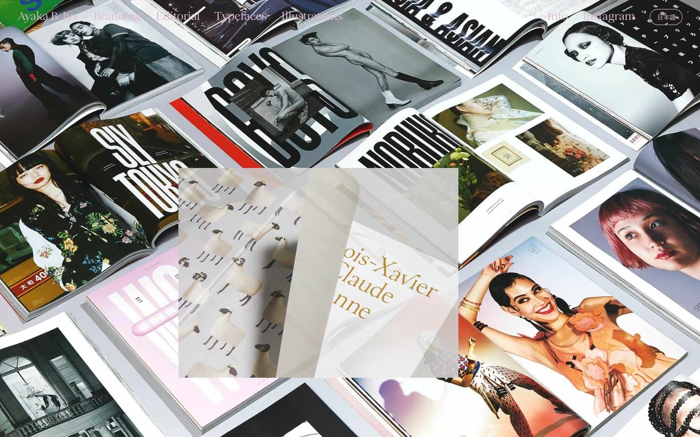
Ayaka B. Ito design system

Brand2
Full-bleed intro section background — the signature terracotta that defines the brand's cover moment
Vivid orange punctuation for accent text and graphic highlights against muted grounds
Accent11
Dusty blue-gray accent for heading type and project labels
Light dusty blue for heading type and border rules — the coolest note in the palette
Soft lavender-blue for heading copy and delicate dividers
Saturated muted teal for heading type — the strongest cool accent in the system
Muted green accent for tag labels and short heading runs
Warm gray-olive for heading type and project titles — anchors the earth-tone half of the palette
Darker olive for emphasized heading type and link rules, reading as near-black with warmth
Golden mustard for full-bleed project backgrounds and accent headings — a signature warm note
Dusty pink used as the dominant hairline border color across the entire UI — the single most repeated chromatic color
Muted rose-gray for heading type and link borders, a softer companion to Blush
Warm taupe for heading rules and type — the bridge between the pinks and the earth tones
Neutrals6
Body text, hairline borders, and rule lines — the dominant structural color used everywhere text and dividers are drawn
Muted helper text, secondary labels, and low-emphasis borders
Cool gray-blue tint for quiet borders and subdued type, balancing the warm earth tones
Warm light-gray surface for secondary spreads and subtle tonal shifts between sections
Warm off-white alt canvas for soft tonal contrast against Bone White
Primary page canvas and base background for gallery and intro spreads
Try a pairing
Pick any two colors from the palette to check whether text stays readable on top.
Aa
Bone White on Ember Rust
4.89 : 1 contrast
- Body textPasses AA 4.5
- Large textPasses AA 3
- StrictFails AAA 7
More DESIGN.md files. Same web, different personalities.

10X HUB
Design tools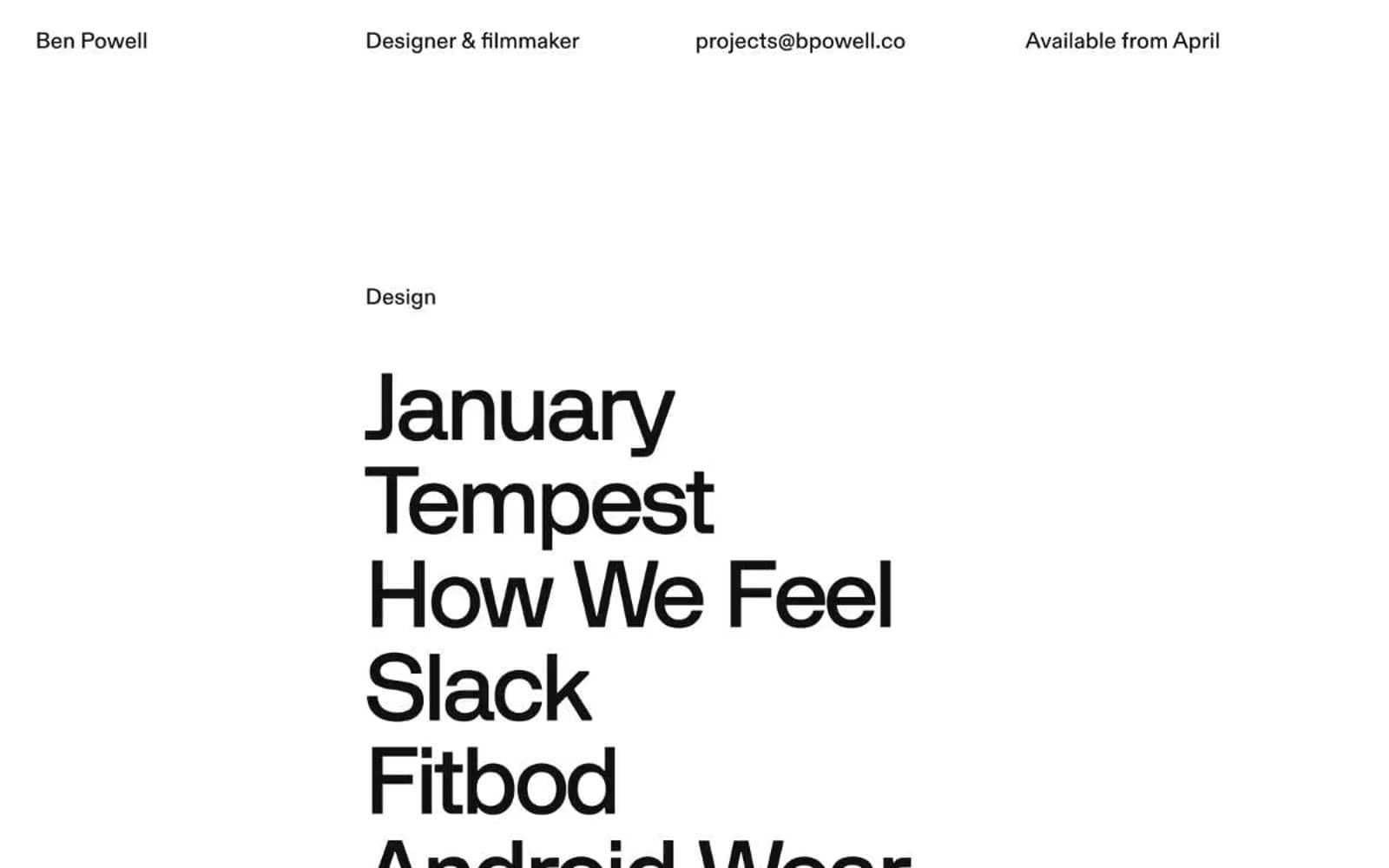
Bpowell
Design tools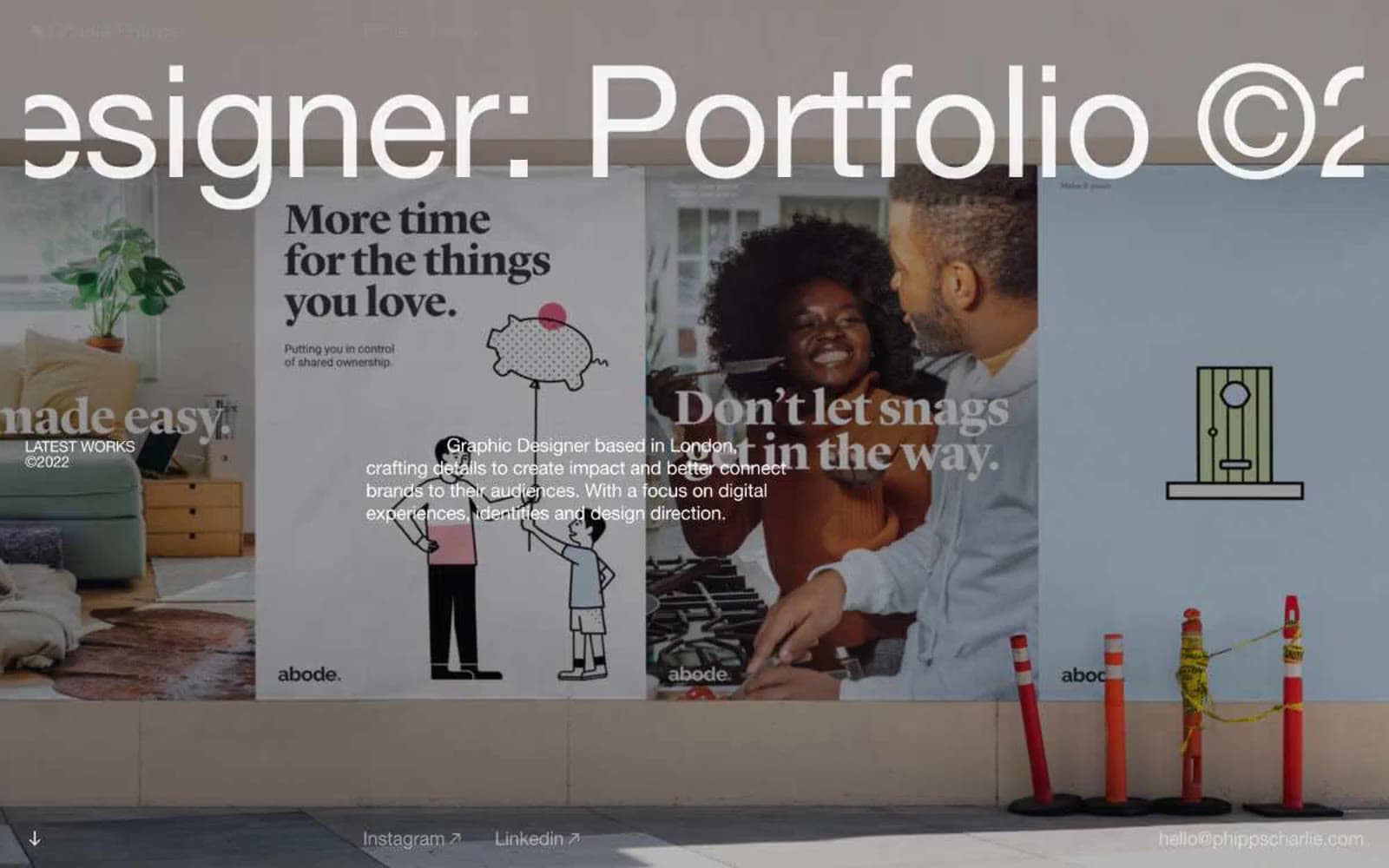
Charlie Phipps
Design tools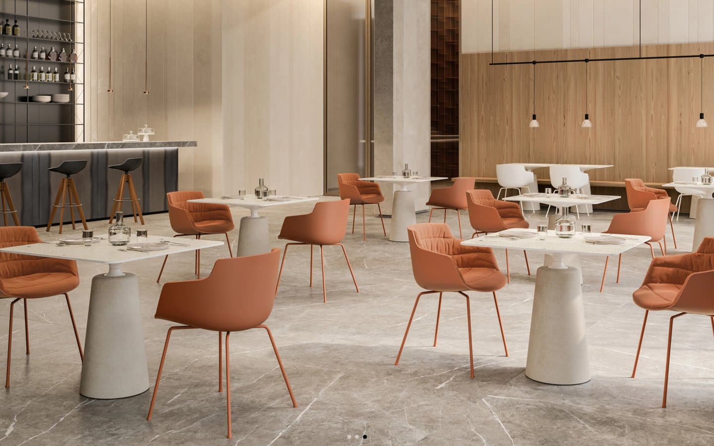
Contract
Design tools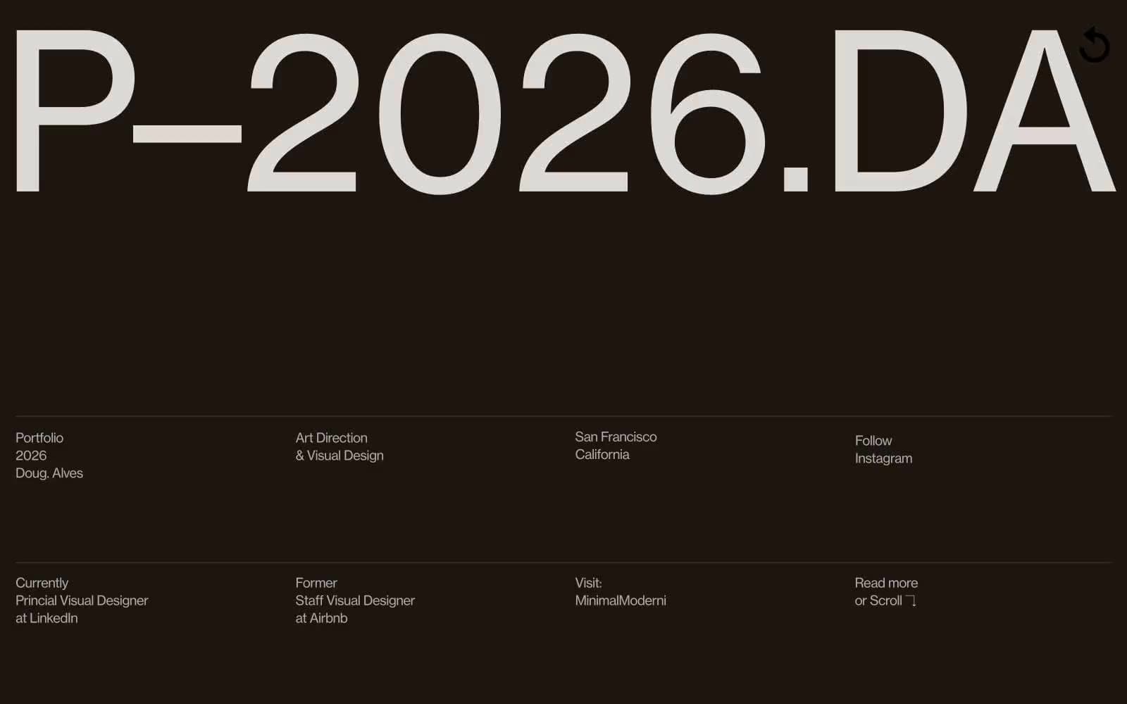
Doug–Alves
Design tools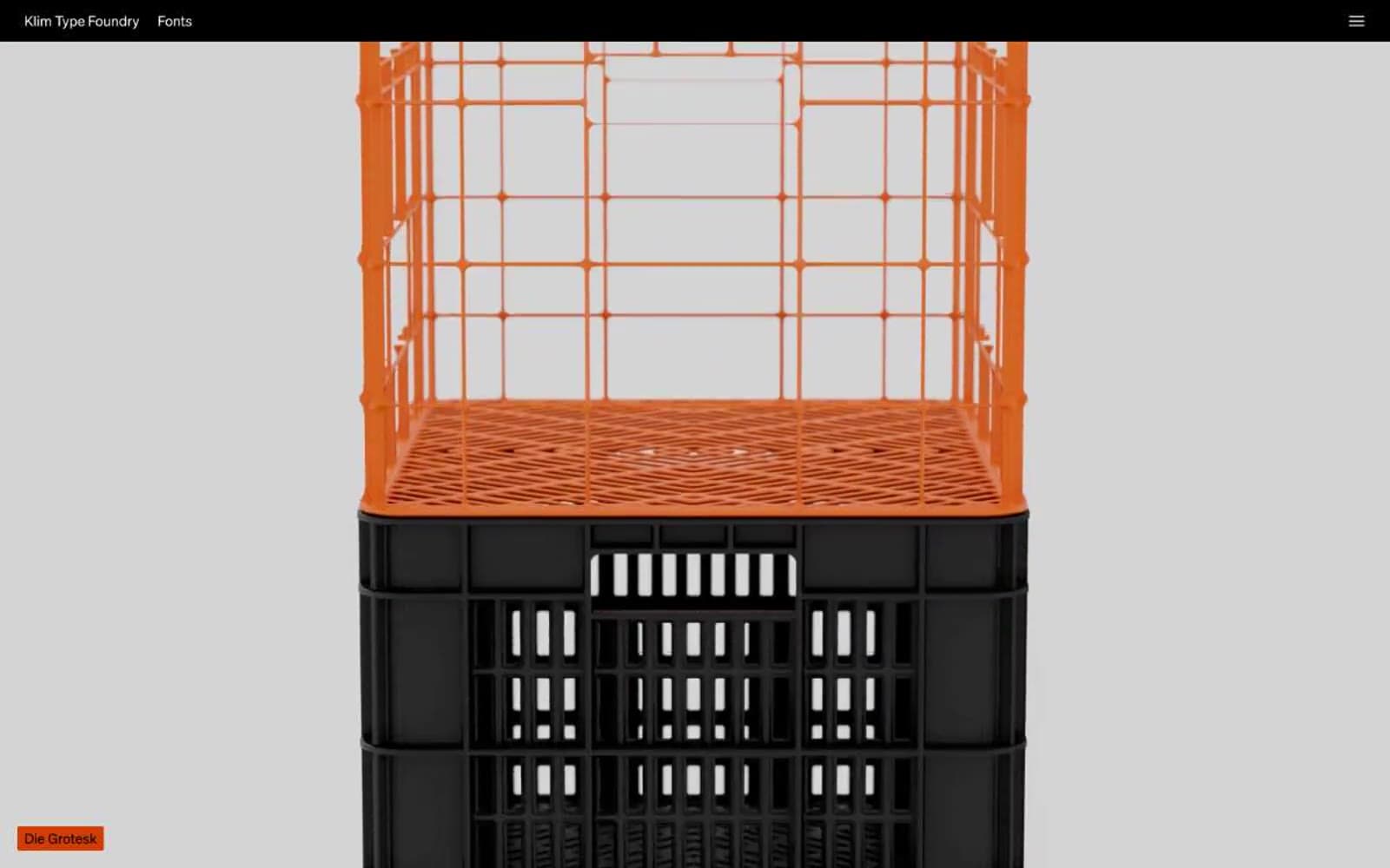
Klim
Design tools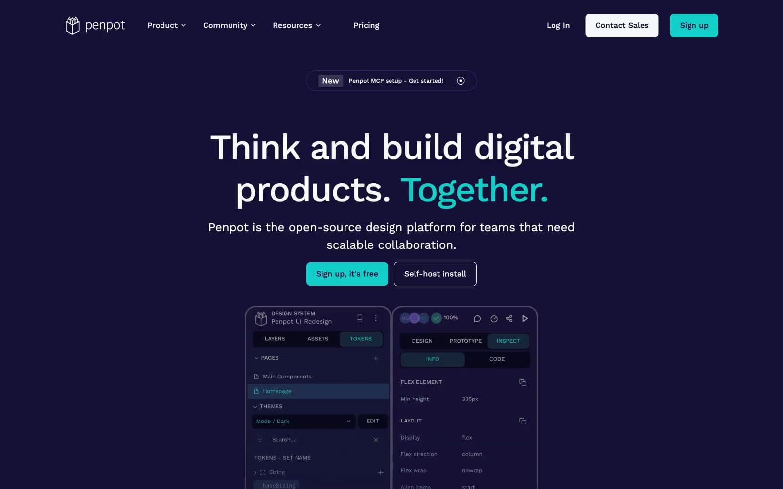
Penpot
Design tools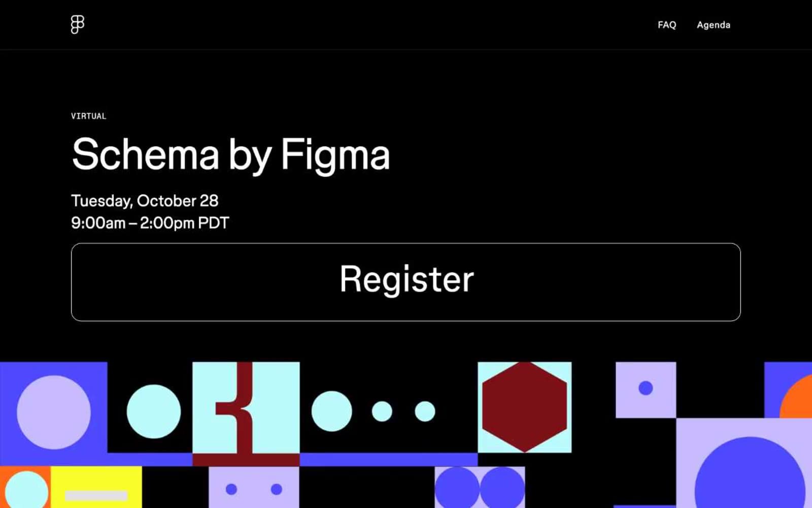
Schema
Design tools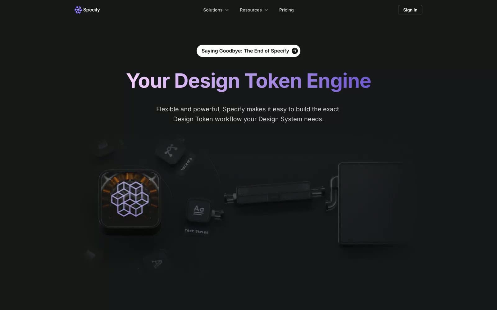
Specify
Design tools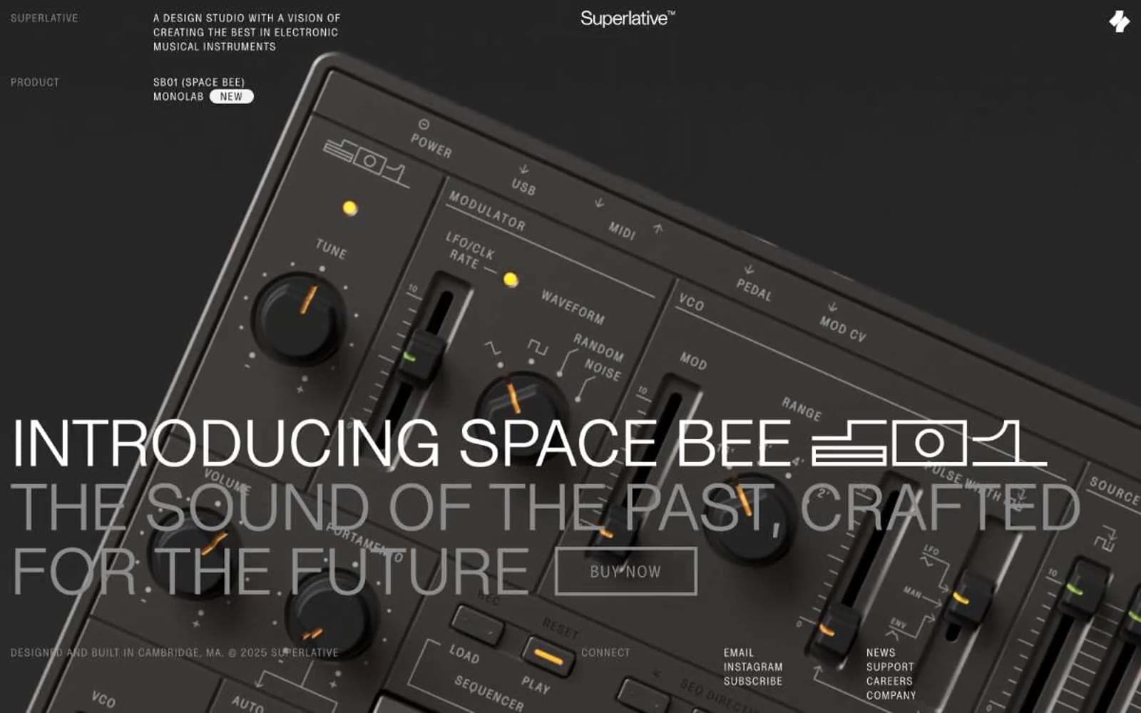
Superlative
Design tools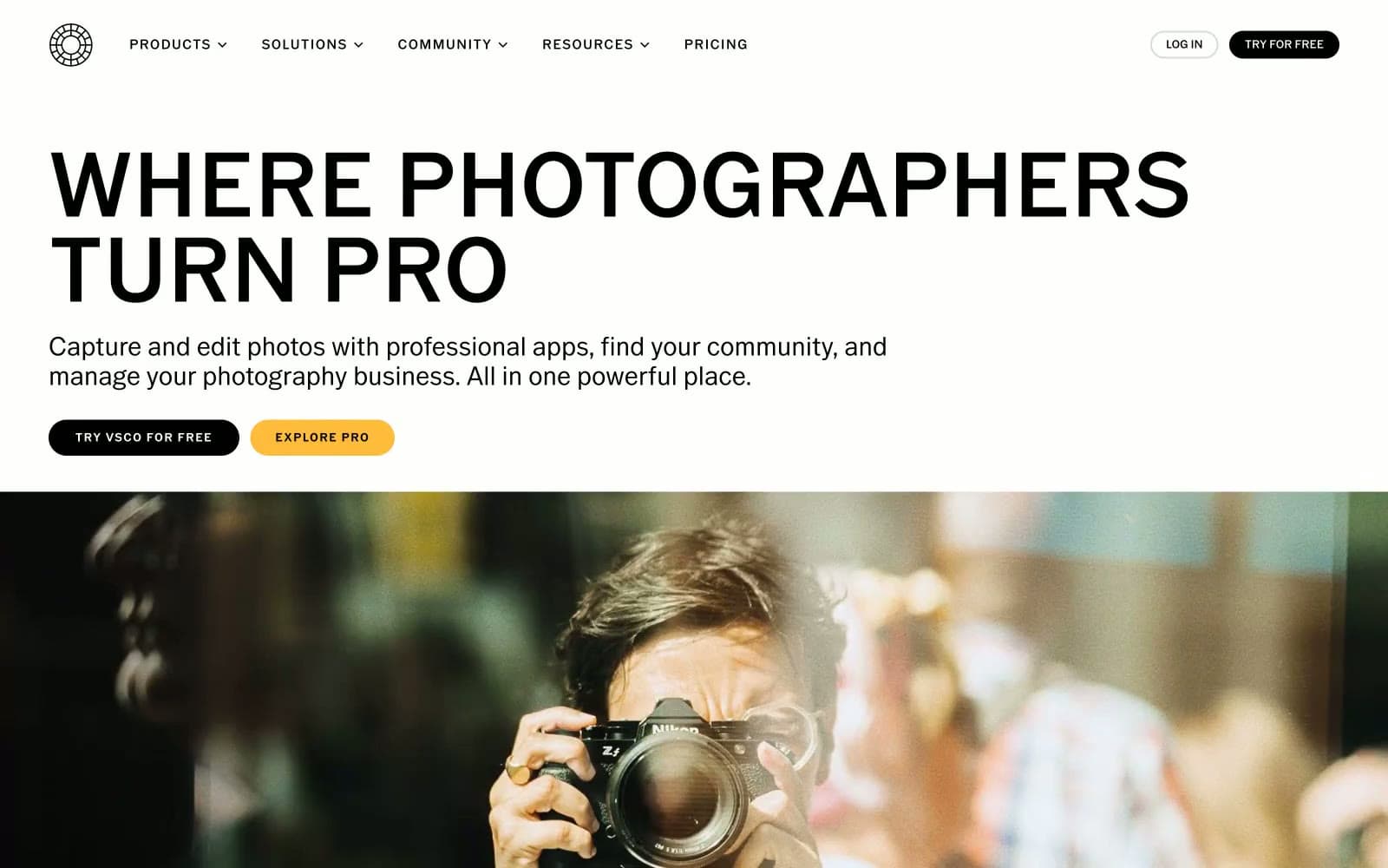
VSCO®
Design tools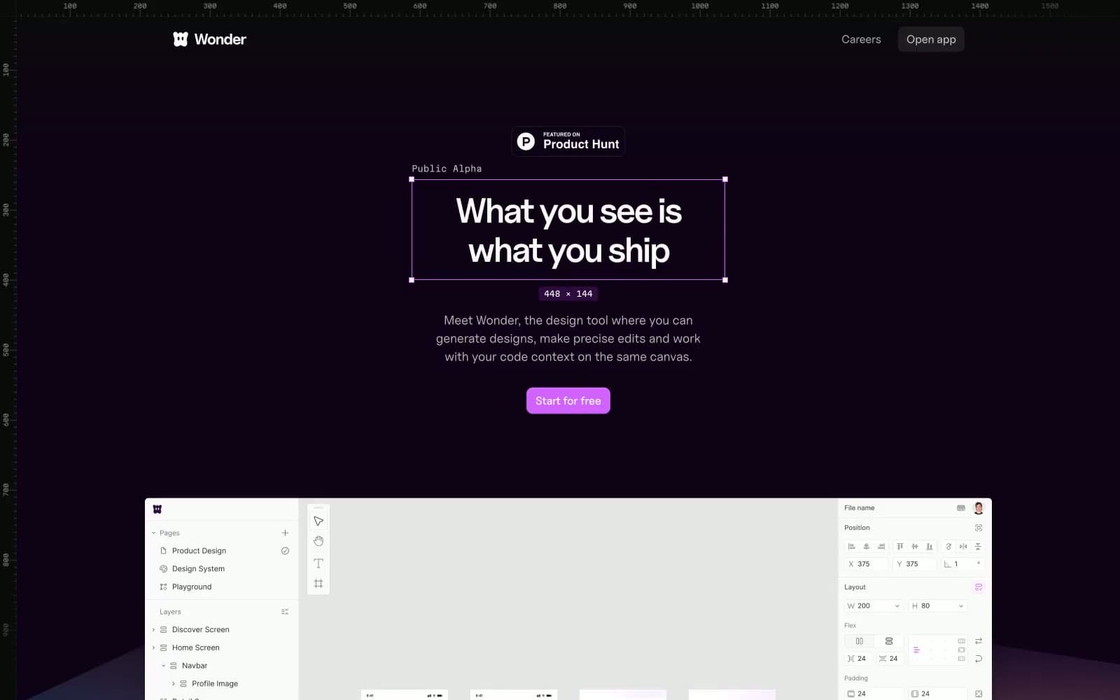
Wonder
Design tools


