
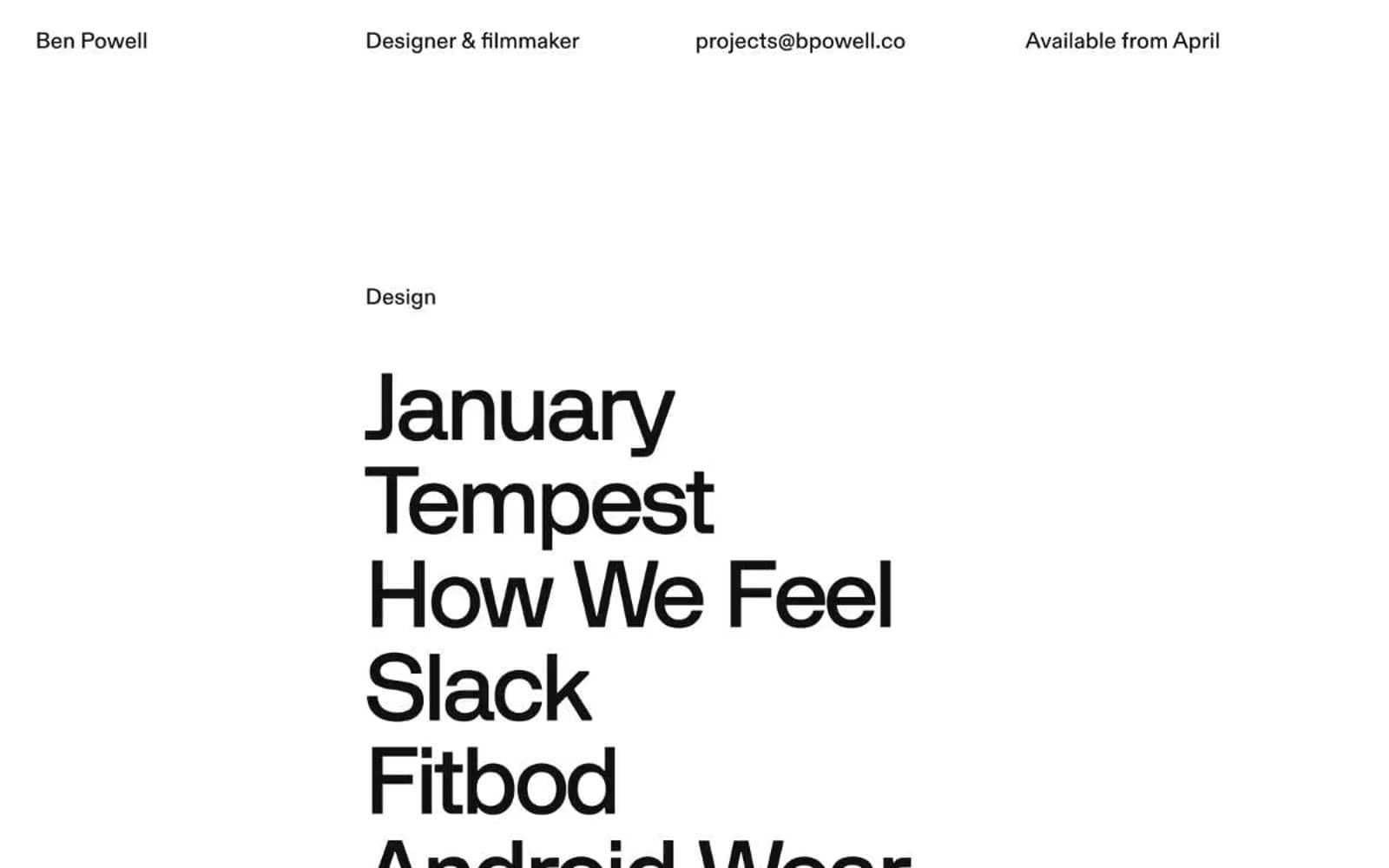
Bpowell. Type as architecture on white plaster.
- Design tools
- Mixed theme
- 4 colors
- 5 typefaces
A text-only portfolio that lets typography do every job — no imagery, no decoration, no chrome. The page reads as an architectural list: small tightly-set labels act as section markers, then oversized project names stack like concrete blocks on a wall. Two surfaces alternate — a bright white canvas for design work, an inverted near-black canvas for film — and the contrast between them is the only visual rhythm. The layout is brutally asymmetric: a single column of oversized text pinned to the left, generous gutters of negative space, and a top nav that distributes itself across the full viewport width rather than clustering in a corner. The system has no buttons, no cards, no borders in the traditional sense — the nearest thing to a border is a 1px black hairline, and even that is used sparingly. The result feels like reading a credits sequence printed on a gallery wall: austere, deliberate, and confident that the names themselves carry the weight.
Bpowell design system

Neutrals4
Secondary text and fill on light sections; used where maximum contrast is needed against the white canvas
Page background for the dark/film section; primary body text on light sections; structural fill for project name typography
Subtle darker border for low-emphasis rules on light surfaces
Primary canvas for the light sections; text color on the dark sections; hairline dividers on the dark sections
Try a pairing
Pick any two colors from the palette to check whether text stays readable on top.
Aa
Plaster White on Ink Black
21.00 : 1 contrast
- Body textPasses AA 4.5
- Large textPasses AA 3
- StrictPasses AAA 7
More DESIGN.md files. Same web, different personalities.

10X HUB
Design tools
Ayaka B. Ito
Design tools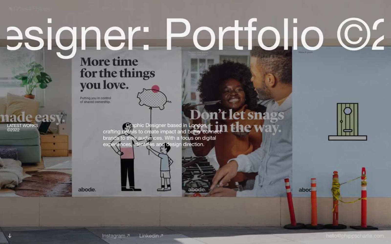
Charlie Phipps
Design tools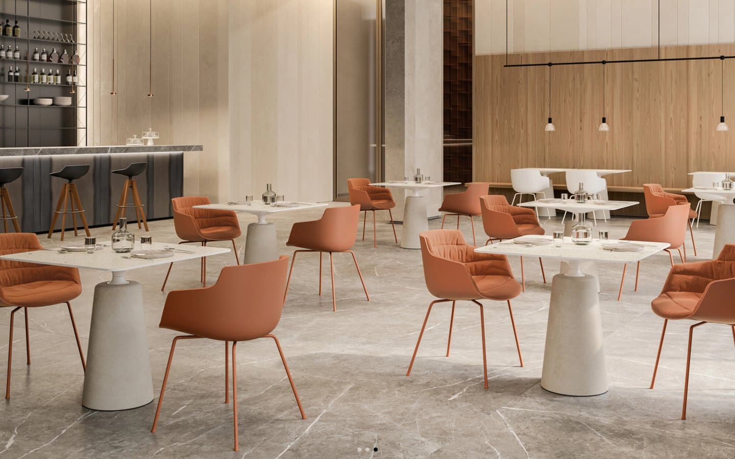
Contract
Design tools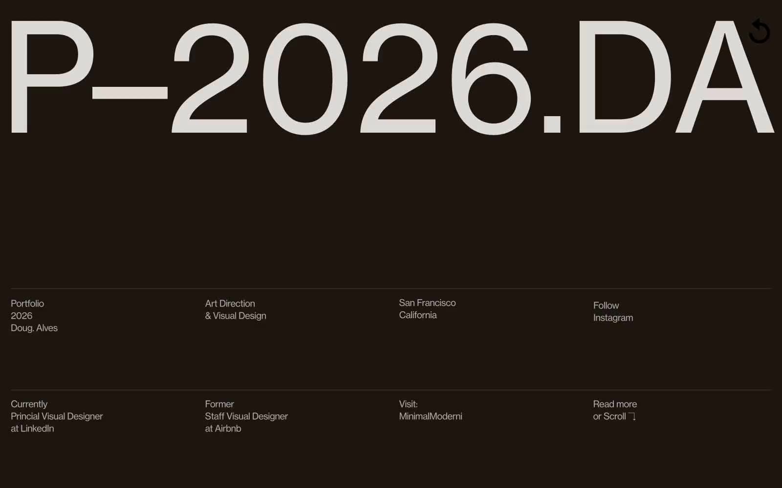
Doug–Alves
Design tools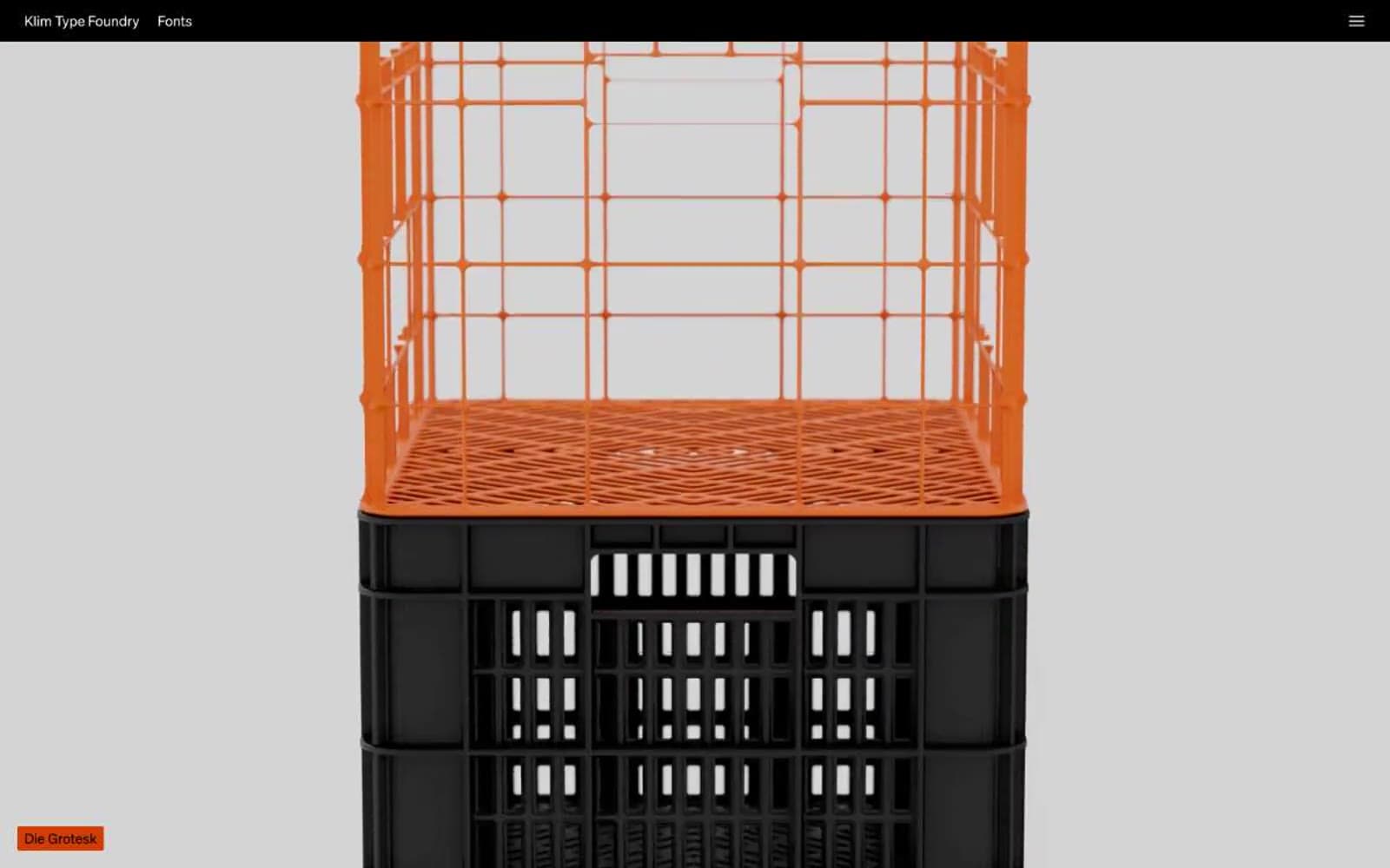
Klim
Design tools
Penpot
Design tools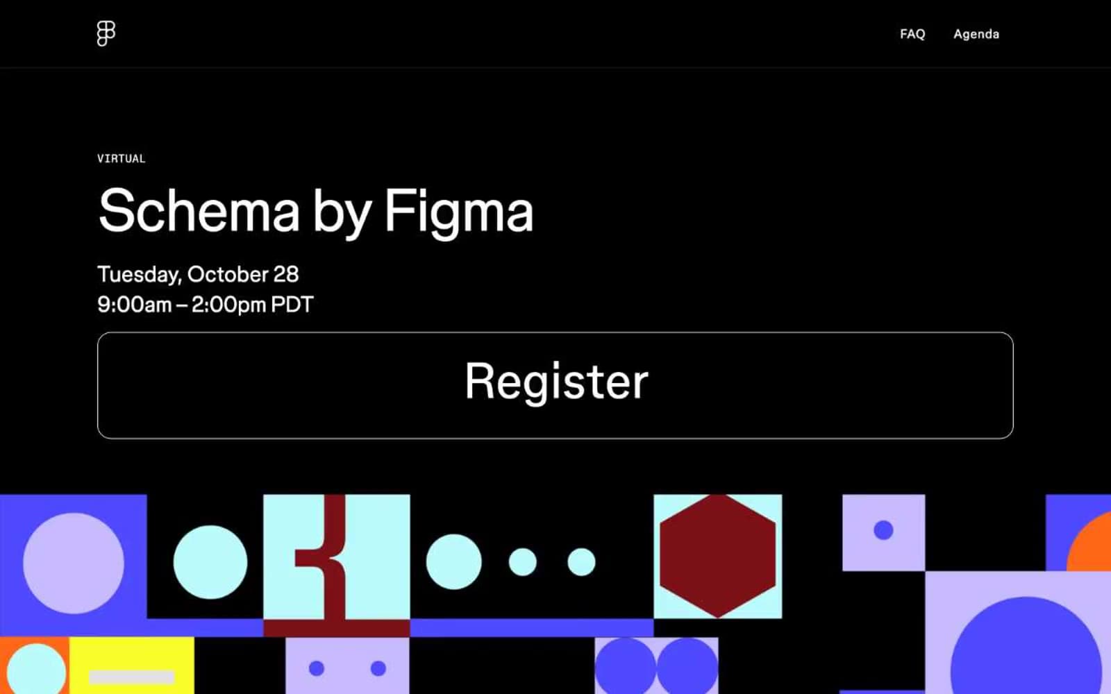
Schema
Design tools
Specify
Design tools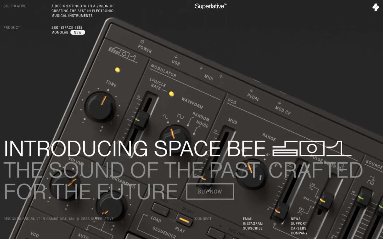
Superlative
Design tools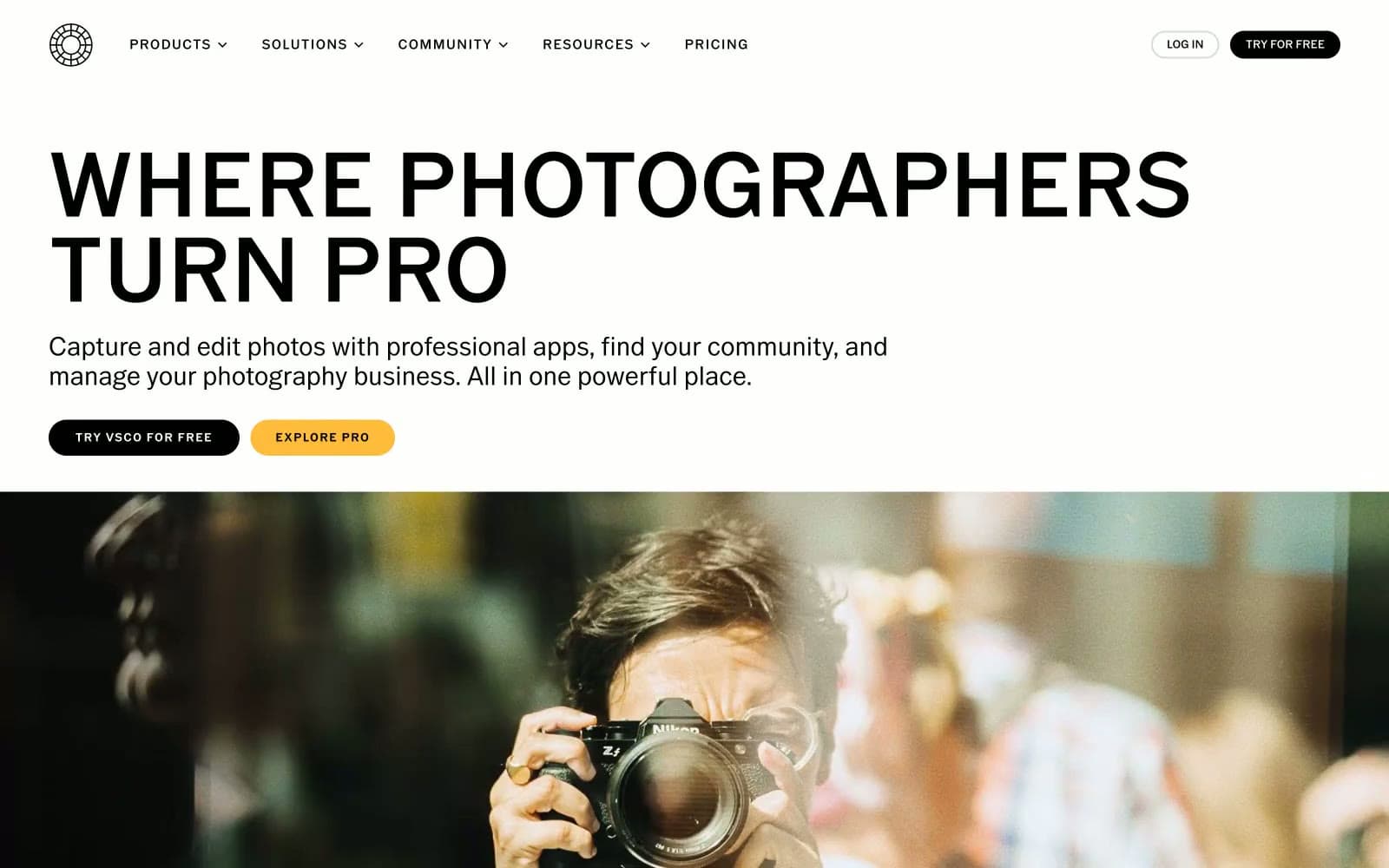
VSCO®
Design tools
Wonder
Design tools


