
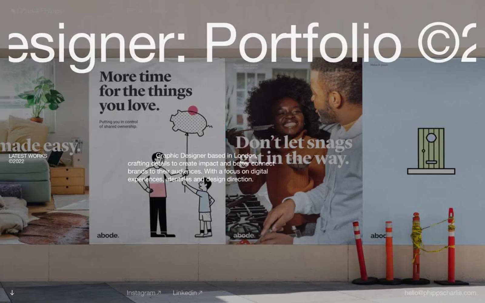
Charlie Phipps. A single massive Helvetica headline and one full-bleed photograph, nothing else.
- Design tools
- Mixed theme
- 8 colors
- 2 typefaces
Charlie Phipps is a London graphic designer's portfolio rendered as an oversized editorial poster system: full-bleed photography as hero canvas, one monumental Helvetica Neue headline per screen, and near-total chromatic silence. The site reads like a printed zine blown up to wall scale — weight 400 at 162px is a deliberate anti-convention (no bold shout, just confident whisper-thin letters) paired with aggressive negative tracking that lets the headline crop the viewport. The base canvas is near-black (#101011) to make photographic color explosions land harder, but content sections flip to white with the same dramatic restraint. No buttons, no rounded corners, no shadows, no color tokens — interaction is implied by thin underlines and cursor states, and navigation is reduced to three thin links in a corner. Whitespace is the primary structural device, not cards or dividers.
Charlie Phipps design system

Neutrals8
Heading and body text on light surfaces; second structural border color — used wherever a slightly harder edge than #101011 is needed
Near-pure black for the darkest link borders and emphasis text — visually indistinguishable from #000000 but kept distinct in the scale for deepest emphasis
Base page canvas beneath full-bleed photography and dark bands; primary text on light surfaces; link underlines in dark contexts
Deepest secondary border and muted text on light sections — just one step lighter than canvas black, used to keep dark elements feeling part of the same family
Body text metadata, link underlines in light contexts, and mid-weight borders — the workhorse neutral for anything that should be seen but not foregrounded
Muted heading accent — used for secondary headings and borders where the hierarchy needs to recede below the primary type
Subtle surface tint separating content blocks from white paper; soft borders on body text and cards where a pure white hairline would disappear
Primary text color on dark/photographic backgrounds; content section background; dominant border color (hairline rules and dividers across the layout)
Try a pairing
Pick any two colors from the palette to check whether text stays readable on top.
Aa
Paper White on Ink Black
21.00 : 1 contrast
- Body textPasses AA 4.5
- Large textPasses AA 3
- StrictPasses AAA 7
More DESIGN.md files. Same web, different personalities.

10X HUB
Design tools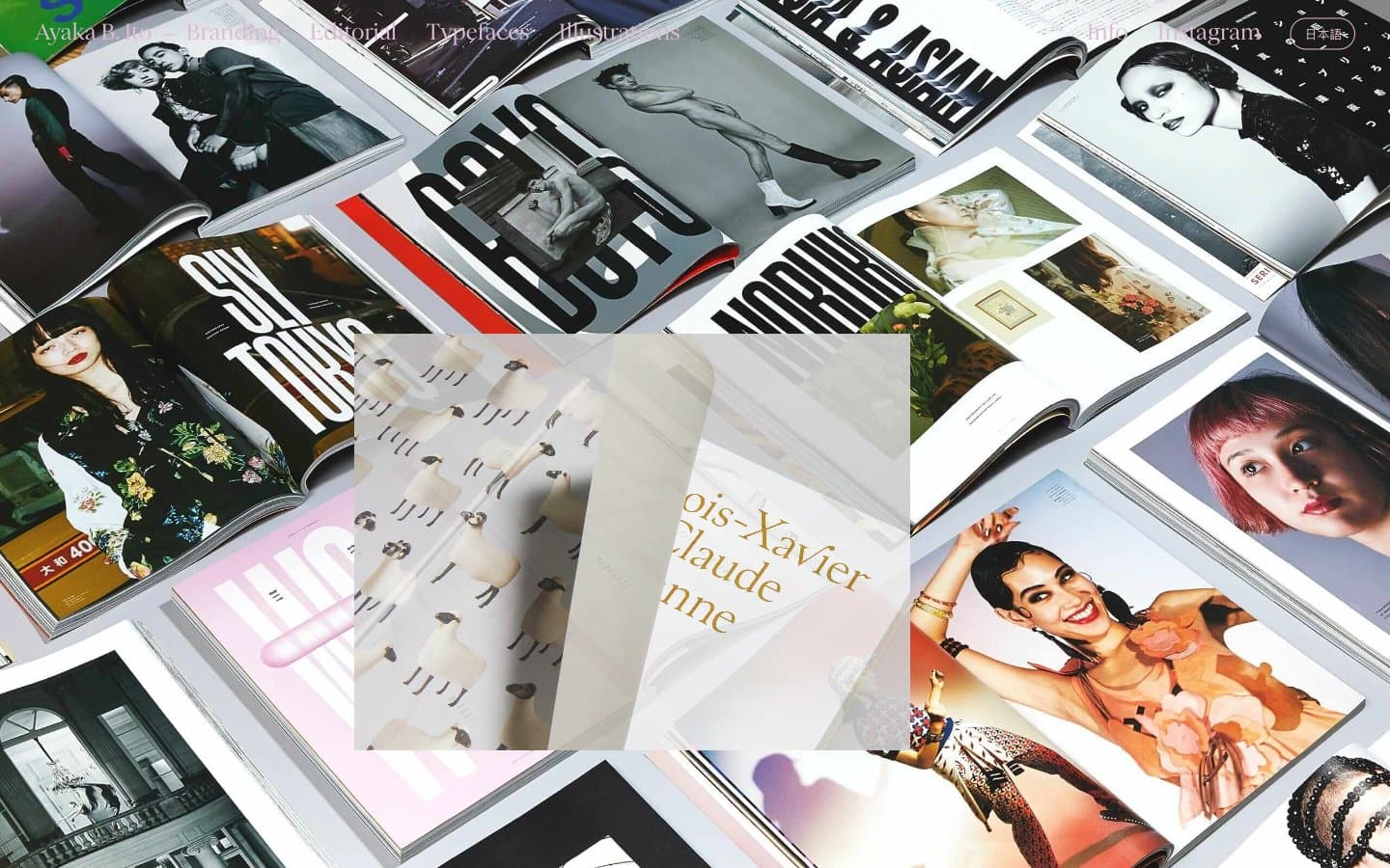
Ayaka B. Ito
Design tools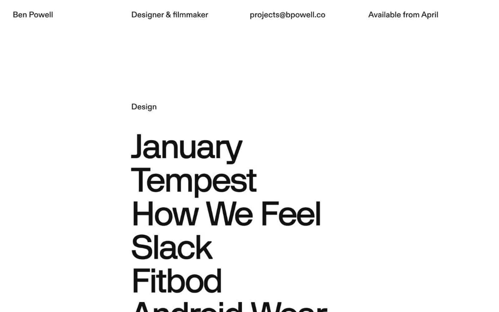
Bpowell
Design tools
Contract
Design tools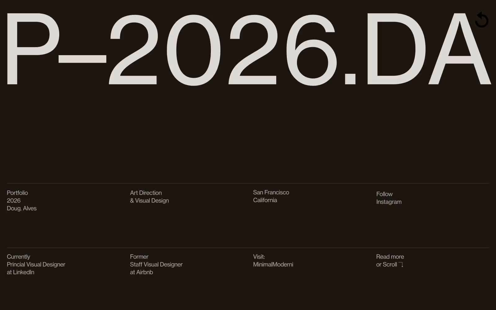
Doug–Alves
Design tools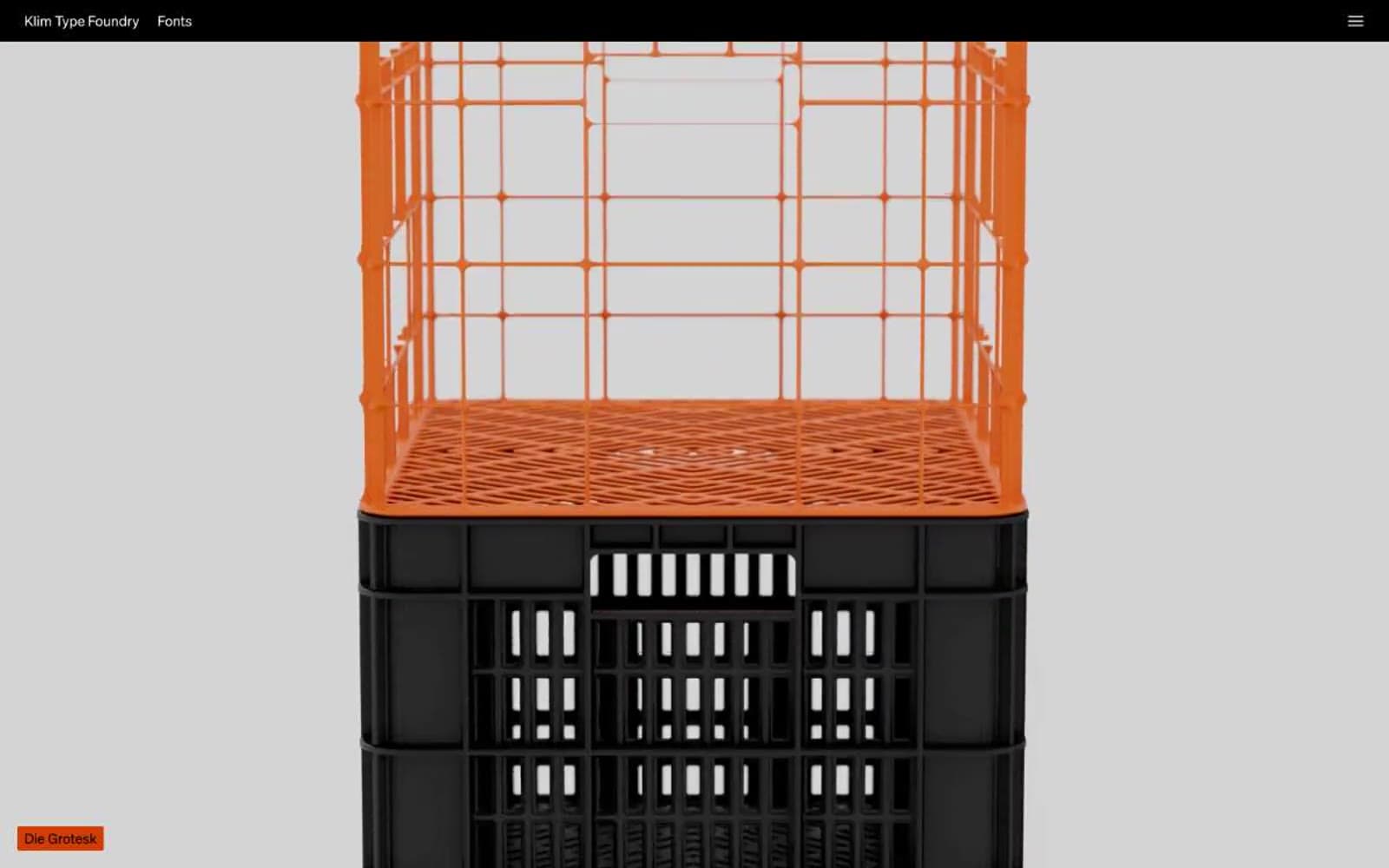
Klim
Design tools
Penpot
Design tools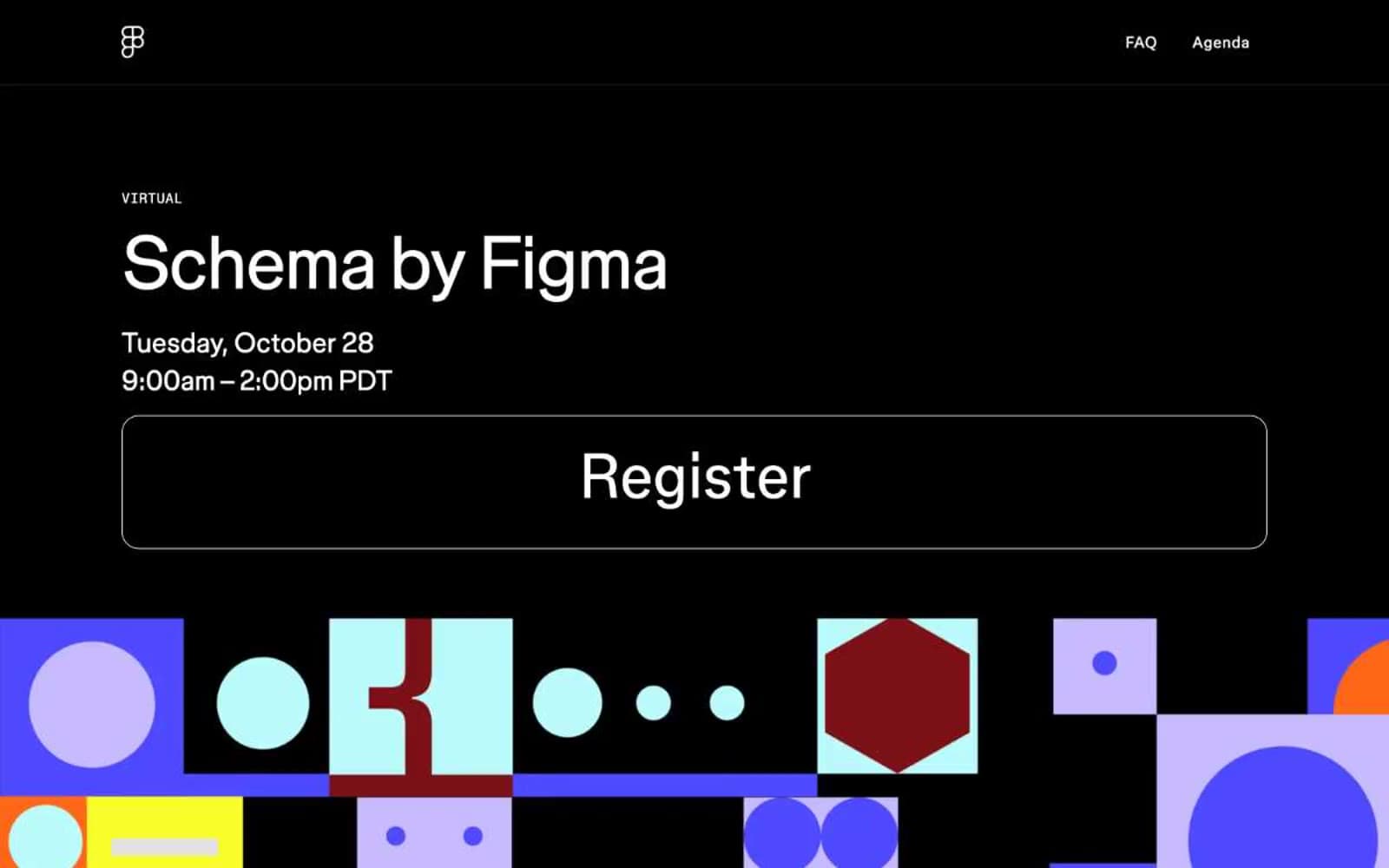
Schema
Design tools
Specify
Design tools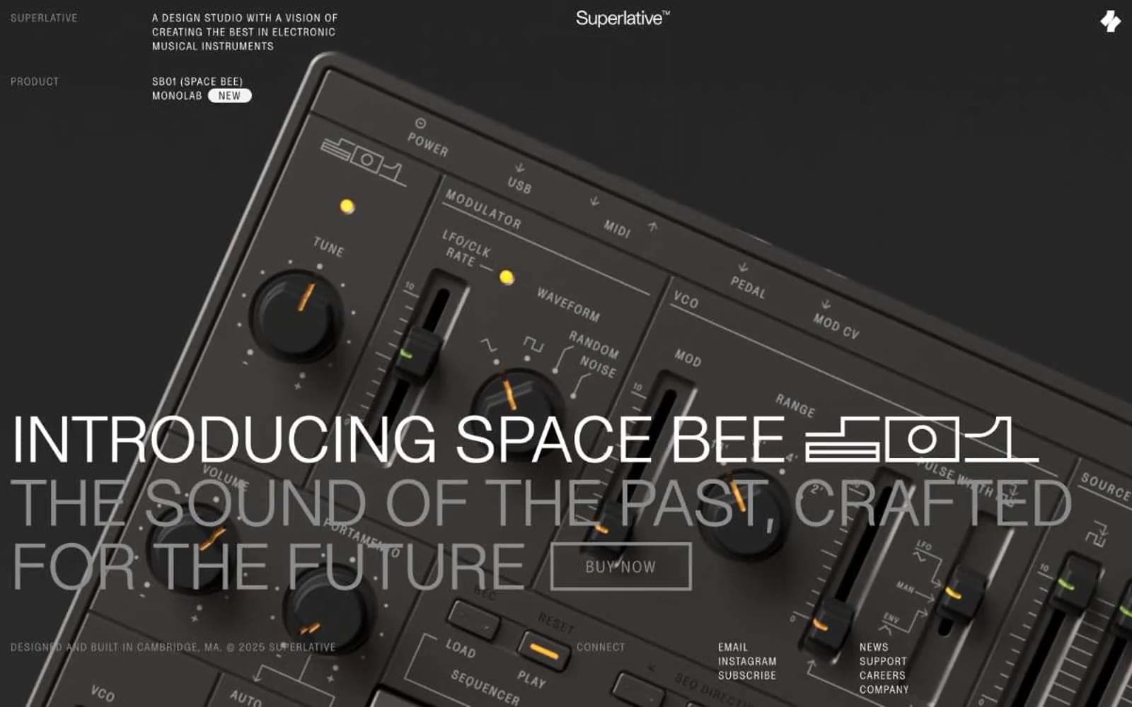
Superlative
Design tools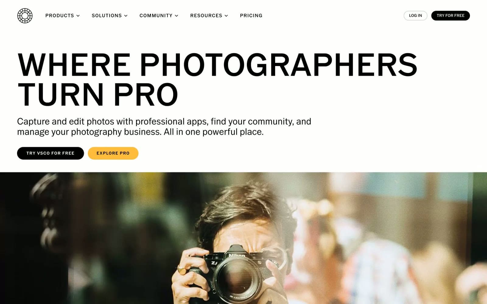
VSCO®
Design tools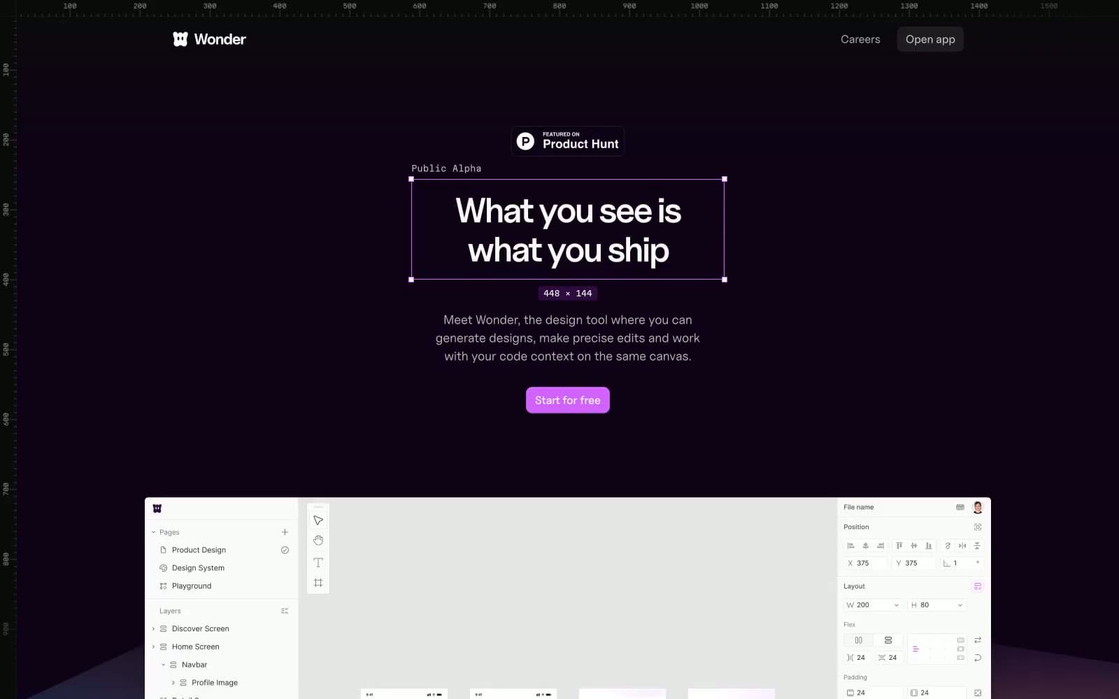
Wonder
Design tools


