
Penpot. A deep violet hero stage where one bright teal button and one teal word ignite an otherwise monochrome canvas.
- Design tools
- Mixed theme
- 7 colors
- 2 typefaces
Penpot operates as a two-act visual system: a deep midnight-violet hero stage that commands attention, then a luminous off-white working area that lets product content breathe. The chromatic palette is intentionally austere — one deep violet, one vivid teal, and neutral grays — so the colorful design tool interface (the actual product) becomes the only place multicolor lives. Work Sans at large display sizes creates confident, slightly tightened headlines, while the same family at 14–16px keeps interface chrome readable and unpretentious. Components are flat and geometric: 8px radii on controls, 20px radii on cards, hairline borders, no decorative shadows. The single teal accent is rationed carefully — it activates CTAs, the emphasis word in headlines, and a few decorative strokes — making it feel like a switch flipped on rather than decoration.
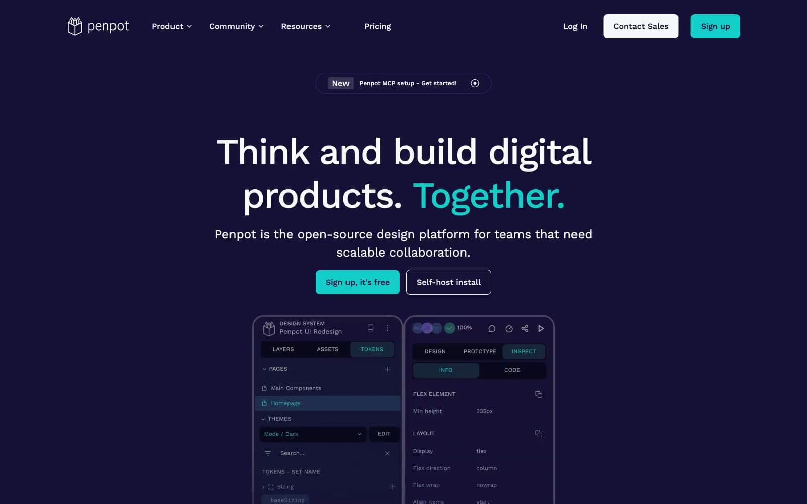
Penpot design system

Brand3
Primary brand surface — hero background, navigation, dark panels, code/token sidebars, and the product UI shell. Sets the dark-mode identity and creates the canvas against which the teal accent glows
Primary action fill, emphasis word in headlines, active tab indicator, and decorative spark. The single chromatic note — rationed to CTAs, highlights, and one word per headline — making each occurrence feel switched on
Secondary violet for subtle borders, dividers, and accent strokes within the dark panels. A bridge between Deep Space Violet and Bright Teal on the dark canvas
Neutrals4
Body text on light surfaces and maximum-contrast borders where the violet would be too soft. Sparingly used — the violet handles most dark roles
Button borders and disabled/secondary control outlines. Slightly heavier than Light Gray — used when a border needs to define a control edge
Hairline borders, subtle dividers, and nav separators on light surfaces. The quietest neutral — present but never demanding attention
Page canvas, light card surfaces, body text on dark surfaces, icon fills. The light-mode workhorse — never pure white, slightly warm to soften the contrast against Deep Space Violet
Try a pairing
Pick any two colors from the palette to check whether text stays readable on top.
Aa
Off-White on Deep Space Violet
17.38 : 1 contrast
- Body textPasses AA 4.5
- Large textPasses AA 3
- StrictPasses AAA 7
More DESIGN.md files. Same web, different personalities.

10X HUB
Design tools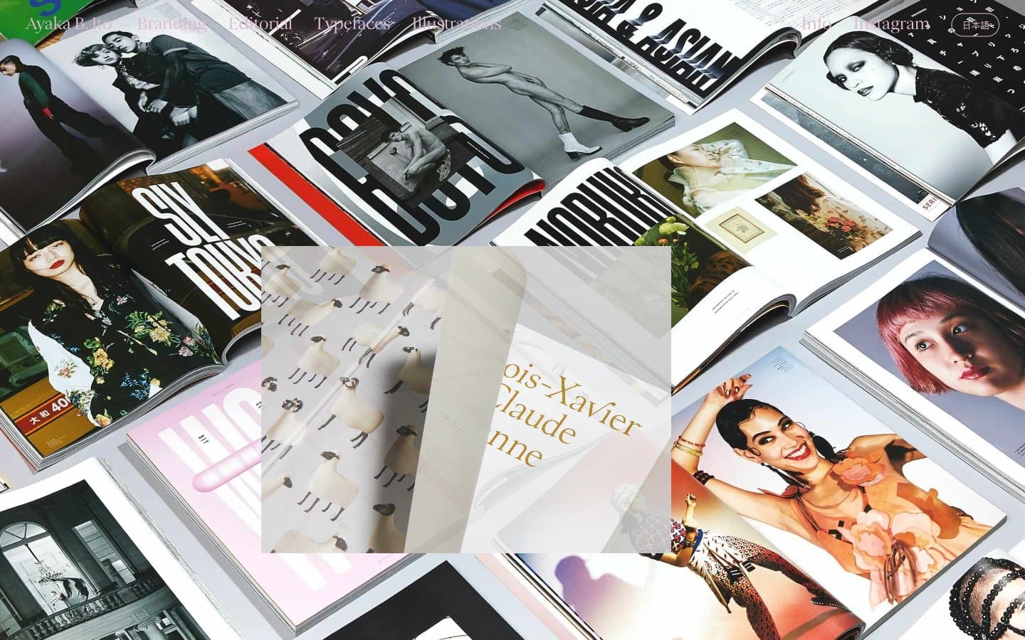
Ayaka B. Ito
Design tools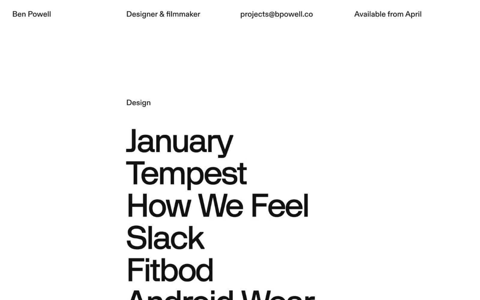
Bpowell
Design tools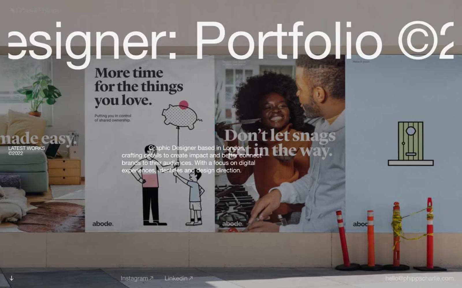
Charlie Phipps
Design tools
Contract
Design tools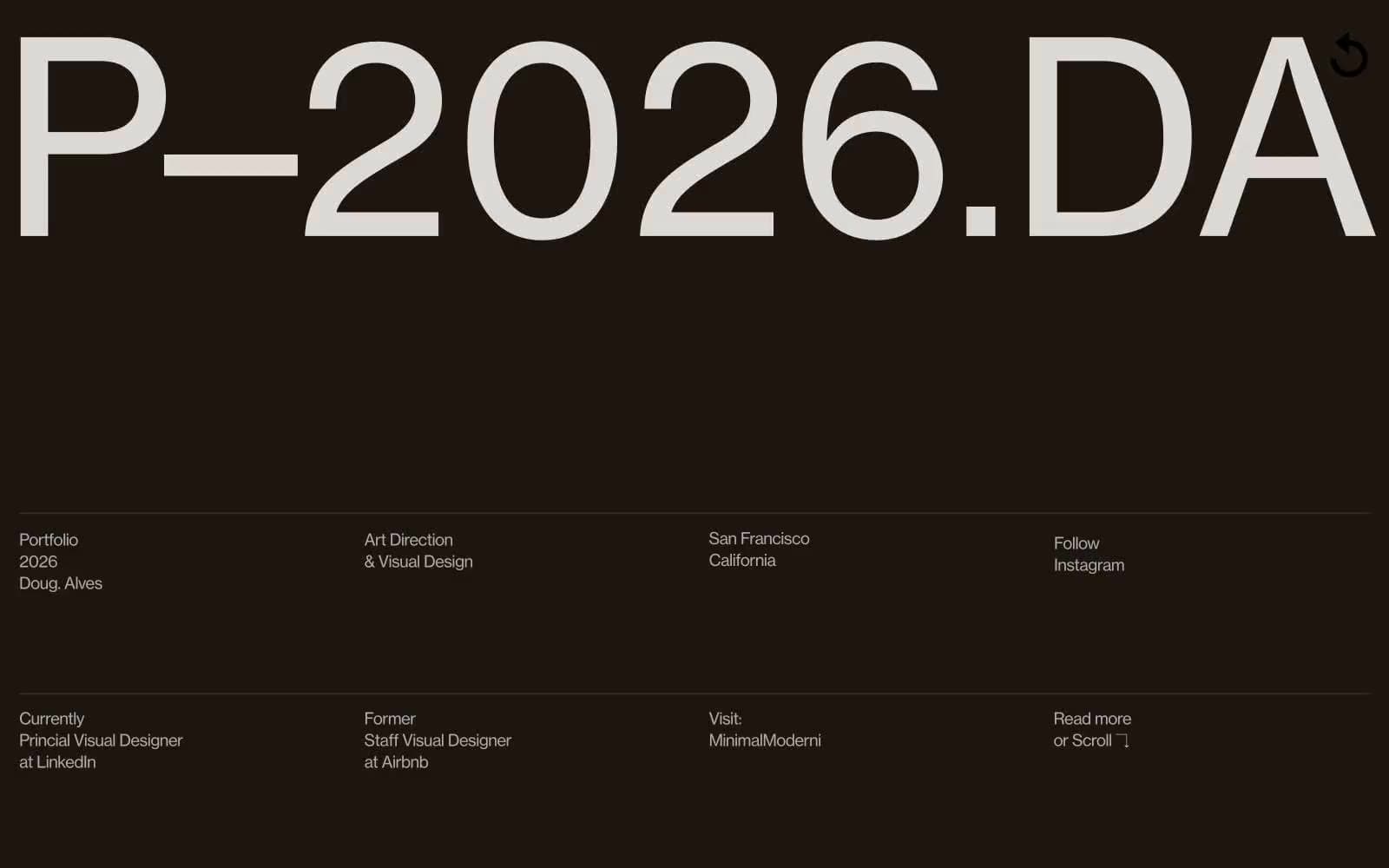
Doug–Alves
Design tools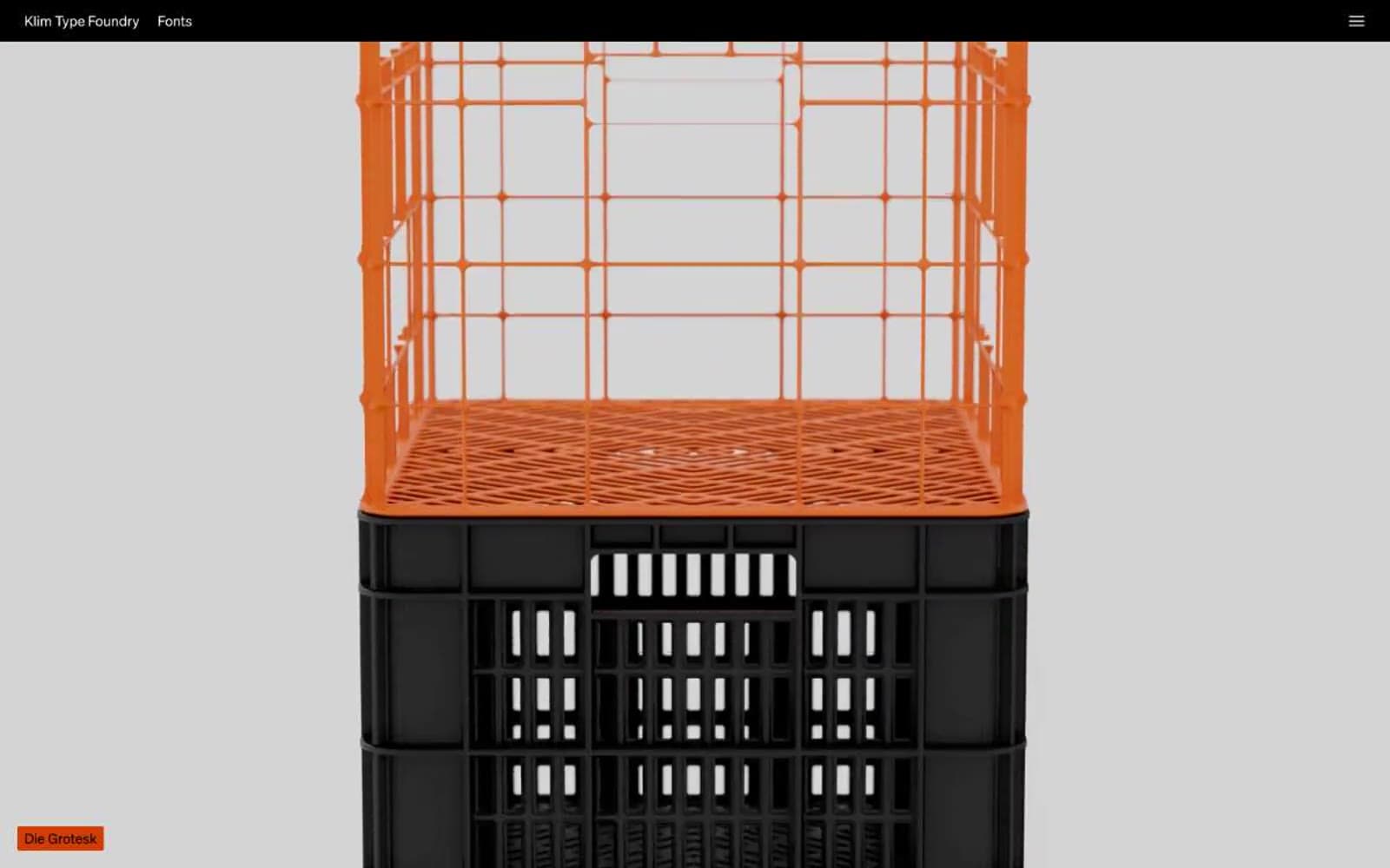
Klim
Design tools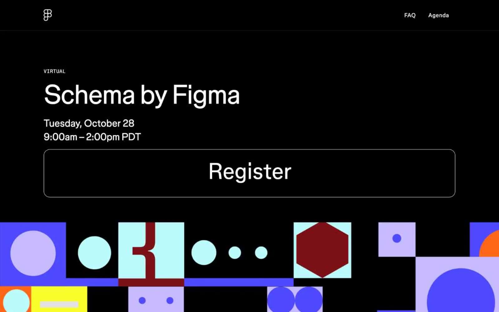
Schema
Design tools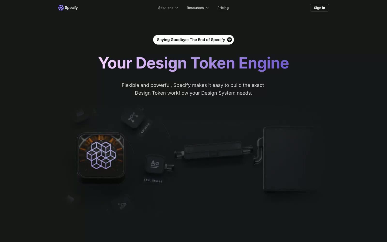
Specify
Design tools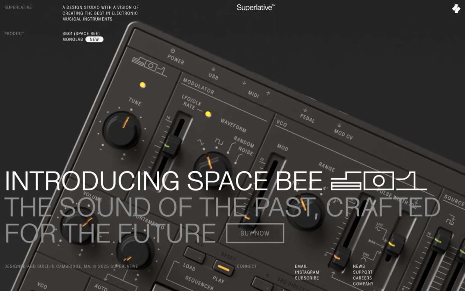
Superlative
Design tools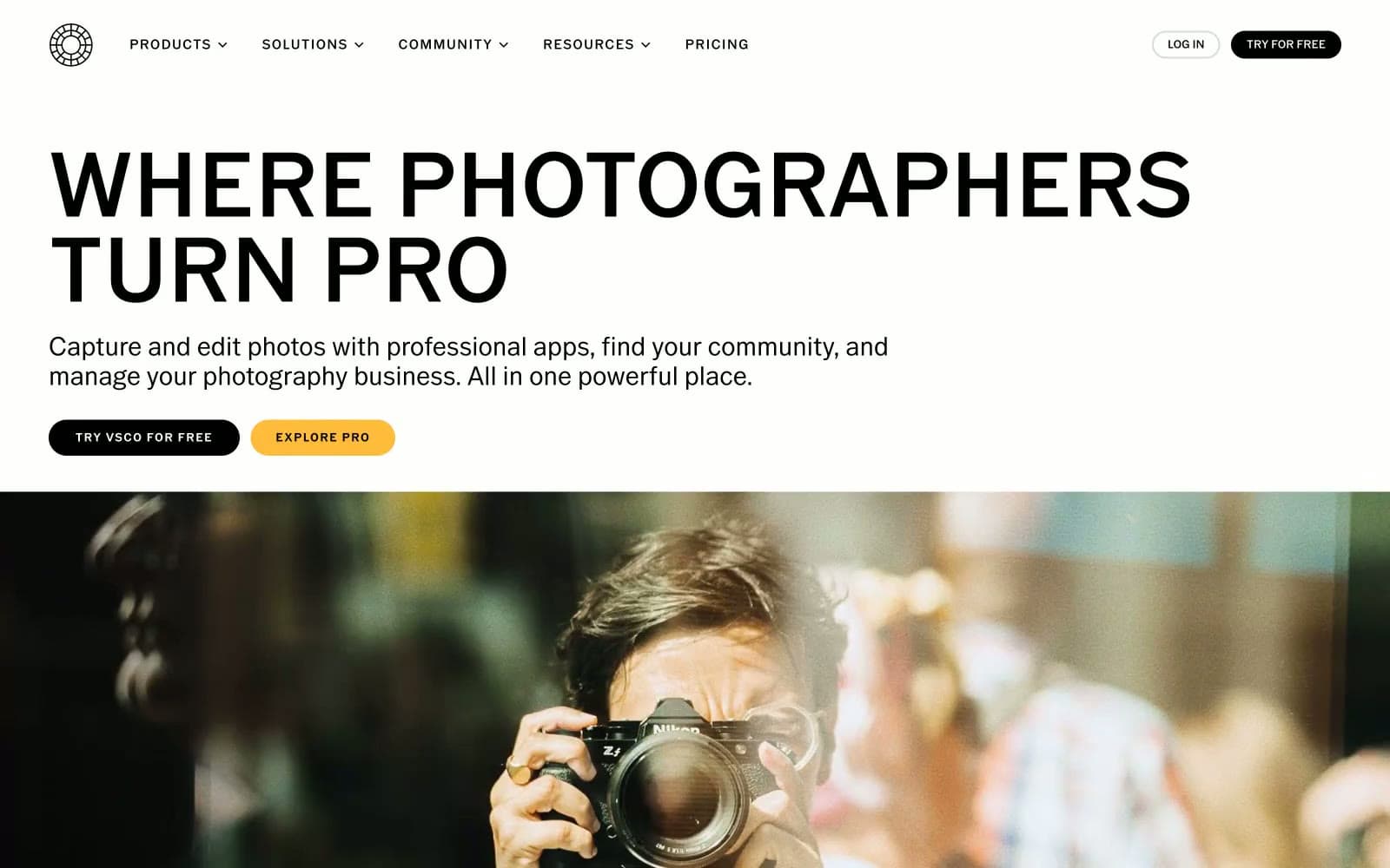
VSCO®
Design tools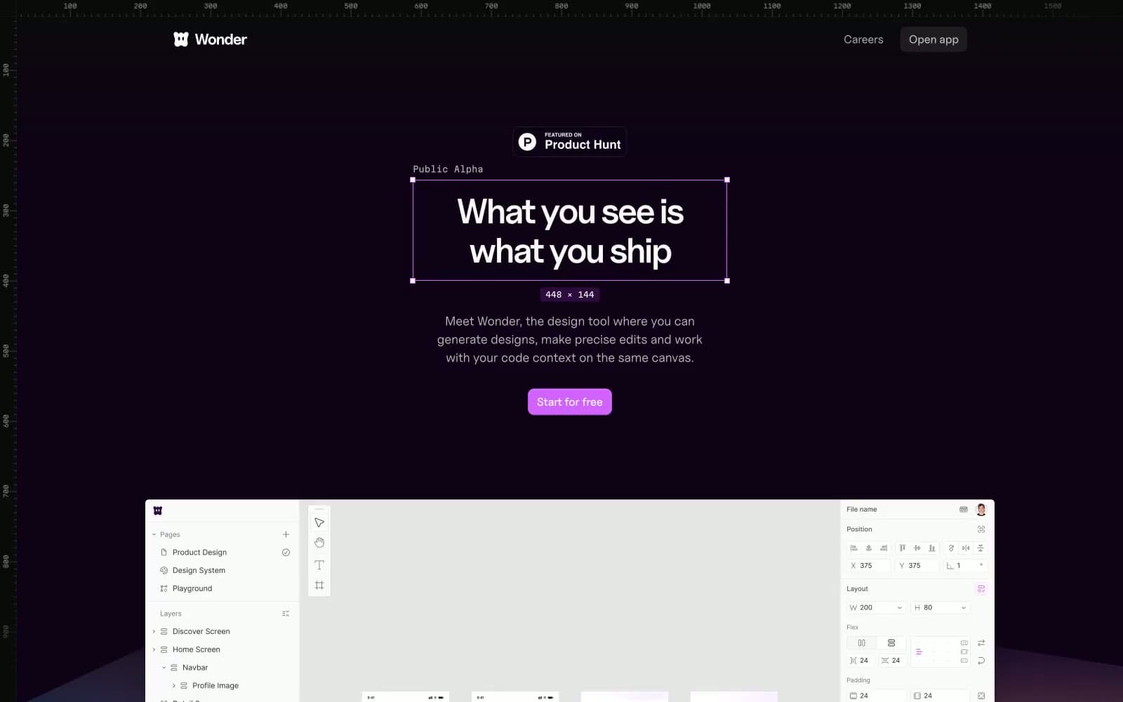
Wonder
Design tools


