
Specify. Black studio wall with neon violet sign.
- Design tools
- Mixed theme
- 15 colors
- 5 typefaces
Specify operates as a dark-to-light narrative canvas: pitch-black hero sections with luminous violet gradient headlines command the top of the page, then flip to clean white surfaces for content and social proof. The visual identity is restrained SaaS geometry — compact 8px-grid spacing, Inter at every weight, subtle dual-layer shadows — with one signal breaking the monochrome: a vivid violet (#624de3) that lives inside text, icon strokes, and a handful of accent fills. Buttons are squat pills (40px radius) rather than the more common 6px chamfer; cards are 16px-rounded; the overall feel is dense, confident, and slightly editorial. The brand voice reads as engineer-adjacent: a product page for people who build design systems, not people who buy them.
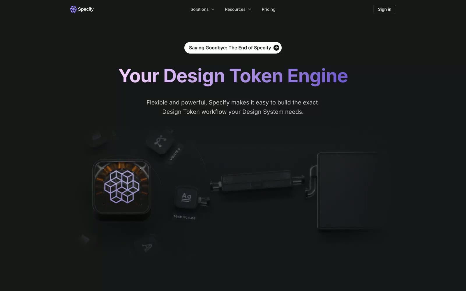
Specify design system

Brand2
Primary brand color — gradient headline text, icon strokes, accent borders, focal links. The only chromatic voice in the system; appears sparingly to make accents feel like punctuation rather than decoration
Gradient tail for the brand violet — the lighter stop in hero headline gradients. Paired with #1d58c0 and #009639 only inside the carousel card color-blocks, not in chrome
Accent5
Carousel testimonial card accent background — appears as a solid color block beside the violet and green variants, not used in chrome
Carousel testimonial card accent background — third slot in the rotating brand color trio. Decorative only
Soft purple-tinted card surface used in the testimonial carousel — echoes the brand violet at 8% saturation
Soft green-tinted card surface in the testimonial carousel — companion to the Fern Pop color block
Soft warm card surface in the testimonial carousel — third pastel slot matching the apricot color block
Neutrals8
Highest-contrast text and the dominant border color across all surfaces. Used where maximum legibility or definition is needed
Hero and section background fill — the deep dark behind the gradient headline and 3D illustration. Slightly cooler/lighter than pure black to keep the violet legible
Primary text, dark filled buttons, body borders, heading strokes. The working near-black that carries 90% of the interface's weight
Secondary text and secondary borders — one step stronger than Graphite for body sub-copy that still needs to recede
Medium-contrast borders, control outlines, and structural separators.
Hairline card and stroke surface, secondary card backgrounds in quiet zones
Soft alternate surface — sits beneath white cards for subtle banding between content sections
Light-theme canvas, card surfaces, button text on dark fills, hero overlay text
Try a pairing
Pick any two colors from the palette to check whether text stays readable on top.
Aa
Pure White on Iris
5.69 : 1 contrast
- Body textPasses AA 4.5
- Large textPasses AA 3
- StrictFails AAA 7
More DESIGN.md files. Same web, different personalities.
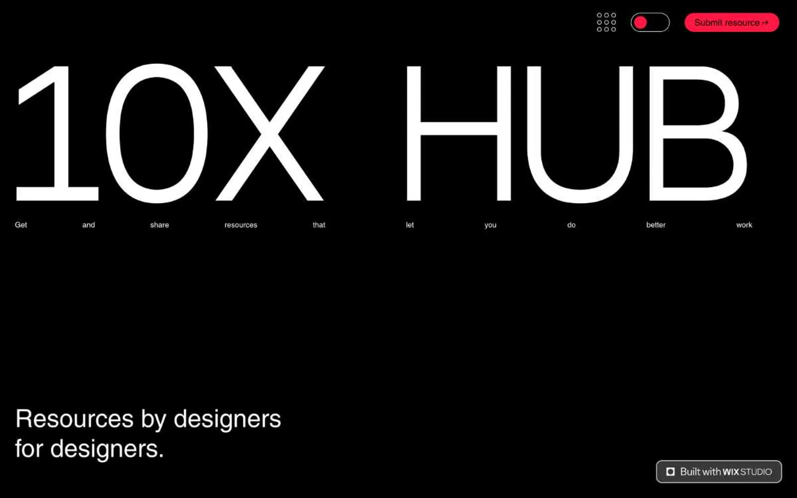
10X HUB
Design tools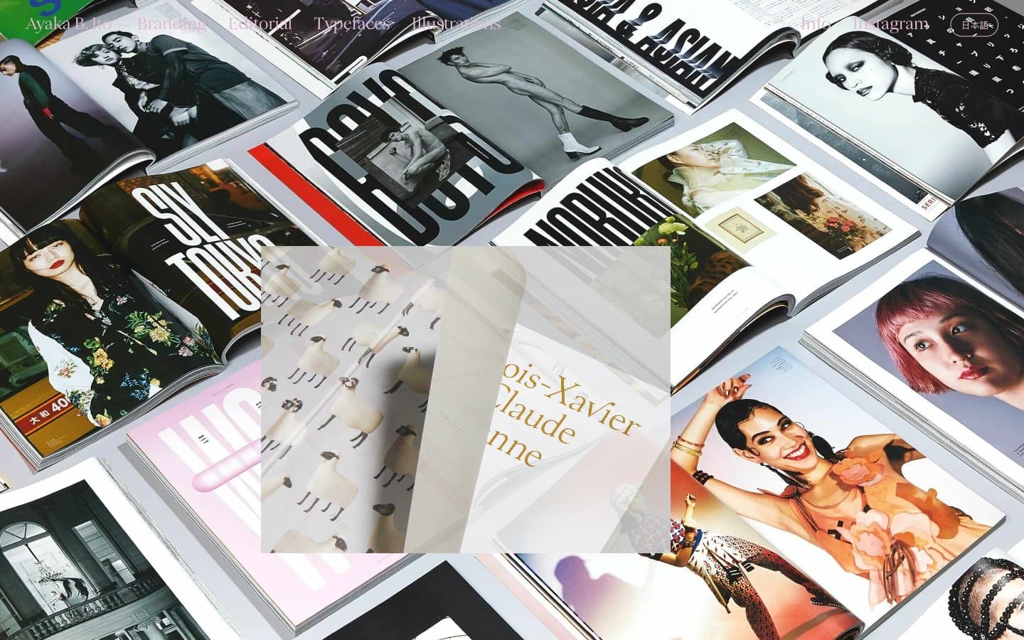
Ayaka B. Ito
Design tools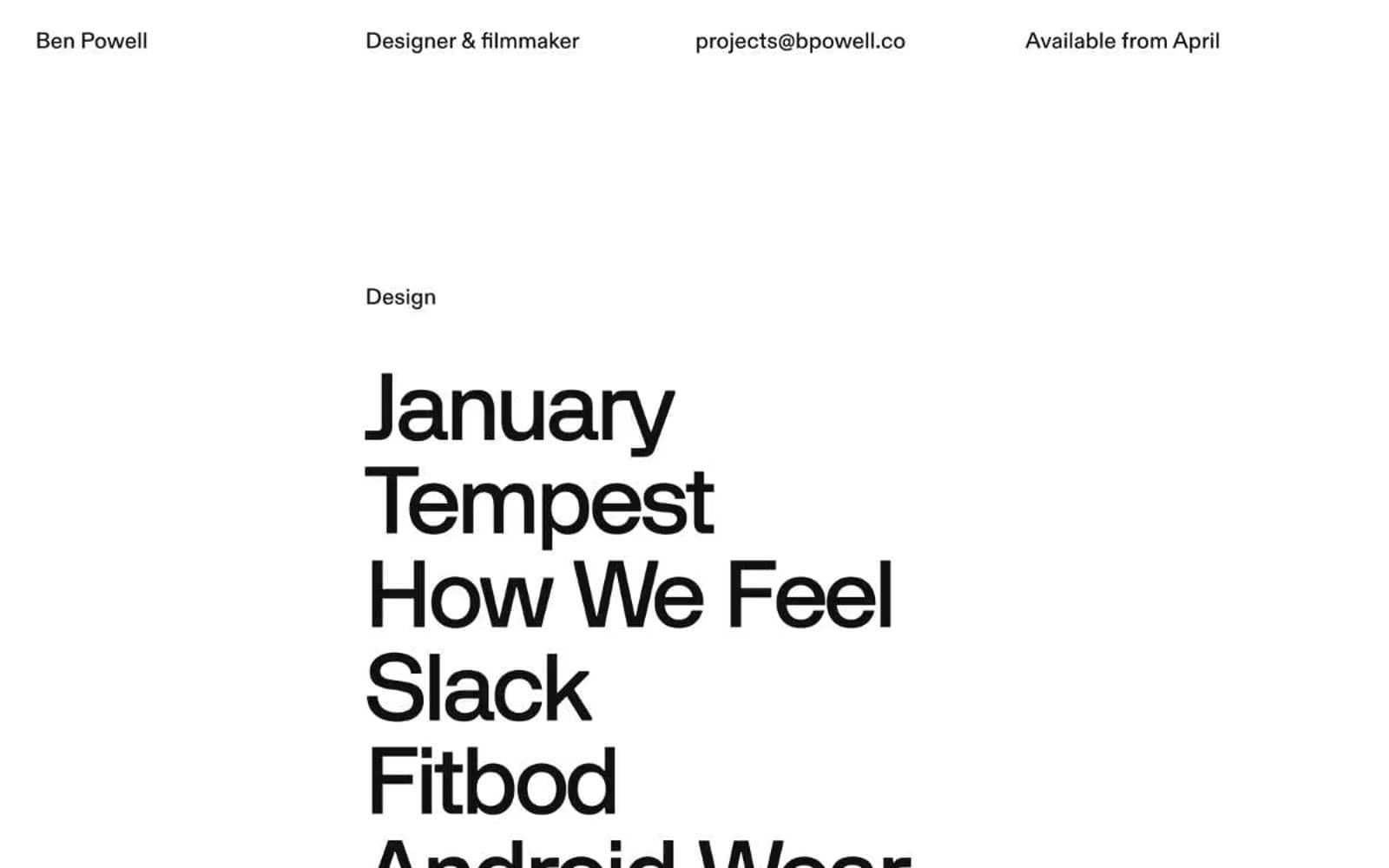
Bpowell
Design tools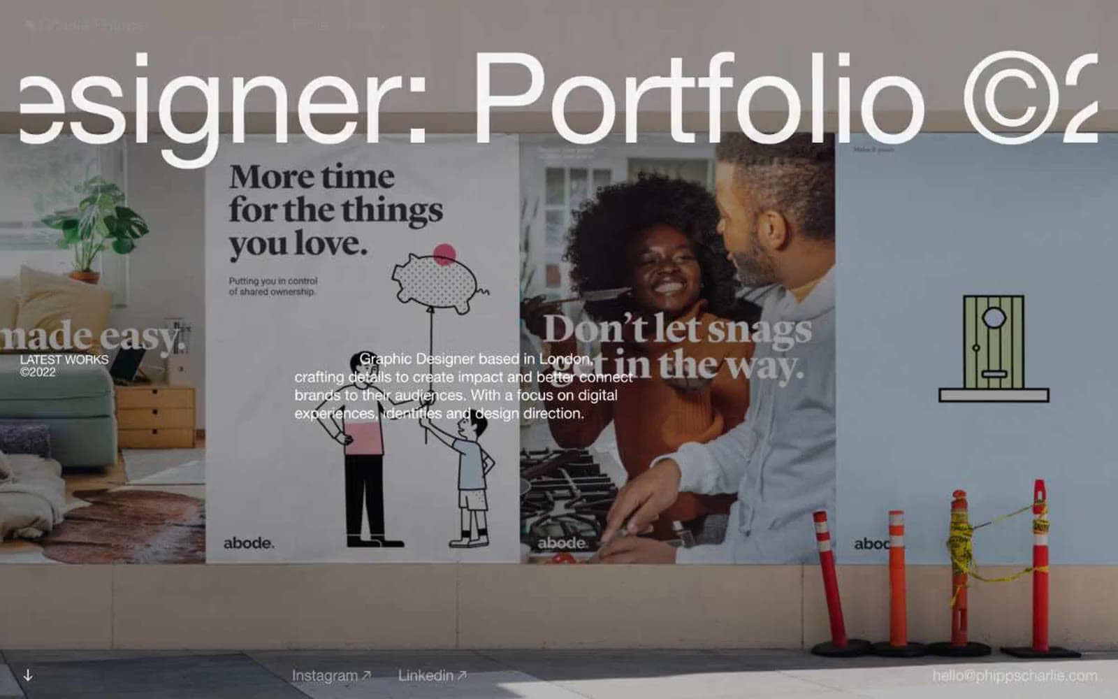
Charlie Phipps
Design tools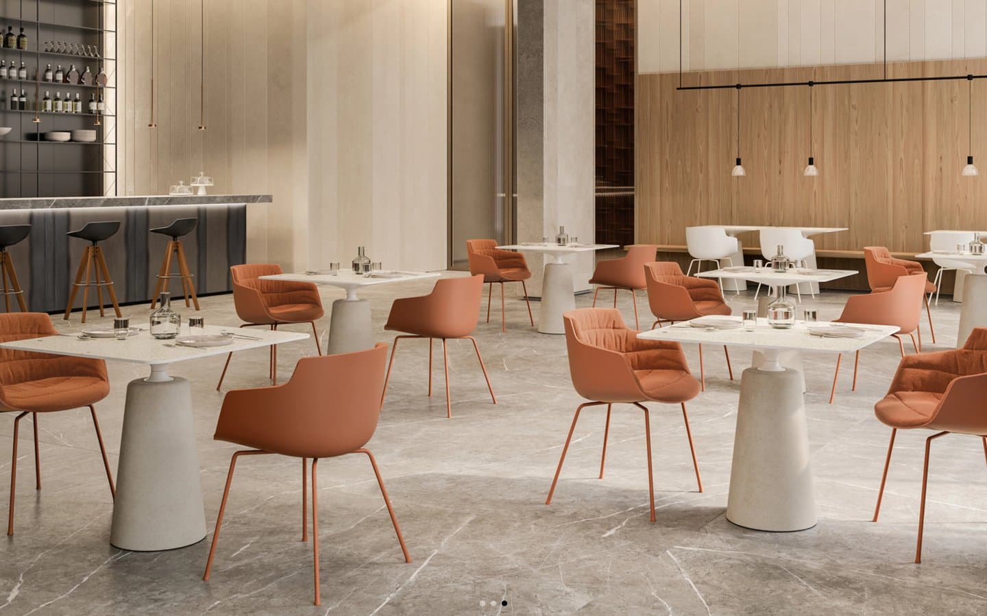
Contract
Design tools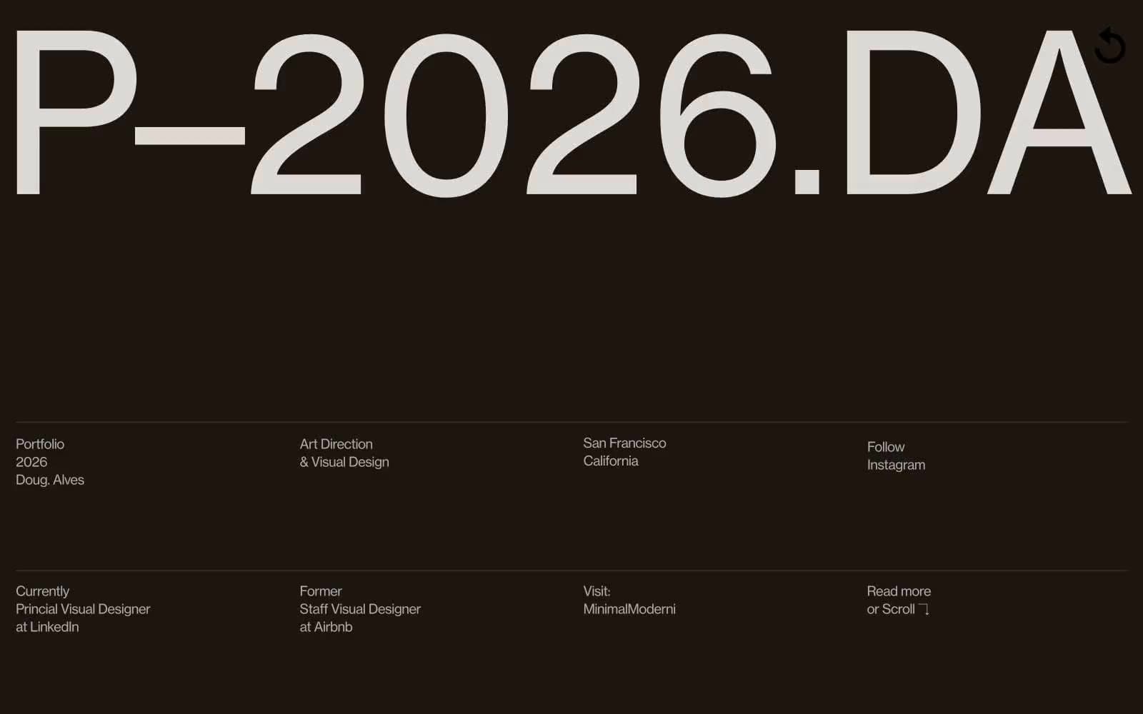
Doug–Alves
Design tools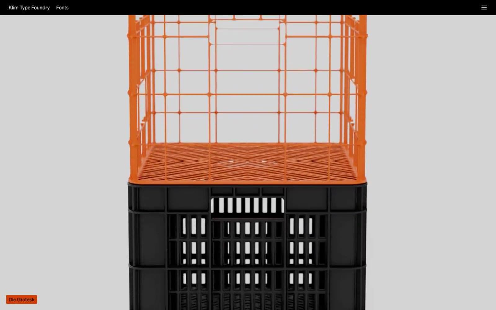
Klim
Design tools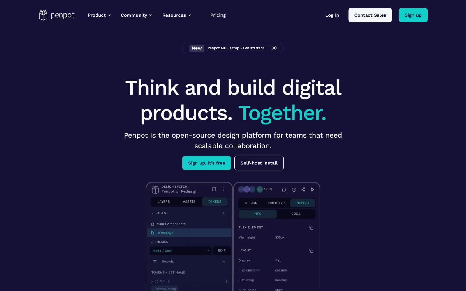
Penpot
Design tools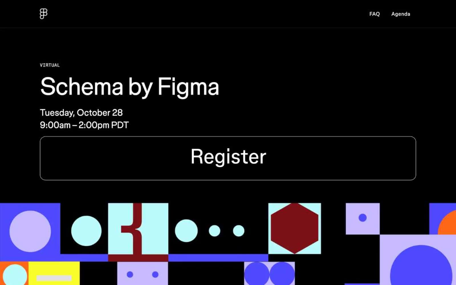
Schema
Design tools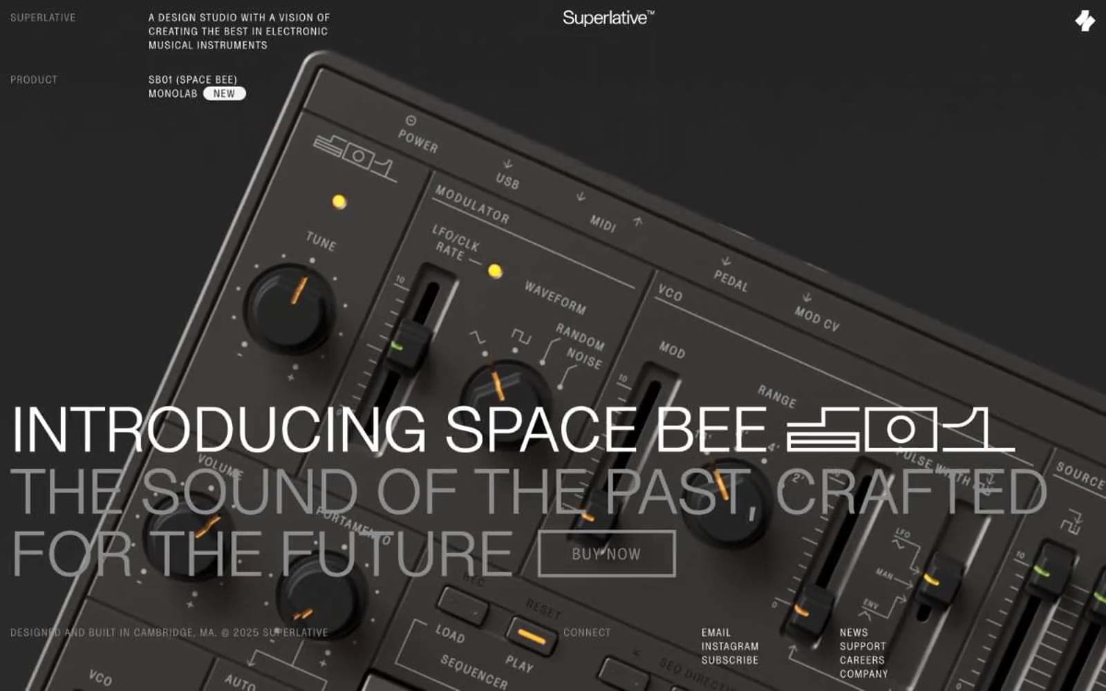
Superlative
Design tools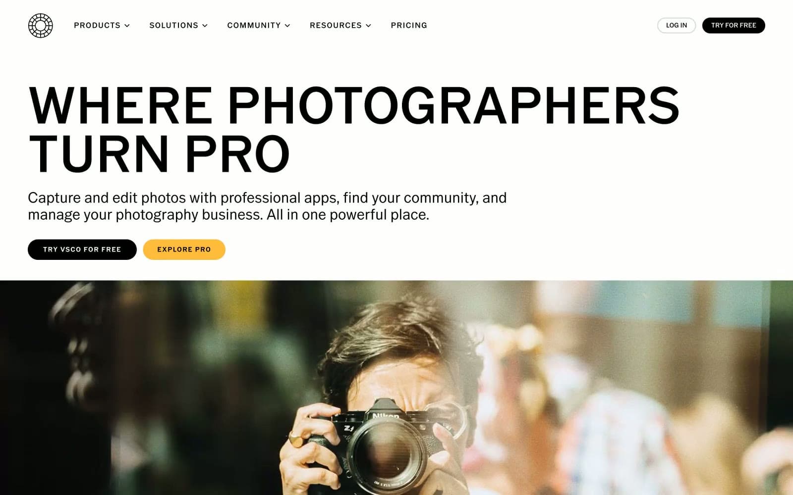
VSCO®
Design tools
Wonder
Design tools


