
Superlative. Industrial product monograph behind studio glass.
- Design tools
- Mixed theme
- 8 colors
- 3 typefaces
Superlative uses an industrial-design monograph language: warm cream canvas, dramatic dark product photography, and large editorial display type that behaves more like a print catalog than a SaaS landing page. Almost all UI is monochrome — the visual interest comes from a single warm ember accent that echoes the LED indicators on the hardware itself, never from decorative gradients or illustration. Components are deliberately sparse and almost sharp — thin 1px borders, tight 3px button radii, 15px gaps — so the product and the typography do the talking. The condensed uppercase labels with wide tracking function as a typographic wiring diagram, identifying every element on screen in the manner of an engineering schematic.
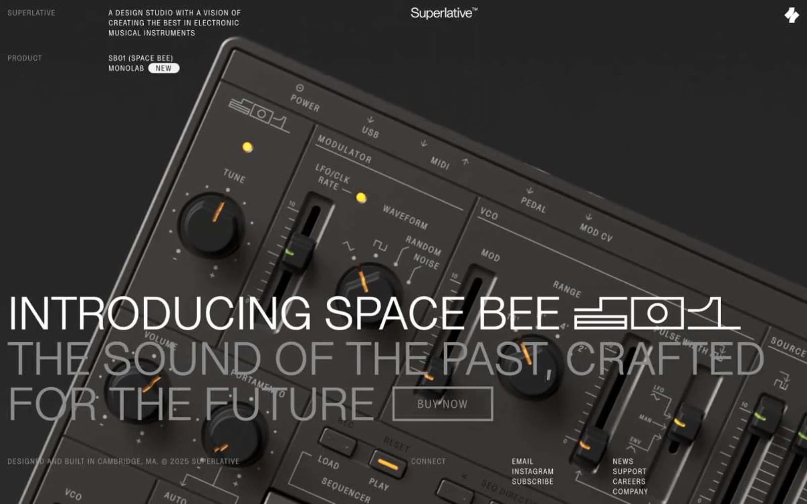
Superlative design system

Accent1
Orange wash for highlight backgrounds, decorative bands, and soft emphasis behind content
Neutrals7
Hairline borders, focus outlines, the deepest void — used as a 1px stroke, never as a fill
Primary text, dark section surfaces, the dominant heading color on light backgrounds
Body text on light backgrounds, secondary text on dark backgrounds — slightly softer than pure ink
Muted metadata text, disabled labels, secondary borders — the middle voice between ink and whisper
Subtle card surfaces, hairline divider washes — one shade darker than the canvas for quiet elevation
Page canvas, light section backgrounds, the warm off-white that defines the brand's paper-like base layer
Text on dark sections, inverted surface highlights, the lightest tone in the system
Try a pairing
Pick any two colors from the palette to check whether text stays readable on top.
Aa
Null on Ember Diode
6.67 : 1 contrast
- Body textPasses AA 4.5
- Large textPasses AA 3
- StrictFails AAA 7
More DESIGN.md files. Same web, different personalities.

10X HUB
Design tools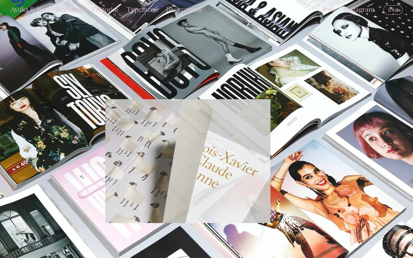
Ayaka B. Ito
Design tools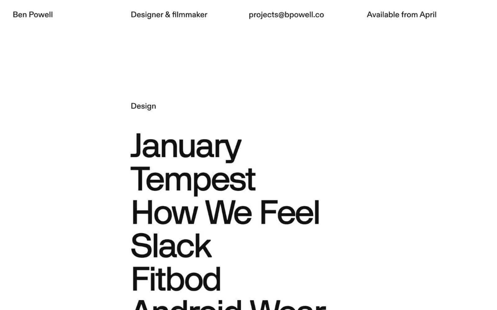
Bpowell
Design tools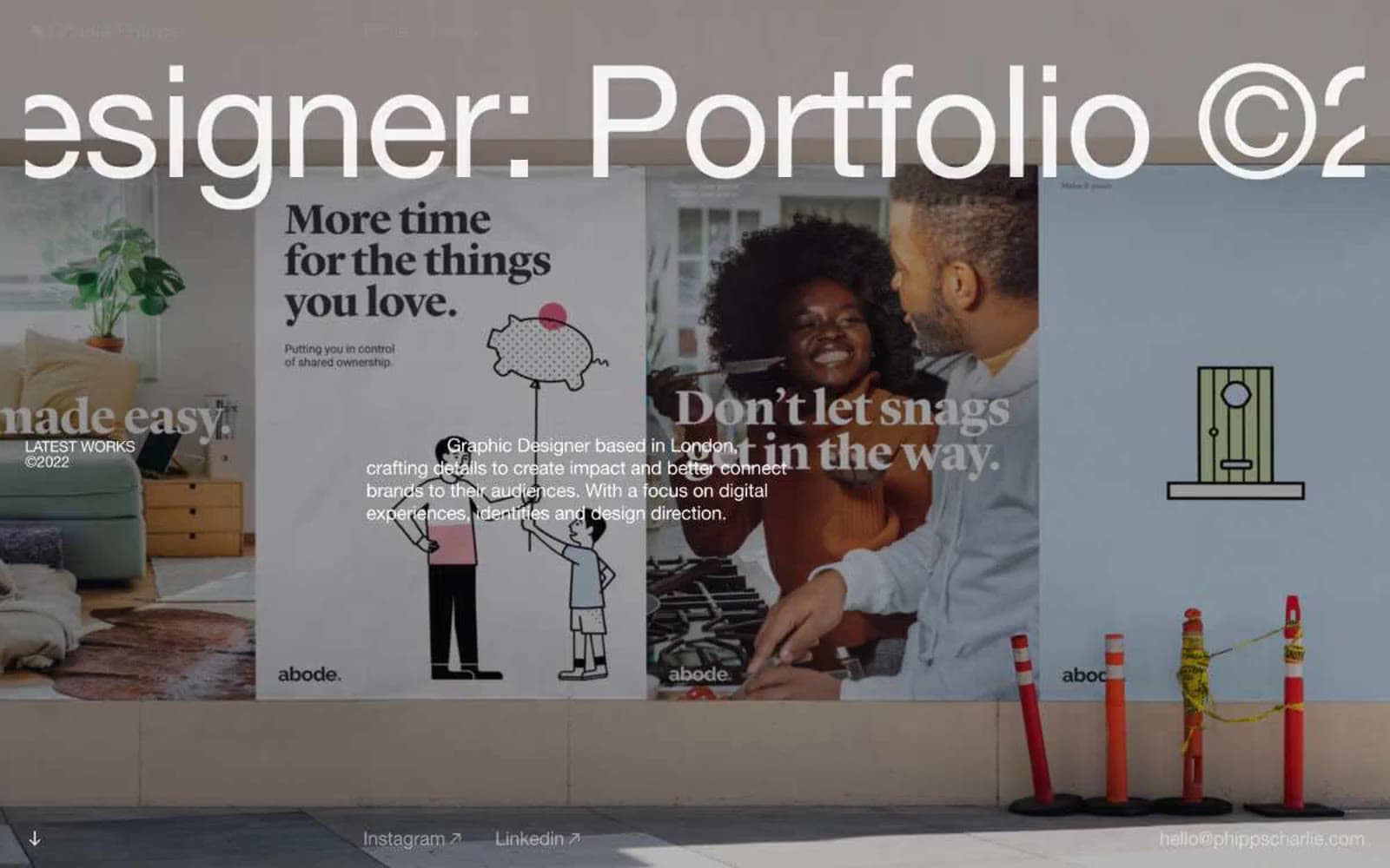
Charlie Phipps
Design tools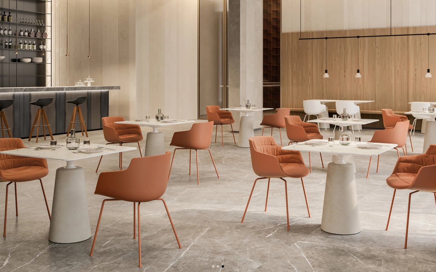
Contract
Design tools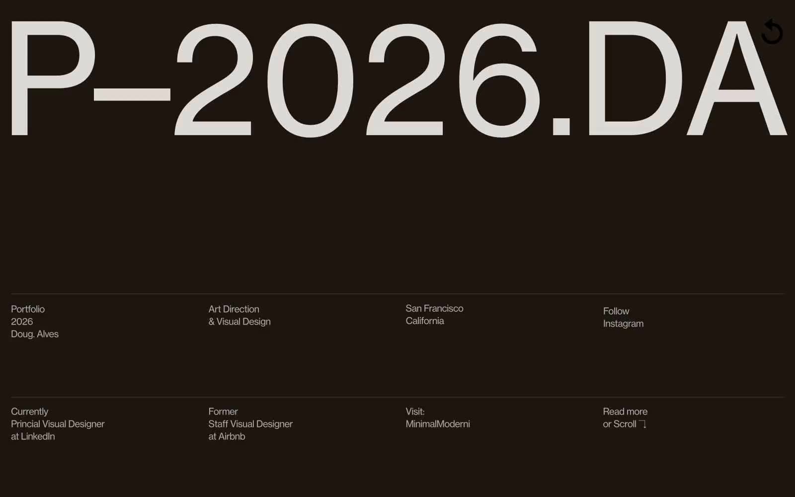
Doug–Alves
Design tools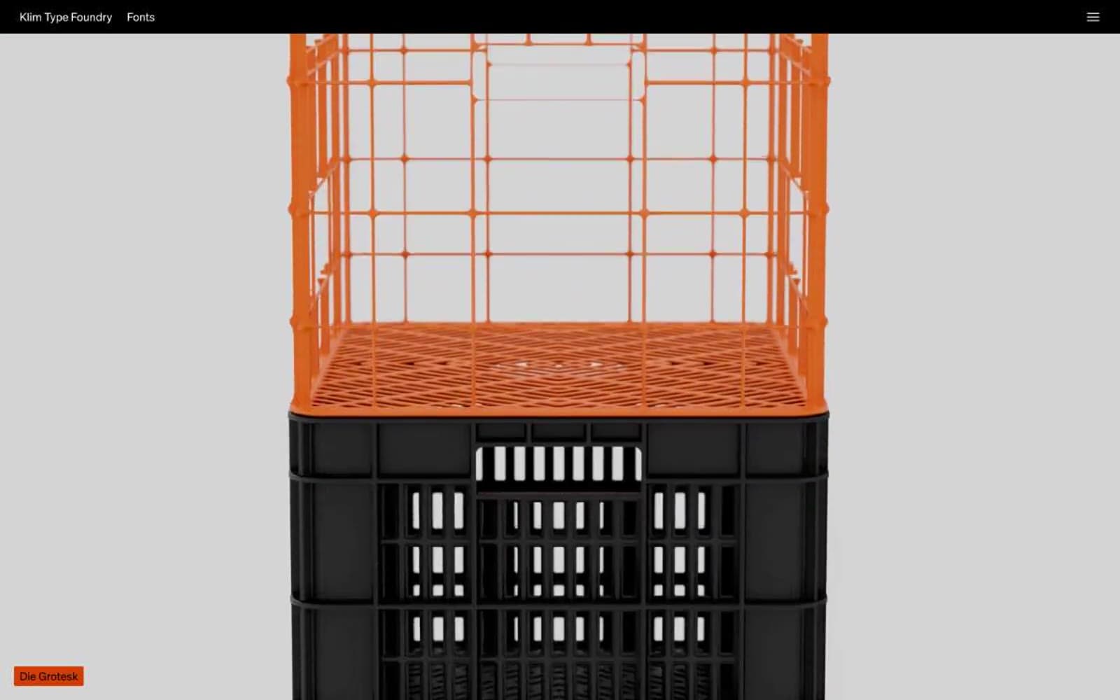
Klim
Design tools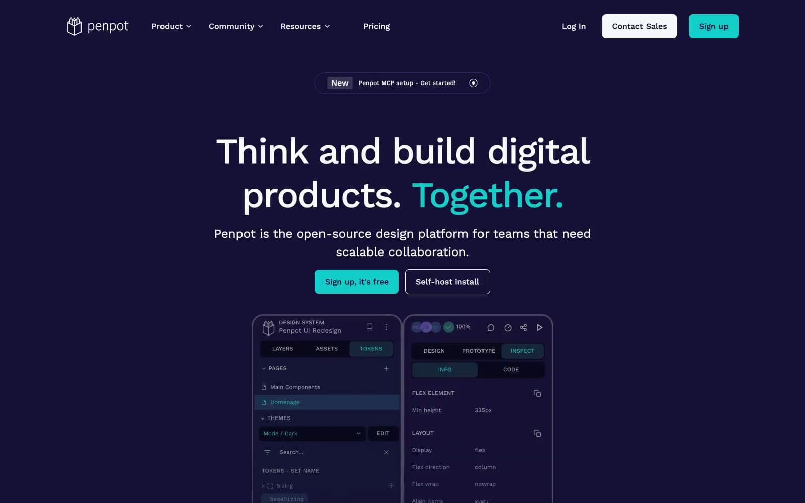
Penpot
Design tools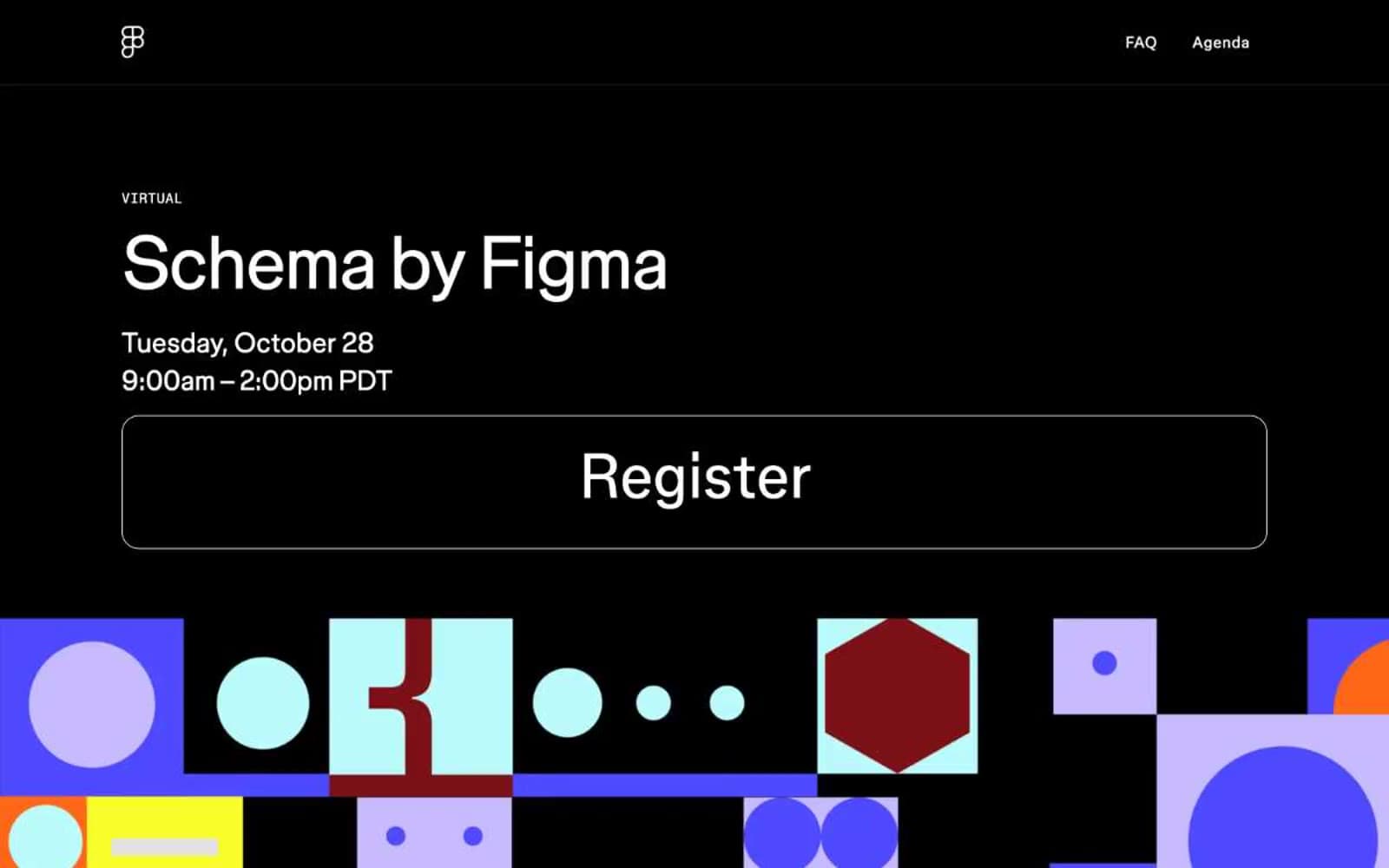
Schema
Design tools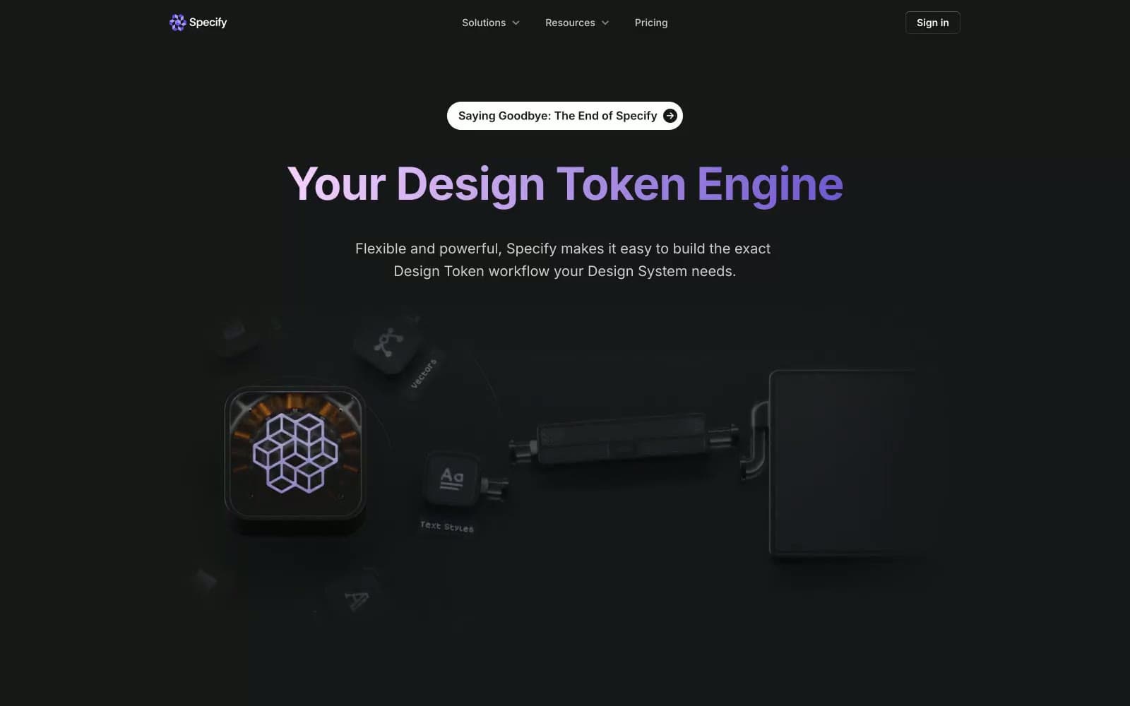
Specify
Design tools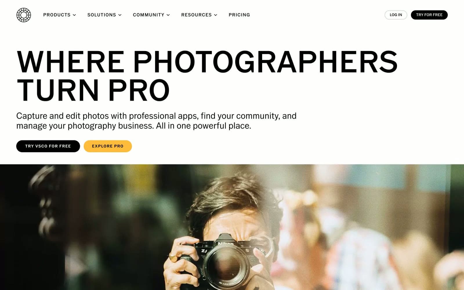
VSCO®
Design tools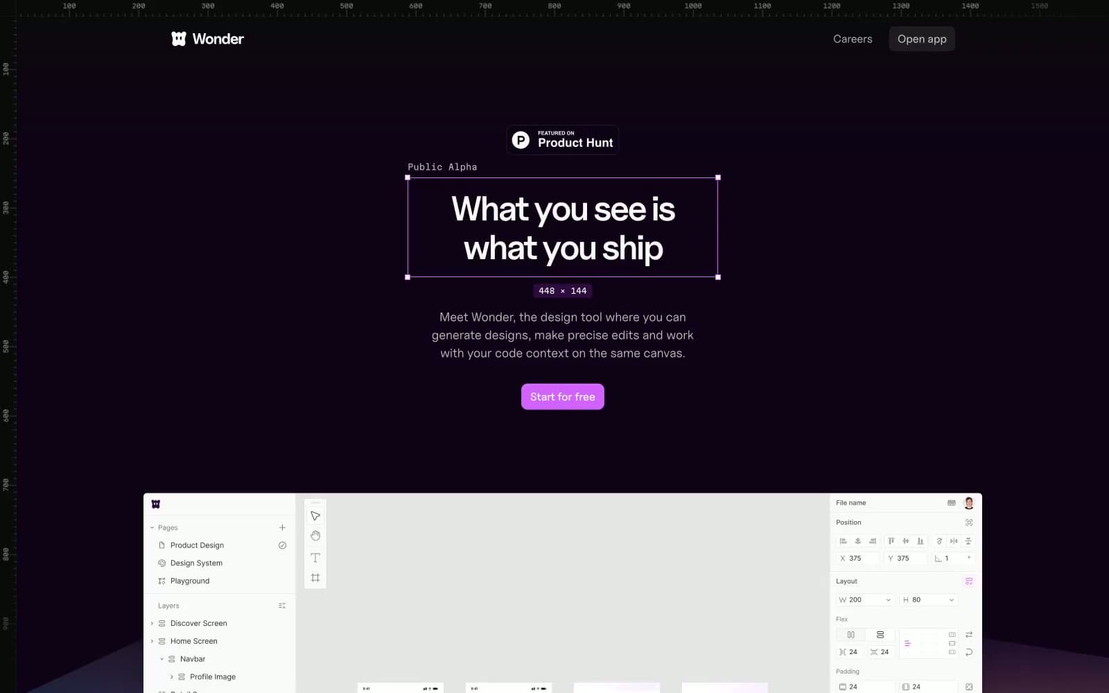
Wonder
Design tools


