
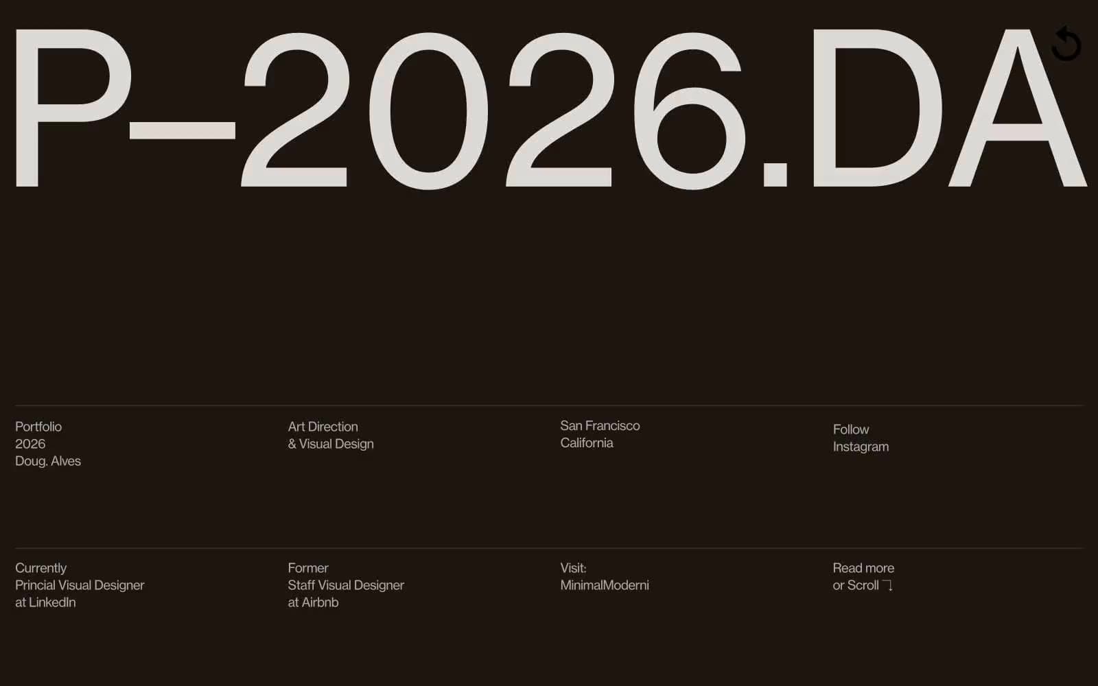
Doug–Alves. Oversized typographic monolith on warm charcoal.
- Design tools
- Mixed theme
- 6 colors
- 5 typefaces
Doug Alves' portfolio treats every viewport like a gallery wall: one massive piece of typographic art dominates the dark hero, then the site steps down into compact, editorial information grids. The palette is ruthlessly achromatic — warm espresso black, bone white, and graphite — with no chromatic accent anywhere; all visual energy comes from type scale and contrast. Headlines run to 197px at weight 300 with aggressive negative tracking, while body copy stays at 16-18px, creating a 10:1 size ratio that makes the whole site feel like a single oversized poster surrounded by fine-print specifications. Layout is full-bleed with sections switching between warm-dark and white, and information always arranges into crisp multi-column grids separated by hairline graphite rules.
Doug–Alves design system

Neutrals6
Display headings on light sections and pure-black accents — used sparingly for maximum impact on the white About and Latest sections
Hero and dark section background — warm-tinted near-black reads as architectural, not as raw #000, giving the oversized display type a gallery-wall feel
Primary body text, structural borders, section dividers — the workhorse neutral that draws the hairline rules and most interface lines
Secondary body and heading text — slightly lighter than Graphite, used for headings and emphasized body copy where Graphite is reserved for borders
Warm off-white page canvas — subtle pink-ivory tint replaces plain white as the base, keeping the entire palette on the warm side of neutral
Content section surfaces and inverted text on dark hero — the bright surface that the warm espresso sections cut against
Try a pairing
Pick any two colors from the palette to check whether text stays readable on top.
Aa
Paper on Obsidian
21.00 : 1 contrast
- Body textPasses AA 4.5
- Large textPasses AA 3
- StrictPasses AAA 7
More DESIGN.md files. Same web, different personalities.

10X HUB
Design tools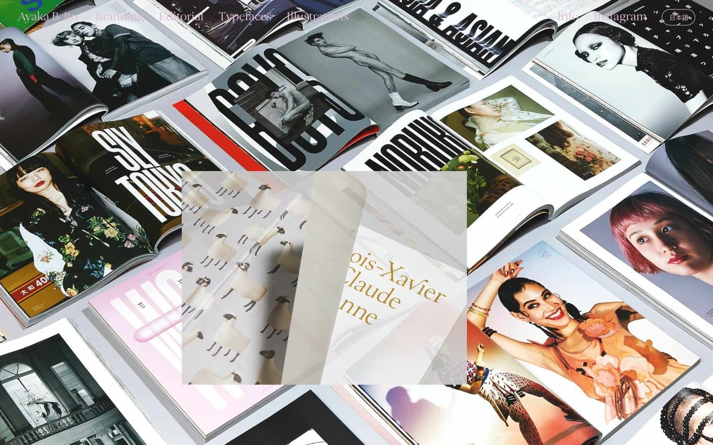
Ayaka B. Ito
Design tools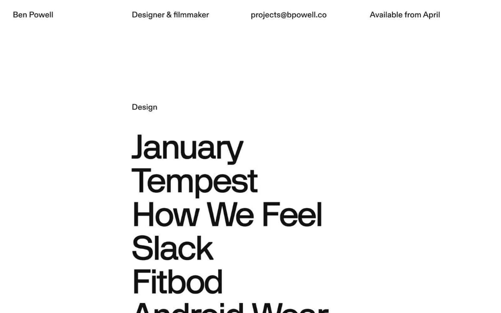
Bpowell
Design tools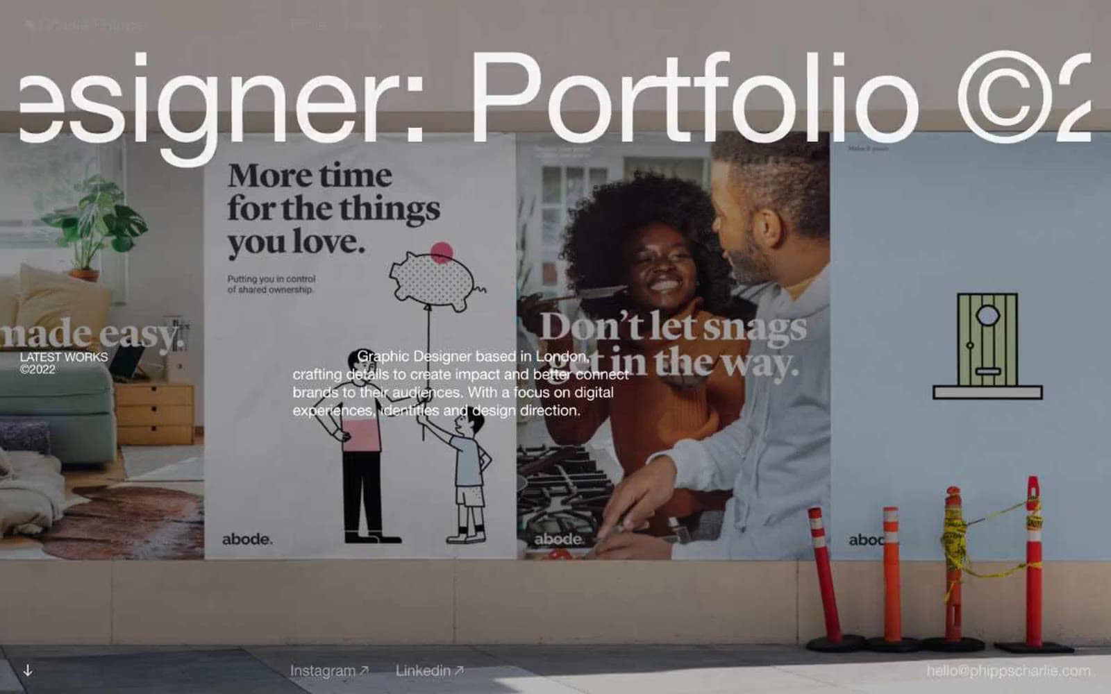
Charlie Phipps
Design tools
Contract
Design tools
Klim
Design tools
Penpot
Design tools
Schema
Design tools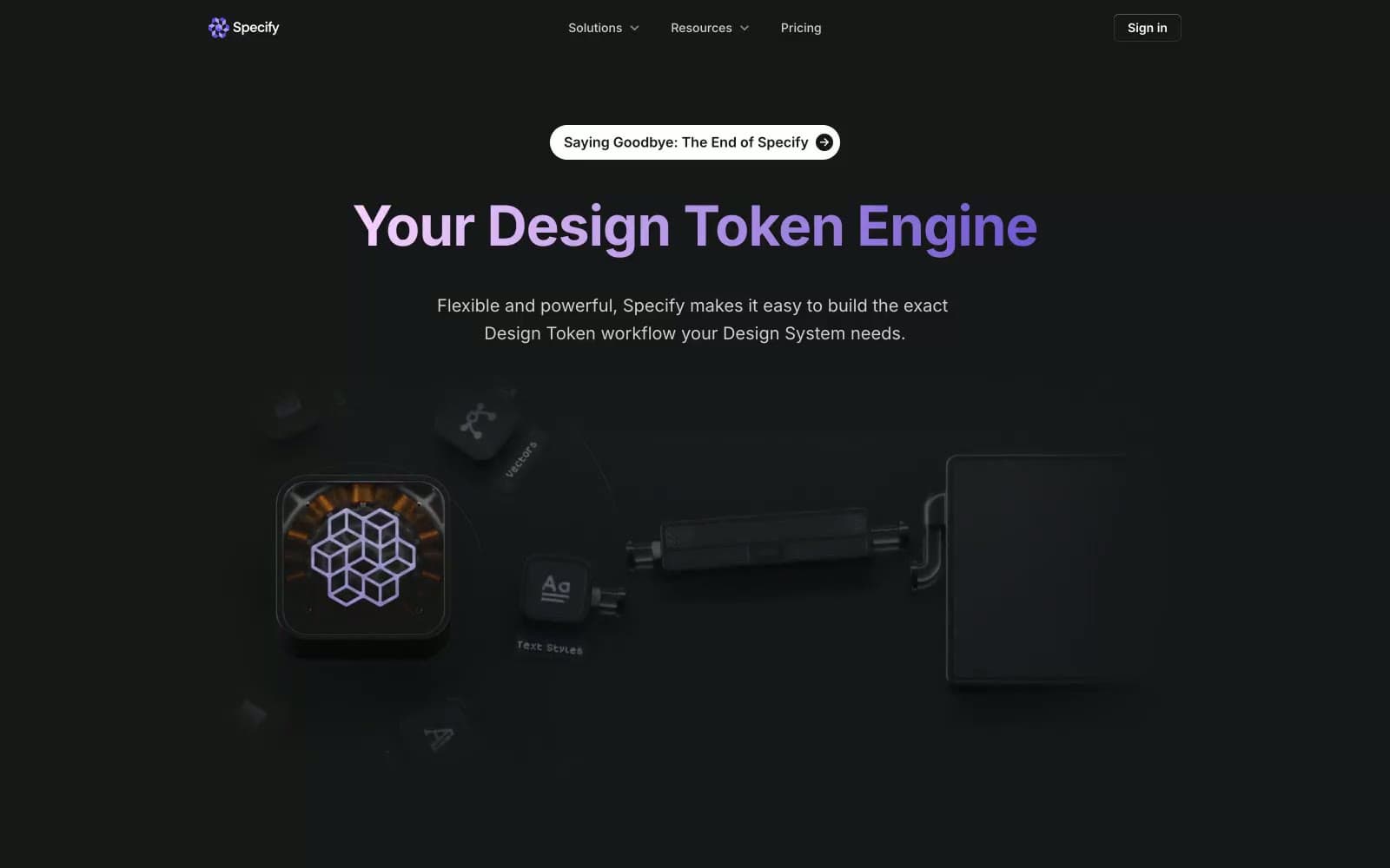
Specify
Design tools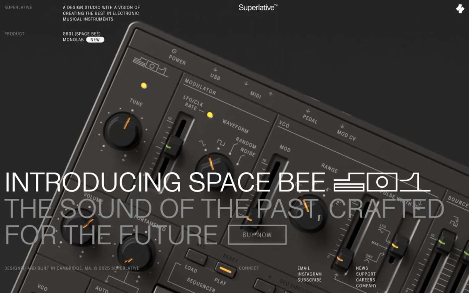
Superlative
Design tools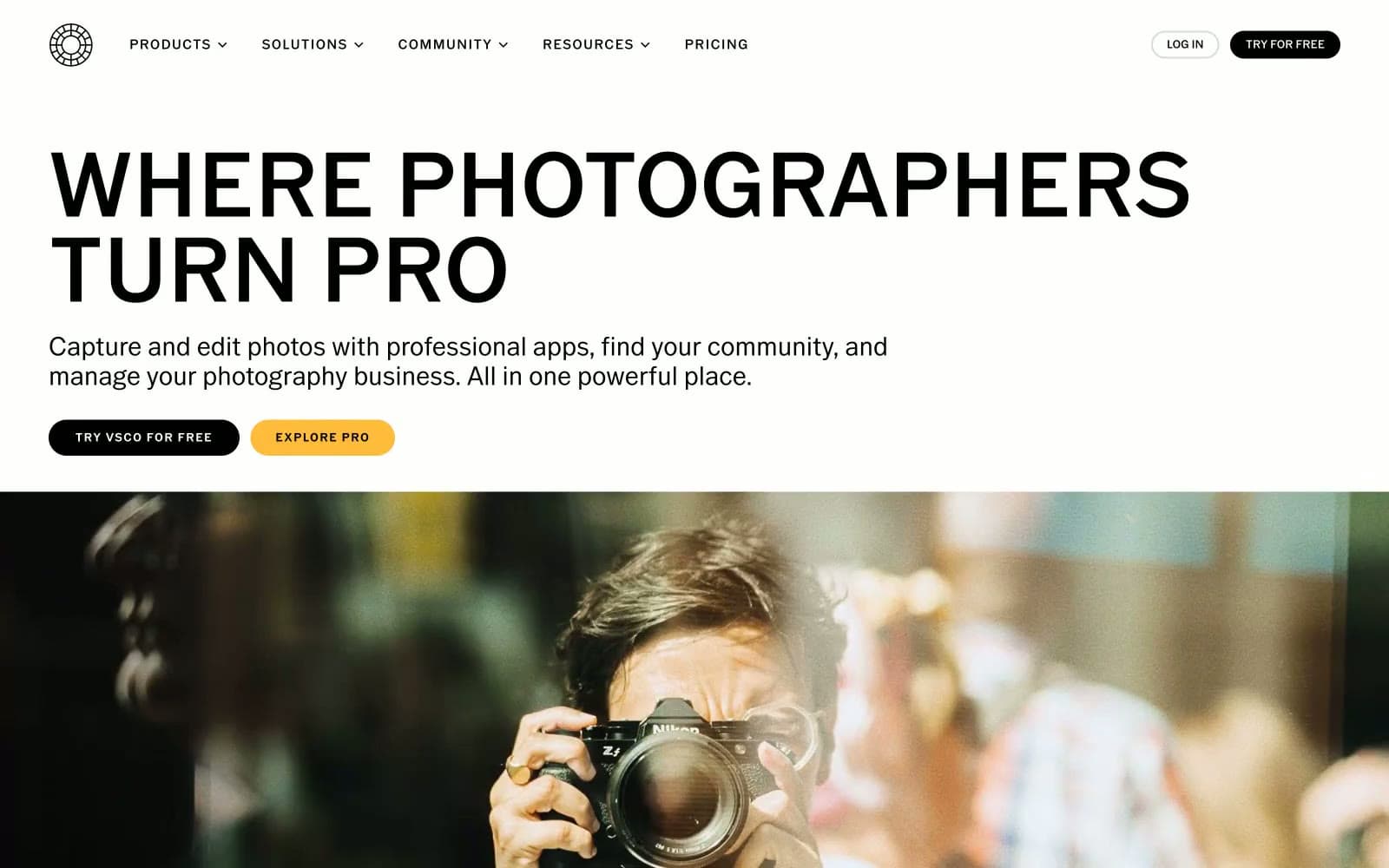
VSCO®
Design tools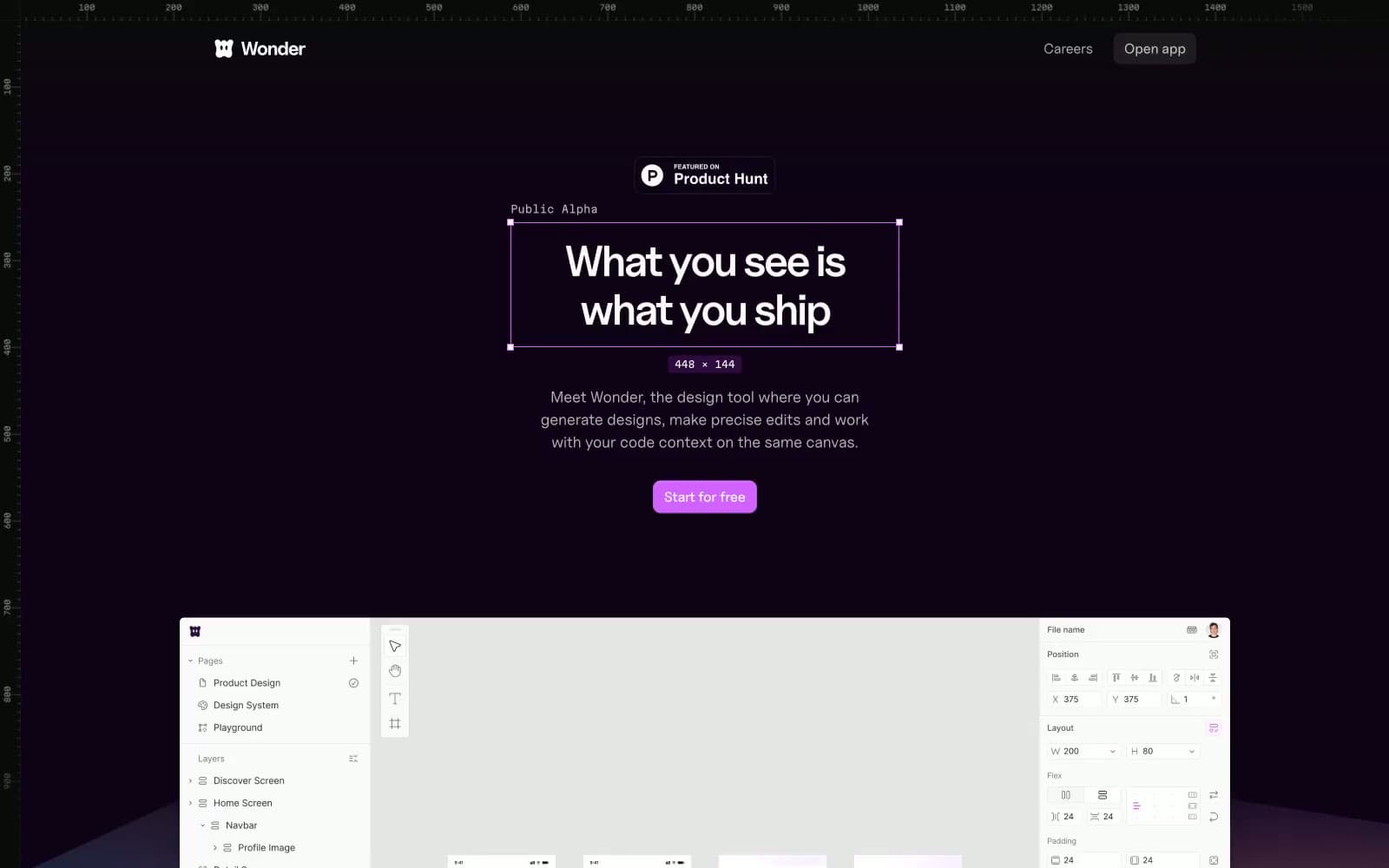
Wonder
Design tools


