
Schema. Ink-black keynote stage with confetti-bright murals.
- Design tools
- Mixed theme
- 6 colors
- 6 typefaces
Schema by Figma runs on a stark monochrome architecture punctured by bold flat-color geometric murals. The UI uses pure black, near-black, and white with hairline gray borders — no shadows, minimal radii, no chromatic accents in the interface itself. Color appears only as decorative art (circles, hexagons, rectangles in purple, teal, maroon, green, orange) and as solid-background speaker portraits. Typography is the loudest element: Figma's custom display face at 56–86px with extreme negative tracking (-0.02em) and tight 0.90 line-height makes headlines feel carved rather than typeset. The hero inverts convention with a black canvas and an oversized outlined Register button; content sections then alternate through full-bleed colored bands before resolving into a clean white speaker grid.
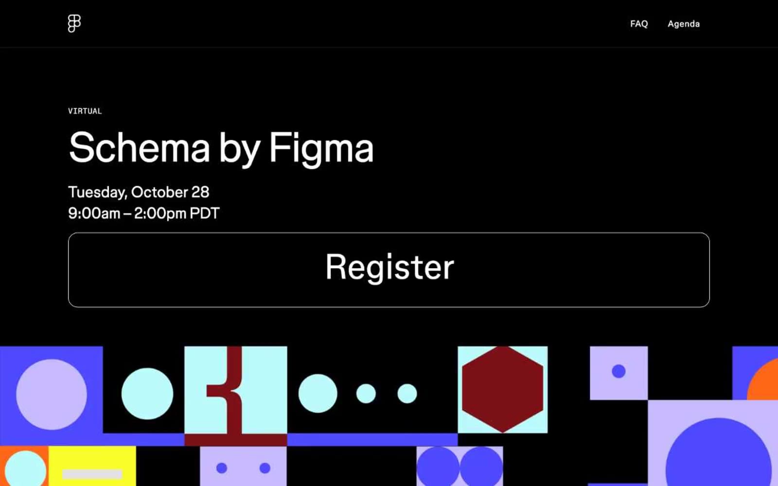
Schema design system

Accent2
Teal wash for highlight backgrounds, decorative bands, and soft emphasis behind content. Do not promote it to the primary CTA color
Full-bleed accent section background — a bright green horizontal band that closes the hero composition
Neutrals4
Hero canvas, heavy structural borders, icon strokes — sets the high-contrast keynote-stage mood for the opening fold
Body and heading text on light surfaces, dark section borders
Hairline borders, subtle icon fills, structural dividers between UI regions
Page background, speaker card surfaces, light-section text on dark hero
Try a pairing
Pick any two colors from the palette to check whether text stays readable on top.
Aa
Obsidian on Mint Wash
18.25 : 1 contrast
- Body textPasses AA 4.5
- Large textPasses AA 3
- StrictPasses AAA 7
More DESIGN.md files. Same web, different personalities.
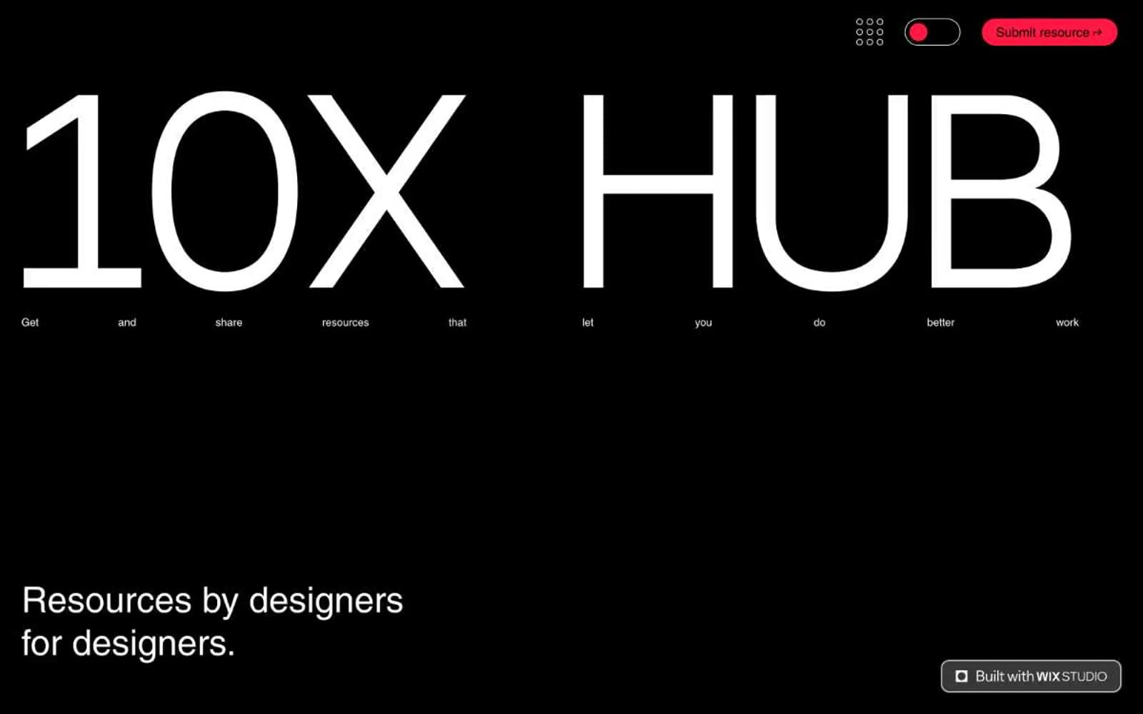
10X HUB
Design tools
Ayaka B. Ito
Design tools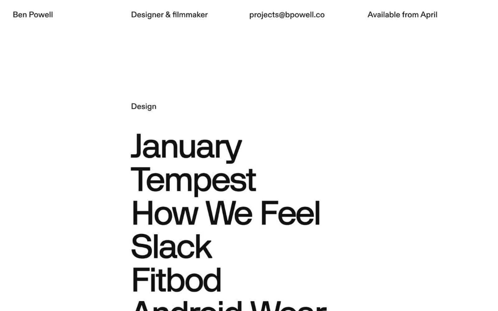
Bpowell
Design tools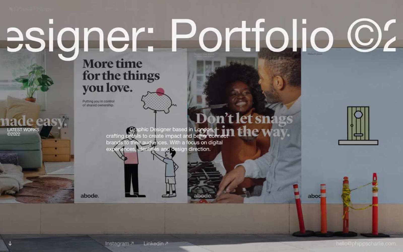
Charlie Phipps
Design tools
Contract
Design tools
Doug–Alves
Design tools
Klim
Design tools
Penpot
Design tools
Specify
Design tools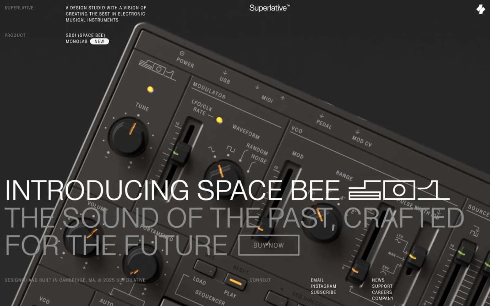
Superlative
Design tools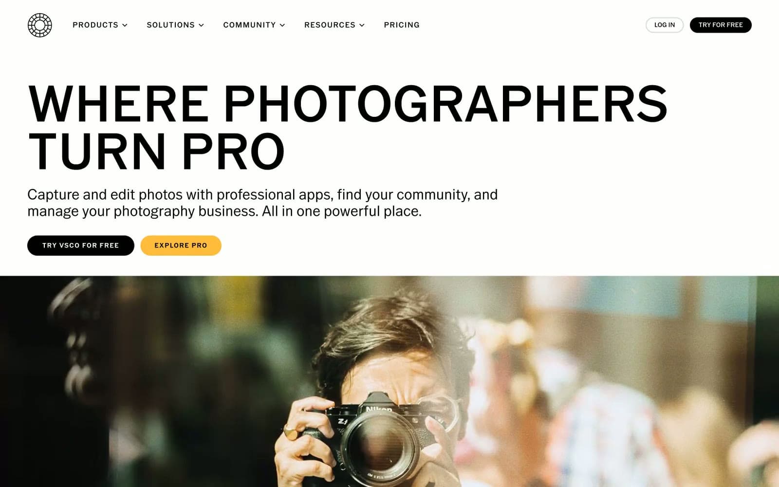
VSCO®
Design tools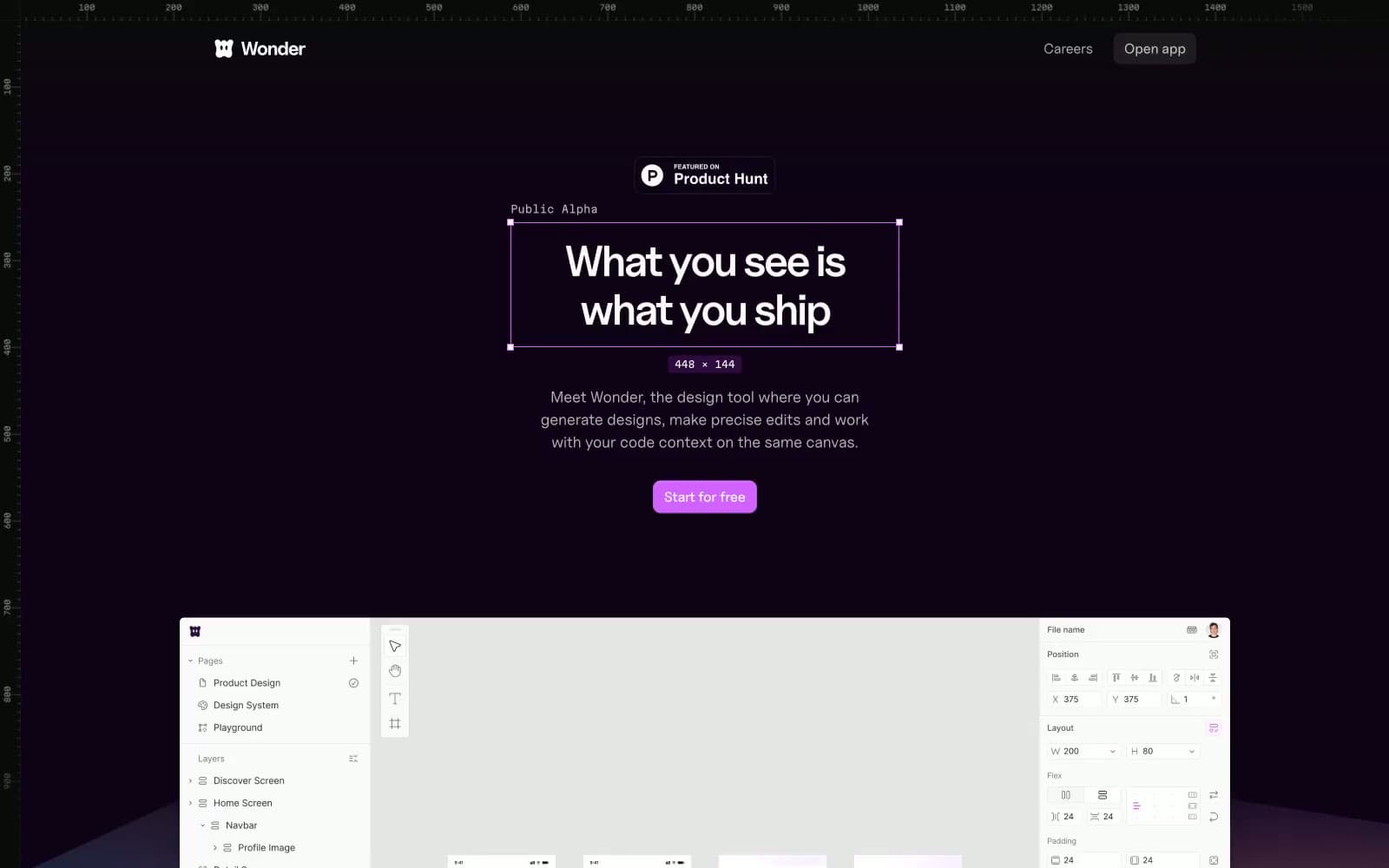
Wonder
Design tools


