
VSCO®. A black-and-white photo exhibition where a single warm spotlight makes the next action glow.
- Design tools
- Mixed theme
- 9 colors
- 1 typeface
VSCO's visual system reads as a monochrome photography gallery: a near-pure black-and-white canvas where a single warm amber accent punctuates action. Display type is narrow, geometric, and enormous — hero headlines push 89-98px, commanding attention through scale and tight tracking rather than through color or ornament. The palette stays disciplined: white sections frame black product bands, and full-bleed photography carries emotional weight that decoration never tries to. Buttons are pill-shaped and unflinching — black fills for default actions, amber for the single moment of warmth. The design is deliberately flat: no shadows, no gradients, no skeuomorphic depth. Elevation comes from surface contrast (white → black bands) and image bleed, not from layered depth effects.
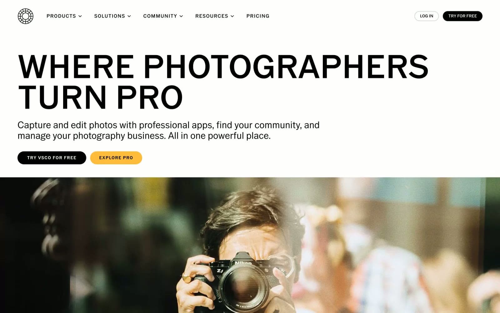
VSCO® design system

Brand2
Yellow supporting accent for decorative details and low-frequency emphasis. Do not promote it to the primary CTA color
Lighter amber variant for hover states, secondary accent surfaces — same hue family, one step lighter
Neutrals7
Body text, filled buttons, dark section backgrounds, nav text, borders, icon strokes — the dominant structural color across all surfaces
Secondary text, footer link text, muted labels — the first step down from body black
Mid-gray auxiliary text and borders
Tertiary text, lighter secondary labels, disabled-adjacent text
Borders on ghost/outline buttons, subtle dividers, placeholder text
Subtle alternate section backgrounds, hairline washes — barely-there surface differentiation
Page canvas, hero background, footer background, text on dark surfaces, nav fill — the primary light surface
Try a pairing
Pick any two colors from the palette to check whether text stays readable on top.
Aa
Photo Black on Amber
10.42 : 1 contrast
- Body textPasses AA 4.5
- Large textPasses AA 3
- StrictPasses AAA 7
More DESIGN.md files. Same web, different personalities.
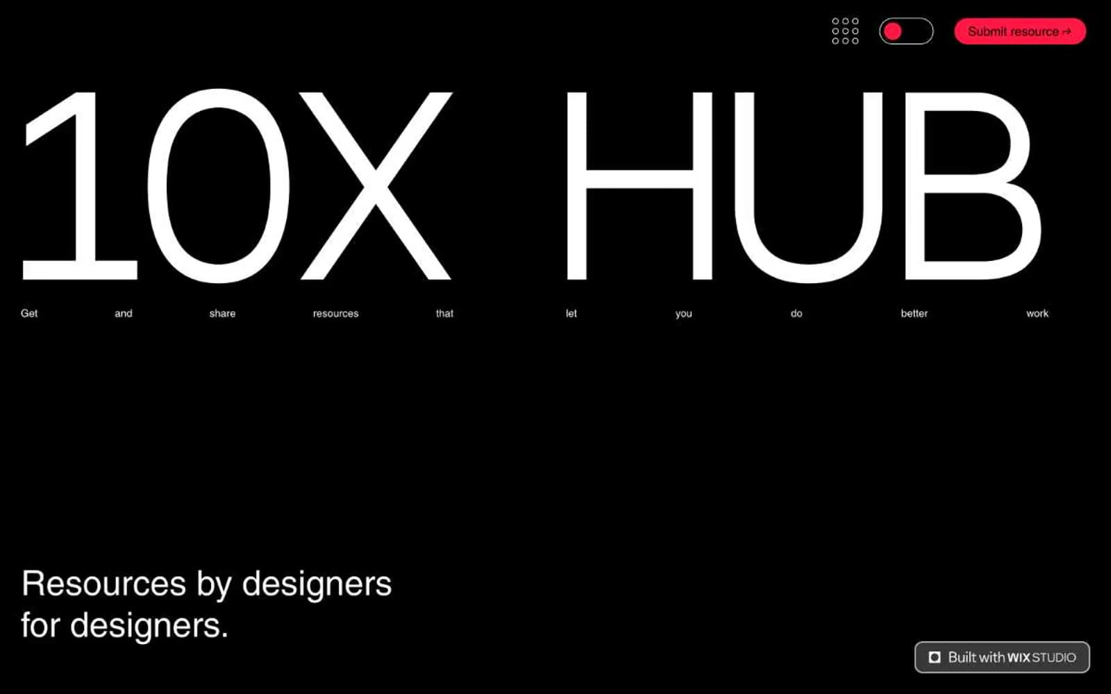
10X HUB
Design tools
Ayaka B. Ito
Design tools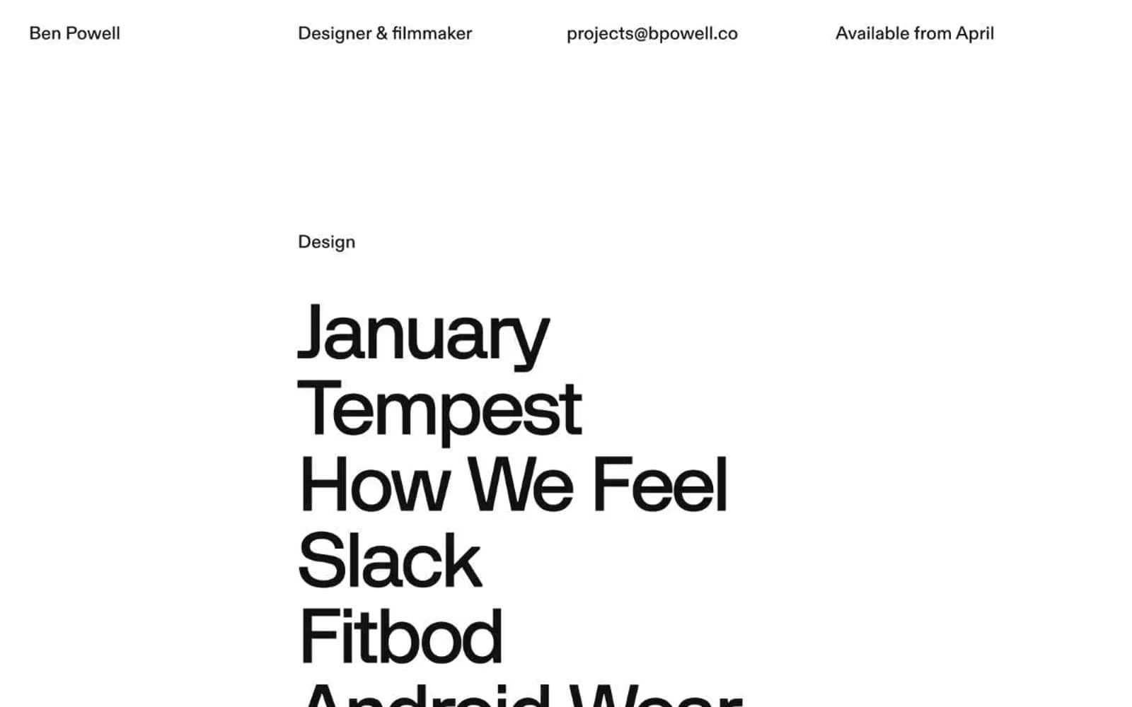
Bpowell
Design tools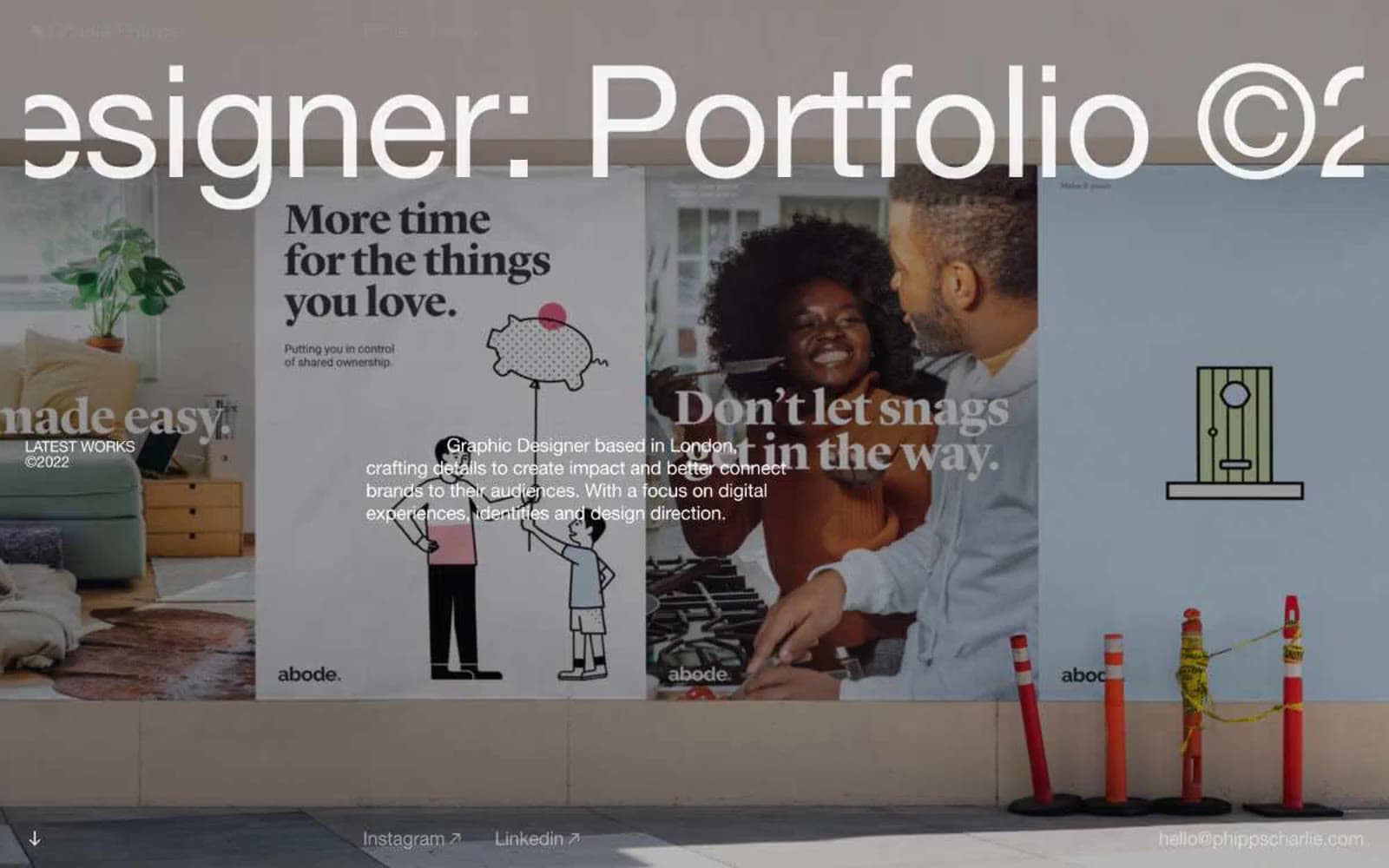
Charlie Phipps
Design tools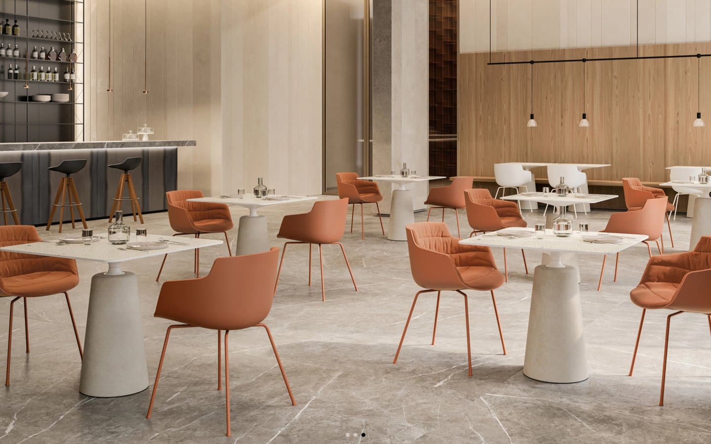
Contract
Design tools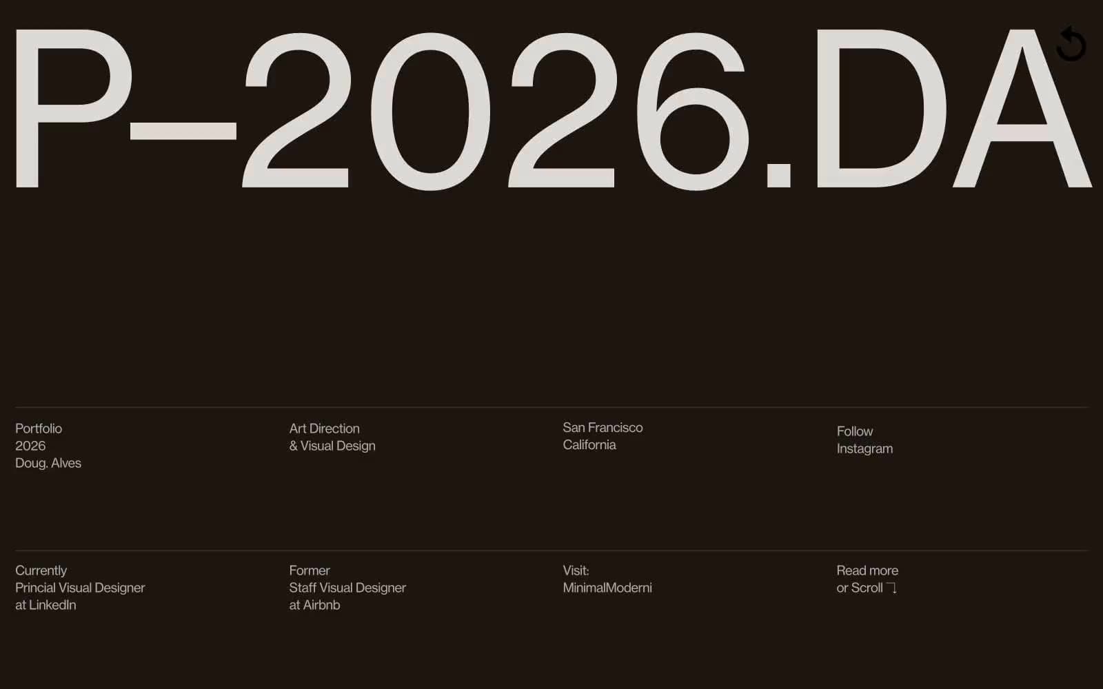
Doug–Alves
Design tools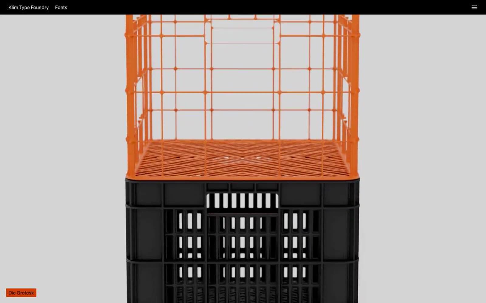
Klim
Design tools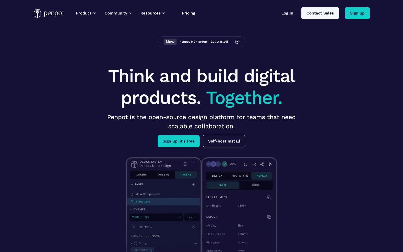
Penpot
Design tools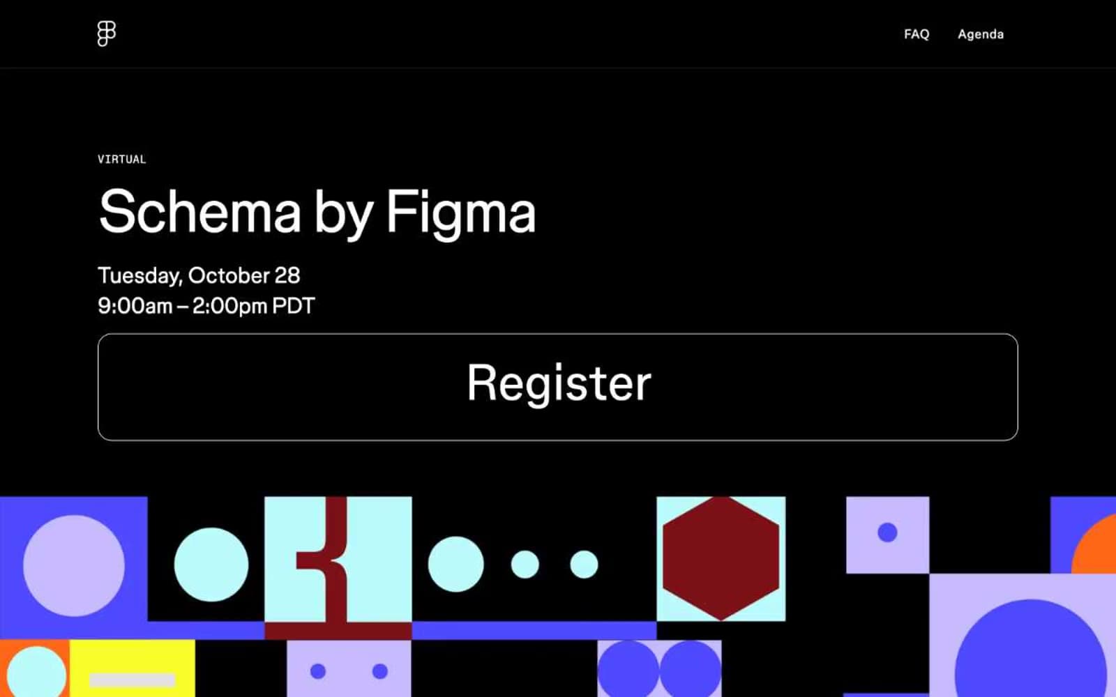
Schema
Design tools
Specify
Design tools
Superlative
Design tools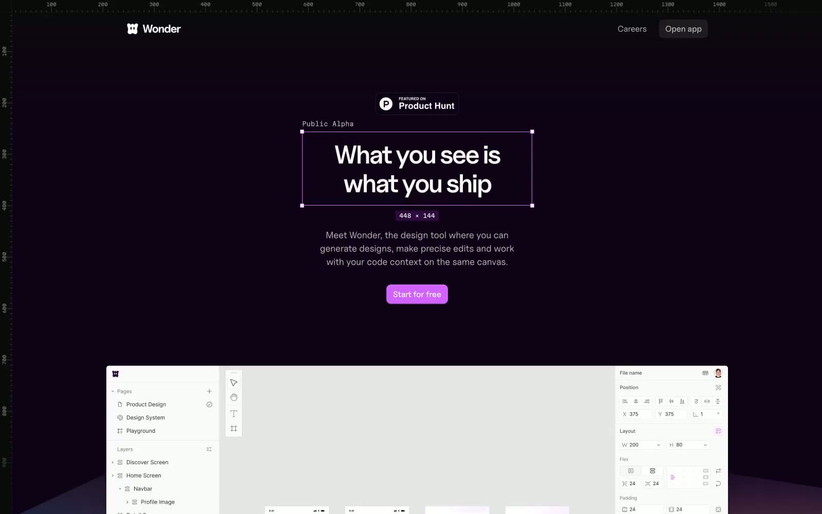
Wonder
Design tools


