
Klim. A curator's vitrina where each specimen hangs in its own dark band.
- Design tools
- Mixed theme
- 16 colors
- 4 typefaces
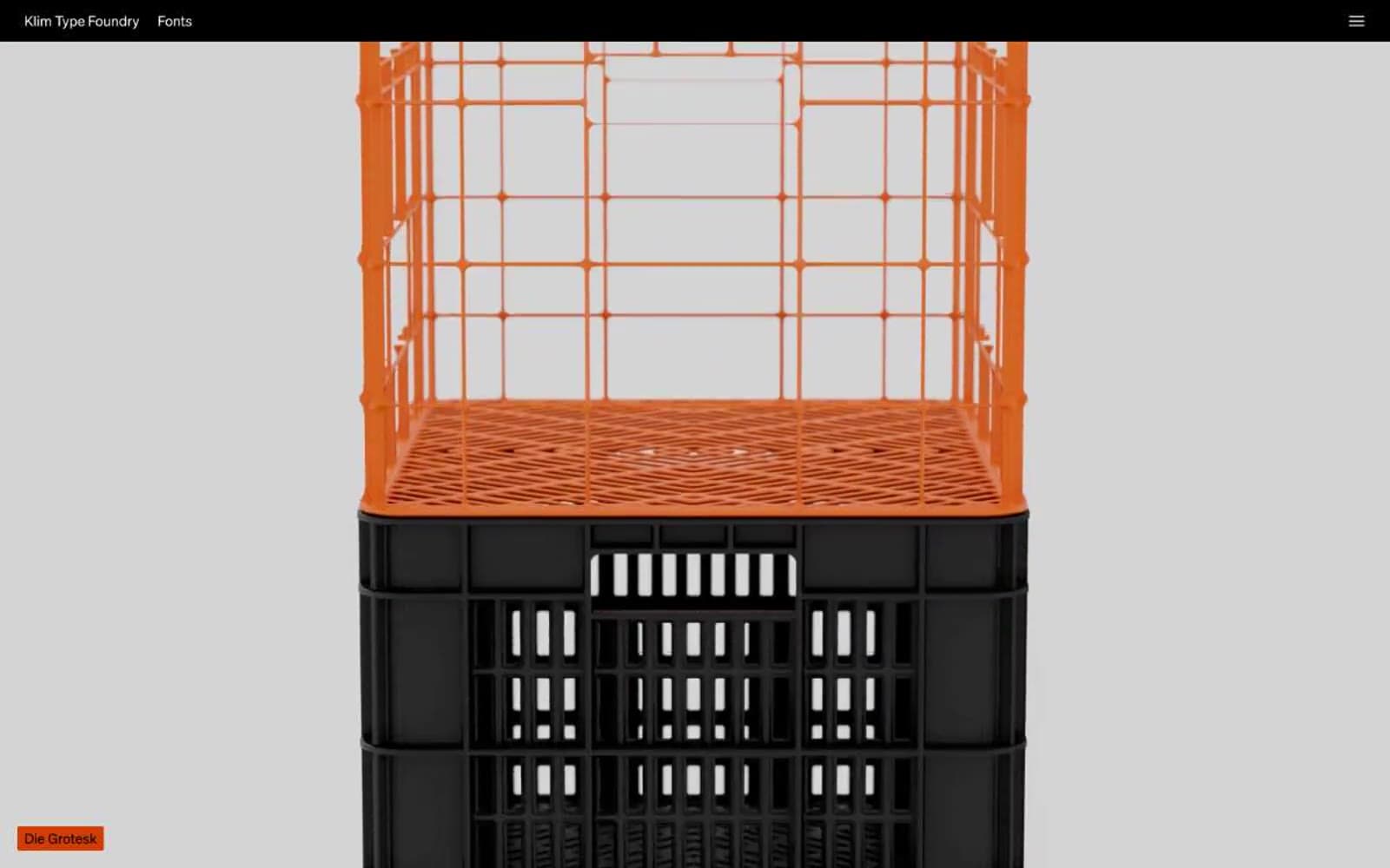
Klim Type Foundry presents its library as a typographic gallery: each typeface gets its own full-bleed band, set in itself, with no ornament. The site alternates between a matte black gallery mode and a pale studio-gray mode, letting the letterforms carry all the visual weight. UI chrome is reduced to a thin black header strip and small orange label tags; everything else is type. The accent system is deliberately loud — vivid orange-red, electric blue, mint teal — used as tiny color punches against an otherwise neutral monochrome canvas.
Klim design system

Brand3
Label tags, collection names, editorial annotations — a saturated vermilion that reads as the foundry's signature mark on light backgrounds
Hot accent on dark surfaces, inline highlights, the reddest red in the palette for maximum voltage
Interactive highlights, active states, link emphasis — a bright cyan-blue that pops against black
Accent3
Decorative text accent, special-occasion highlights — a pale mint used sparingly for emphasis
Rare chromatic accent, used for the highest-attention text moment on dark backgrounds
Soft warm accent, subtle text tint — a cream-pink that warms dark sections without competing with type
Neutrals10
Feature bands, specimen backgrounds, header bar — pure black for maximum type contrast
Page canvas, primary background — a near-black with a green undertone that reads as neutral but feels warmer than pure black
Elevated surface, input fields, secondary panel backgrounds — one step lighter than the canvas
Muted accent band, tertiary surface — desaturated blue-gray used as an alternate section background
Mid-tone borders, muted body text on light sections, card outlines
Secondary borders, subdued link text on dark backgrounds
Tertiary borders, inactive UI elements, secondary text
Medium-contrast borders, control outlines, and structural separators. Do not promote it to the primary CTA color
Light-mode page canvas, pale gray that photographs cleanly for specimen presentations
Primary text on dark backgrounds, type specimen letterforms, button labels, high-contrast surfaces
Try a pairing
Pick any two colors from the palette to check whether text stays readable on top.
Aa
Bone on Flare Orange
4.75 : 1 contrast
- Body textPasses AA 4.5
- Large textPasses AA 3
- StrictFails AAA 7
More DESIGN.md files. Same web, different personalities.
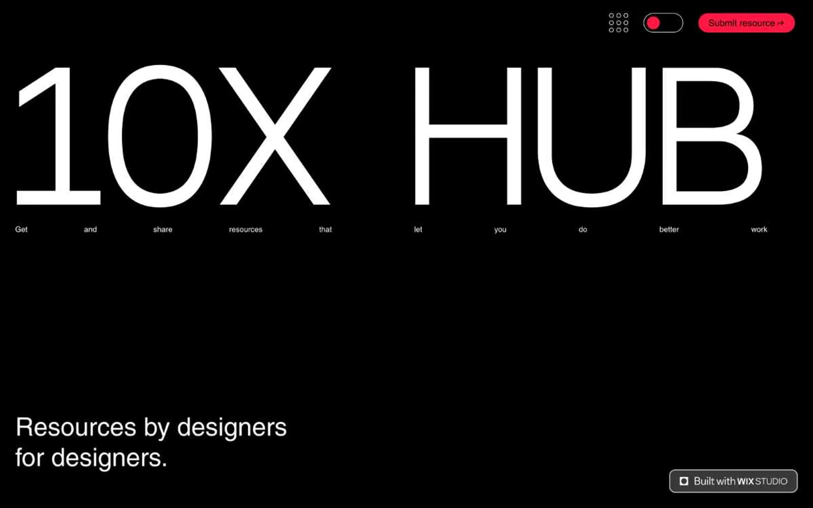
10X HUB
Design tools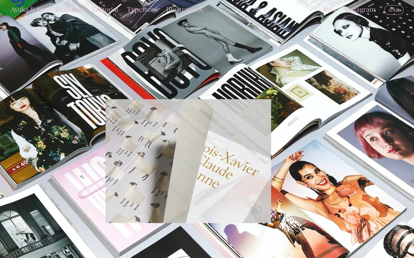
Ayaka B. Ito
Design tools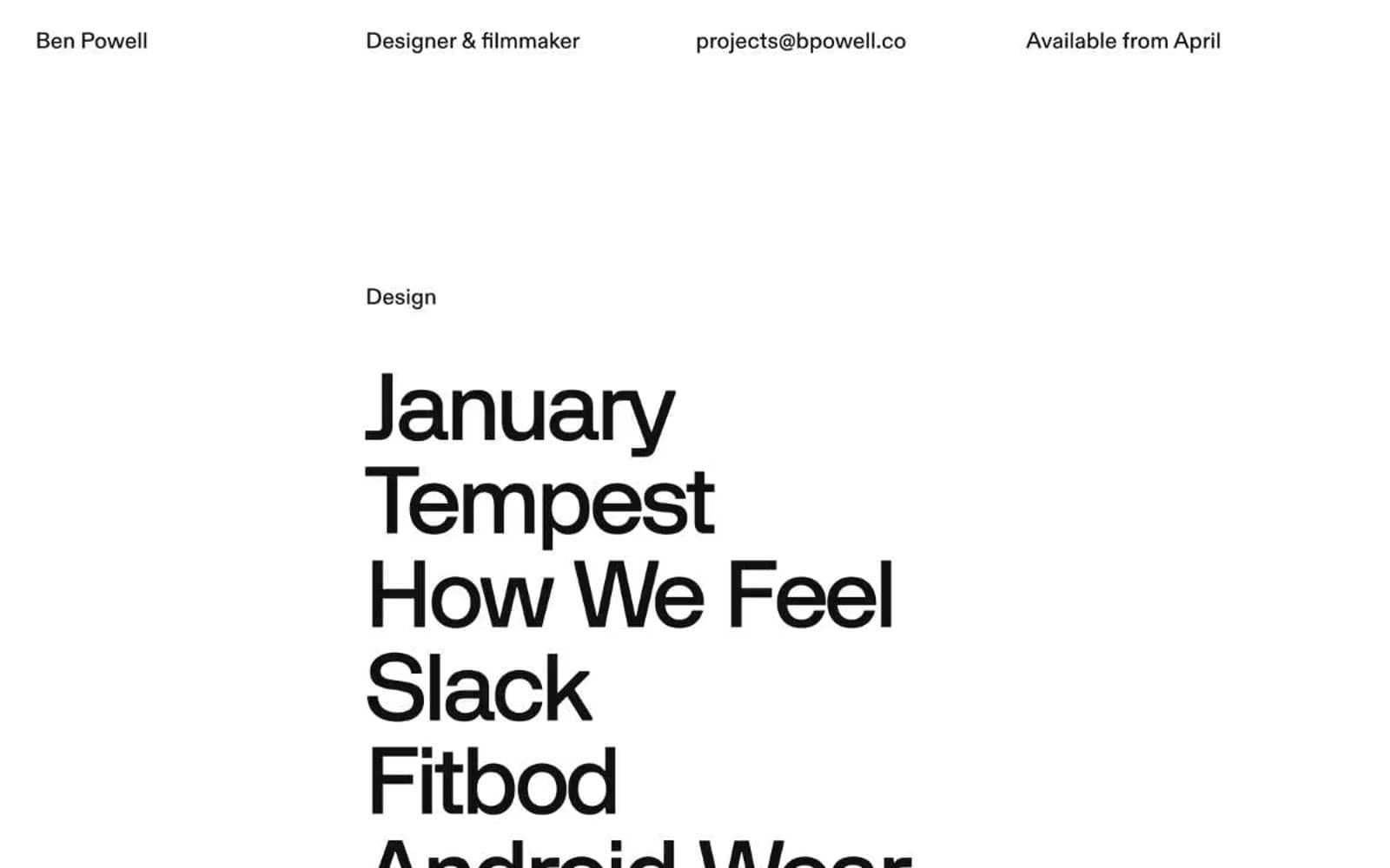
Bpowell
Design tools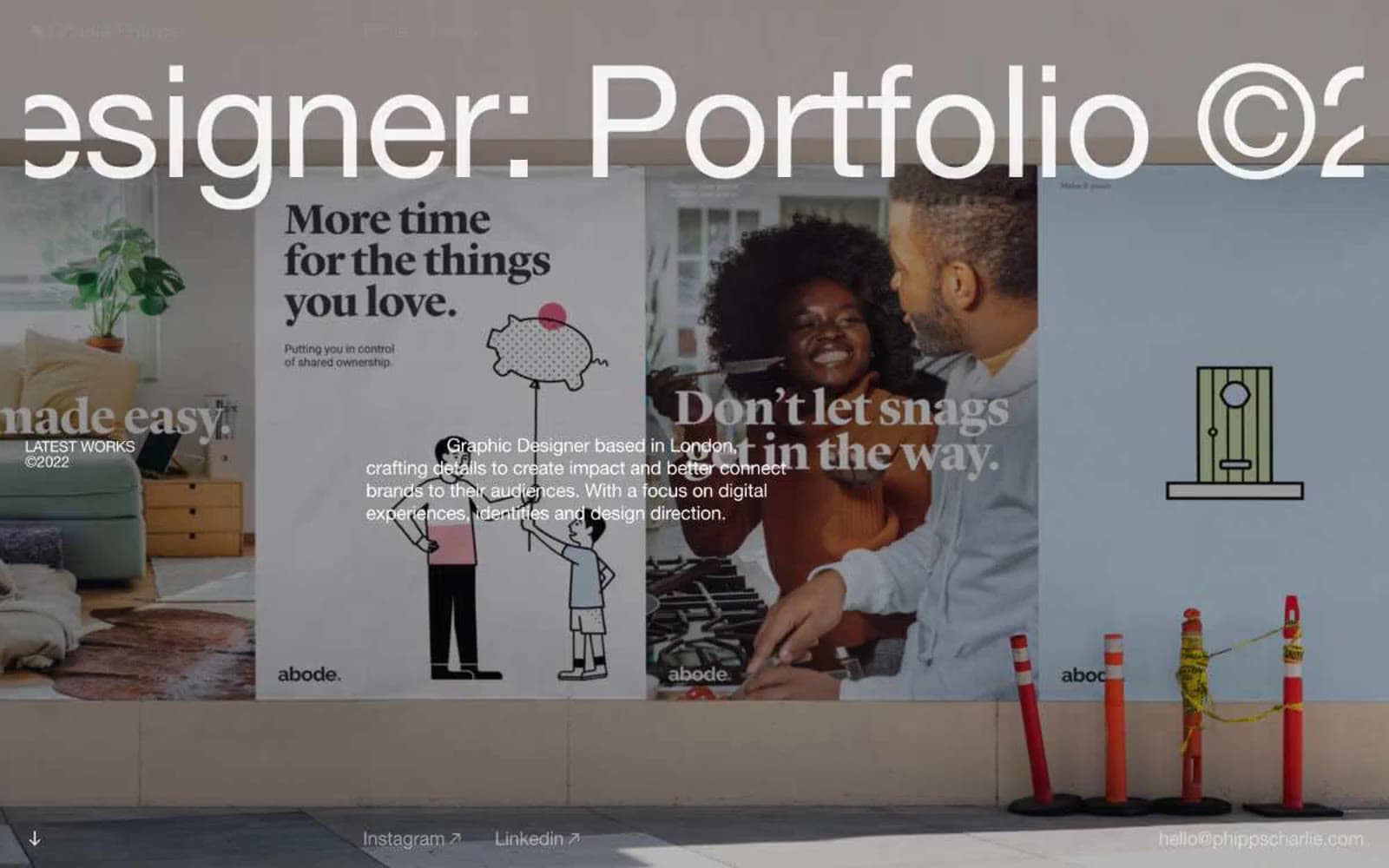
Charlie Phipps
Design tools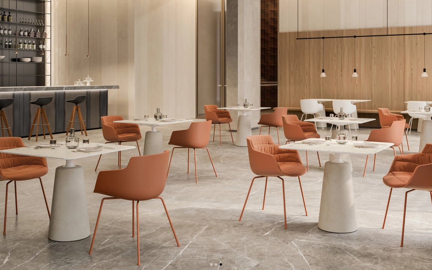
Contract
Design tools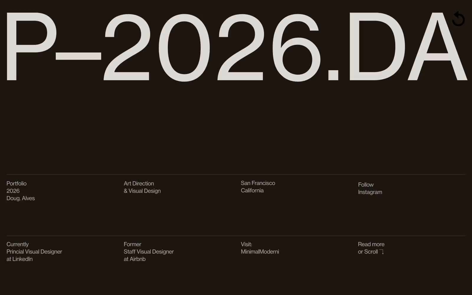
Doug–Alves
Design tools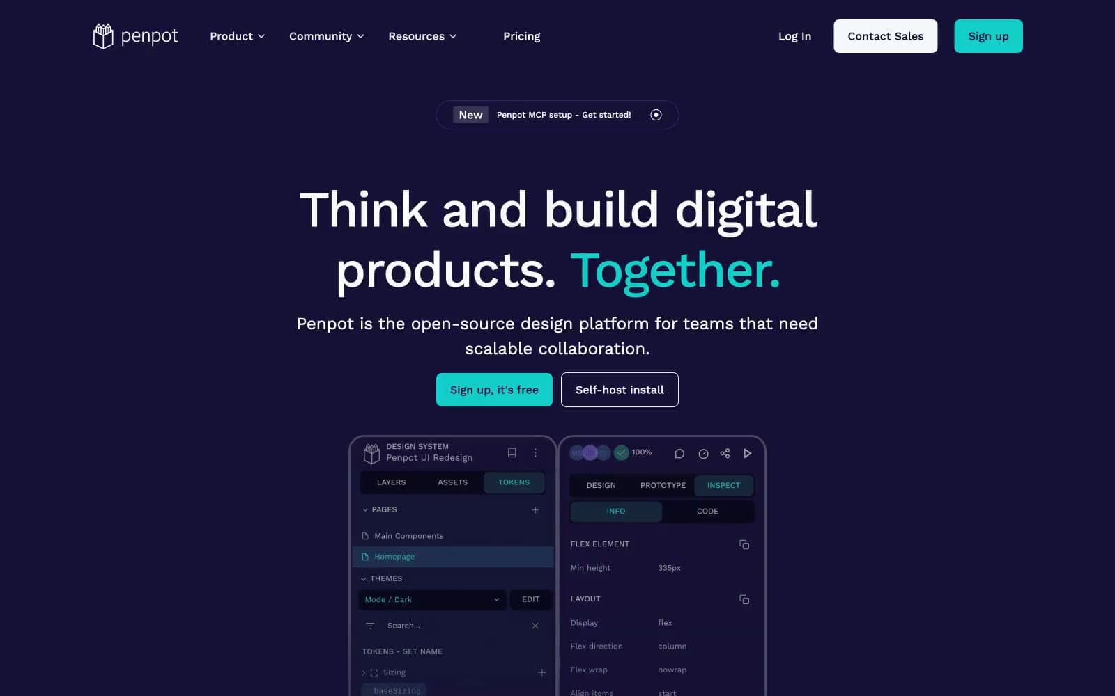
Penpot
Design tools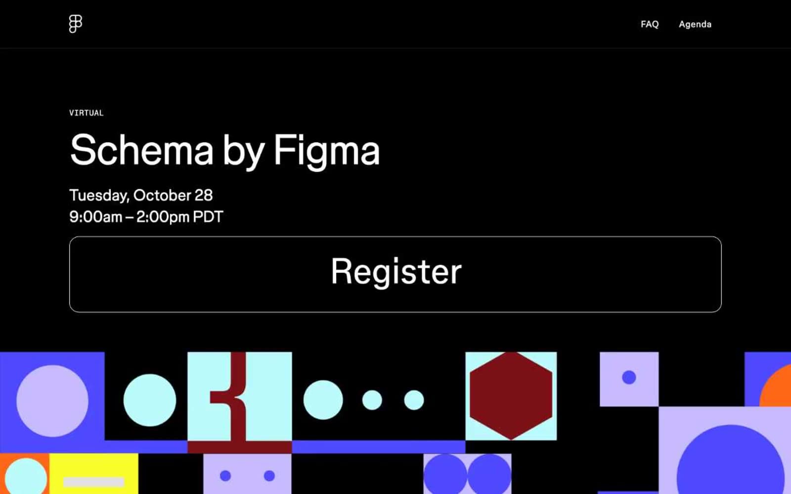
Schema
Design tools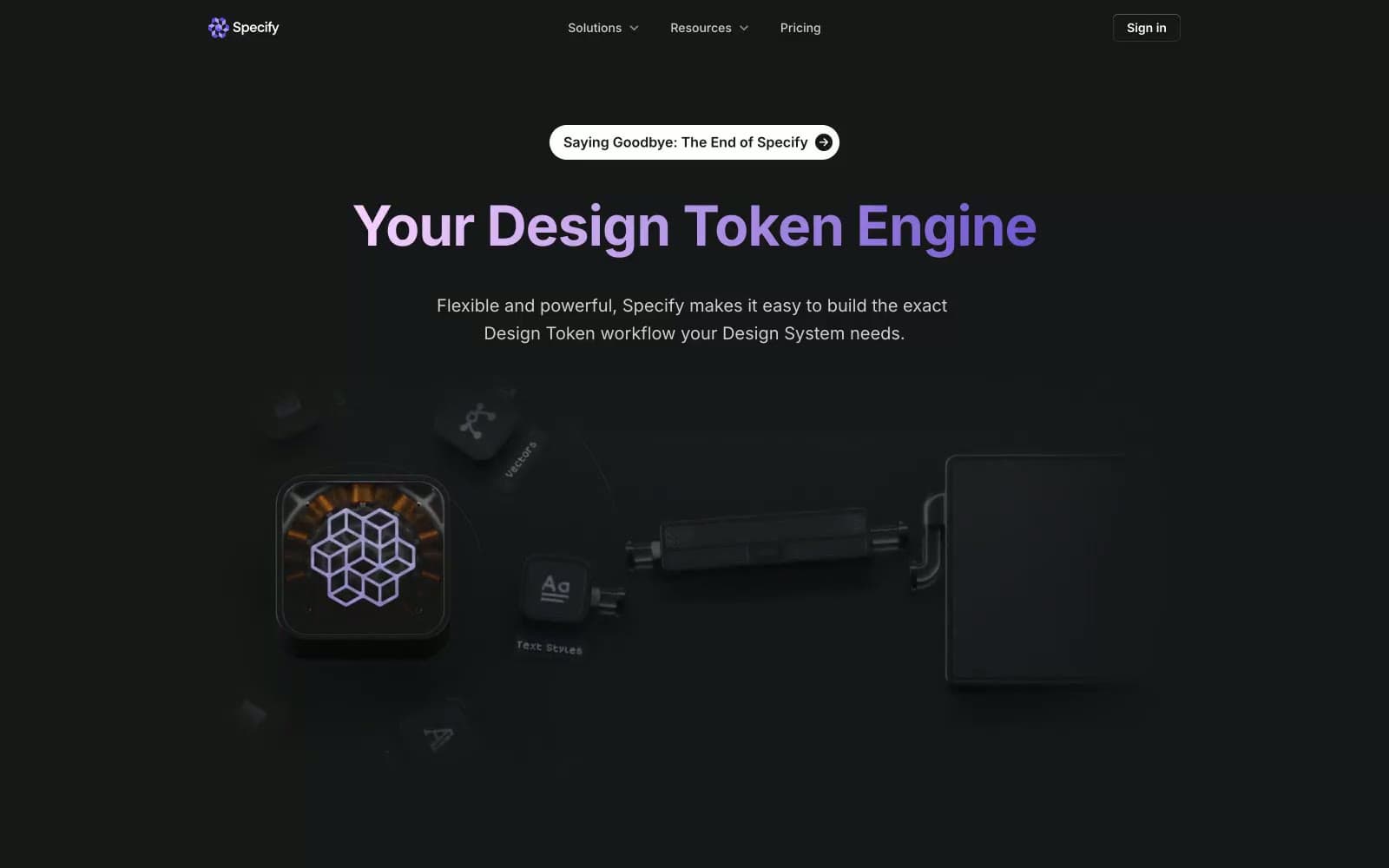
Specify
Design tools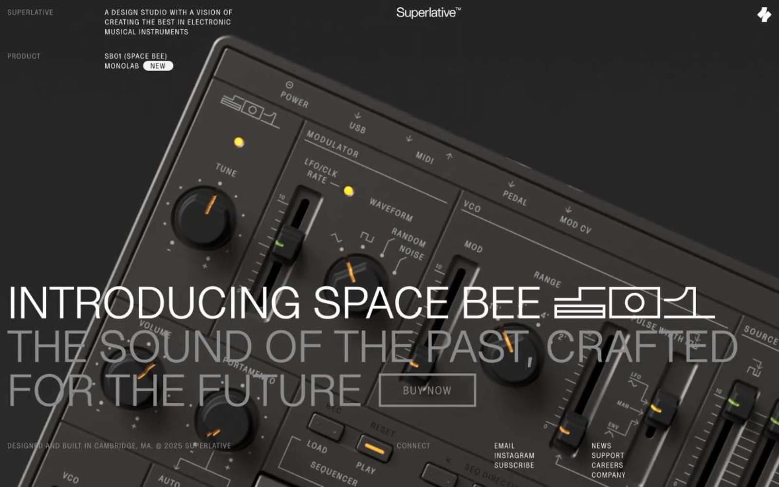
Superlative
Design tools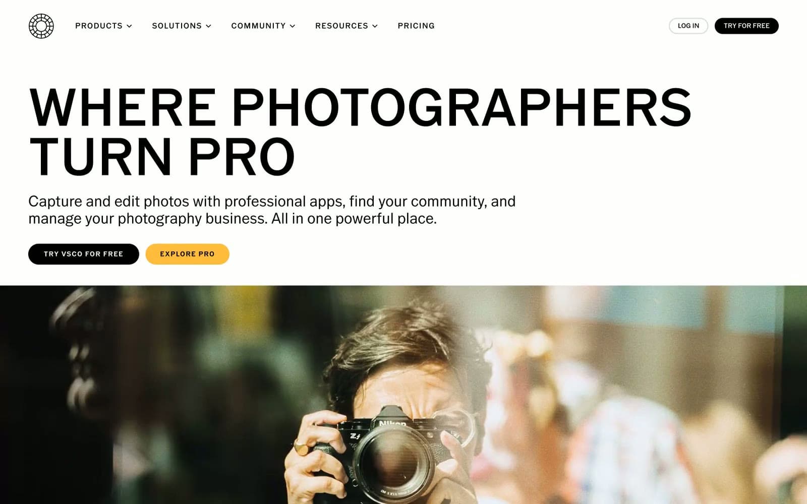
VSCO®
Design tools
Wonder
Design tools


