
Contract. White-walled gallery catalogue.
- Design tools
- Mixed theme
- 7 colors
- 1 typeface
MDF Italia Contract uses an editorial Swiss-grid language: a pure white canvas interrupted by full-bleed photographic plates and stark black bands, with the only ornament coming from the type itself. Typography is the primary design material — a geometric sans (Plain) pushed to display sizes of 100px with aggressive negative tracking, creating a confident architectural voice that reads more like a design monograph than a product site. The palette is almost entirely achromatic: hairline #e5e7eb rules do all the structural work, replacing cards, boxes, and dividers with single-pixel lines; solid #000000 anchors headlines, nav text, and inverted panels. The sole chromatic accent is a single vivid blue used sparingly for link and active states, never for fills. Components are flat, borderless in the traditional sense, and almost shadowless — depth is communicated by alternating white-to-black bands rather than elevation. The result is a portfolio-grade editorial surface that treats furniture as fine art and lets the product photography carry all the warmth and color the chrome refuses to.
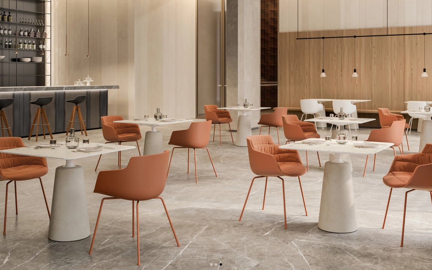
Contract design system

Accent1
Active links, focus state, inline emphasis — the only chromatic note in an otherwise monochrome system, used for switching states on not for fills
Neutrals6
Primary text, headings, navigation, inverted section bands, footer surfaces — the dominant ink of the system
Neutral form states, badge text, and quiet UI feedback where color should stay understated. Do not promote it to the primary CTA color
Muted body text, captions, placeholder and helper text — de-emphasized reading copy
Tertiary text, fine print
Structural borders, dividers, card outlines, key-value grid frames — the load-bearing neutral of the entire layout system
Primary canvas, card surfaces, inverted text on black panels
Try a pairing
Pick any two colors from the palette to check whether text stays readable on top.
Aa
Pure White on Signal Blue
5.17 : 1 contrast
- Body textPasses AA 4.5
- Large textPasses AA 3
- StrictFails AAA 7
More DESIGN.md files. Same web, different personalities.

10X HUB
Design tools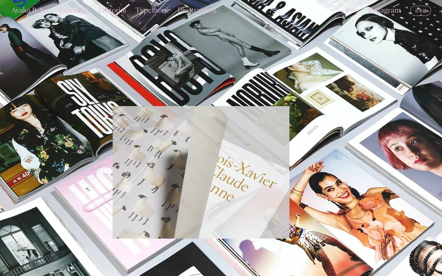
Ayaka B. Ito
Design tools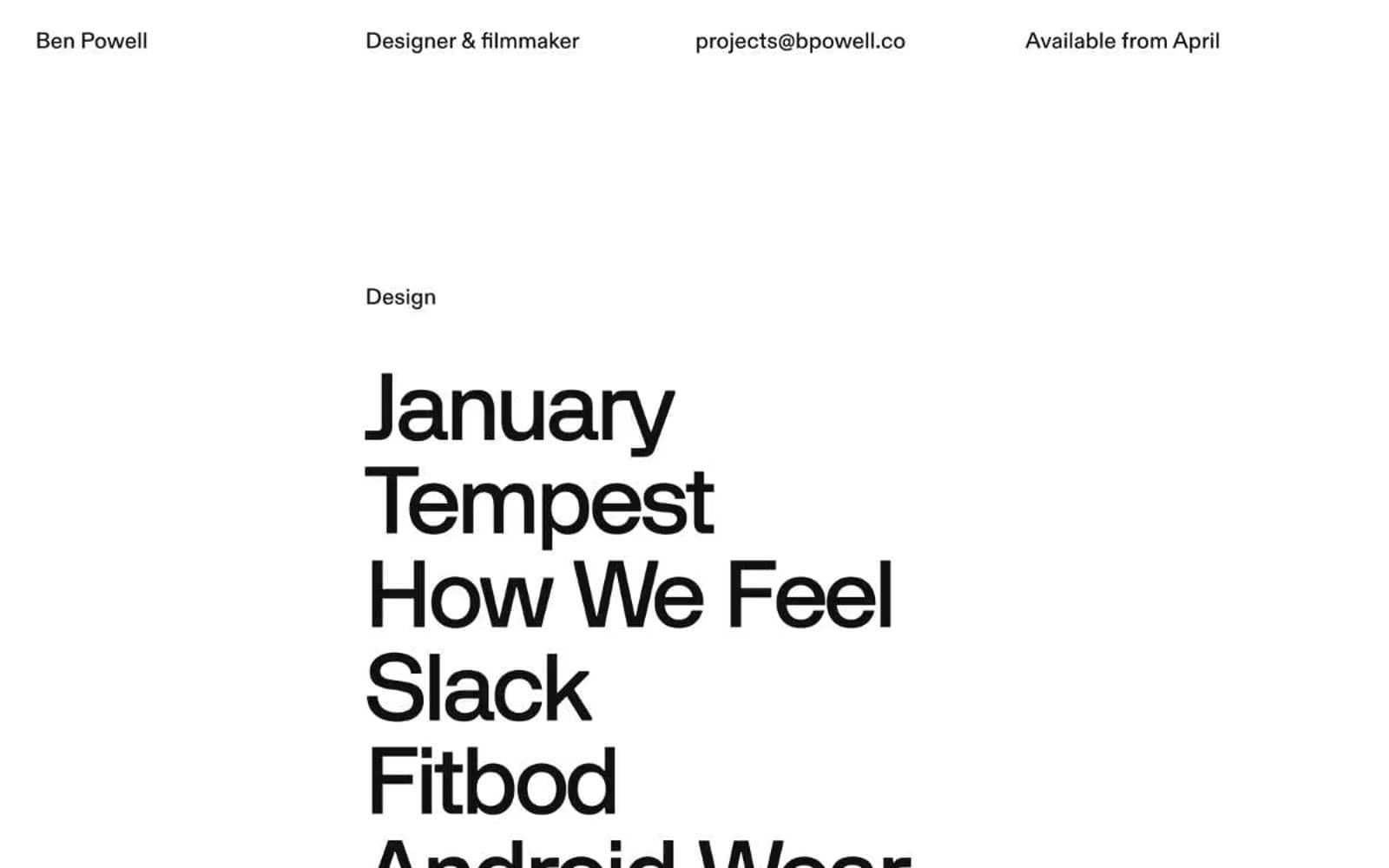
Bpowell
Design tools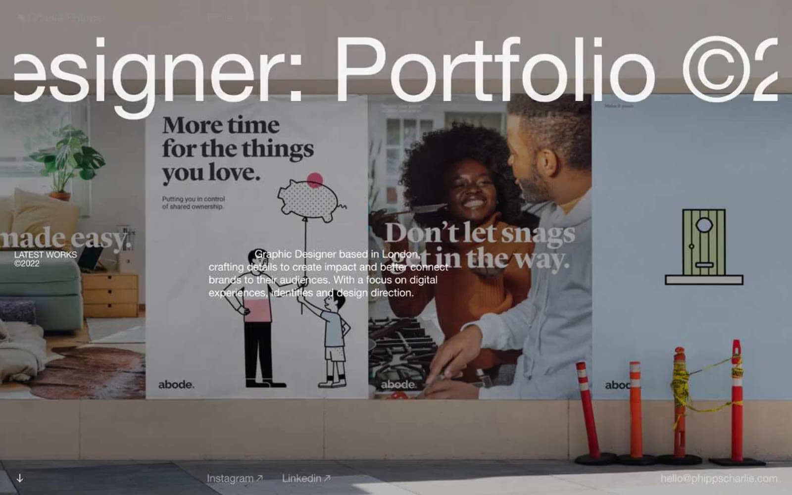
Charlie Phipps
Design tools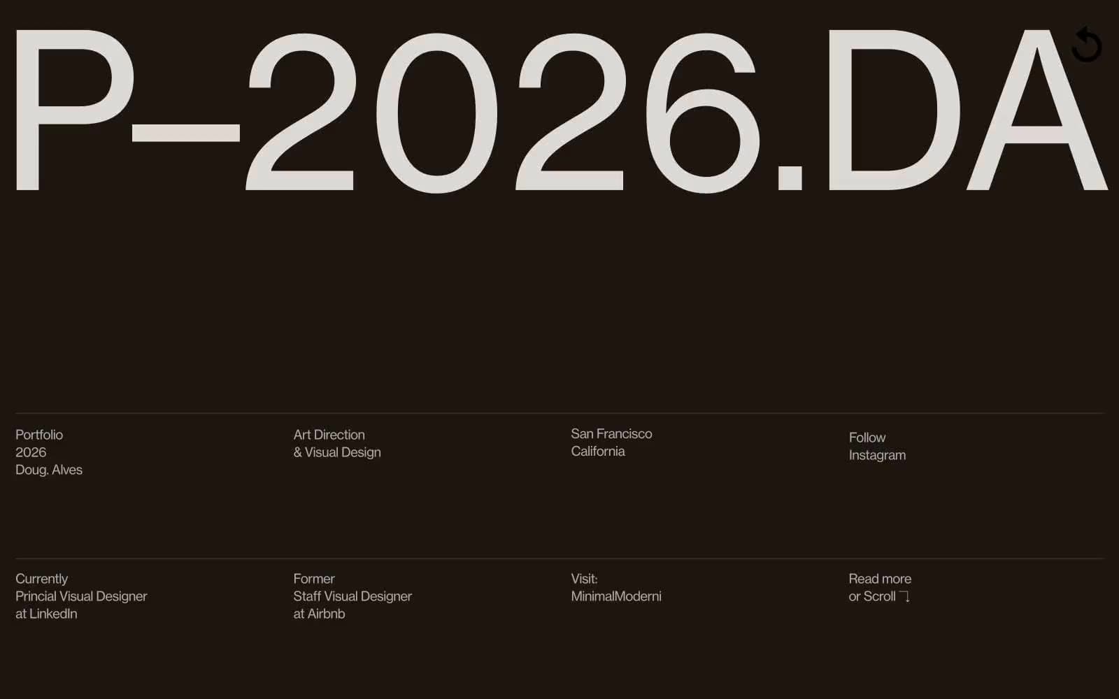
Doug–Alves
Design tools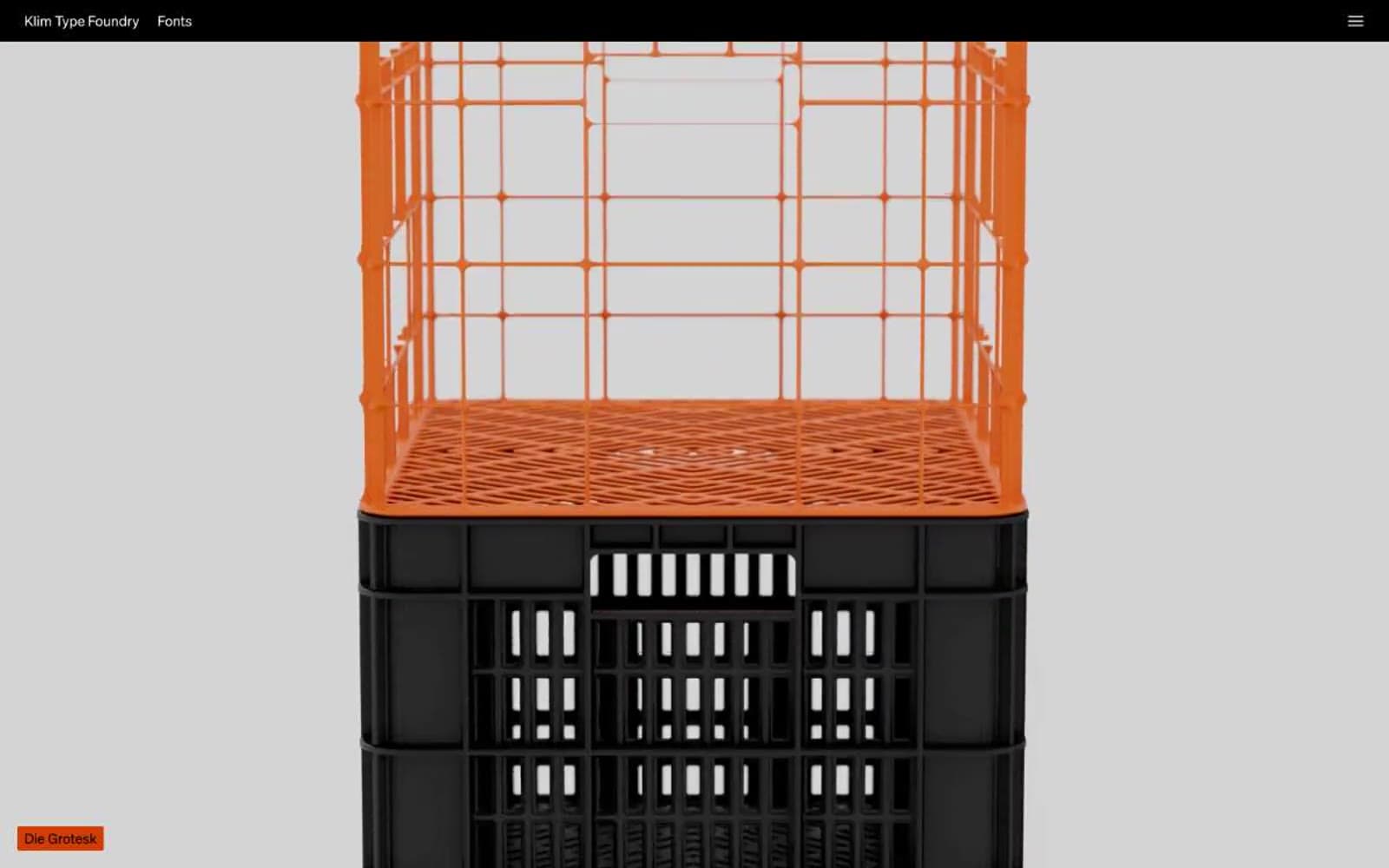
Klim
Design tools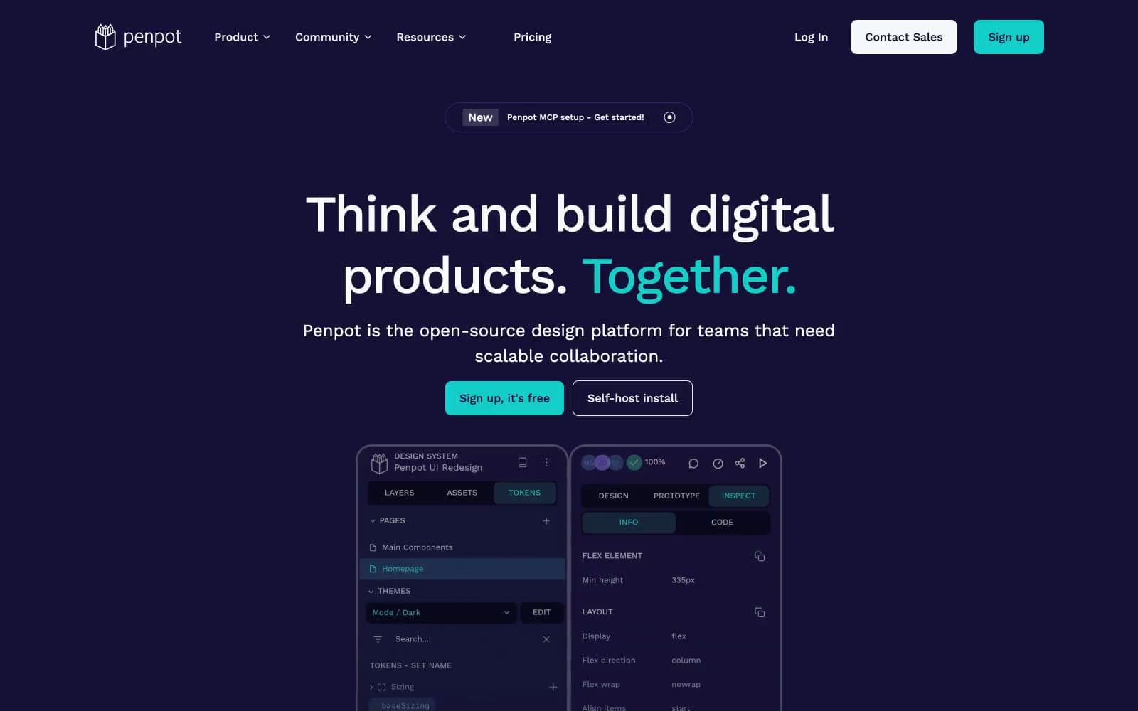
Penpot
Design tools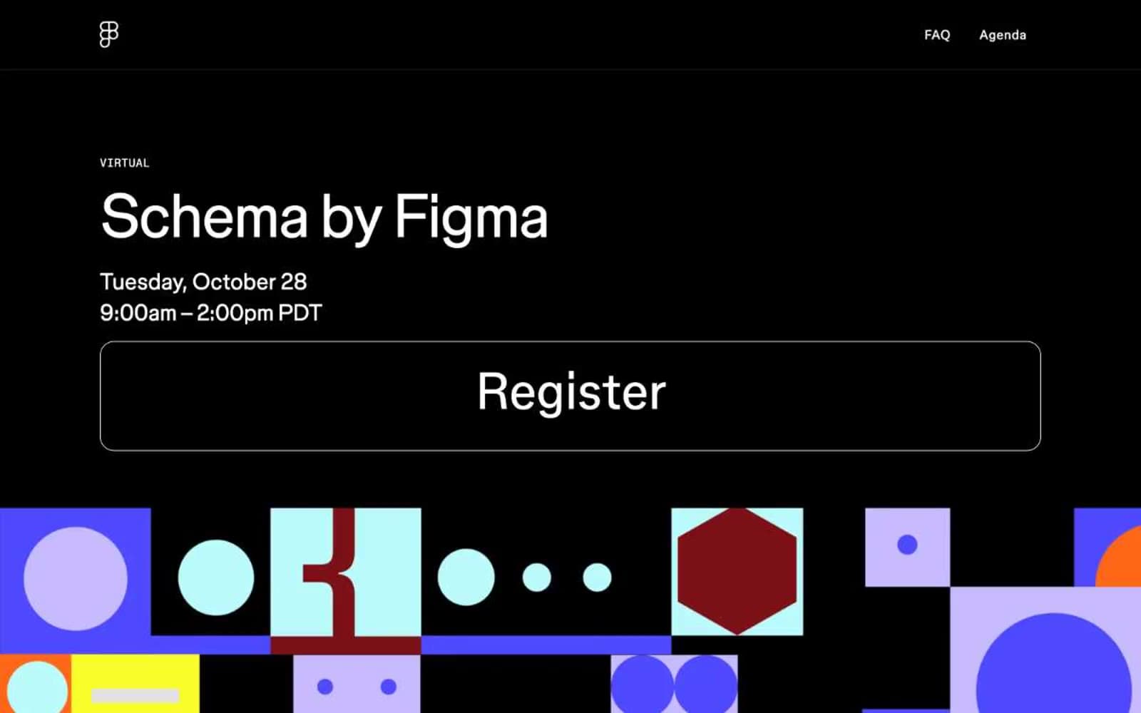
Schema
Design tools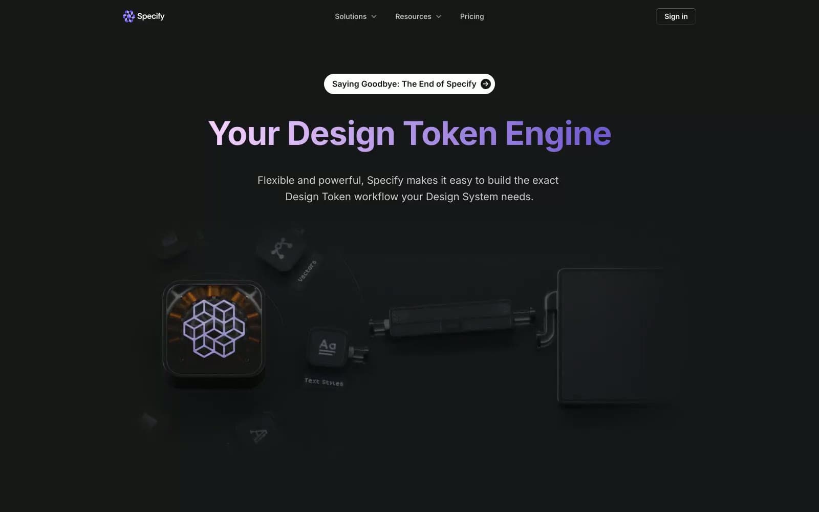
Specify
Design tools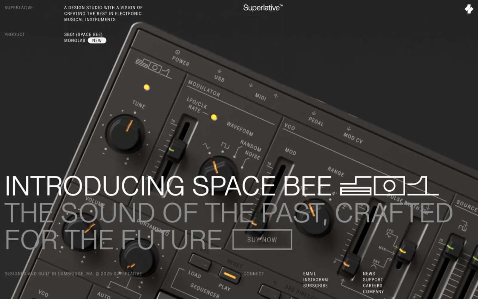
Superlative
Design tools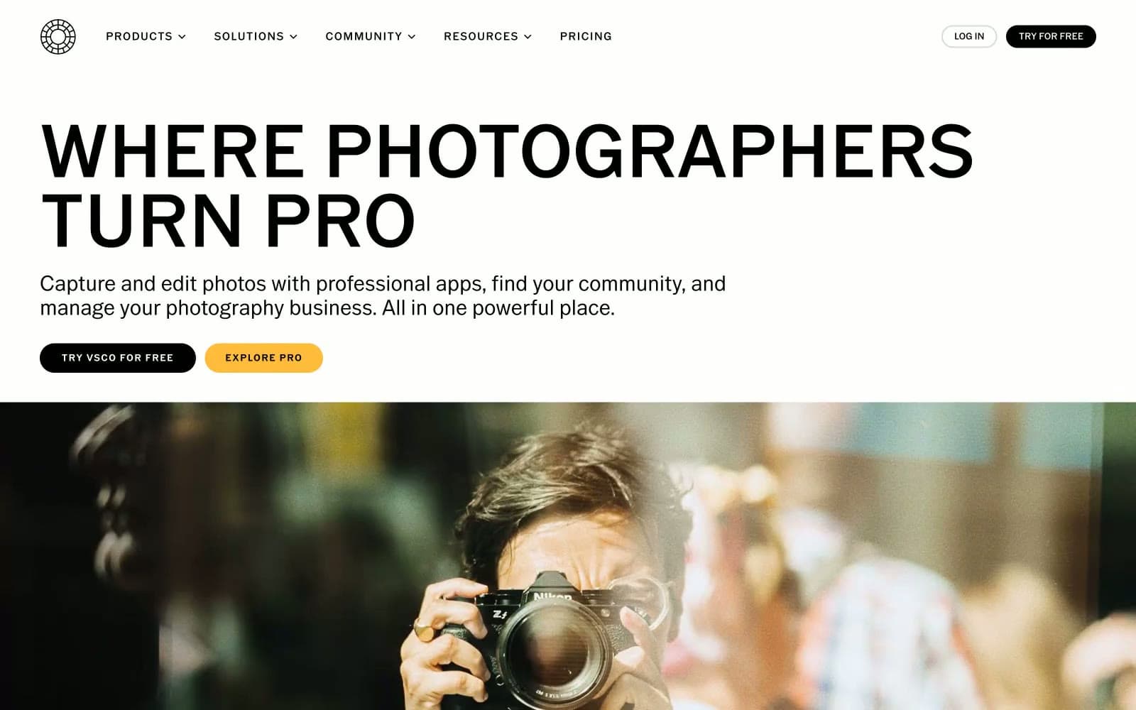
VSCO®
Design tools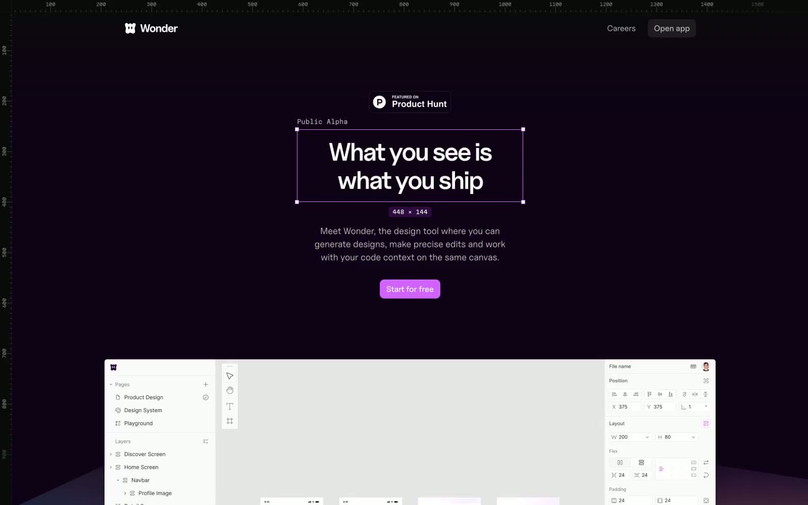
Wonder
Design tools


