
Toys for Joy. Crumpled plum poster, lavender love letter.
- Commerce
- Light theme
- 12 colors
- 2 typefaces
Toys for Joy is a lavender-washed sexual-wellness storefront that behaves like an art-nouveau poster rather than a shop grid. A crumpled purple paper hero carries Lilac Haze #d7c6ee capitals, then the page settles onto Lavender Paper #f5ecff and Seashell Paper #fdf4ee with Dahlia Plum #5d4b7a type, broken by full-bleed colour fields: a split plum and Mauve Panel #817895 product block, a Sky Wash #e6f1ff discovery section and a Wisteria Band #897aa9 sign-up. Dahlia condensed at 400 does all the talking at 112–304px with sub-1.0 line-heights, while Aeonik Light 300 whispers in 16px body and 12.8px uppercase labels. No shadows, almost no radius: depth comes from arch masks, stepped bands and colour shifts.
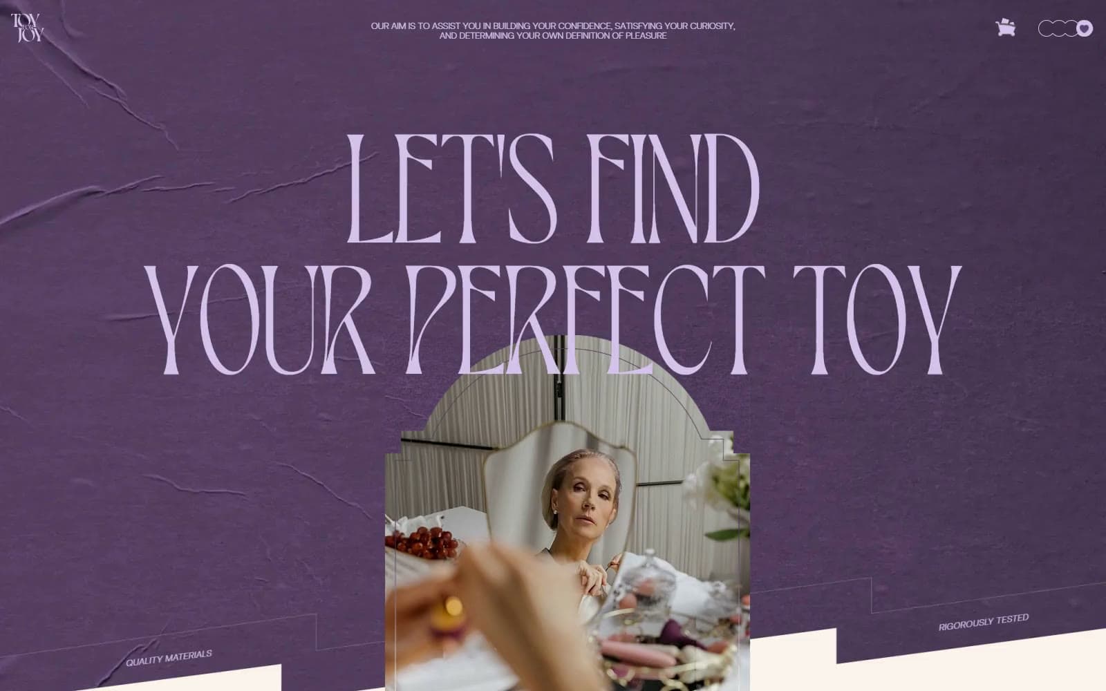
Toys for Joy design system

Brand1
Display and section type on light fields, the left product panel and feature titles — a dusky plum that reads intimate rather than loud
Accent4
Hero capitals on the crumpled plum poster, cart icon, menu-dot outlines and footer credits — the pale voice on dark purple
Right half of the split Choose Your Pleasure block, a greyed mauve that sits one step quieter than Dahlia Plum
Full-bleed Join our community band near the page end — a softer violet that prepares the footer frame
The Discover the ideal toy field, the one cool break in an otherwise warm-violet page
Neutrals7
Main page canvas, the emotion word wall, the footer card and pale display type on mauve panels
Warm off-white under the hero bands and the Our devices intro — the stepped bands that rise out of the poster
Display and support text set on the Wisteria Band and other mid-violet fields
Small uppercase Aeonik copy, footer links and dense label text on light fields
The dark violet frame around the footer card and the closing flower mark area
Filled dots of the four-circle menu toggle in the top-right corner
rgba(93, 75, 122, 0.2) 1px dividers between footer columns and the feature-trio centre rule
Try a pairing
Pick any two colors from the palette to check whether text stays readable on top.
Aa
Seashell Paper on Dahlia Plum
7.03 : 1 contrast
- Body textPasses AA 4.5
- Large textPasses AA 3
- StrictPasses AAA 7
More DESIGN.md files. Same web, different personalities.
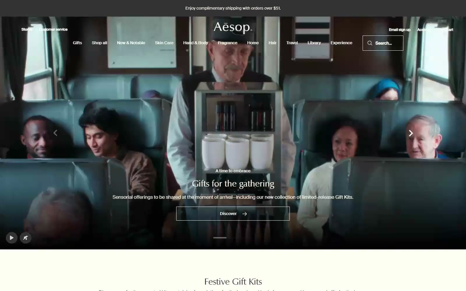
Aesop
Commerce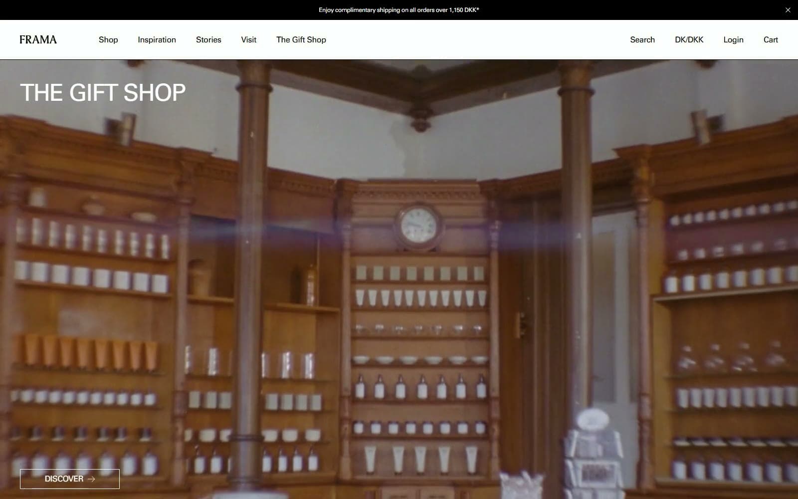
FRAMA
Commerce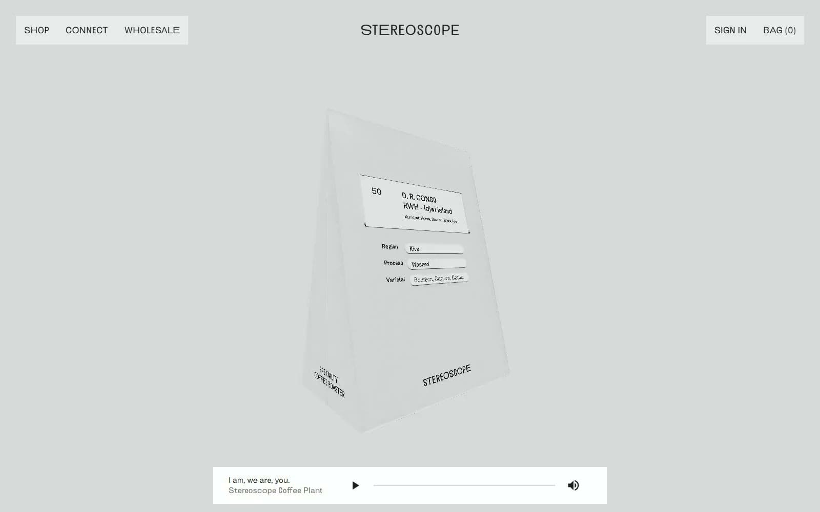
Stereoscope Coffee
Commerce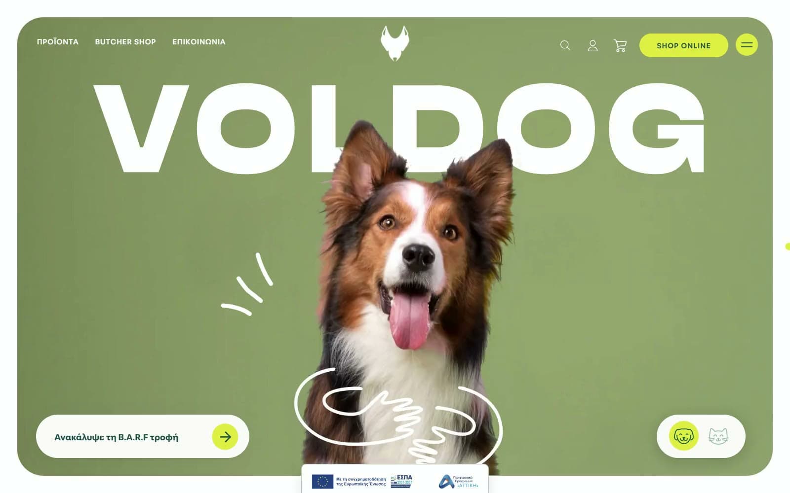
VOLDOG Food
Commerce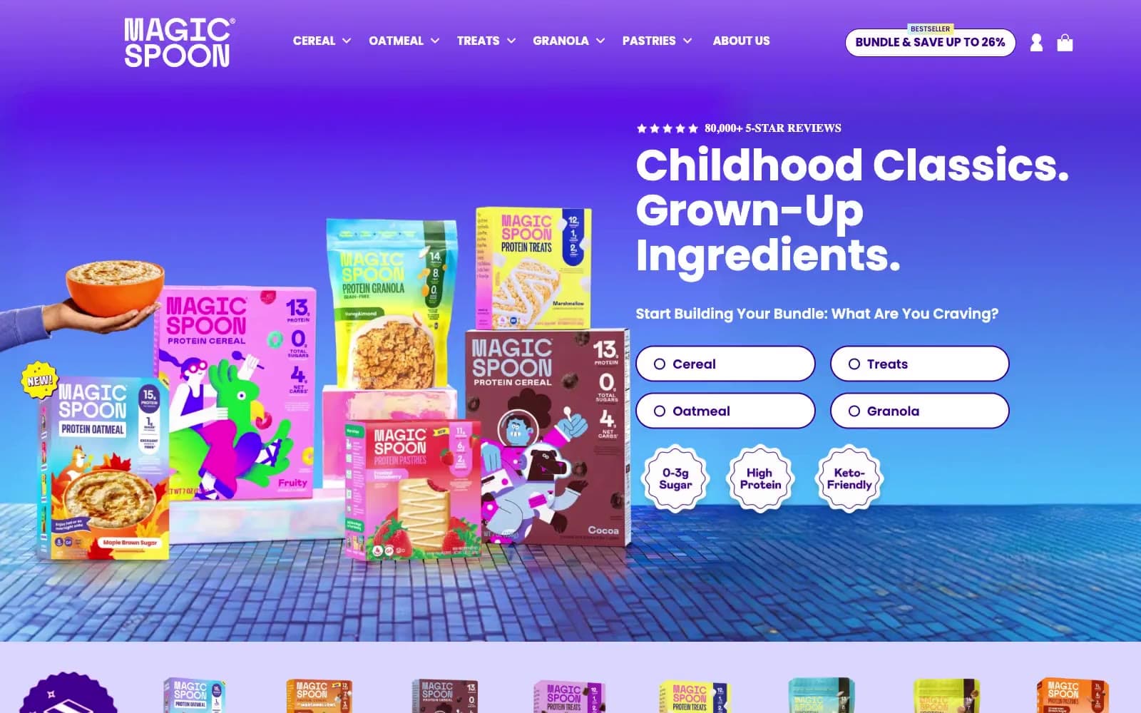
High Protein
Commerce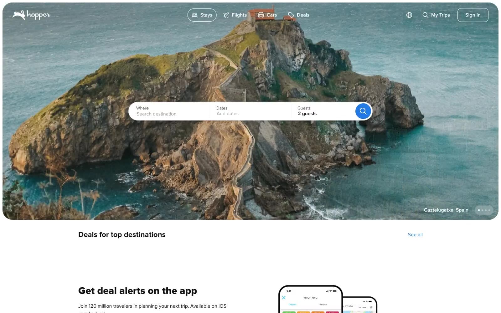
Hopper
Commerce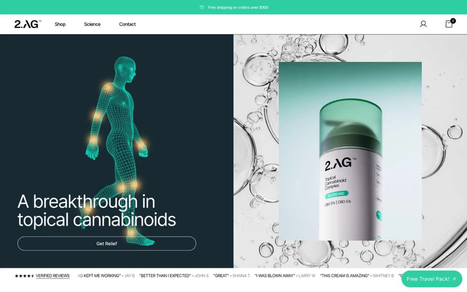
2.AG
Commerce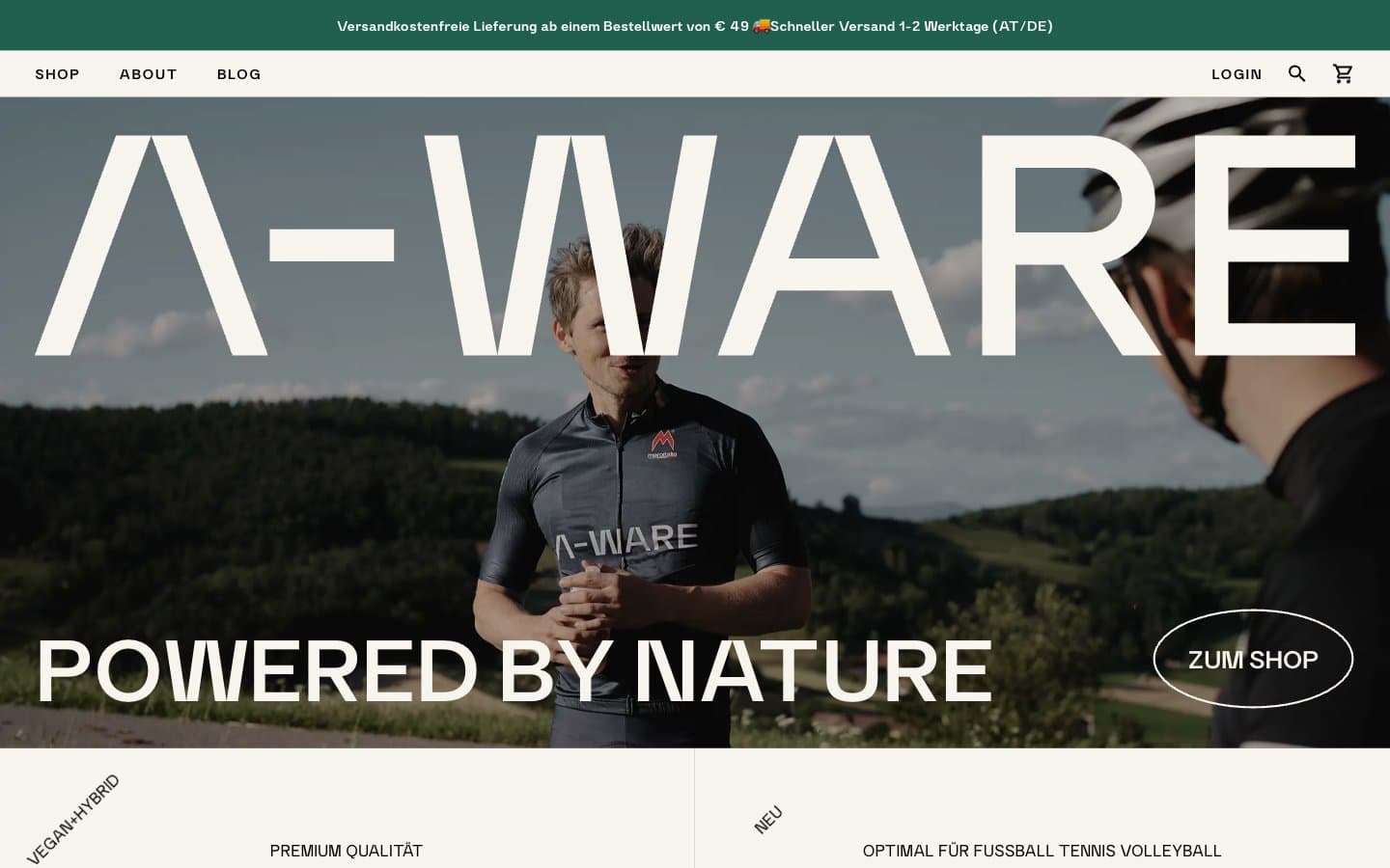
A-WARE
Commerce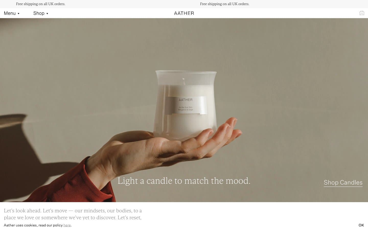
AATHER
Commerce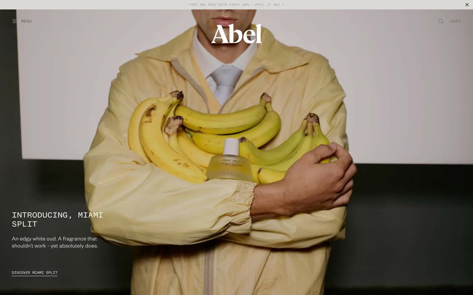
Abel
Commerce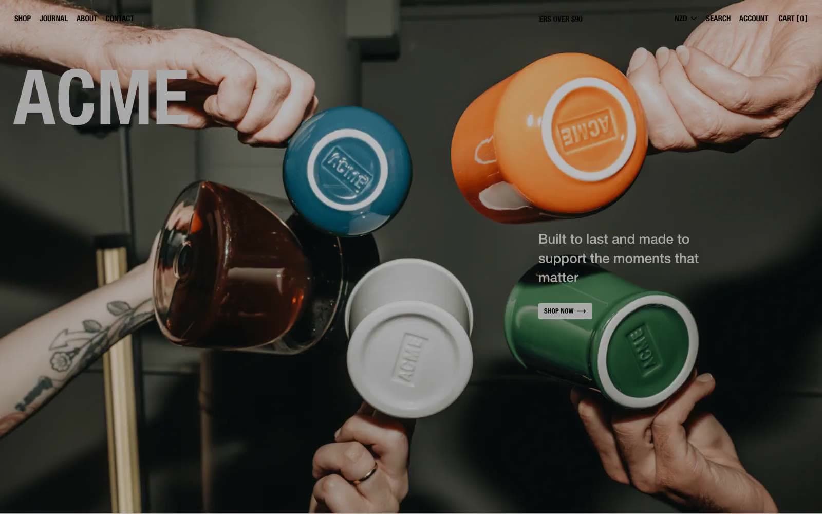
Acme Cups New Zealand
Commerce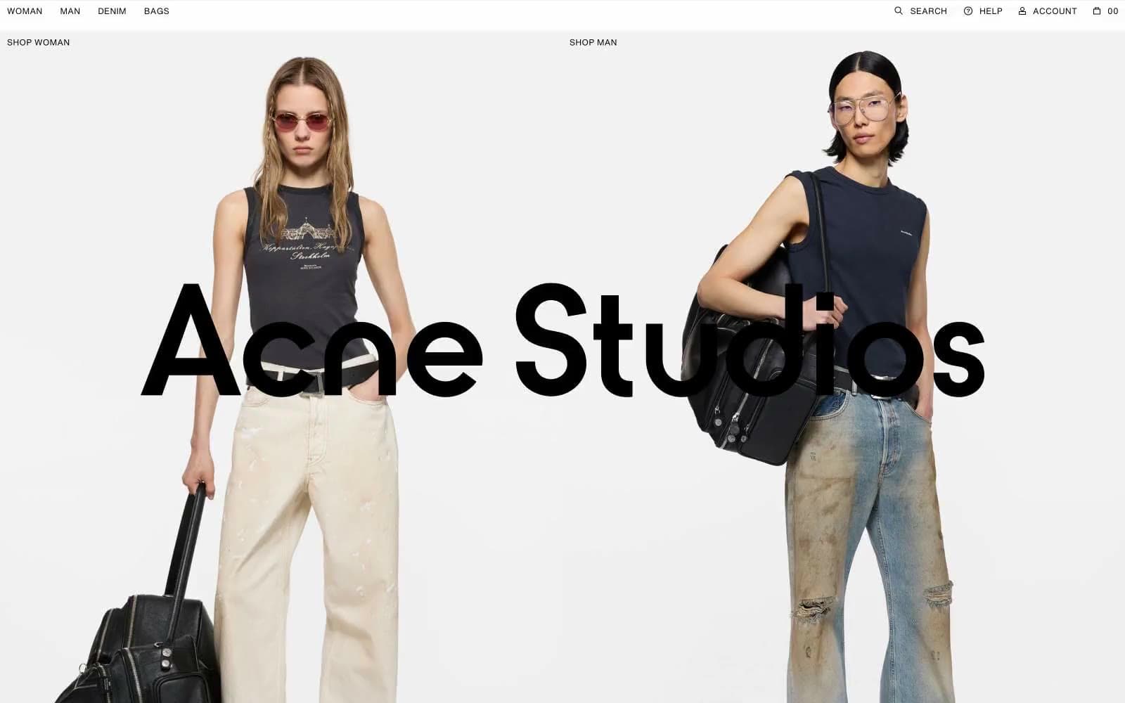
Acne Studios
Commerce


