
Aesop. Apothecary paper, amber glass.
- Commerce
- Light theme
- 11 colors
- 3 typefaces
Aesop sells skin care like a well-kept laboratory ledger. The canvas is Apothecary Cream #fffef2, a faintly yellow paper rather than white, and even reversed text and outlined buttons use it. Charcoal Label #333333 is the only strong ink, filling the announcement bar and every Add to cart block. Corners are square throughout; only round media controls break the rule. Zapf-Humanist at 31px, regular weight, is the single display voice, while SuisseIntl handles all interface text between 11px and 18px, so hierarchy stays hushed. Colour comes from photography and film: amber bottles, snow, brick, skin. Amber Glass #945c26 appears only as a small Limited release label. The page breathes through 100px section gaps inside a 1200px container, with full-bleed films opening and closing it.
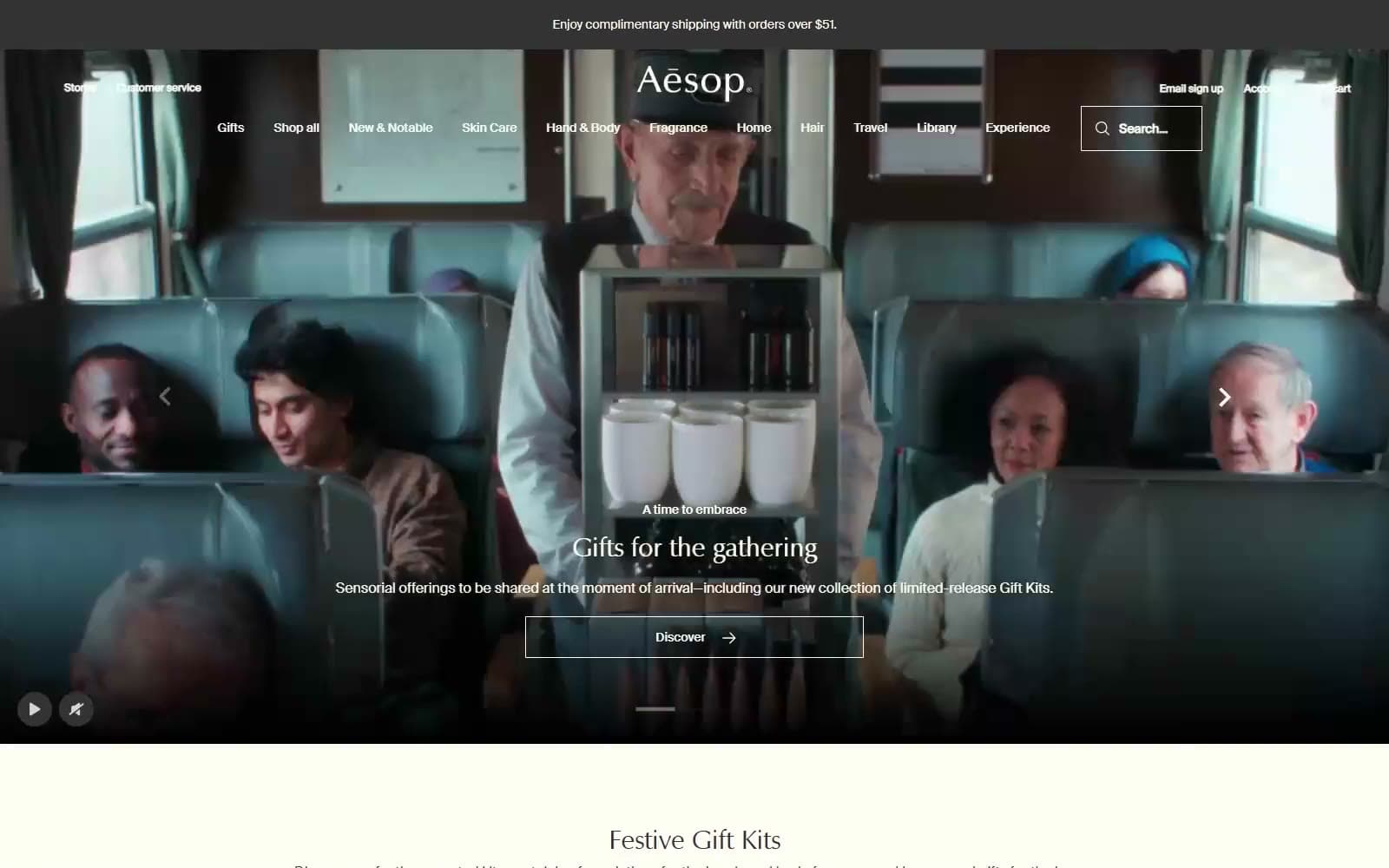
Aesop design system

Brand1
Announcement bar, Add to cart fill, Submit button and all body ink — the printed-label black that is softer than true black
Accent1
The 11px Limited release label above product tiles — the only hue in the interface, echoing the brown bottles
Neutrals9
Page canvas, open menu panel, field fill, and all reversed text and outlines on film and on the footer
Tinted bands for Certified B Corp and Recommended reading, one quiet step down from the canvas
Full-width footer field, also the fill Add to cart darkens to on hover over 0.25s
Product descriptions, helper text, and the active segment of carousel pagination
Secondary button outlines and field borders, composited from Charcoal Label at 20% opacity on cream
The 2px base rule under the search cell when the header turns cream for an open menu
Idle carousel pagination segments, composited from Charcoal Label at 25% opacity on cream
The dim over the cream page while a menu is open, Charcoal Label at 50% opacity composited on the canvas
End stop of the transparent-to-black scrim behind hero copy, and the bookmark icon on product tiles
Try a pairing
Pick any two colors from the palette to check whether text stays readable on top.
Aa
Apothecary Cream on Charcoal Label
12.46 : 1 contrast
- Body textPasses AA 4.5
- Large textPasses AA 3
- StrictPasses AAA 7
More DESIGN.md files. Same web, different personalities.
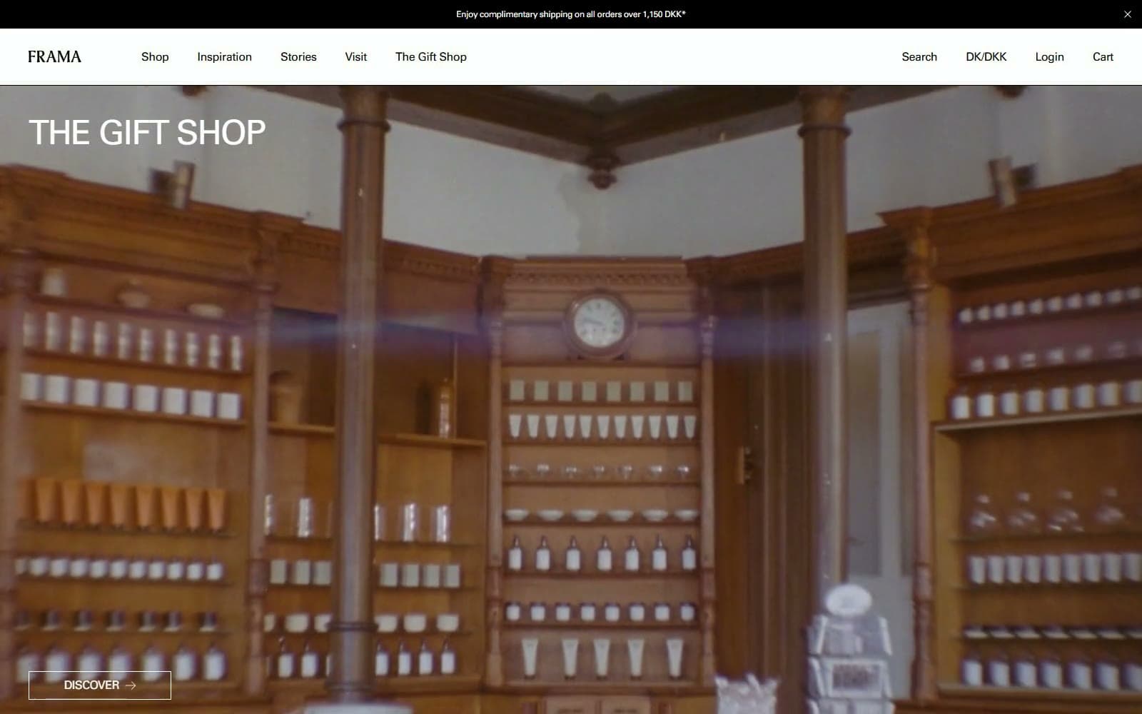
FRAMA
Commerce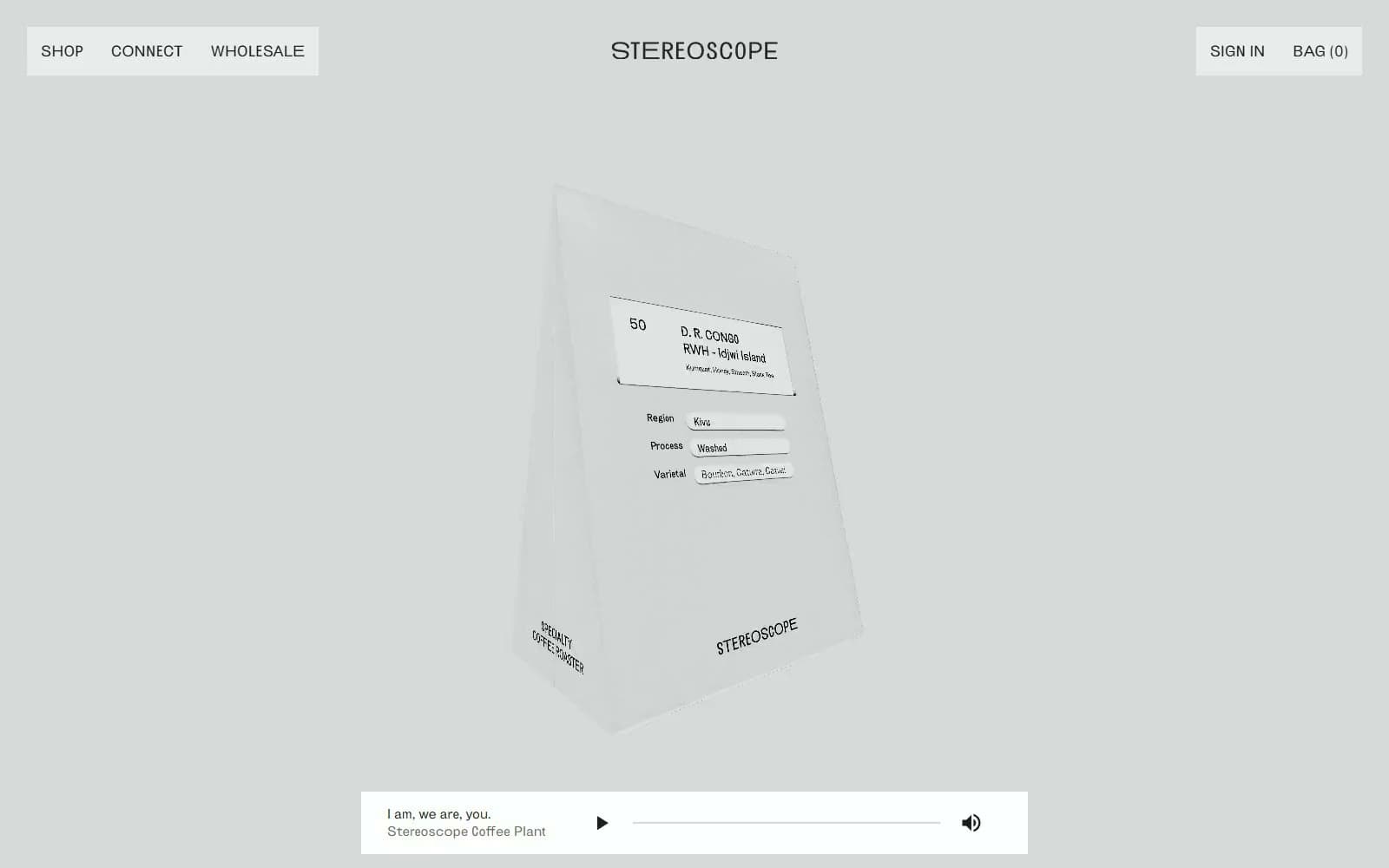
Stereoscope Coffee
Commerce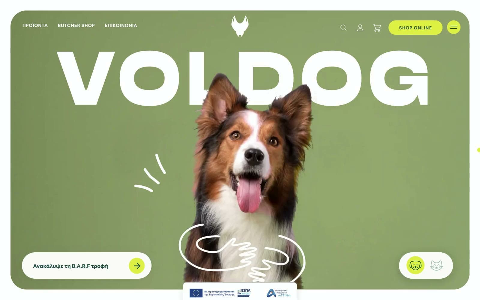
VOLDOG Food
Commerce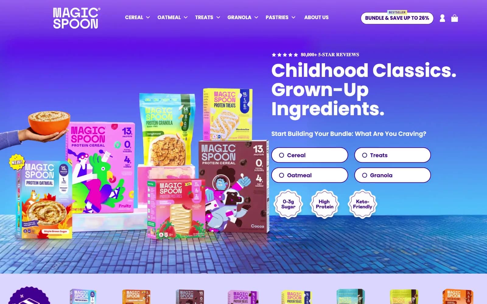
High Protein
Commerce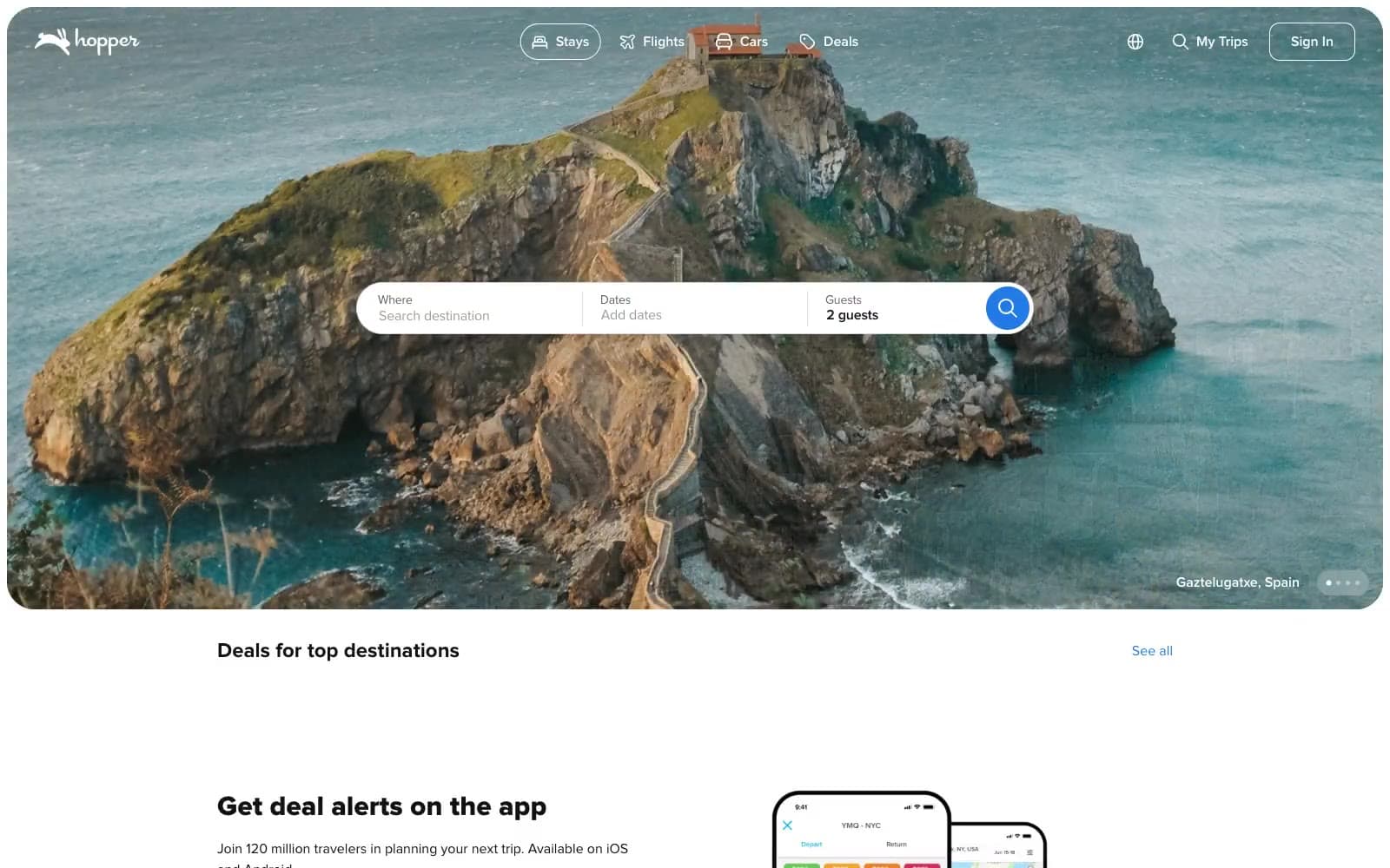
Hopper
Commerce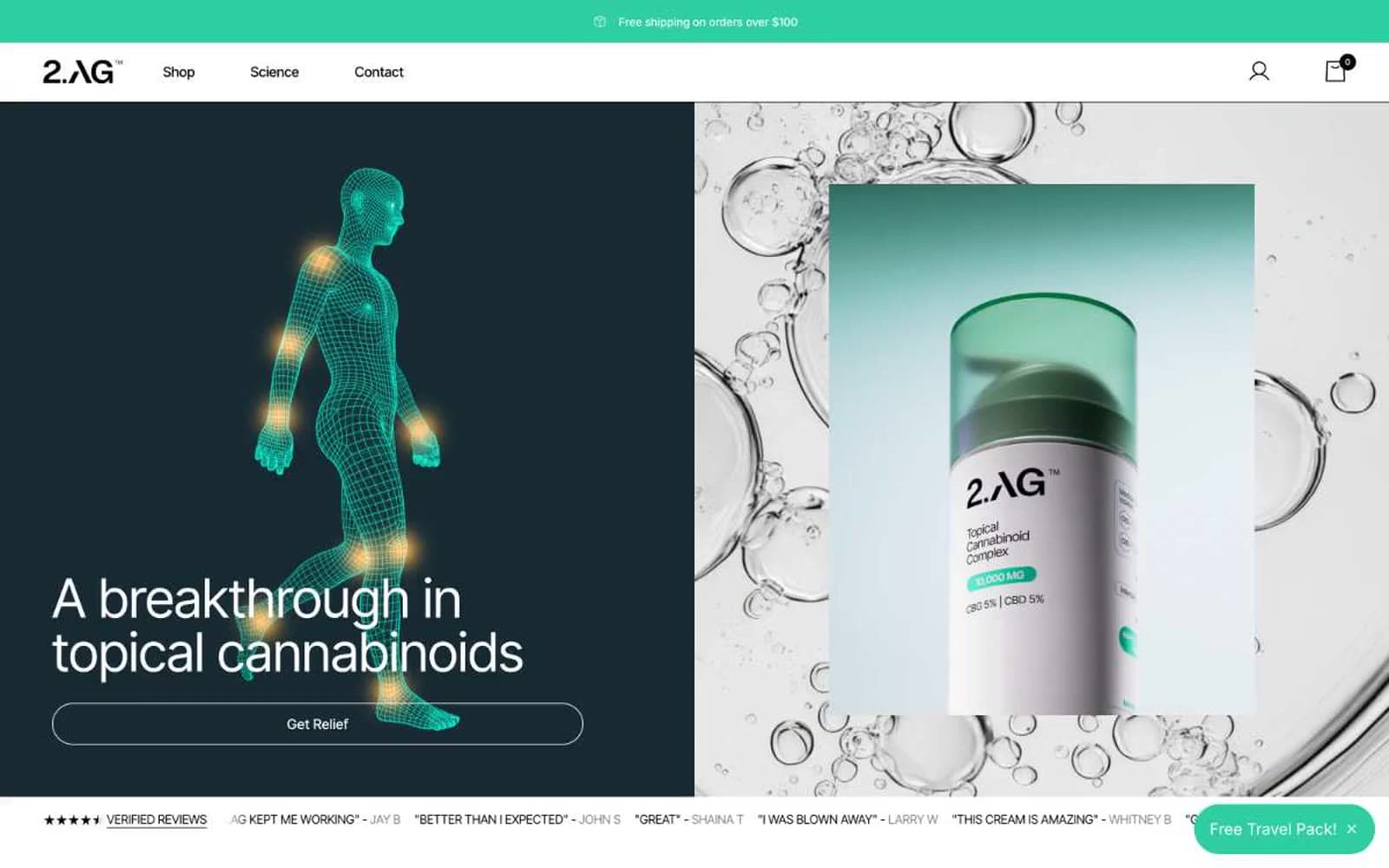
2.AG
Commerce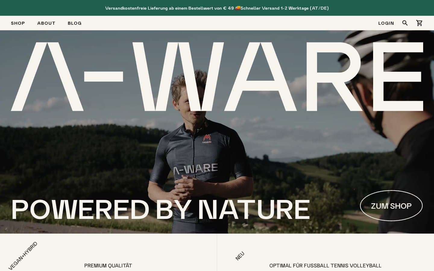
A-WARE
Commerce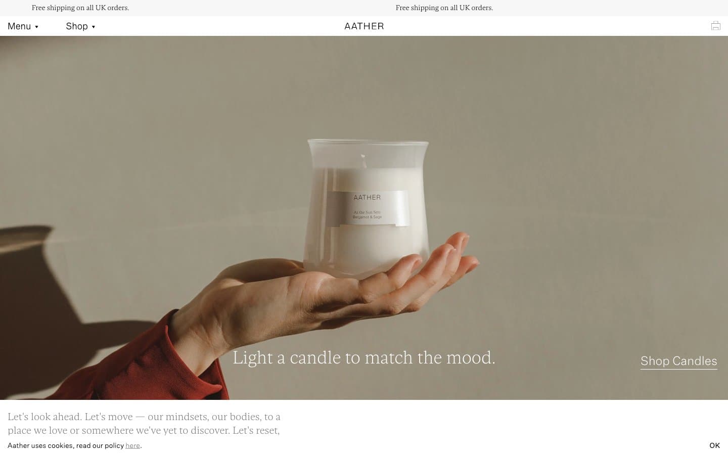
AATHER
Commerce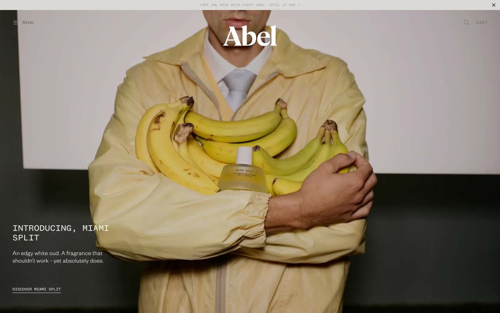
Abel
Commerce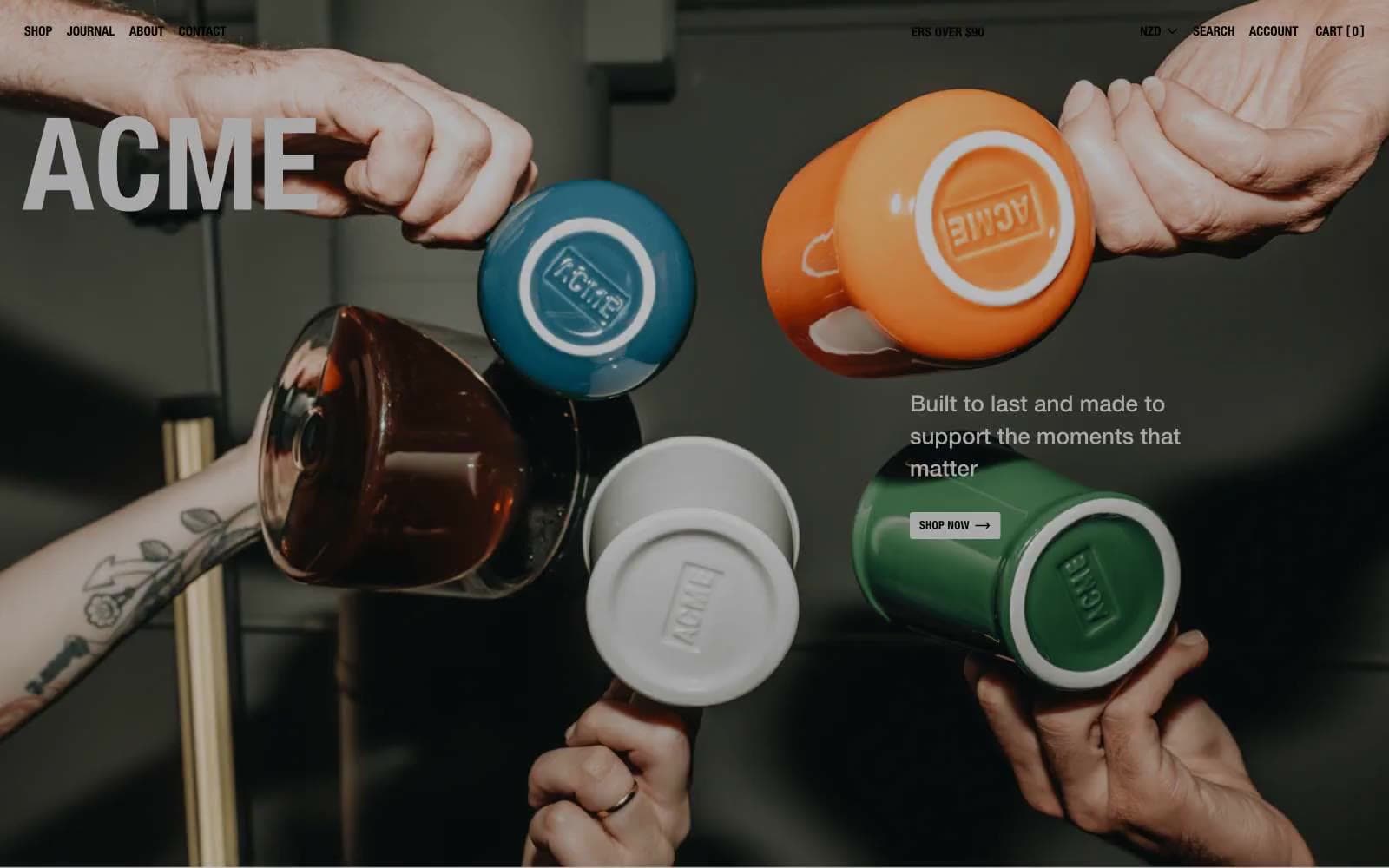
Acme Cups New Zealand
Commerce
Acne Studios
Commerce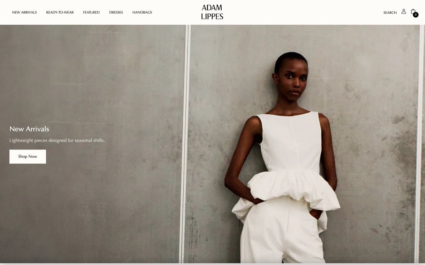
Adam Lippes
Commerce


