
2.AG. A measured, prescriptive wellness brand that treats the product shot like a specimen slide.
- Commerce
- Light theme
- 11 colors
- 2 typefaces
2.AG reads as a clinical apothecary crossed with a modern science brand: near-white canvas, deep teal structural surfaces, and one vivid mint accent that activates CTAs and data highlights. Inter Tight is tightened for a pharmaceutical voice — slightly negative tracking on display sizes, generous tracking on small caps for ingredient lists and badges. Components lean into large pill radii (30–50px) for buttons and soft 12–20px corners on cards, signaling a brand that is precise about dosage but warm on the body. Dark teal sections (Rapid Relief Cream header, stat blocks) ground the page in clinical authority, while bright green punctuation provides energetic, almost pharmacy-shelf accent. Layout is split, generous, and product-forward: hero pairs a dark editorial half with a bright product half, sections alternate white and teal, and reviews/stats form dense but airy card grids.

2.AG design system

Brand2
Primary structural color — dark hero background, stat block surfaces, icon strokes, navigation wordmark, secondary button borders. A near-gray teal that reads as ink rather than ocean, so it grounds the brand without going clinical-cold
Primary action color — filled CTA backgrounds, badge fills, active dots, announcement bar, review star highlights. Bright green with cyan lean, makes every interactive element feel switched on and biological
Accent1
Teal text accent for links, tags, and emphasized short phrases. Do not promote it to the primary CTA color
Neutrals8
Body text, hairline borders, icon strokes, input borders. The dominant structural neutral — most borders on the site are pure black, giving the UI a stark, editorial frame
Primary heading text and secondary borders. Softer than pure black for large headlines where Carbon reads as too heavy
Subhead text, button text on light surfaces, muted labels
Muted body text, helper copy, disabled labels, secondary icon strokes. The workhorse neutral for anything that needs to recede
Input borders, placeholder color, low-priority surface accents
Card and section dividers, subtle borders on white surfaces, separators between review cards
Lightest card and list surface — sits one step above pure white for subtle elevation on the page canvas
Page canvas, card surfaces, button text, input fills. The dominant light surface
Try a pairing
Pick any two colors from the palette to check whether text stays readable on top.
Aa
Paper on Deep Teal
9.27 : 1 contrast
- Body textPasses AA 4.5
- Large textPasses AA 3
- StrictPasses AAA 7
More DESIGN.md files. Same web, different personalities.

High Protein
Commerce
Hopper
Commerce
A-WARE
Commerce
AATHER
Commerce
Abel
Commerce
Acme Cups New Zealand
Commerce
Acne Studios
Commerce
Adam Lippes
Commerce
Adanola
Commerce
Advene
Commerce
Aevi Wellness
Commerce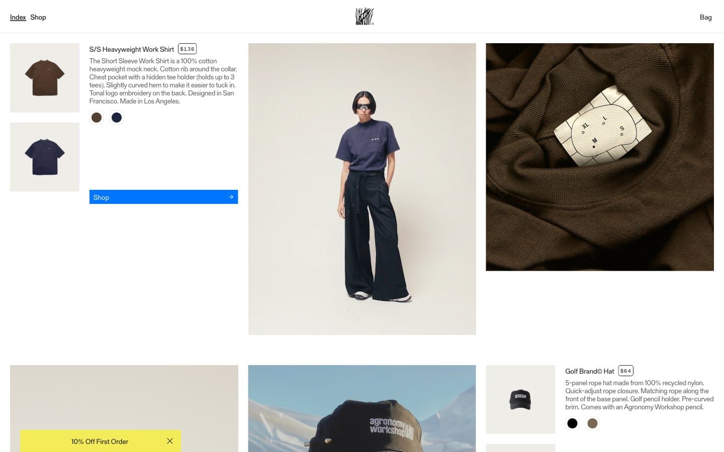
Agronomy Workshop
Commerce


