
Hopper. Santorini window at dusk.
- Commerce
- Light theme
- 8 colors
- 1 typeface
Hopper frames travel booking as a panoramic destination window: a full-bleed, rounded travel photograph carries the navigation and search controls, while the rest of the page returns to expansive white and pale-gray utility sections. The interface is text-dominant outside of imagery, using tightly structured Proxima Nova headings, blue links as navigational punctuation, and restrained 1px gray dividers. Pill-shaped controls float over photography, while destination and app-promotion content sits in flat, border-led surfaces with virtually no shadow.

Hopper design system

Brand1
Search button fill, destination links, inline navigation links, and selected product accents — saturated blue punctuates an otherwise achromatic travel interface
Neutrals7
Headings, search-entry text, and highest-emphasis content
Muted informational text, footer links, and secondary iconography
Placeholder text and inactive control icons
1px card borders, search-field separators, and quiet structural rules
Secondary page bands and subdued background areas
Muted card and footer-region surfaces
Primary page and card surfaces; white text and outlines over the photographic hero
Try a pairing
Pick any two colors from the palette to check whether text stays readable on top.
Aa
Ink on Hopper Blue
4.44 : 1 contrast
- Body textFails AA 4.5
- Large textPasses AA 3
- StrictFails AAA 7
More DESIGN.md files. Same web, different personalities.

High Protein
Commerce
2.AG
Commerce
A-WARE
Commerce
AATHER
Commerce
Abel
Commerce
Acme Cups New Zealand
Commerce
Acne Studios
Commerce
Adam Lippes
Commerce
Adanola
Commerce
Advene
Commerce
Aevi Wellness
Commerce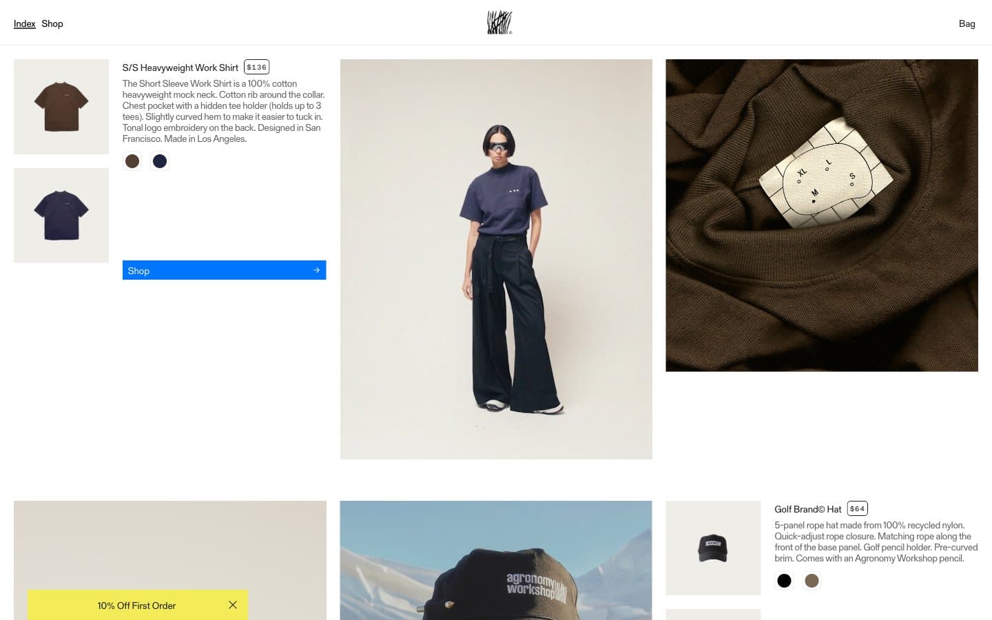
Agronomy Workshop
Commerce


