
Stereoscope Coffee. Paper bag, ruled atlas.
- Commerce
- Light theme
- 7 colors
- 1 typeface
Stereoscope Coffee is an architectural coffee storefront where fine black rules connect product, editorial and store information into one continuous grid. Paper #ffffff alternates with Gallery Mist #f3f3f3, Packaging Gray #d9d9d9 and Carbon Panel #1d1d1b. Brunswick Grotesque stays predominantly at weight 400, with 16px uppercase navigation and a restrained 30px display scale. Rotating packaging, film and photography supply the movement and color; square controls, 30px panel padding, a border-built footer and an enormous vector wordmark keep the interface itself precise and flat.
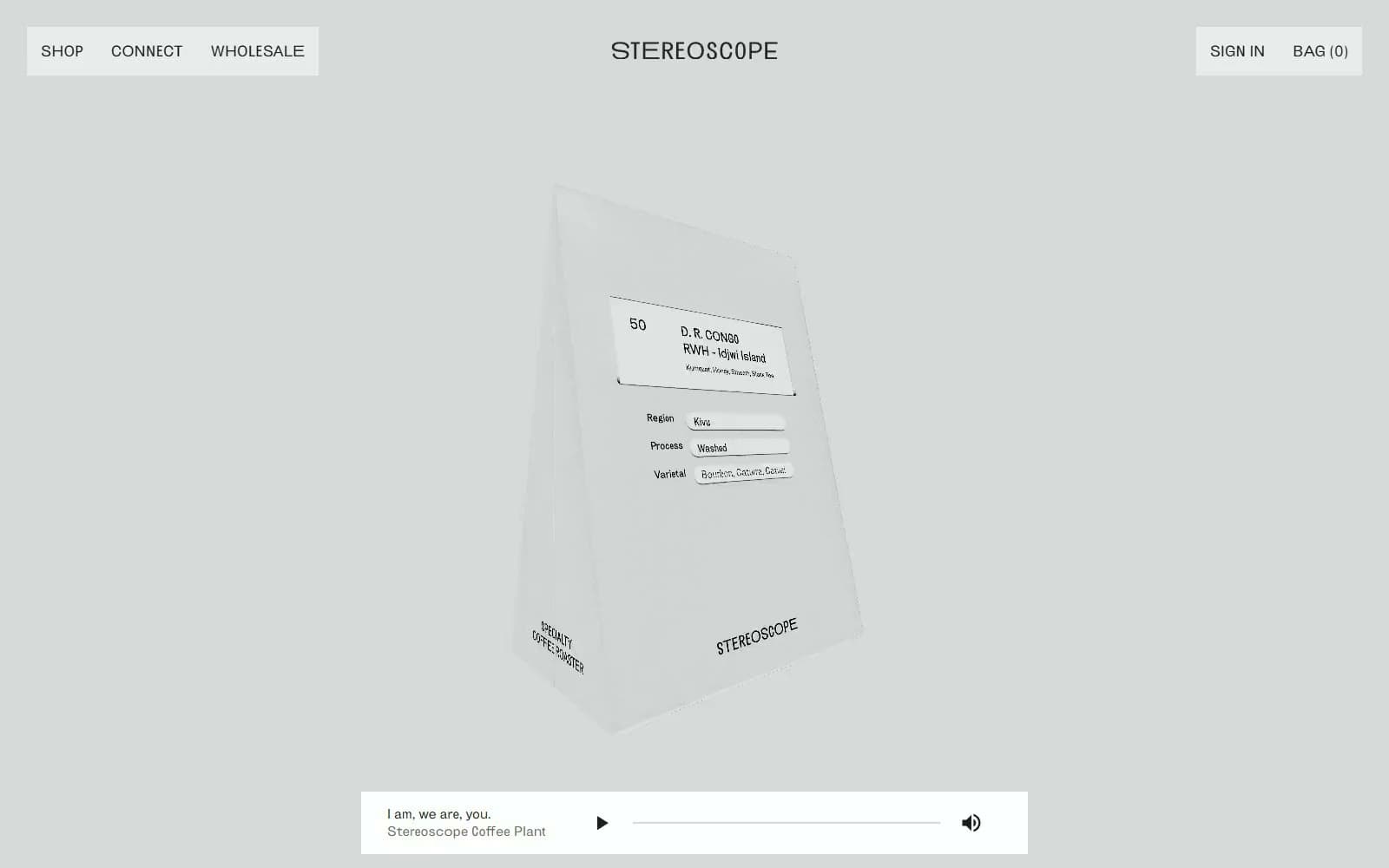
Stereoscope Coffee design system

Brand1
Uppercase navigation, headings, outline controls, hairline grid borders and the oversized footer wordmark.
Accent1
Tiny circular store-status marker only; this isolated indicator does not define the wider interface palette.
Neutrals5
Primary reading surfaces, product-grid ground and reversed labels on the dark Subscribe control.
Dark media panels, Subscribe fills, input rules and a softer near-black navigation treatment.
Pale product and editorial media fields and the quiet pre-footer return-to-top area.
Large packaging hero and editorial/footer backdrop, keeping white packaging visible without a saturated wash.
Product explanations, form text and understated Learn more links alongside black headings.
Try a pairing
Pick any two colors from the palette to check whether text stays readable on top.
Aa
Paper on Ink
21.00 : 1 contrast
- Body textPasses AA 4.5
- Large textPasses AA 3
- StrictPasses AAA 7
More DESIGN.md files. Same web, different personalities.
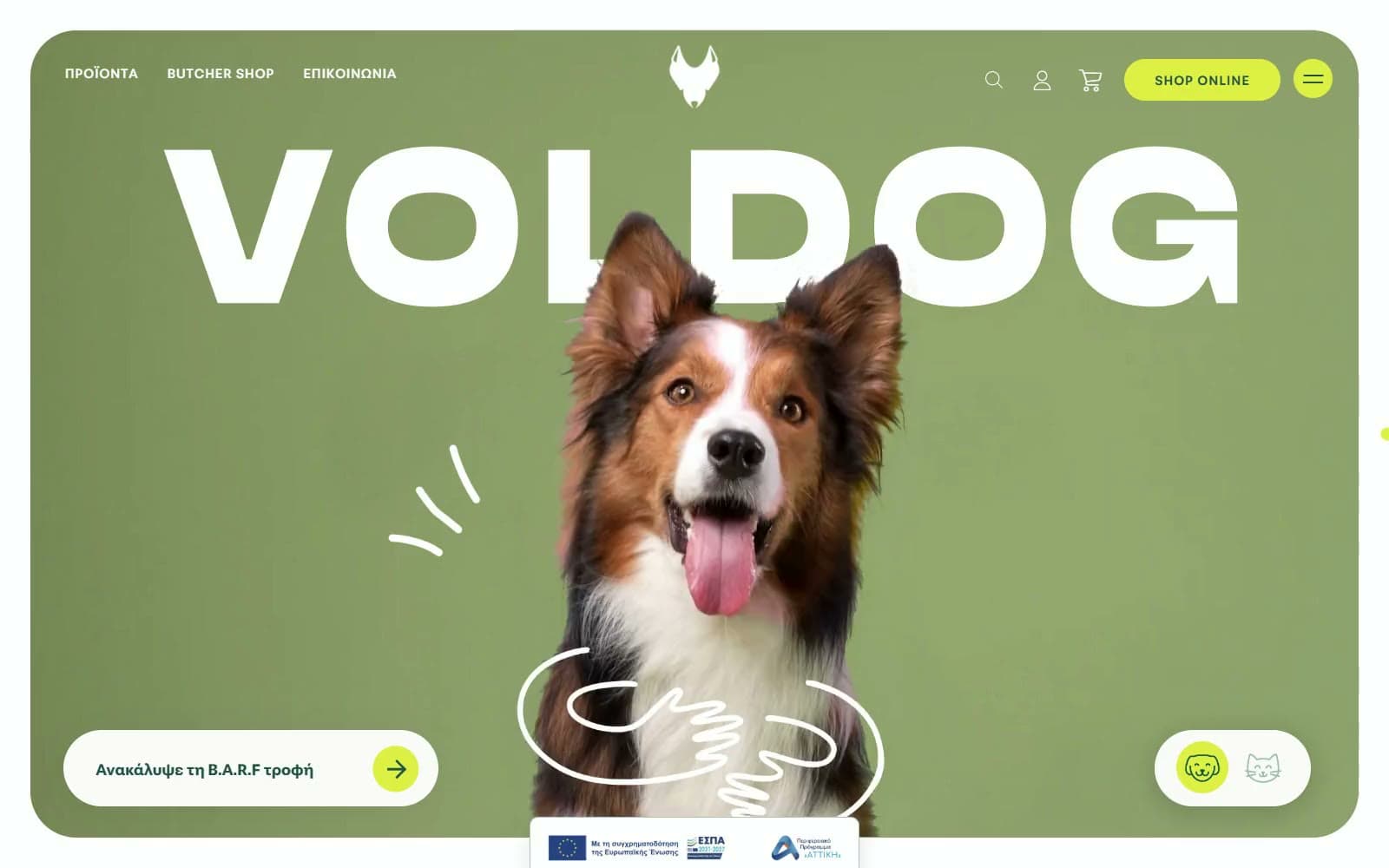
VOLDOG Food
Commerce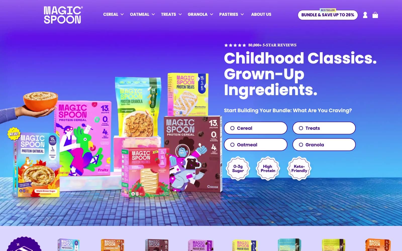
High Protein
Commerce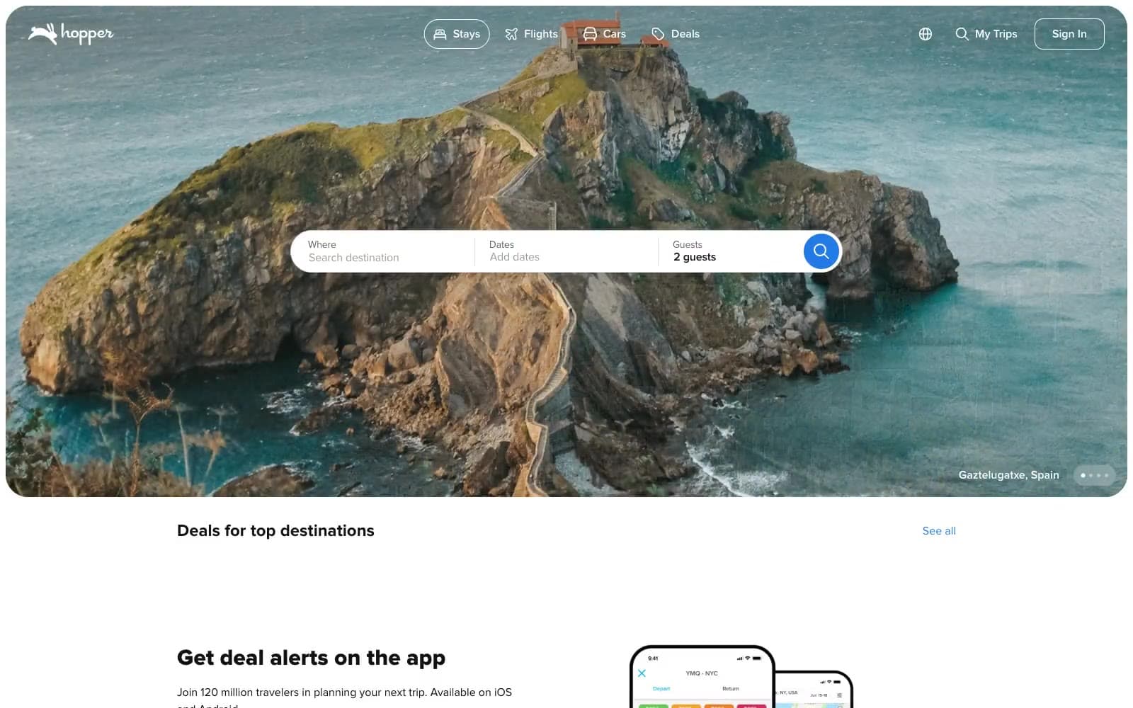
Hopper
Commerce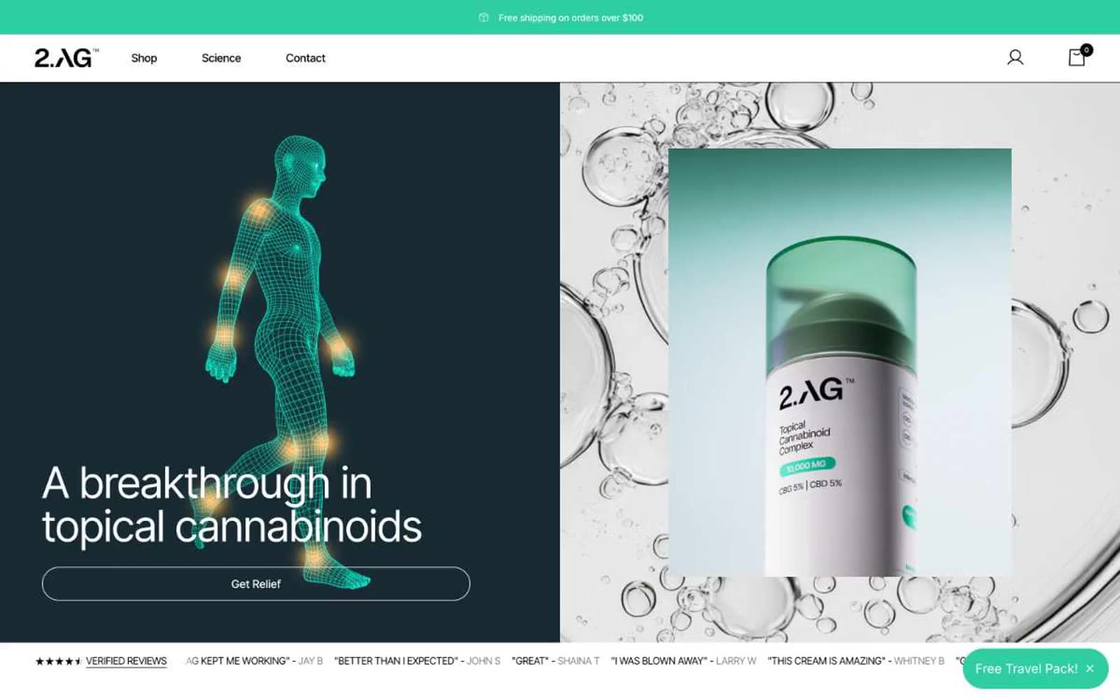
2.AG
Commerce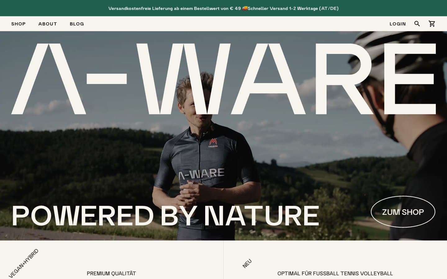
A-WARE
Commerce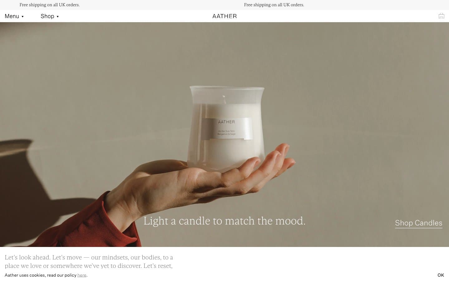
AATHER
Commerce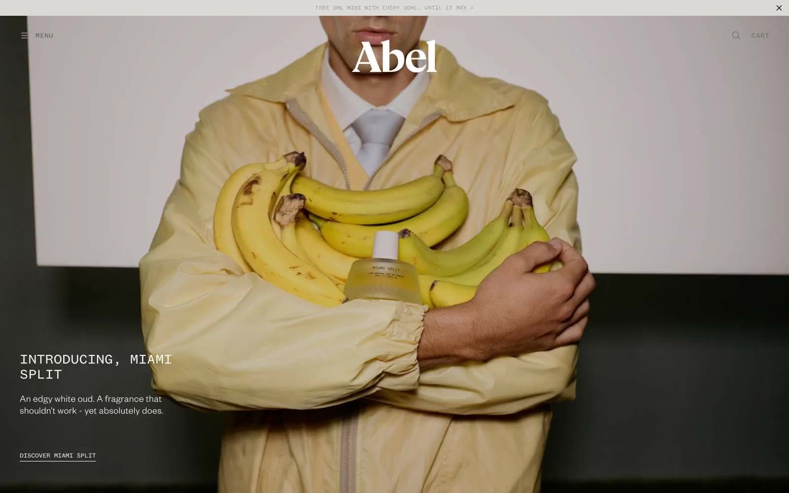
Abel
Commerce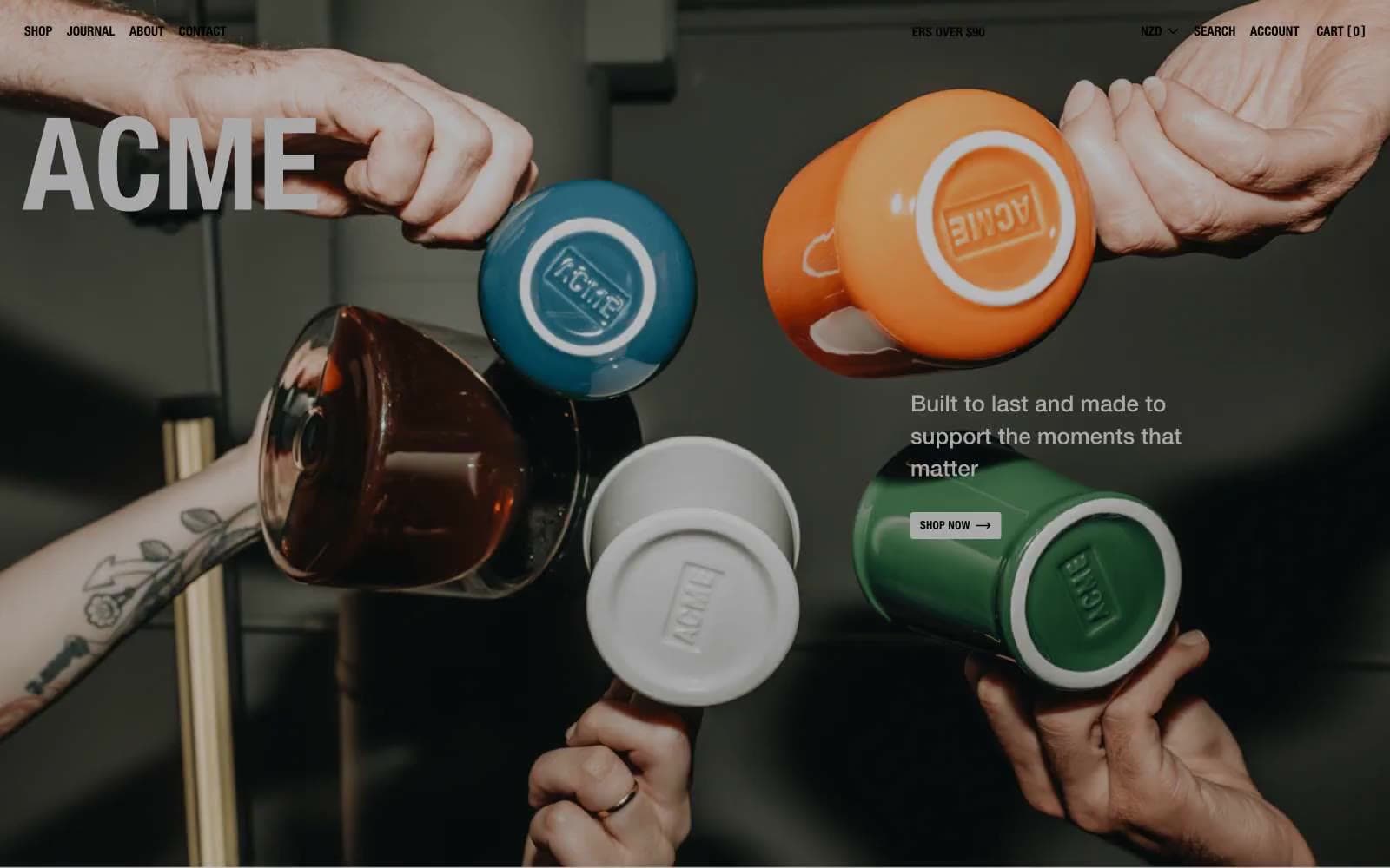
Acme Cups New Zealand
Commerce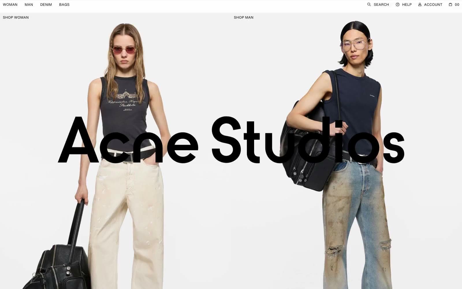
Acne Studios
Commerce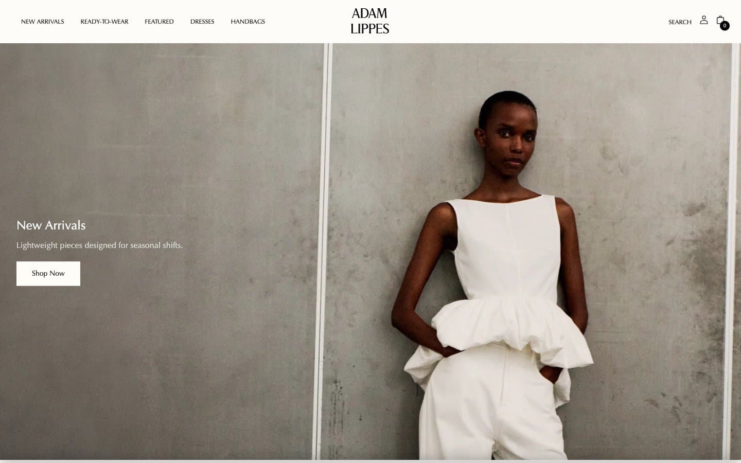
Adam Lippes
Commerce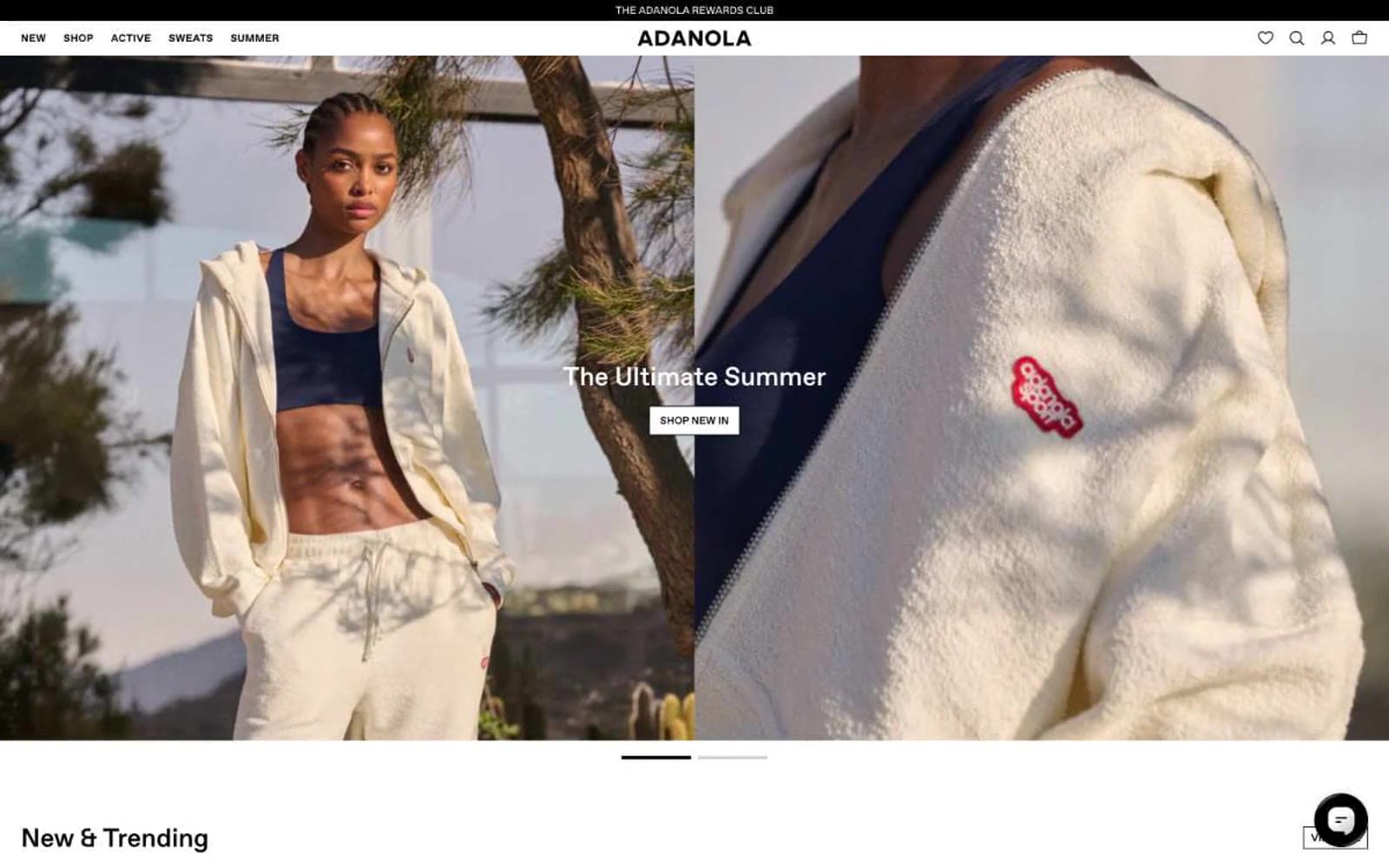
Adanola
Commerce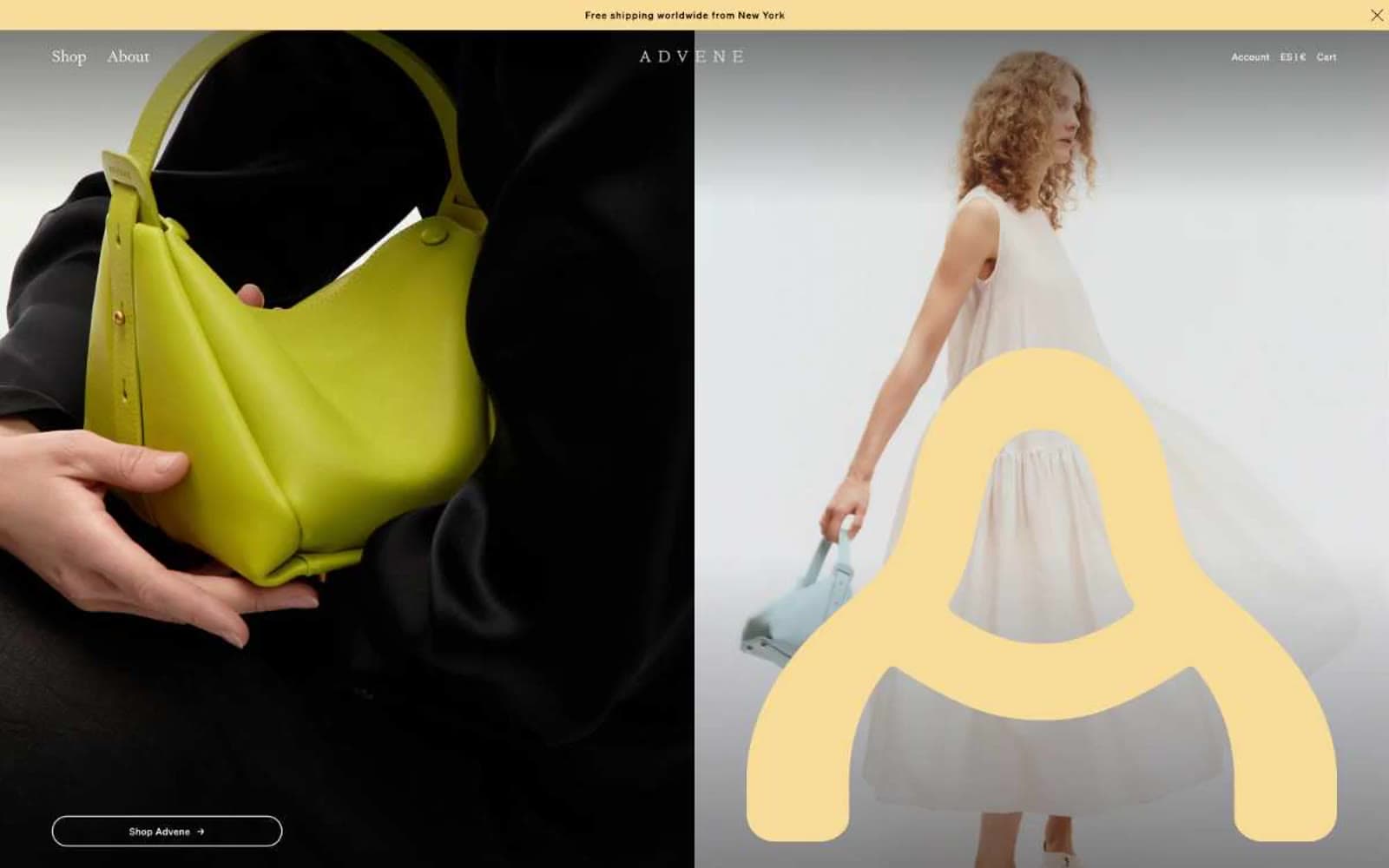
Advene
Commerce


