
AATHER. Quiet luxury held in stillness.
- Commerce
- Light theme
- 6 colors
- 4 typefaces
AATHER operates as an editorial candle studio rendered in near-total monochrome: white canvas, black ink, hairline rules, and photography doing all the emotional heavy lifting. The interface itself is austere to the point of being almost invisible — every typographic decision is calibrated toward whisper (weights 100–200) and air (tracking 0.036–0.056em), so the UI reads like a fashion magazine layout rather than a storefront. Warmth is never injected into the UI palette; instead, a single sand-toned surface (#dec39d) and full-bleed editorial photography carry the brand's tactile, hand-held mood. Components are reduced to their most elemental forms: text links with thin underlines stand in for buttons, 2px corners refuse decoration, and the centered wordmark navigation borrows directly from print editorial conventions.

AATHER design system

Accent1
Yellow wash for highlight backgrounds, decorative bands, and soft emphasis behind content. Do not promote it to the primary CTA color
Neutrals5
Neutral form states, badge text, and quiet UI feedback where color should stay understated.
Muted secondary text, low-emphasis borders, tertiary metadata. Pairs with body and link borders at lower visual weight than Ink
Footer and secondary dividers — the lightest perceptible rule, reserved for structural seams that must recede
Alternate canvas band, subtle section wash — used to separate content blocks without introducing a visible border line
Page background, card surfaces, reversed text on dark — the default canvas. Never tinted, never warmed; warmth arrives only through photography
Try a pairing
Pick any two colors from the palette to check whether text stays readable on top.
Aa
Ink on Warm Sand
12.40 : 1 contrast
- Body textPasses AA 4.5
- Large textPasses AA 3
- StrictPasses AAA 7
More DESIGN.md files. Same web, different personalities.

High Protein
Commerce
Hopper
Commerce
2.AG
Commerce
A-WARE
Commerce
Abel
Commerce
Acme Cups New Zealand
Commerce
Acne Studios
Commerce
Adam Lippes
Commerce
Adanola
Commerce
Advene
Commerce
Aevi Wellness
Commerce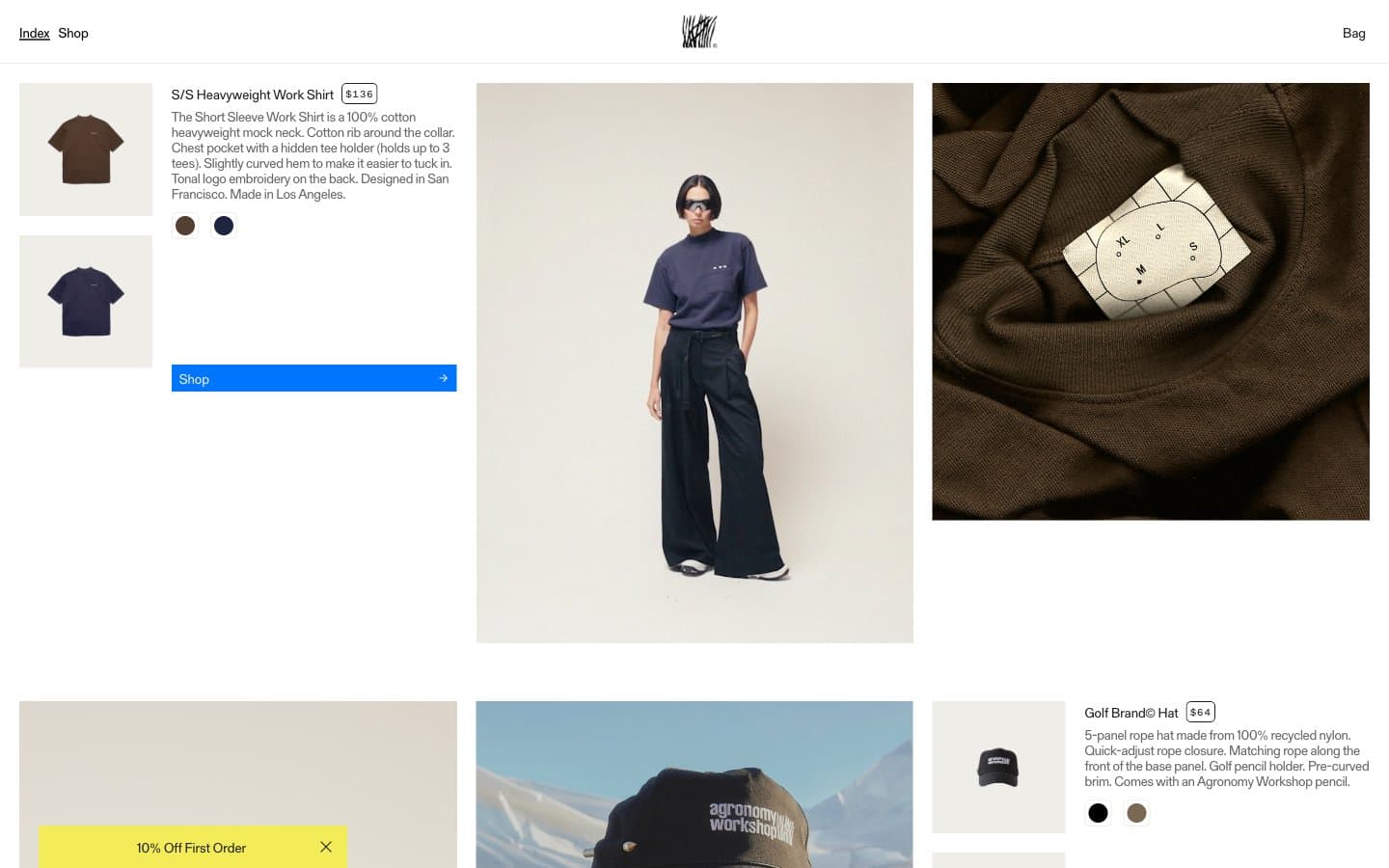
Agronomy Workshop
Commerce


