
FRAMA. Walnut apothecary, ruled in black.
- Commerce
- Light theme
- 11 colors
- 2 typefaces
FRAMA is a Copenhagen design house whose store reads like a printed catalogue laid over a working apothecary. A black #000000 announcement strip and a white nav ruled by one 1px line sit above full-bleed film of walnut cabinets, kraft paper and hands at work. Below that the page turns stark white #ffffff, with cut-out furniture on nothing and photography split edge to edge in pairs. All type is Univers Roman at weight 400, stepping from 12px captions to 47px titles with tight -0.4px tracking, and hierarchy comes from size and capitals alone. Every radius measured is 0px, every control is a black or white hairline box, and colour arrives only through the images.
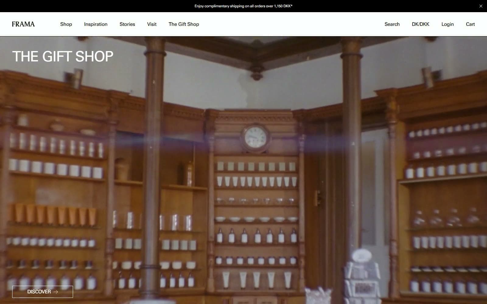
FRAMA design system

Brand1
Text, 1px rules and outlines, the announcement strip and the solid Add to Cart block: the only interface colour
Accent6
Deep cabinet brown sampled from the hero film, the darkest note in the warm imagery
Mid walnut sampled from the hero film, the tone white hero type sits on
Wrapping-paper brown sampled from the film as the shots move across the table
Muted grey-brown sampled from the film edges, where light falls off the paper
Cooler ash brown sampled from the film, a quiet bridge from the browns to the white page
Shadowed umber sampled from the film, close to the tone of the darker wood
Neutrals4
Page, nav, mega menu and product stage, plus text and outlines over film and photographs
Fill of the FRAMA wordmark SVG in the nav, a barely green black beside pure black type
Variant and subtitle line under product names, one step back from the name above it
The selected variant name beside the Select Variant label, the faintest text on the site
Try a pairing
Pick any two colors from the palette to check whether text stays readable on top.
Aa
Page White on Catalogue Black
21.00 : 1 contrast
- Body textPasses AA 4.5
- Large textPasses AA 3
- StrictPasses AAA 7
More DESIGN.md files. Same web, different personalities.

Aesop
Commerce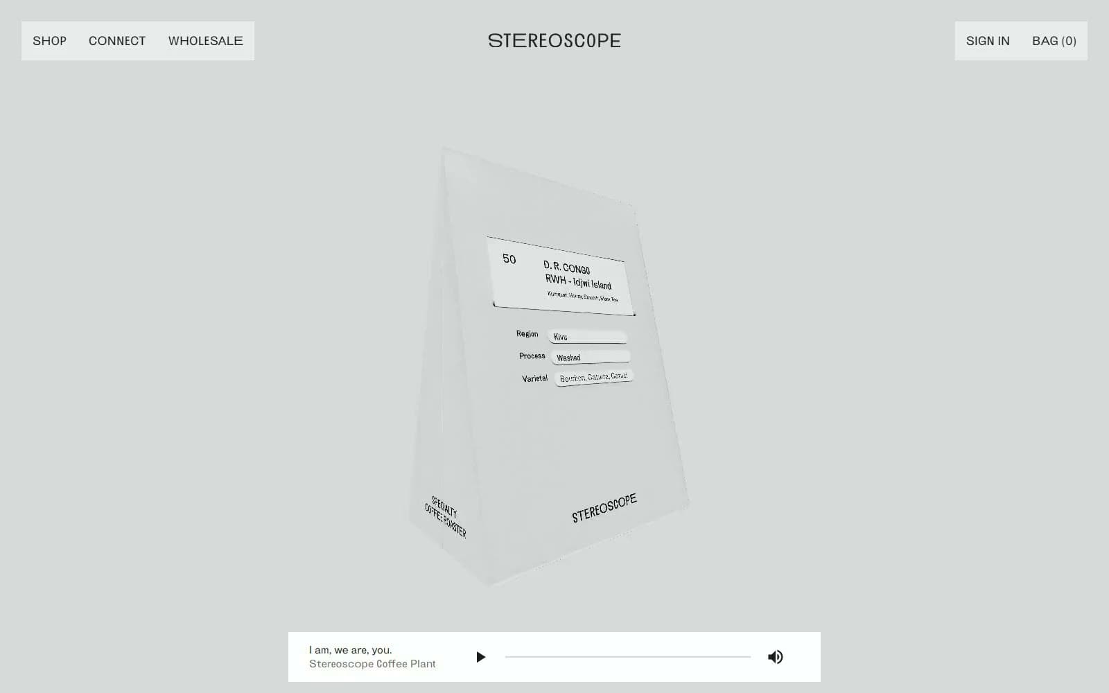
Stereoscope Coffee
Commerce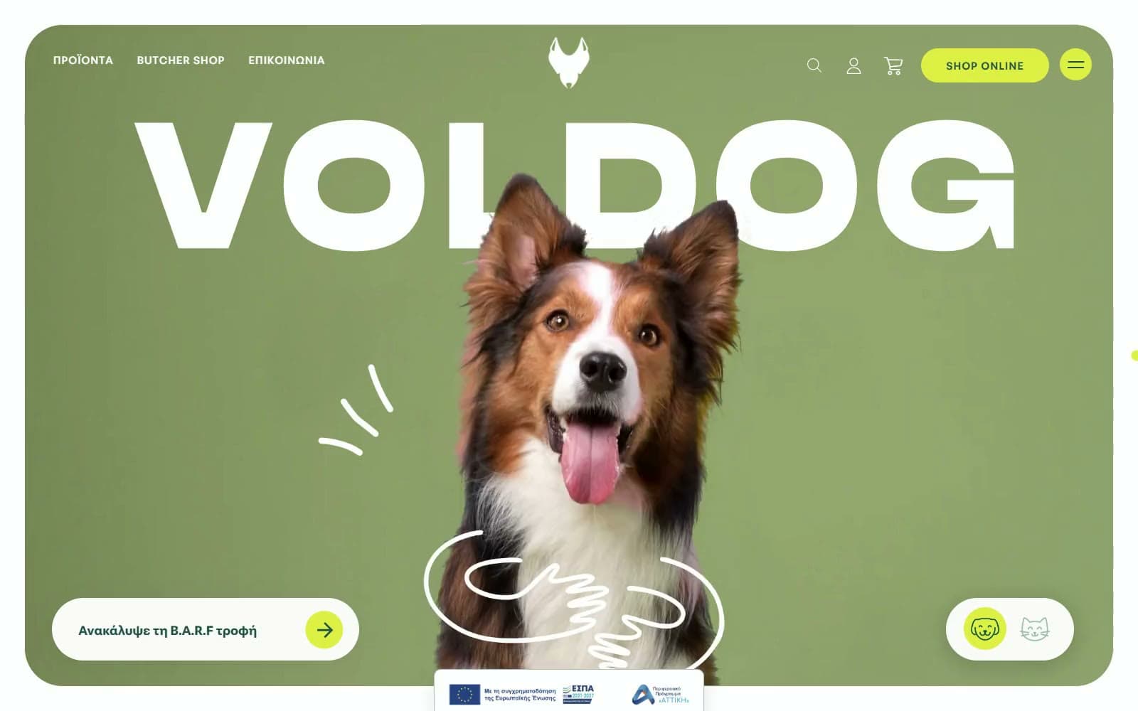
VOLDOG Food
Commerce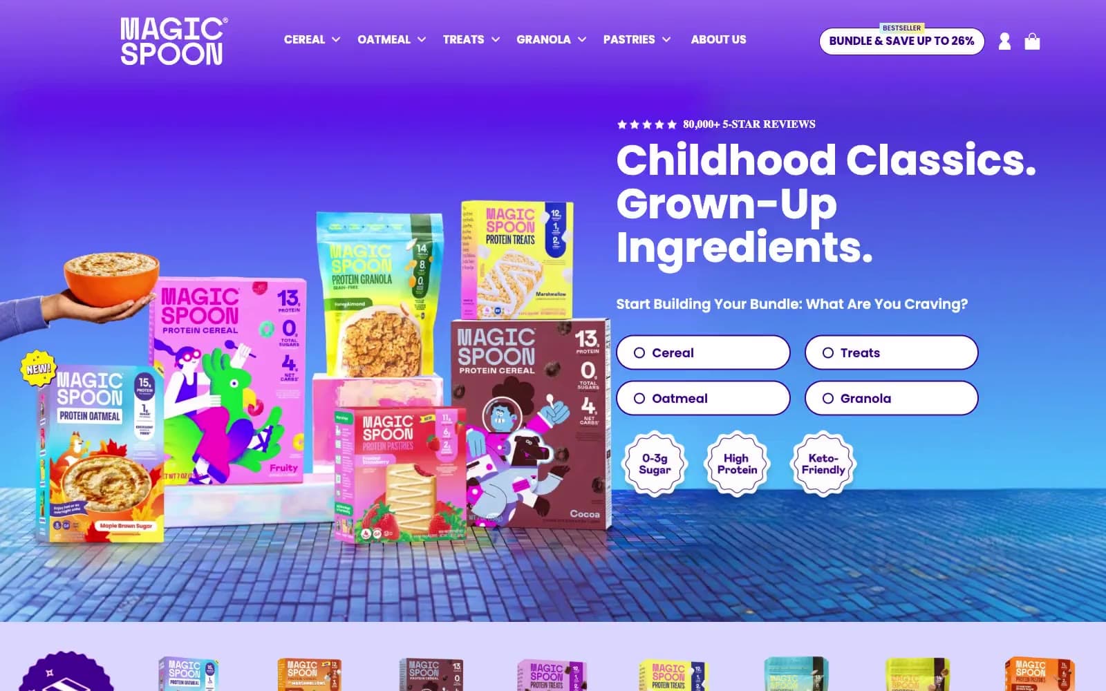
High Protein
Commerce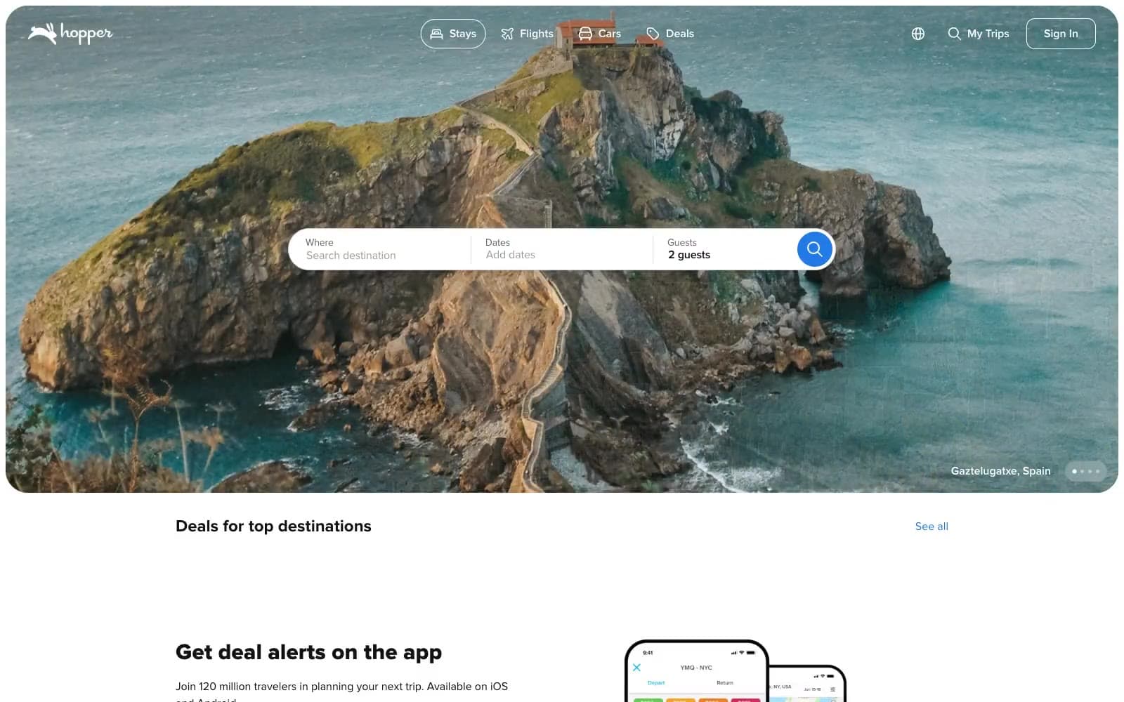
Hopper
Commerce
2.AG
Commerce
A-WARE
Commerce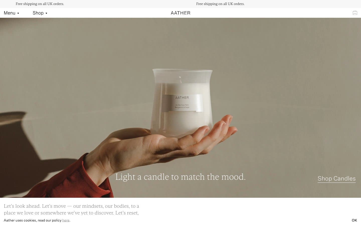
AATHER
Commerce
Abel
Commerce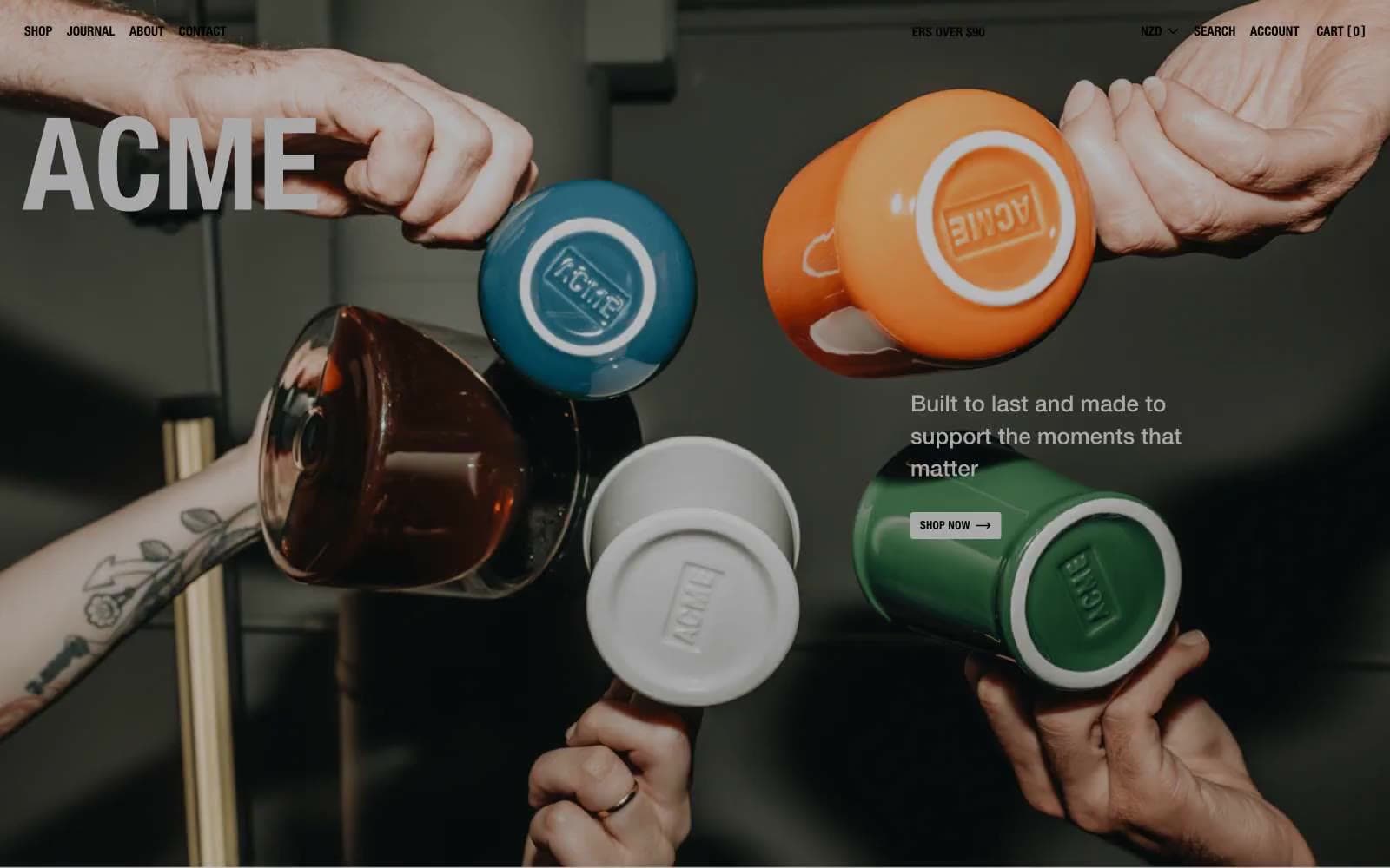
Acme Cups New Zealand
Commerce
Acne Studios
Commerce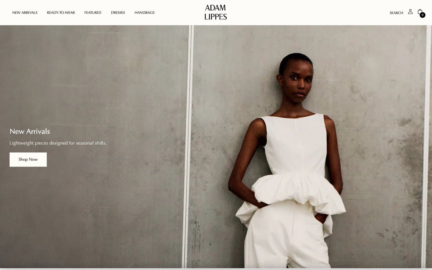
Adam Lippes
Commerce


