
DICE. Black ink on white paper, headlines screaming, everything else dead quiet.
- Media
- Light theme
- 7 colors
- 2 typefaces
DICE runs on a strictly monochromatic, high-contrast visual system that reads like a concert poster forced into an app store. Pure black and white carry the entire interface; color exists only inside the artwork of event posters and one neon-green confirmation screen. A custom condensed display face (Foggy) shouts at 100px+ in the hero, while Favorit handles every UI surface with a slightly loosened 0.06em tracking that makes even body copy feel editorial. Buttons are 40px-radius pills, images sit in soft 8px-rounded frames, and sections alternate between white canvas and full-bleed black bands to create a zine-like rhythm. The overall attitude is punk, confident, and typographically loud — restraint everywhere except the headlines.

DICE design system

Neutrals7
Primary text, filled pill buttons, full-bleed dark section backgrounds, icon strokes, hairline borders — the structural backbone of every page
Secondary button fills, elevated dark surfaces, muted-on-dark text in nested components
Muted body text, secondary navigation labels, supporting metadata
Tertiary body text, disabled states, low-priority metadata
Hairline dividers, muted borders, input field outlines
Soft image backgrounds, secondary surface tint, subtle card/poster fill behind event artwork
Page canvas, card surfaces, text on dark sections, button text on filled black buttons, search field fill
Try a pairing
Pick any two colors from the palette to check whether text stays readable on top.
Aa
Paper White on Pitch Black
21.00 : 1 contrast
- Body textPasses AA 4.5
- Large textPasses AA 3
- StrictPasses AAA 7
More DESIGN.md files. Same web, different personalities.

Josh W. Comeau
Media
The Pudding
Media
2020
Media
amra
Media
Bluesky Social
Media
Cup of Couple
Media
Desktop.fm
Media
Dezeen
Media
Epidemicsound
Media
Exhibition Magazine
Media
Flying Papers
Media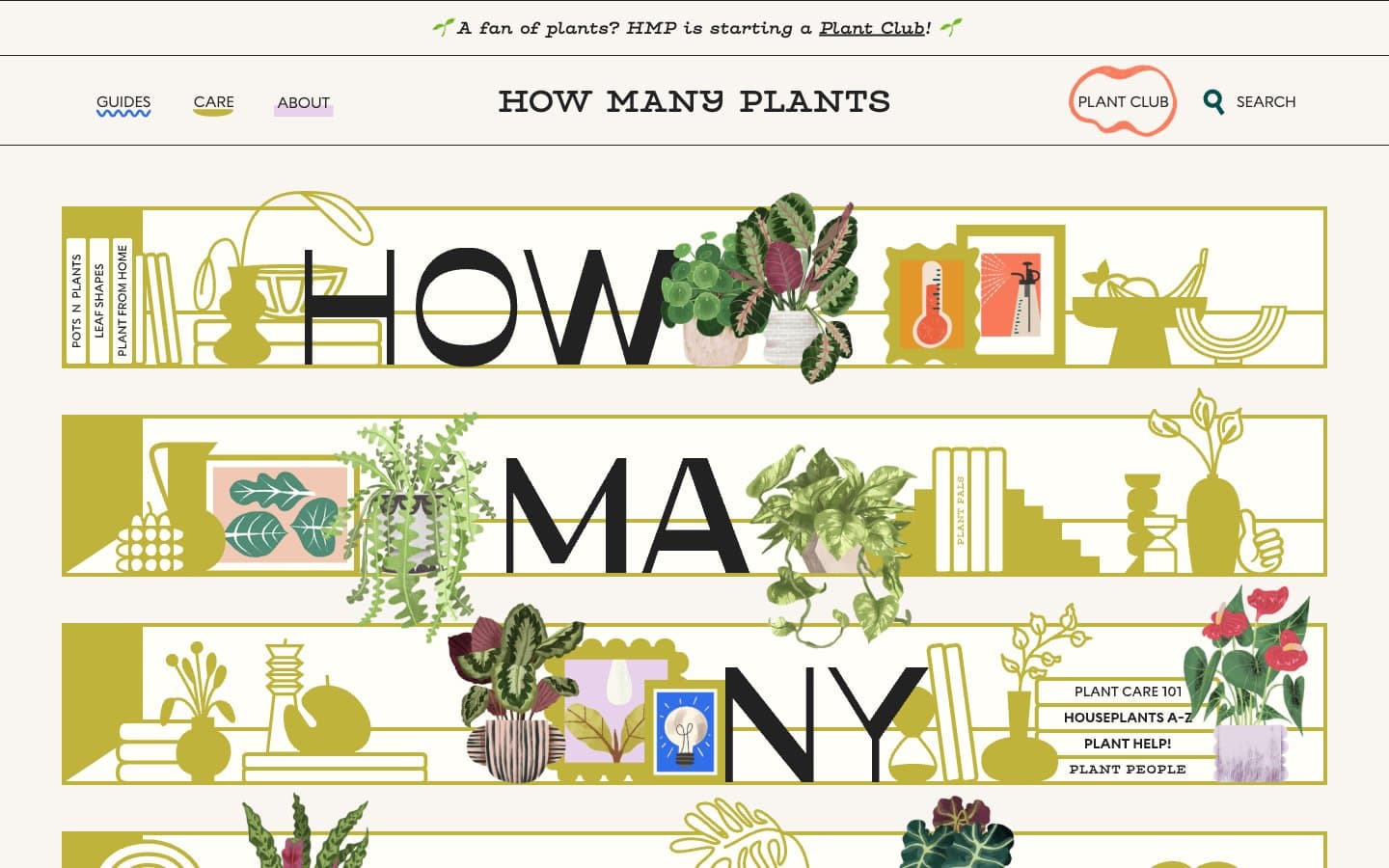
How Many Plants
Media


