
Dezeen. Pure white canvas, image-first cards, blue-violet ink.
- Media
- Light theme
- 9 colors
- 4 typefaces
Dezeen operates as a white-cube editorial gallery for architecture and design — the page reads like a curated biennale catalogue rather than a content portal. Photography occupies near-total visual weight: full-bleed image cards sit on a pure white canvas with almost no chrome between them, letting the work speak before the typography. A single muted blue-violet (#556e9b) carries every interactive signal — links, nav, heading accents — against a strict black-on-white text system, with a vivid orange (#ff7617) reserved as a rare chromatic punctuation for hover and emphasis. Headlines use StandardCT at weight 700 with tight line-heights that compress display copy into architectural bands, while Chronicle Text G1 A keeps body copy quiet and readable at 14–16px. Components are deliberately flat: no drop-shadows on cards, no decorative gradients, and a distinctive blue-violet colored shadow (rgba(101,122,183,0.6)) that bleeds horizontally from select headings as the only elevation gesture.

Dezeen design system

Brand1
Violet supporting accent for decorative details and low-frequency emphasis. Do not promote it to the primary CTA color
Accent1
Hover states on links, rare emphasis marks, accent strokes — appears sparingly to create a small spark against the cool blue-violet baseline
Neutrals7
Primary text, body copy, headlines, icons — the dominant ink used everywhere readable content appears
Muted secondary text, metadata, timestamps, comment counts — subordinated body information that should not compete with primary copy
Cool-tinted borders and rules — carries a faint blue cast that harmonises with the Gallery Indigo brand color rather than fighting it
Supporting neutral for secondary UI, dividers, and muted labels. Do not promote it to the primary CTA color
Nav backgrounds, hairline surface separators — used where a neutral needs to sit visibly above the canvas
Subtle surface wash for nested blocks, list items, secondary panels — barely visible depth beneath the white canvas
Page canvas, card surfaces, modal backgrounds, input fields — the base layer of the entire interface
Try a pairing
Pick any two colors from the palette to check whether text stays readable on top.
Aa
Gallery White on Gallery Indigo
5.13 : 1 contrast
- Body textPasses AA 4.5
- Large textPasses AA 3
- StrictFails AAA 7
More DESIGN.md files. Same web, different personalities.

Josh W. Comeau
Media
The Pudding
Media
2020
Media
amra
Media
Bluesky Social
Media
Cup of Couple
Media
Desktop.fm
Media
DICE
Media
Epidemicsound
Media
Exhibition Magazine
Media
Flying Papers
Media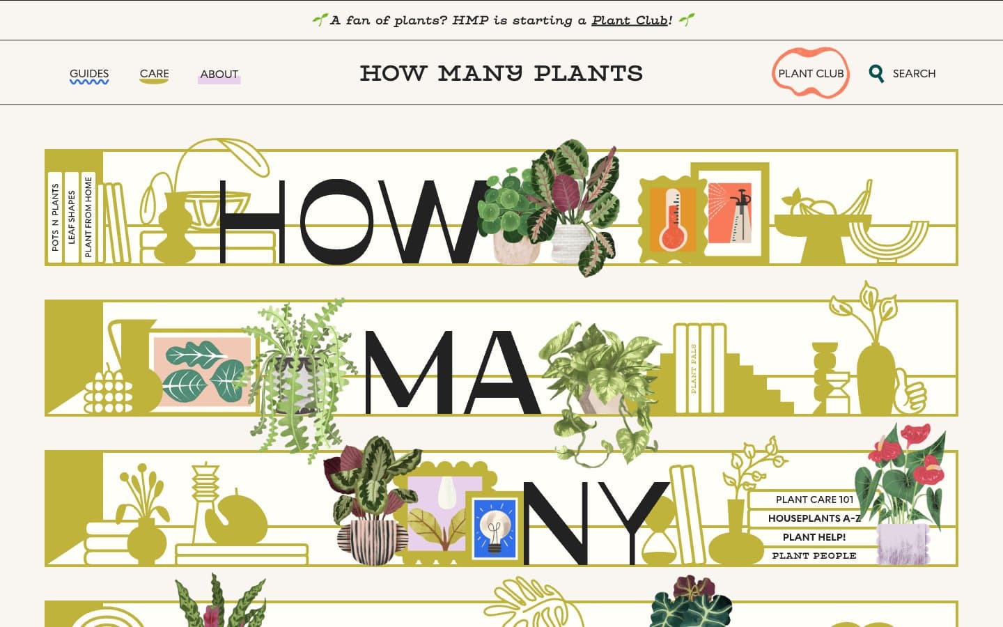
How Many Plants
Media


