
Desktop.fm. Apple keynote restraint meets cyberpunk CD-ROM nostalgia.
- Media
- Light theme
- 6 colors
- 2 typefaces
Desktop.fm is a near-monochrome product page that treats a single 3D-rendered object as the entire hero. The canvas is a cold light gray, the chrome disc floats centered, and the interface furniture is reduced to a single macOS-style window card with one black button. Typography is aggressive: system fonts pushed to weights 700-800 with tight tracking, never thin or light. The page is 1% chromatic by design — the only color comes from the rendered scene (neon green laser lines across a silver CD), and that color is not part of the UI token system, it is the product. Components are compact, radii are mostly sharp (1.5px), and the only soft radius belongs to the app-window card itself (25px) and the pill-lozenge button (20px). The result reads as an Apple product page filtered through a cyberpunk CD-ROM era — restrained chrome surfaces, one bold interactive element, and atmosphere carried entirely by a 3D asset rather than by gradient or illustration.

Desktop.fm design system

Neutrals6
Dark supporting neutral for text, icons, and strong contrast. Do not promote it to the primary CTA color
Secondary dark surfaces, icon strokes, muted dark UI elements
Muted backgrounds, disabled states, low-emphasis surfaces
Hairline borders, dividers, secondary card backgrounds
Page background, dominant surface across hero and surrounding space
Elevated card surface (app window mockup), inverse text on dark buttons
Try a pairing
Pick any two colors from the palette to check whether text stays readable on top.
Aa
Pure White on Carbon Black
18.88 : 1 contrast
- Body textPasses AA 4.5
- Large textPasses AA 3
- StrictPasses AAA 7
More DESIGN.md files. Same web, different personalities.

Josh W. Comeau
Media
The Pudding
Media
2020
Media
amra
Media
Bluesky Social
Media
Cup of Couple
Media
Dezeen
Media
DICE
Media
Epidemicsound
Media
Exhibition Magazine
Media
Flying Papers
Media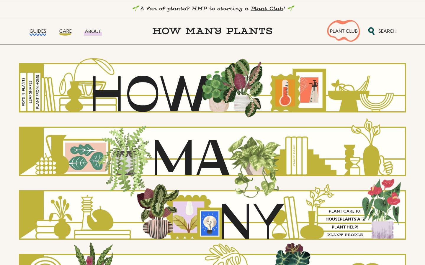
How Many Plants
Media


