
The Pudding. Die-cut stickers on a contact sheet.
- Media
- Light theme
- 7 colors
- 3 typefaces
The Pudding is a white-canvas index of visual essays laid out like a contact sheet: three columns of story cards, each a flat, saturated colour frame with a screenshot of the essay sunk into it. The site's own chrome stays almost colourless, Paper #ffffff with Pudding Charcoal #262626 type, outlined issue-number pills and 2px-cornered charcoal buttons, so the per-story frames supply every bit of hue. Gooper SemiCondensed 32px/700 lowercase titles at -0.8px tracking give the page a chunky, friendly editorial voice, Atlas Typewriter uppercase labels add a zine-like catalogue register, and Atlas Grotesk keeps teasers plain. Die-cut sticker lettering for the wordmark, nav and footer is the signature flourish.

The Pudding design system

Brand1
Body text, story titles, issue-pill outlines and the filled block buttons — a soft charcoal rather than pure black runs the whole chrome
Accent2
Example story-frame fill — each essay picks its own flat frame colour; this acid yellow is one of the loudest in the grid
Example story-frame fill — saturated per-story colour fields like this, never the chrome, bring the hue to the index
Neutrals4
Page canvas, header, footer, text fields and button labels — the flat white field every colour frame sits on
Sticker wordmark, filter icons and other SVG artwork fills — the pure black of the die-cut lettering
Story teaser lines under each title and the link hover colour — one quiet step down from Pudding Charcoal
1px outline of the search, email and captcha fields, measured as rgba(48, 48, 48, 0.4) over Paper
Try a pairing
Pick any two colors from the palette to check whether text stays readable on top.
Aa
Paper on Pudding Charcoal
15.13 : 1 contrast
- Body textPasses AA 4.5
- Large textPasses AA 3
- StrictPasses AAA 7
More DESIGN.md files. Same web, different personalities.

Josh W. Comeau
Media
2020
Media
amra
Media
Bluesky Social
Media
Cup of Couple
Media
Desktop.fm
Media
Dezeen
Media
DICE
Media
Epidemicsound
Media
Exhibition Magazine
Media
Flying Papers
Media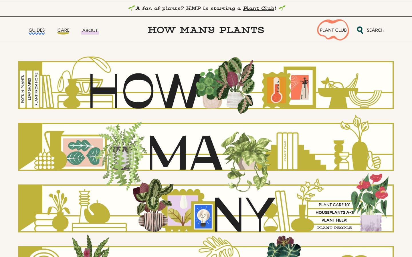
How Many Plants
Media


