
2020. Solid color poster wall.
- Media
- Light theme
- 12 colors
- 2 typefaces
Album Colors is a color-first editorial canvas: the entire viewport is a single saturated wash that changes on refresh, and everything else — type, images, UI — defers to it. The design language is brutally minimal: one custom geometric sans (Helvetica LT Pro) in a single weight, set at extraordinary sizes with aggressively tight leading, producing headline blocks that read as solid shapes rather than text. Color is the product, the navigation, and the identity — the only chrome is a small record-button icon in the corner and a rotated label urging the viewer to refresh. Album covers float on the colored field as unframed tiles; the page is closer to a poster than a website.

2020 design system

Brand2
Primary canvas — the full-viewport page background that changes on refresh; this is the design system
Primary text, headline color, and the only outlined action accent (outlined-button borders, link underlines) — warm dark green-brown that pairs with the orange field without competing chroma
Accent5
Alternating surface variation — one of the page colors the background can take on refresh
Alternating surface variation — secondary warm shade the canvas can adopt
Alternating surface variation — deep cool surface the canvas can adopt, creates the darkest mode of the page
Soft warm highlight — one of the lighter surface variations the canvas can adopt
Soft cool surface variation — one of the muted color states the canvas cycles through
Neutrals5
Album cover backgrounds, deep text on light surface states
Album cover and card backgrounds within the grid
Album cover backgrounds and heavy dark surface tone
Mid-neutral for muted helper text and secondary surface states
Album cover backgrounds, text on dark surface states
Try a pairing
Pick any two colors from the palette to check whether text stays readable on top.
Aa
Carbon on Signal Orange
7.53 : 1 contrast
- Body textPasses AA 4.5
- Large textPasses AA 3
- StrictPasses AAA 7
More DESIGN.md files. Same web, different personalities.

Josh W. Comeau
Media
The Pudding
Media
amra
Media
Bluesky Social
Media
Cup of Couple
Media
Desktop.fm
Media
Dezeen
Media
DICE
Media
Epidemicsound
Media
Exhibition Magazine
Media
Flying Papers
Media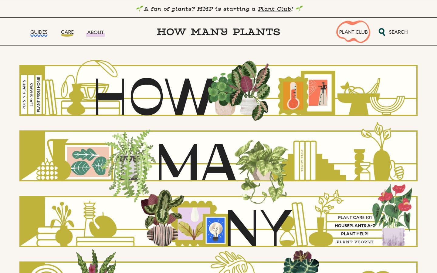
How Many Plants
Media


