
Epidemicsound. Boutique liner notes on sunlit paper.
- Media
- Light theme
- 14 colors
- 2 typefaces
Epidemic Sound reads as a music-industry editorial: a warm bone-white canvas, confident black sans-serif UI, and a custom high-contrast serif that carries the brand voice at display sizes. A single vivid hot-pink (#ff82c2) is the signature accent — used sparingly as full-bleed section backgrounds and inline emphasis rather than scattered decoration. Colorfulness sits at 1%, so the system should feel mostly monochrome with chromatic color arriving as deliberate editorial punctuation (pink, signal blue, sun yellow). Components are flat and rectangular, almost no border-radius, very little shadow — the design trusts typography weight and generous spacing to create hierarchy. Italic inside the display serif is a signature move: emphasis is set in the same family rather than a separate color or weight shift, giving headlines a literary, liner-notes quality.

Epidemicsound design system

Brand1
Signature accent section backgrounds (announcement bar, Studio feature block), inline link emphasis — the brand's editorial punctuation. Used full-bleed, not as a tint
Accent4
Accent highlight wash and decorative badge fills. Secondary chromatic accent that pairs with the pink in the brand's signature palette
Secondary section background, decorative callout. A cool counterpoint to the warm pink and yellow, used when a third chromatic moment is needed in long pages
Sporadic chromatic accent for icon strokes and small decorative highlights. Does not define sections
Green supporting accent for decorative details and low-frequency emphasis
Neutrals9
Dark supporting neutral for text, icons, and strong contrast. Do not promote it to the primary CTA color
Secondary text and dark surface variant. Slightly cooler than pure black; used where a softer dark surface is needed without losing authority
Muted body copy, helper text, secondary icon fills. The workhorse secondary text color at high frequency
Mid-tone divider, disabled border, subtle icon stroke. A neutral that sits between Slate and Bone for hairline UI
Cool-toned gray for card backgrounds and image placeholders where a cooler counterpart to Bone is needed
Decorative warm wash and image placeholder. The warmest neutral — used as a soft tonal block, rarely as functional UI
Slightly cooler light surface for card variants and disabled/secondary button states where Bone would feel too warm
Light supporting surface for subtle backgrounds and section separation. Do not promote it to the primary CTA color
Page canvas and inverse text on dark fills. The cleanest, coolest surface — Bone sits one step above it for warmth
Try a pairing
Pick any two colors from the palette to check whether text stays readable on top.
Aa
Ink Black on Hot Pink
9.22 : 1 contrast
- Body textPasses AA 4.5
- Large textPasses AA 3
- StrictPasses AAA 7
More DESIGN.md files. Same web, different personalities.

Josh W. Comeau
Media
The Pudding
Media
2020
Media
amra
Media
Bluesky Social
Media
Cup of Couple
Media
Desktop.fm
Media
Dezeen
Media
DICE
Media
Exhibition Magazine
Media
Flying Papers
Media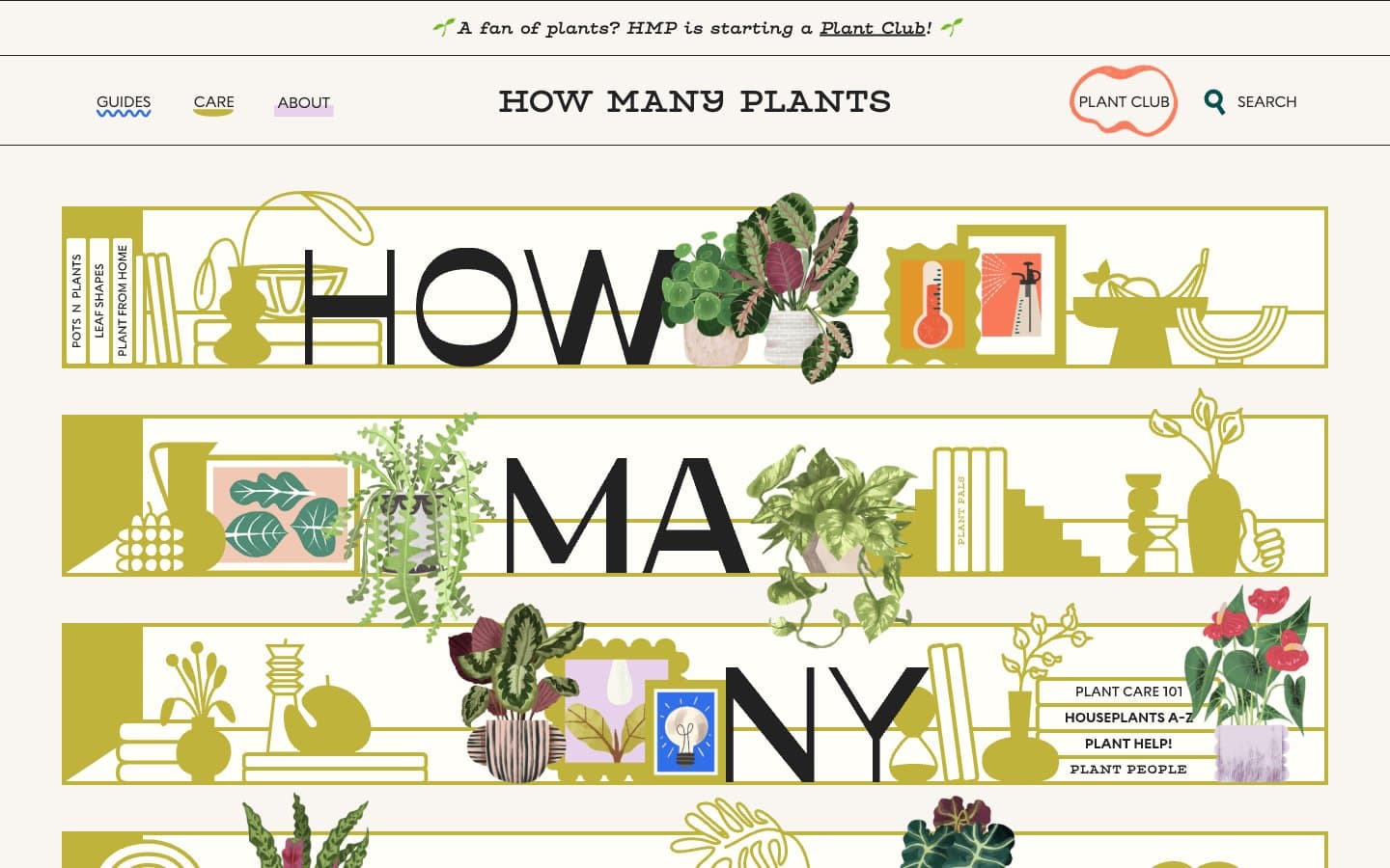
How Many Plants
Media


