
Cup of Couple. Printed fashion magazine on cream paper.
- Media
- Light theme
- 4 colors
- 4 typefaces
Cup of Couple operates as an editorial visual diary: a near-monochrome canvas with warm photography doing all the chromatic work. Every interface element is weight 400 — no bold weights exist in the system, so hierarchy is built through typeface choice (a humanist sans, a classical serif, a titling serif) rather than through thickness. The result reads like a printed magazine spread that happens to scroll: large serif titles, hairline gray rules, generous whitespace, and a gridded portfolio of lifestyle imagery. Brand identity lives almost entirely in one custom display face for the wordmark and the discipline of never adding color to chrome.

Cup of Couple design system

Neutrals4
Primary text, all UI borders, nav rules, image borders — the only non-white structural color in the system. The brand's deliberate refusal to go pure black gives headlines a softer, printed feel
Rare nav underline / accent rule — used sparingly where a separator needs slightly more presence than Dust Gray
Secondary borders, card dividers, footer rules, tertiary UI separators — a mid-gray that recedes behind content and never competes with photography
Card surfaces, subtle elevation against the white page, light shadow tints — warms the page away from clinical white and echoes paper stock
Try a pairing
Pick any two colors from the palette to check whether text stays readable on top.
Aa
Bone on Ink Charcoal
11.58 : 1 contrast
- Body textPasses AA 4.5
- Large textPasses AA 3
- StrictPasses AAA 7
More DESIGN.md files. Same web, different personalities.

Josh W. Comeau
Media
The Pudding
Media
2020
Media
amra
Media
Bluesky Social
Media
Desktop.fm
Media
Dezeen
Media
DICE
Media
Epidemicsound
Media
Exhibition Magazine
Media
Flying Papers
Media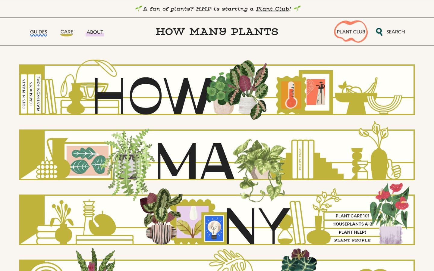
How Many Plants
Media


