Wispr Flow. Cream broadsheet, dark velvet chambers.
- AI
- Mixed theme
- 9 colors
- 2 typefaces
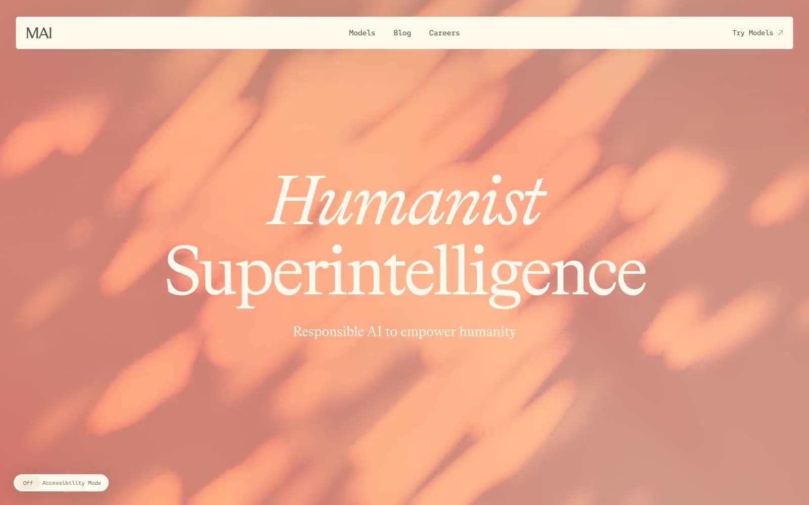
Wispr Flow reads like an editorial broadsheet rebuilt for software: a warm cream canvas (#ffffeb) hosts weight-400 Eb Garamond at display sizes (48–120px) that commands through sheer scale rather than weight, while Figtree handles every interactive surface. Pages alternate between bright cream chambers and deep near-black rooms, separated by 2px ink borders and oversized corner radii (40–80px) that make each section feel rounded like a polished pebble. The palette stays disciplined to four working colors — cream, black, lavender (#f0d7ff) for primary actions, and forest teal (#034f46) for inner accents — with an occasional ember orange (#ffa946) punctuating active states.
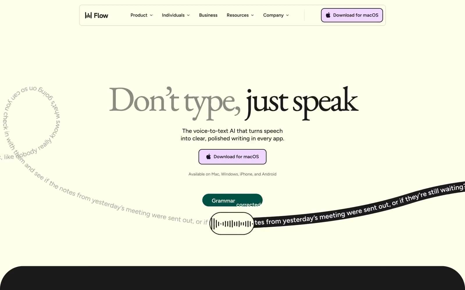
Wispr Flow design system

Brand2
Primary CTA fill, accent card surfaces — soft pink-lavender that signals the one clickable thing on any page without ever shouting
Secondary brand surface — teal pill badges, inner dark-panel cards, secondary buttons against dark backgrounds
Accent1
Live/active state accent — notification dots, active mic indicators, occasional badge highlights
Neutrals6
Primary text, button borders, dark section/card backgrounds — the dominant near-black that defines every dark chamber
Secondary button text and nav text — slightly lighter than Vast Ink for less critical text
Muted captions, helper text, and de-emphasized UI labels.
Subtle borders, nav pill background, muted dividers — one shade darker than the cream canvas for low-contrast separation
Dominant page canvas, card surfaces, button fills, light text on dark — warm off-white that reads as paper, not screen
Badge borders on dark surfaces, light text on color, SVG icon strokes
Try a pairing
Pick any two colors from the palette to check whether text stays readable on top.
Aa
Vast Ink on Lavender Whisper
13.15 : 1 contrast
- Body textPasses AA 4.5
- Large textPasses AA 3
- StrictPasses AAA 7