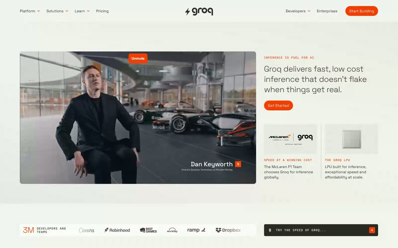
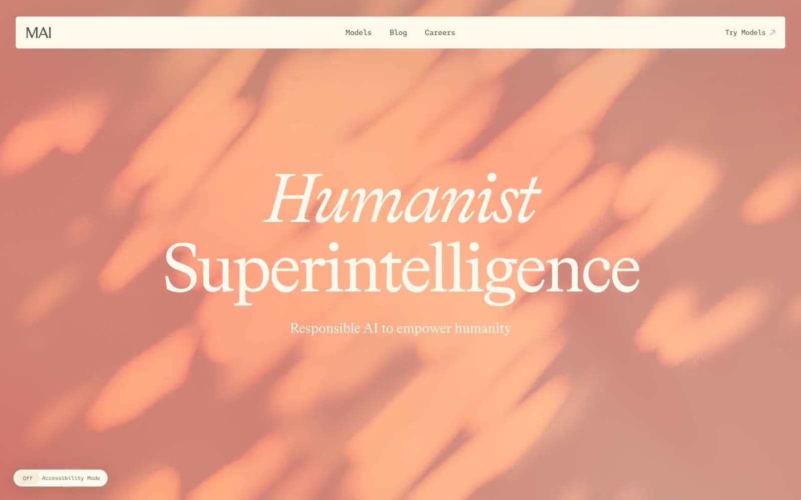
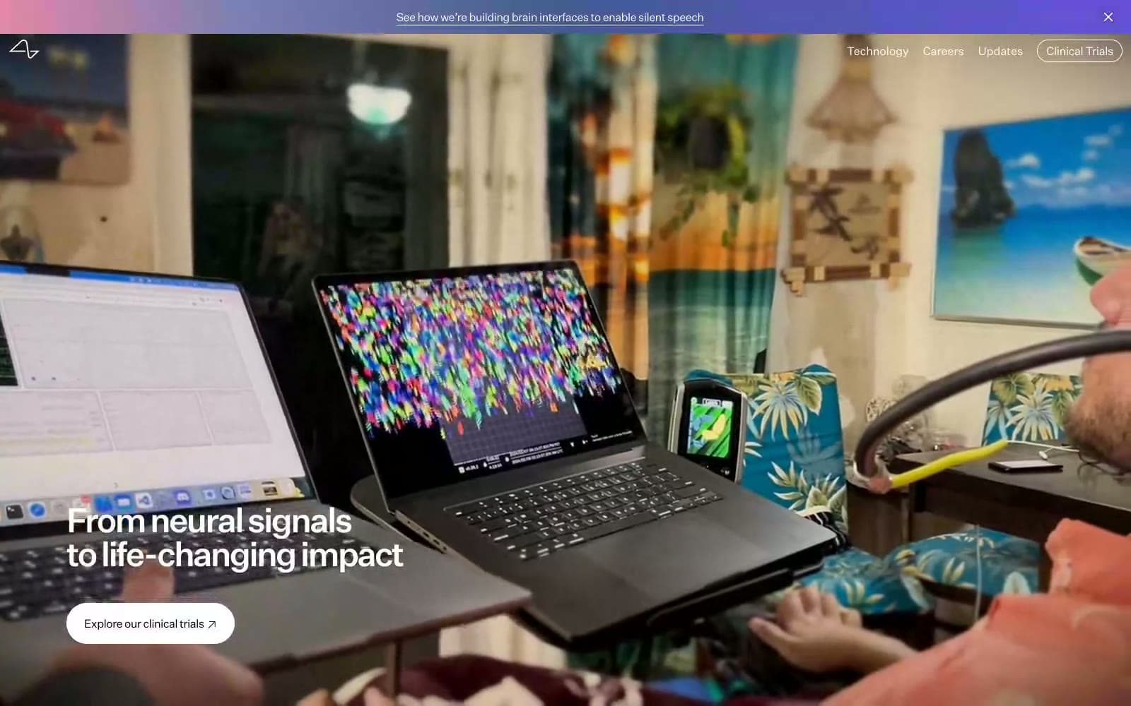
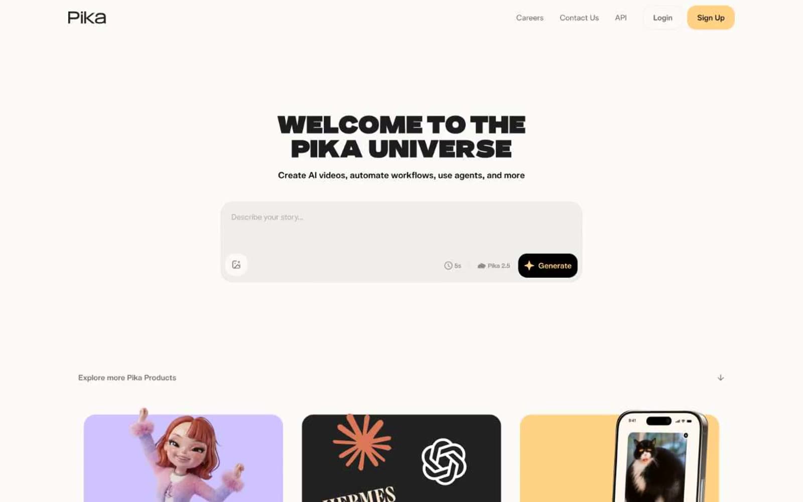
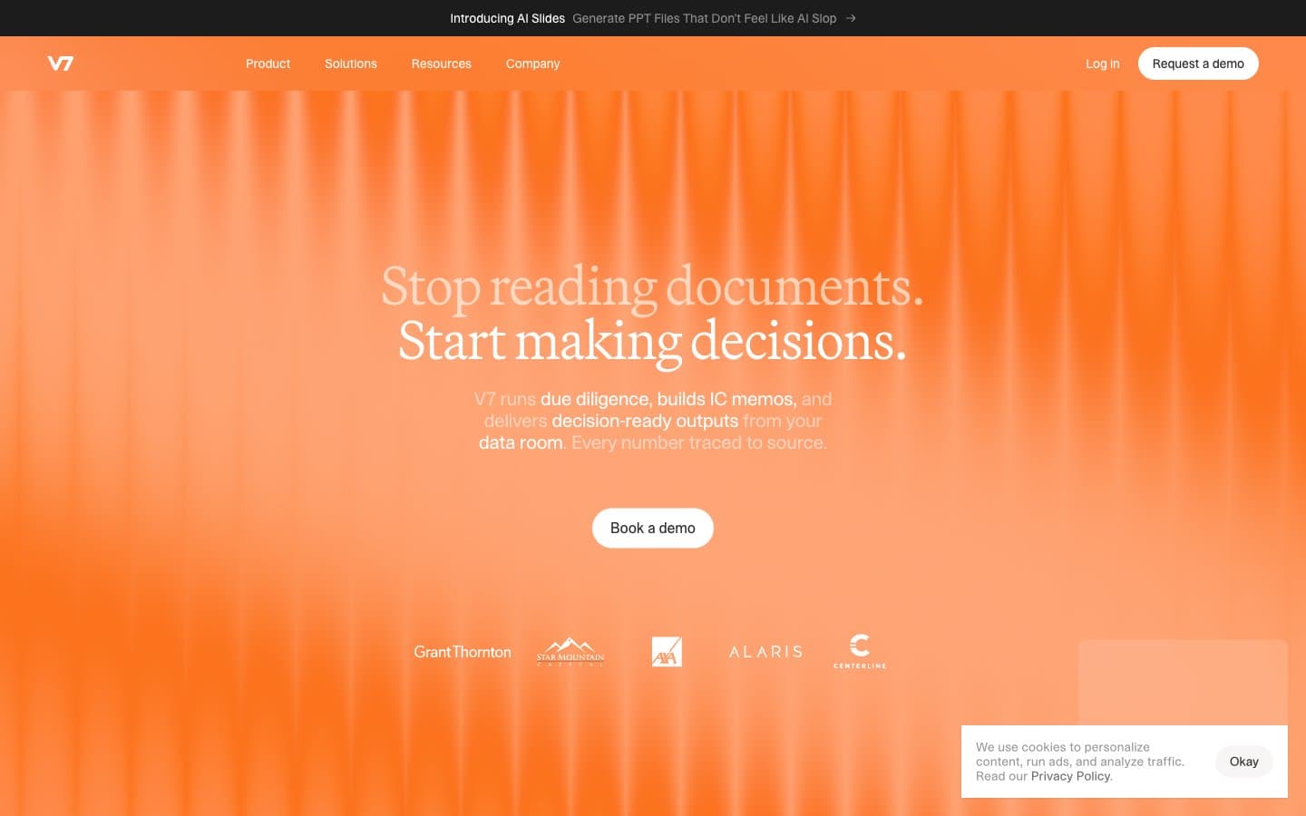
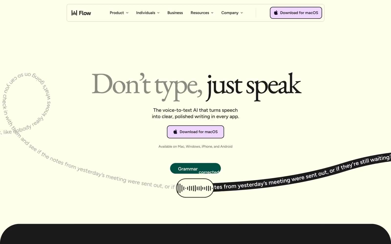
Aboard. Editorial field journal under industrial light.
- AI
- Mixed theme
- 11 colors
- 4 typefaces
Aboard reads as an editorial dossier drafted inside a working warehouse: Tobias serif headlines at weight 300 float over Atkinson Hyperlegible Mono body copy, a pairing that treats the page as a technical specification rather than a marketing surface. The system alternates full-bleed dark documentary bands with warm off-white reading sections, the rhythm controlled by a single vivid ember-orange that punctuates CTAs, icons, and active states against an otherwise achromatic palette. Components are deliberately thin: pill-shaped CTAs, translucent floating nav, hairline borders at 1px, almost no shadow or elevation — the interface recedes so the photography and the prose can carry the page. The warmth of the neutrals (bone white, linen, warm graphite) keeps the dark sections from feeling cold, while the orange never decorates — it always signals an action or a live status.

Aboard design system

Brand2
Primary CTAs, active nav items, icon fills, link accents — the only chromatic color in the UI, it acts as a power-switch indicator against the muted neutrals
Hover-state borders, subdued accent outlines, tag strokes — a desaturated echo of Ember Orange for quieter accents
Neutrals9
Pure black for maximum-contrast text and image overlay scrims
Dark section canvases — nearly black with a green-warm undertone that complements the orange
Primary body and heading text on light surfaces — a warm near-black with brown undertone instead of pure black
Strong dark borders, deep separators
Translucent nav background tint, muted UI surfaces
Medium-strength borders where hairline is too faint
Hairline borders across cards, images, dividers, and form fields
Warm secondary surface, elevated card backgrounds, subtle shadow tint
Page canvas on light sections, text color on dark/image sections
Try a pairing
Pick any two colors from the palette to check whether text stays readable on top.
Aa
Ink on Ember Orange
5.14 : 1 contrast
- Body textPasses AA 4.5
- Large textPasses AA 3
- StrictFails AAA 7