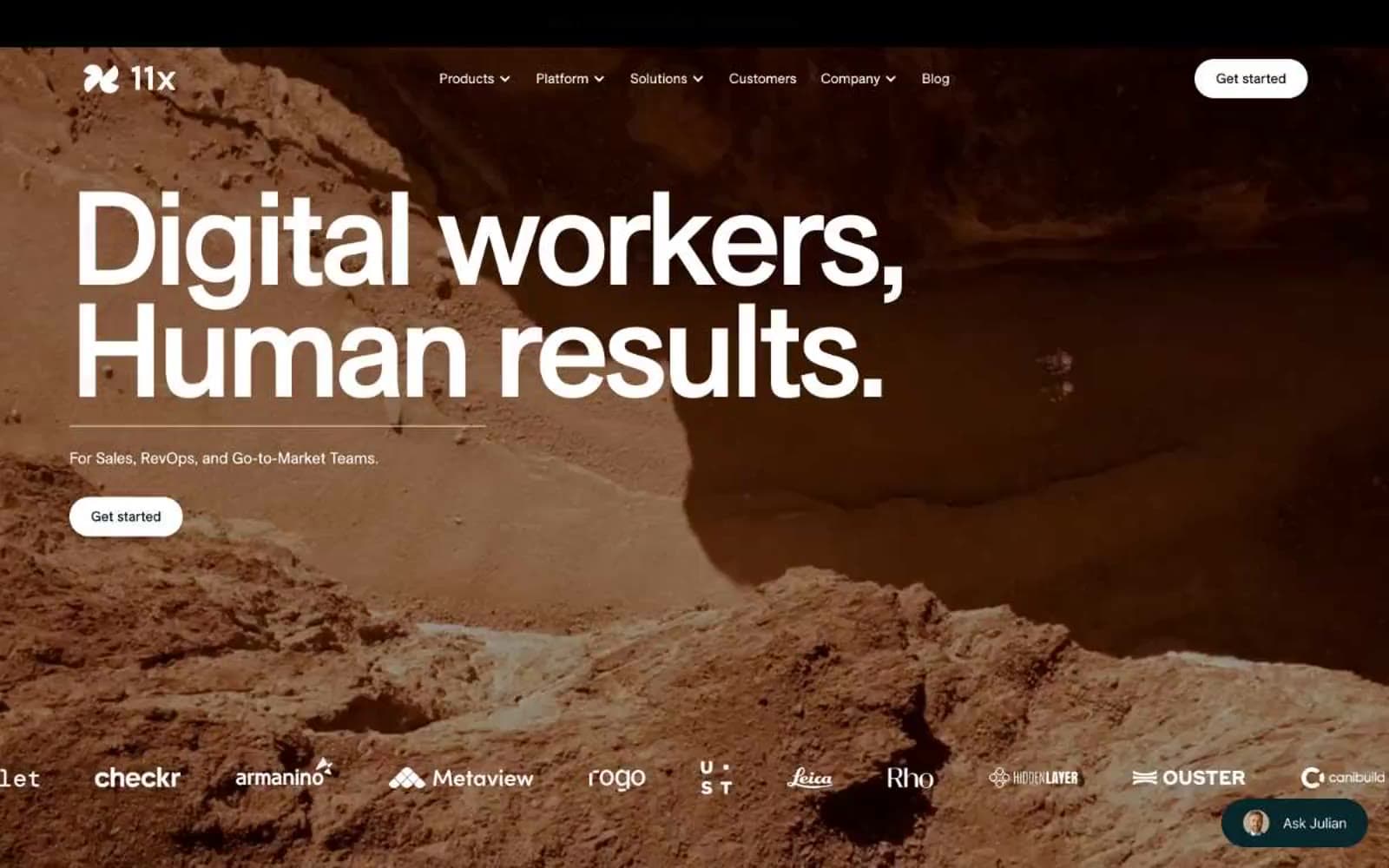
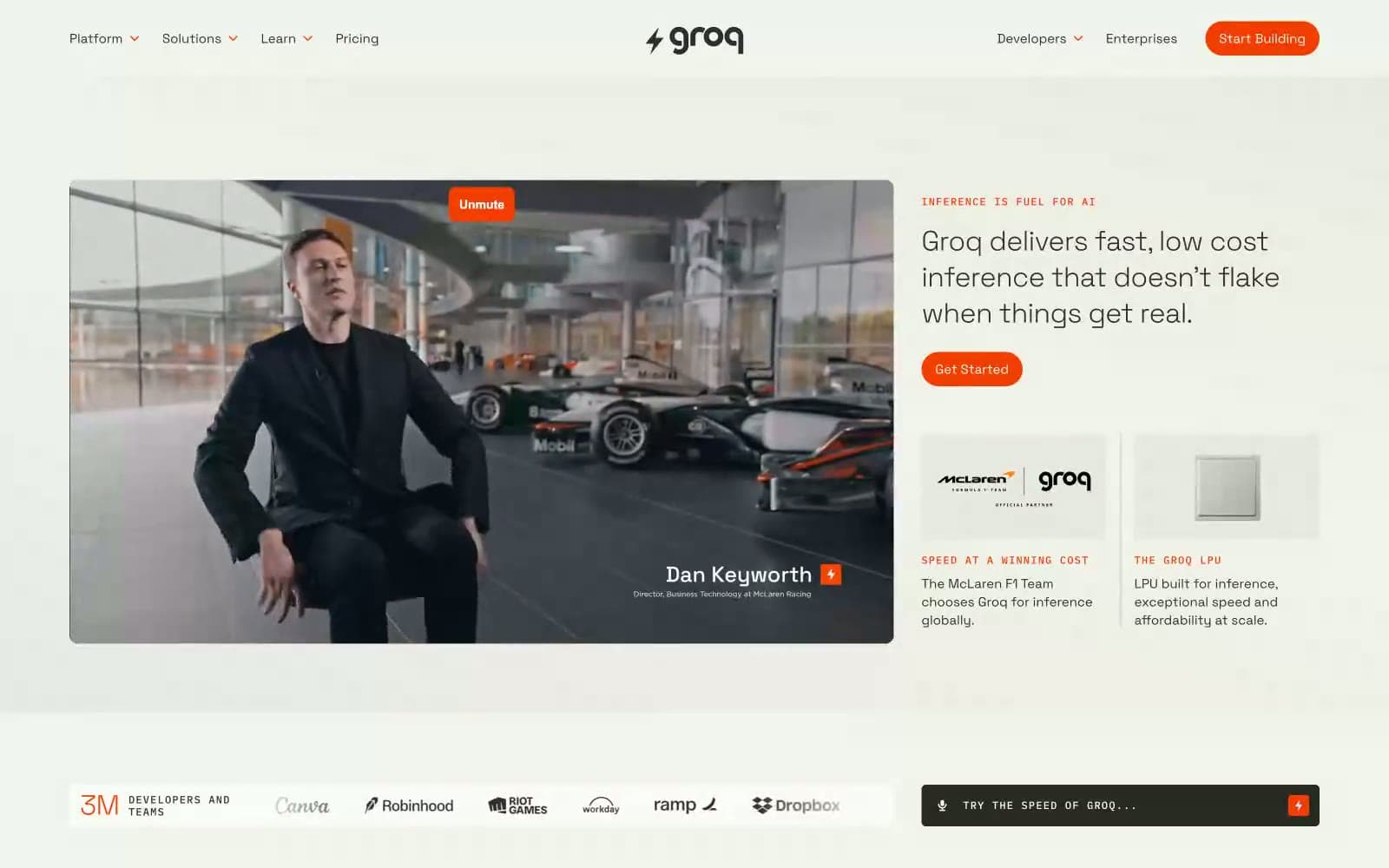
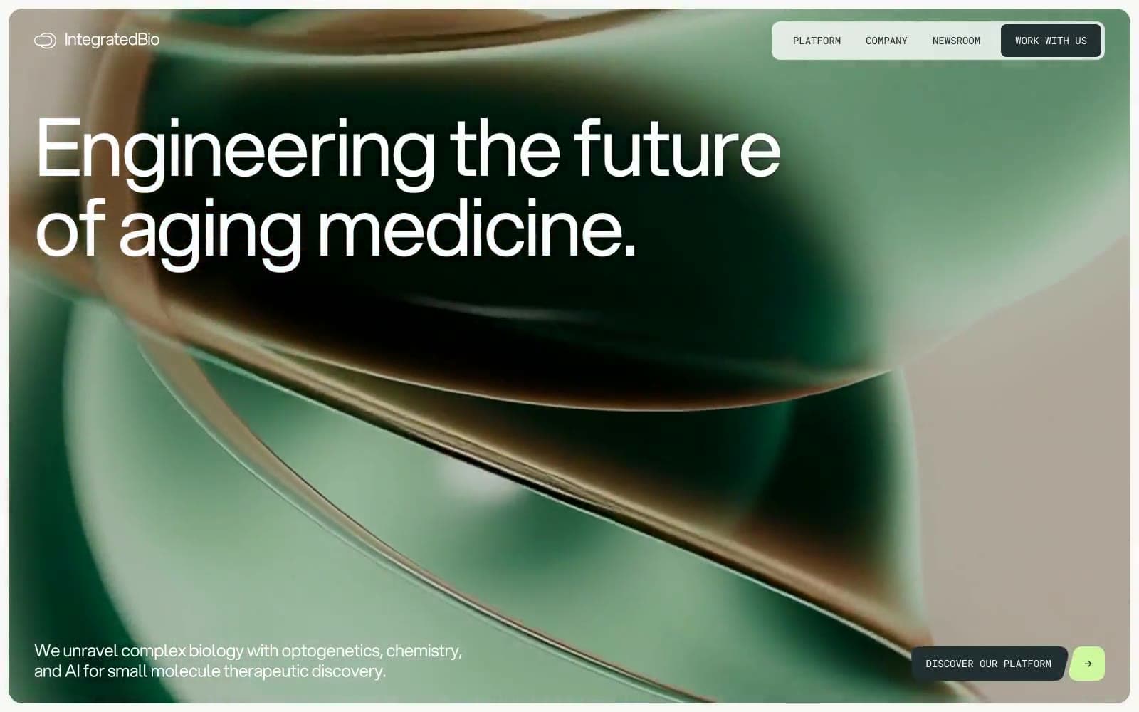
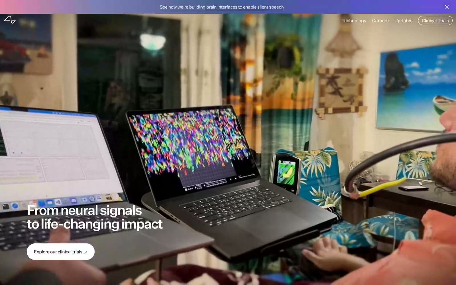
Microsoft AI. Old library at golden hour.
- AI
- Mixed theme
- 9 colors
- 3 typefaces
Microsoft AI reads like a rare-press manuscript bound in linen — warm parchment canvases, deep ink-teal voids, and oversized serif type that treats the page as editorial space rather than product surface. The palette is almost entirely earth-toned: cream, walnut, faded rose, and a single anchoring deep green-black that appears only in the hero, creating a dramatic chiaroscuro between top-of-page and everything below. Typography is the entire personality: a custom transitional serif (Bradford LL) dominates display and body, carrying italic for emphasis and aggressive negative tracking as sizes grow; a monospace (Red Hat Mono) handles the few UI affordances — tabs, labels, search, accessibility toggle. There are no saturated brand colors, no gradient buttons, no filled CTAs with hue. Action lives in text, in arrow glyphs, and in the giant pill radius that makes every control look like a wax seal on an envelope. The design intentionally avoids shadow and elevation — surfaces are flat planes of warm paper stacked against each other, separated by generous breathing room and the occasional peach wash.
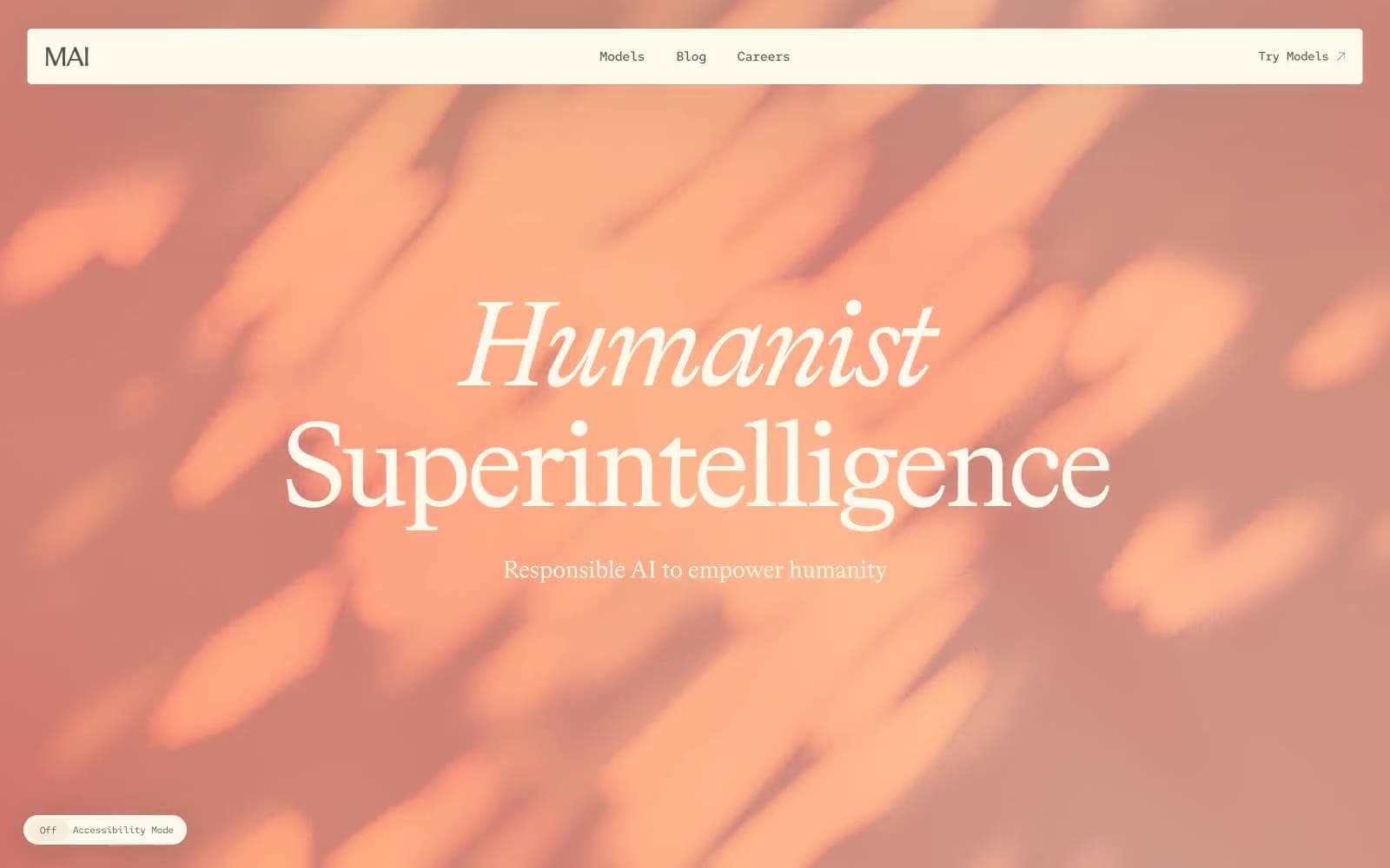
Microsoft AI design system

Brand1
Hero background, dark section fill — deep desaturated teal-green, the only cool note in the system; creates the dramatic contrast with the warm display type
Accent3
Gradient accent, warm highlight band, peachy atmosphere — the only chromatic warmth, used as a wash rather than a fill
Accent text, italic emphasis, decorative label — muted burgundy that recedes into the warm palette without shouting
Cool secondary accent for sparse cross-palette moments — muted blue-gray, used sparingly to break the warm monotony
Neutrals5
Primary text, body copy, nav links, icons, borders — warm dark brown replaces black, keeping the system on the earth-tone spectrum
Muted secondary text, helper copy, inactive nav — mid-tone brown for de-emphasis within the warm scale
Hairline borders, input outlines, dividers — warm light gray that reads as thread on the cream canvas
Secondary surface, muted panels, badge backgrounds, tab track — one shade deeper than the canvas for subtle layering without shadow
Page canvas, card surface, light text on dark — the foundational warm cream that carries 80% of the interface
Try a pairing
Pick any two colors from the palette to check whether text stays readable on top.
Aa
Parchment on Library Ink
8.75 : 1 contrast
- Body textPasses AA 4.5
- Large textPasses AA 3
- StrictPasses AAA 7