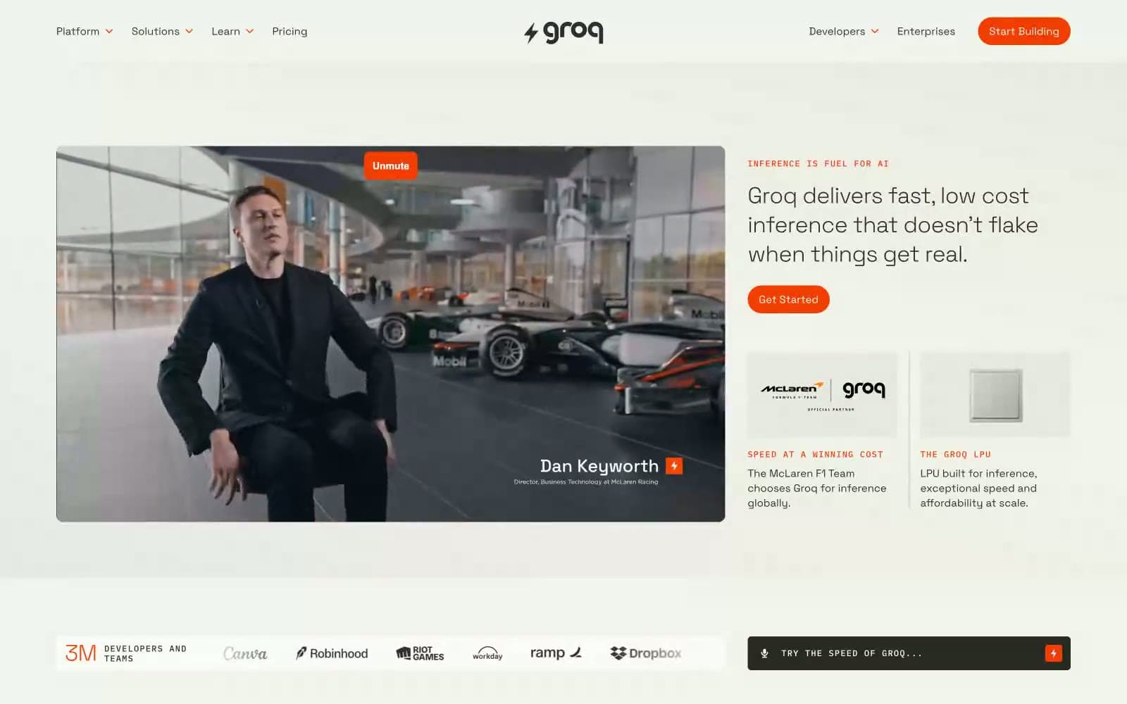
Groq. Parchment pages, graphite text, one highlighter-orange mark.
- AI
- Mixed theme
- 10 colors
- 2 typefaces
Groq reads as a speed lab notebook — warm parchment surfaces, tight geometric sans-serif (Space Grotesk at whisper-weight 300), and a single searing orange accent that marks every action and highlight like a highlighter pen on graph paper. The layout alternates between bright cream and deep charcoal panels, creating a documentary rhythm of thesis (light) → proof (dark) → evidence (light) rather than a marketing funnel. Typography is small, confident, and slightly compressed; pill buttons and IBM Plex Mono eyebrows with wide tracking give the whole system a technical-spec feel. Components stay flat and minimal — no drop shadows, no gradients, no decorative chrome — so the orange is always the loudest thing on screen.
Groq design system

Brand1
Orange supporting accent for decorative details and low-frequency emphasis. Do not promote it to the primary CTA color
Accent1
Secondary decorative accent — rare highlights, special-emphasis inline marks, and select graphic flourishes. Used as a cool counterpoint to Ember Orange when a second color is needed
Neutrals8
Deepest dark — alt dark-panel fill, footer surfaces. Slightly warmer than Graphite for variation in dark sections
Primary text and dark section background — near-black with a cool cast. The workhorse color for headings, body copy, and full-bleed dark bands
Secondary text — descriptions, supporting copy, muted labels. Warm olive-gray that harmonizes with Parchment rather than fighting it
Tertiary text and disabled states — nav dropdown items, fine print, inactive icons
List separators and secondary borders — a touch cooler than Khaki for list-item dividers
Hairline borders and dividers — low-contrast warm gray that defines edges without drawing attention
Page canvas — the warm off-white that defines the site's light mode. Warmer than pure white, it gives the whole interface a paper-like quality
Elevated surface — cards, content blocks, nav backgrounds. One step lighter than Parchment, used to lift elements off the canvas without harsh contrast
Try a pairing
Pick any two colors from the palette to check whether text stays readable on top.
Aa
#111111 on Ember Orange
4.98 : 1 contrast
- Body textPasses AA 4.5
- Large textPasses AA 3
- StrictFails AAA 7