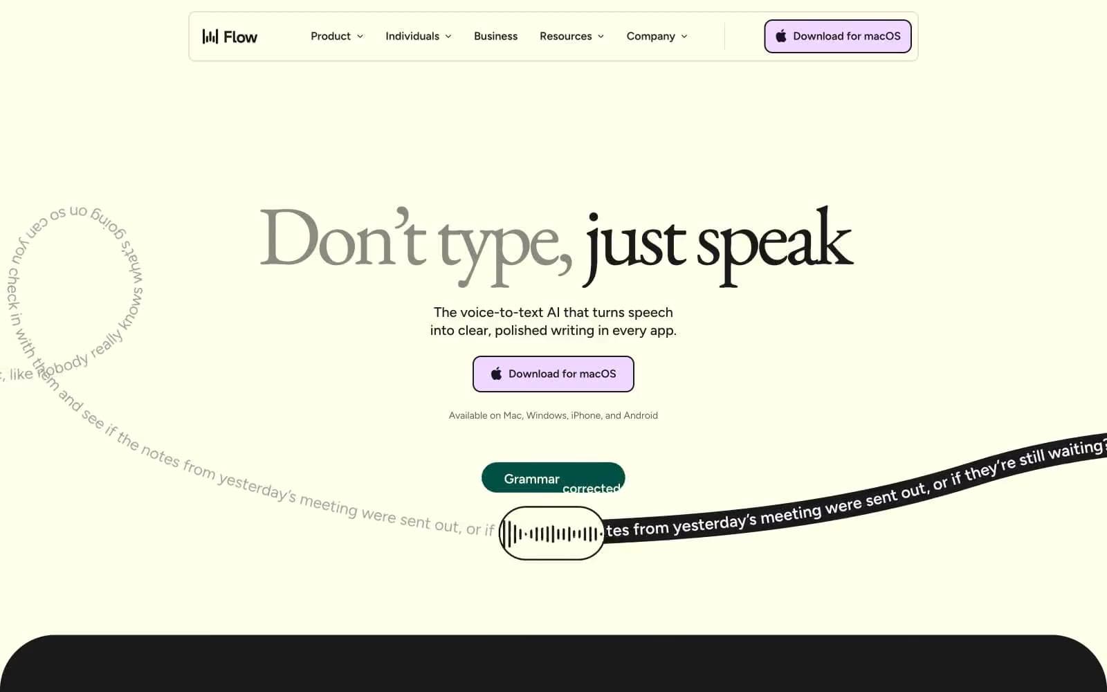
Pika. Cream diptych meets cinema void.
- AI
- Mixed theme
- 6 colors
- 2 typefaces
Pika is a warm-cold diptych: a cream paper canvas on the left holds the product (video, copy, brand mark), while a near-black void on the right houses functional UI (auth, navigation). The palette is almost monastic — black, white, cream, two grays — with cream (#ffedd2) acting as the only warmth, a deliberate foil to the cinematic dark that makes the AI-generated video read as 'premiere' rather than 'demo'. Type is a whisper-to-shout system: telka at weights 300-450 for everything functional reads like editorial body copy, while telkaExtended at weight 900 detonates on the single display heading ('REALITY IS OPTIONAL') to create punctuation, not hierarchy. Components are bare and rectangular: 6px-radius buttons, 10px-radius containers, 1px hairline borders, zero shadows. The design relies on contrast (cream/void, 300/900, still/motion) rather than ornament to carry the brand.
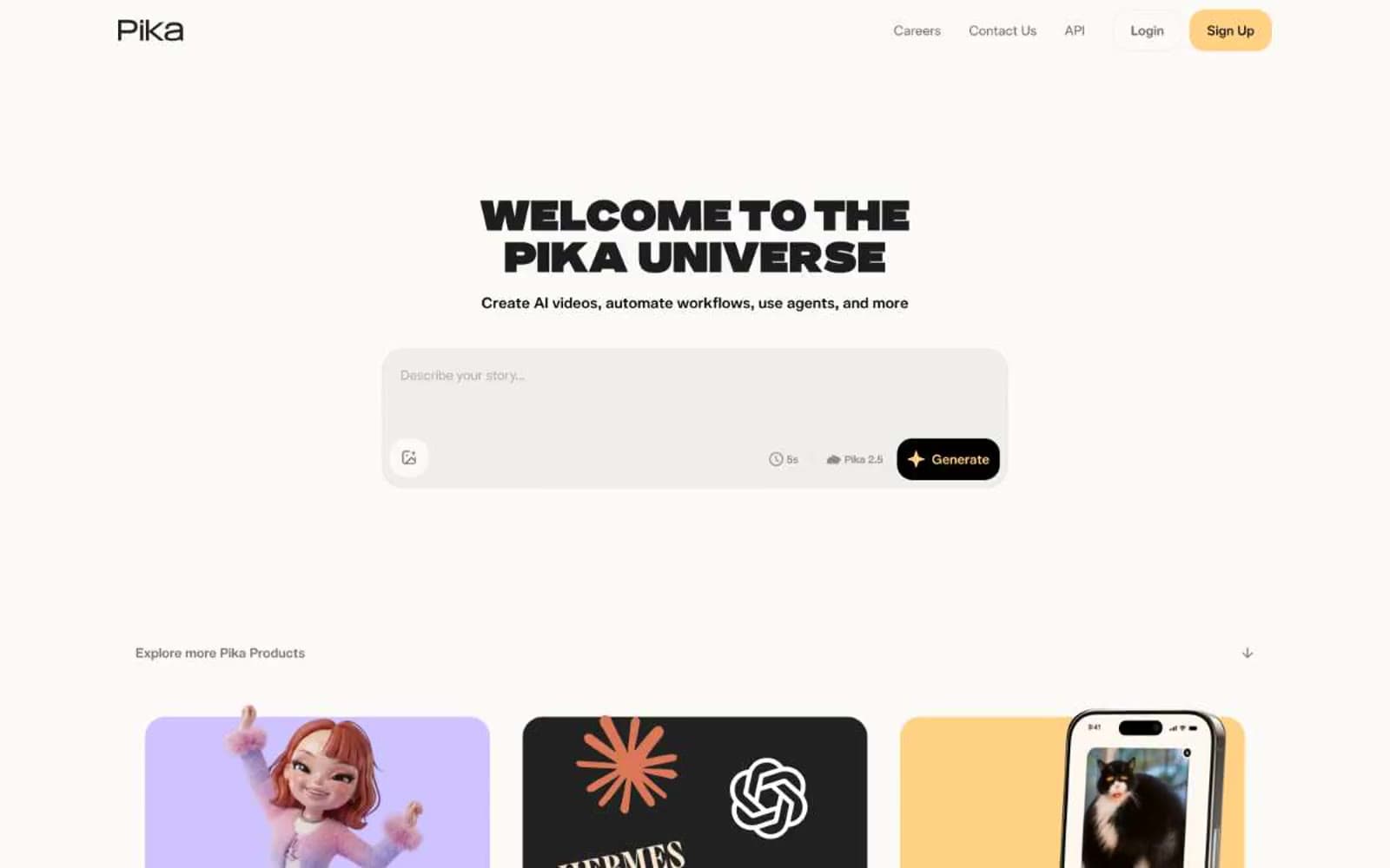
Pika design system

Brand1
Left-panel canvas, the warm half of the split — also used as a quiet heading surface and the background of the primary video preview tile
Neutrals5
Right-panel canvas, primary text on cream, icon strokes and fills
Subtle elevation lift on the dark panel — hovered or pressed button states, recessed containers
Secondary helper text, muted link state, copyright/footer labels on dark
Dividers, button borders, icon strokes, subtle structural lines on the cream side
Filled auth button surfaces on the dark panel, body text on the dark panel, icon strokes on dark
Try a pairing
Pick any two colors from the palette to check whether text stays readable on top.
Aa
Void Black on Cream Paper
16.93 : 1 contrast
- Body textPasses AA 4.5
- Large textPasses AA 3
- StrictPasses AAA 7