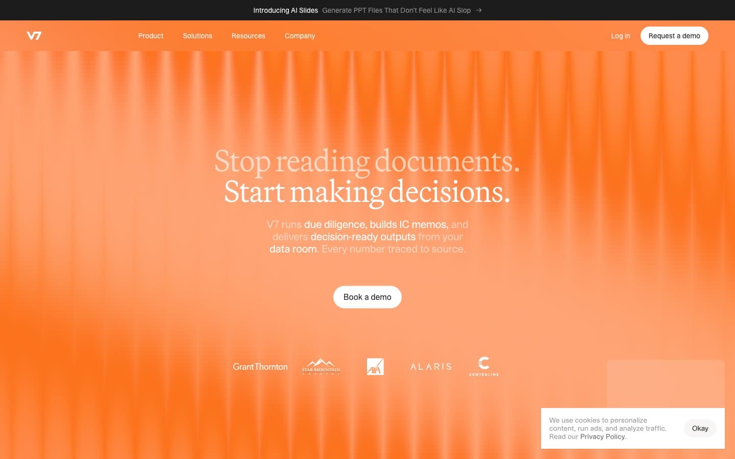
V7labs. Editorial intelligence behind theater curtains.
- AI
- Mixed theme
- 11 colors
- 4 typefaces
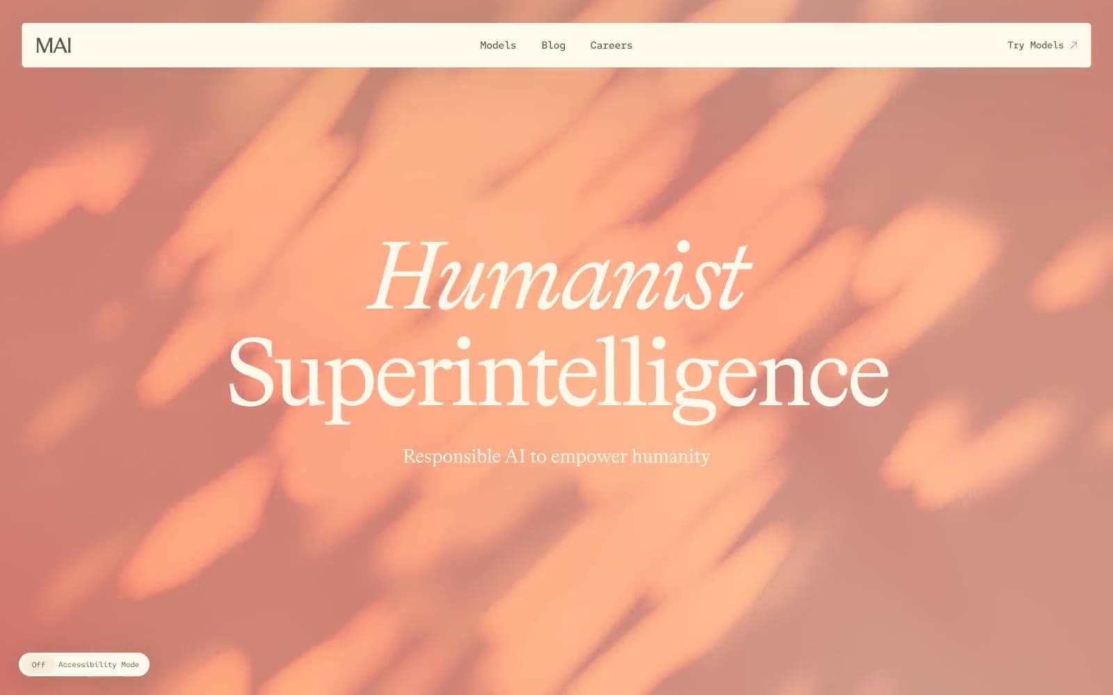
V7 stages its interface like a film studio: a single warm amber hero floods the first screen with vertical curtain-like light streaks, then gives way to a high-contrast editorial system of cream-white canvases and near-black panels. The voice is serious and archival — Martina Plantijn serif at whisper-light weight for headlines carries a printed-publication authority, while the dense sans-serif body text in STK Bureau keeps the data-heavy product feel quiet and clinical. Color discipline is absolute in the interface: every interactive surface is either pure white, pure black, or the deep warm neutral, with the amber orange reserved almost exclusively for atmospheric hero and statistic blocks — never for buttons, never for links, never for accents. Components are pill-shaped and minimal, sitting flush on the page with hairline borders and almost no shadow, reinforcing the impression of a system designed for decisions rather than decoration.
V7labs design system

Brand3
Hero and statistics block backgrounds, brand atmospheric layer — the entire warm light system of the page, applied as full-bleed gradient with vertical streak texture. Never used for buttons, links, or inline accents
Lighter highlight within the amber gradient — the illuminated folds of the curtain texture, appearing in hero highlights and statistic card upper regions
Deep navy used sparingly for outlined link borders and select link text — the only chromatic accent in the otherwise achromatic interface, and only where link affordance must be unmistakable
Neutrals8
Primary text, hairline borders, icon strokes, the dominant border color across the entire interface
Dark section backgrounds, footer, inverse card surfaces — the counterweight to the amber hero, used when content must read against a near-black ground
Filled button backgrounds, input fields, dense neutral surfaces — the primary action surface when a button must be heavy and deliberate rather than ghost
Secondary card backgrounds and darker card variants on light sections
Quiet border strokes and disabled text — present but unobtrusive
Muted helper text, secondary metadata, and low-emphasis borders on light backgrounds
Page background, the warm off-white that gives the whole system its paper-like editorial base — sits behind cards, inputs, and quiet content areas
Card surfaces, elevated panels, button fills for ghost and light action variants — the bright top layer of the surface stack
Try a pairing
Pick any two colors from the palette to check whether text stays readable on top.
Aa
Onyx on Amber Curtain
5.97 : 1 contrast
- Body textPasses AA 4.5
- Large textPasses AA 3
- StrictFails AAA 7