Empower. Chartreuse zine on midnight paper.
- Finance
- Mixed theme
- 10 colors
- 5 typefaces
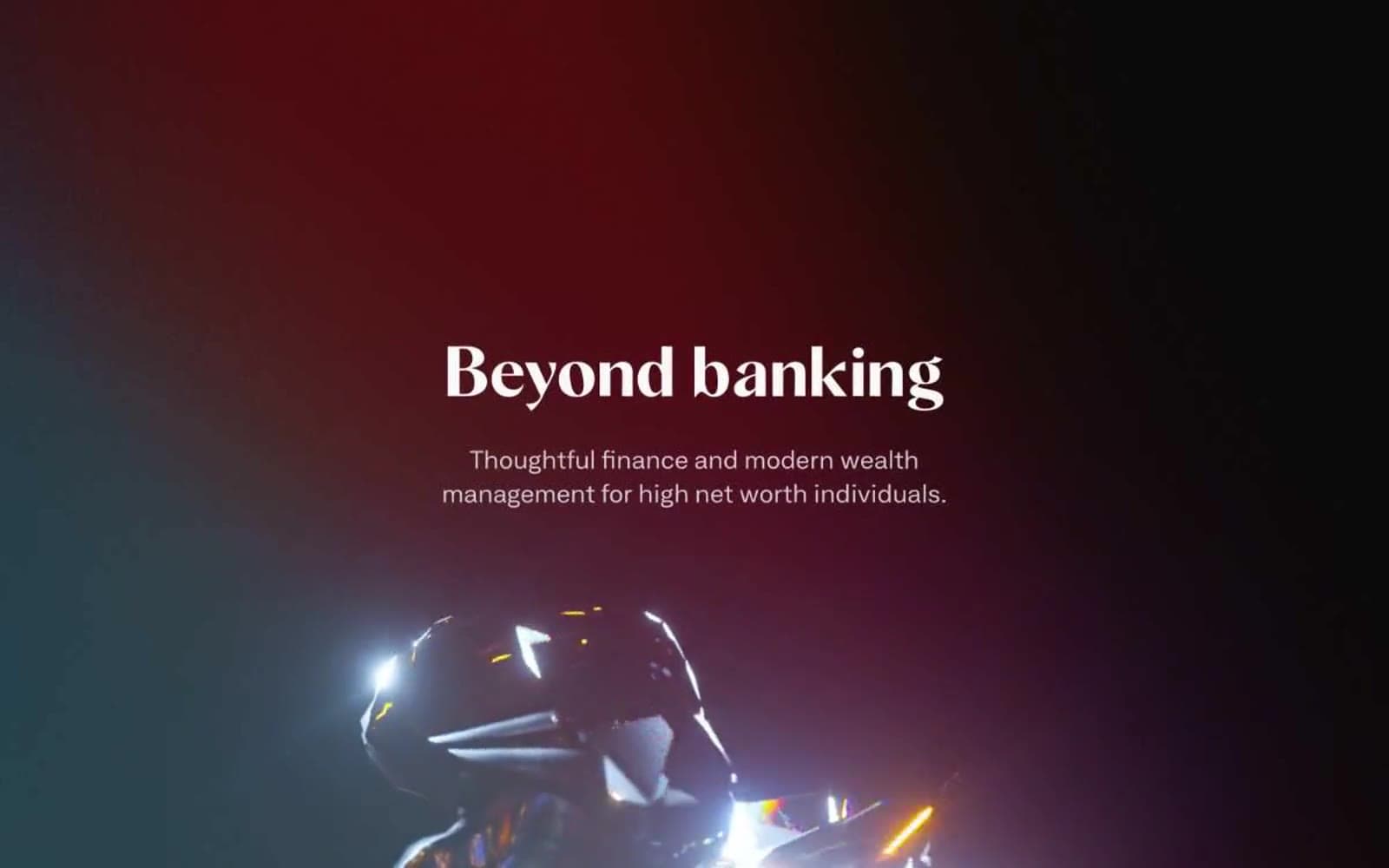
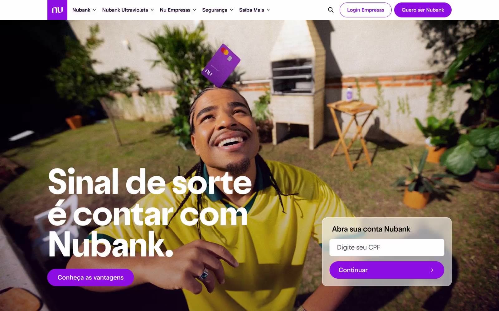
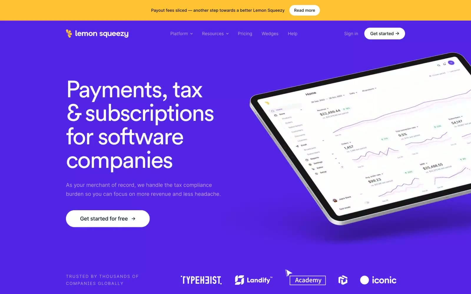
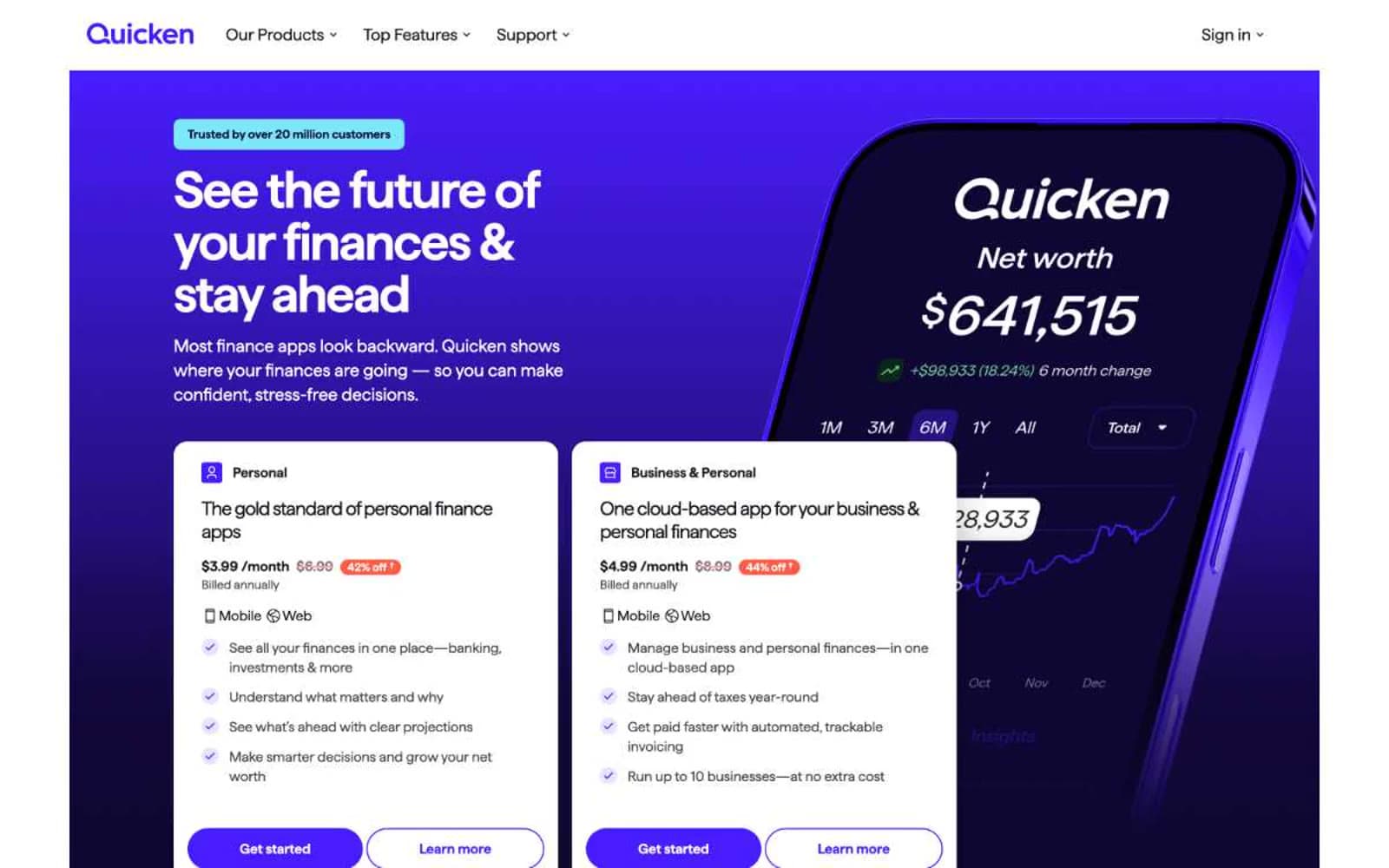
Tilt is a high-contrast financial brand built on three tonal registers: deep matte-black stages for emotional photography, warm cream paper for product education, and a single punchy chartreuse (#e4e24e) that acts as the system's only chromatic voice. The visual hierarchy is extreme — a 205px Gravity display headline commands the dark hero while supporting text settles into an unusually narrow extended sans-serif (GTAmericaExtendedRegular) that gives body copy a condensed, almost editorial feel. Photography is documentary-style real people, shot close, annotated with hand-placed price-tag pills (+$200, +$900) — the product literally hangs from their collars. The system feels like a fintech zine: confident, slightly retro, paper-warm, with yellow used sparingly to make CTAs feel switched on rather than branded.

Empower design system

Brand1
Primary CTA fill, active states, highlight tags, product accent cards — the only saturated color in the system, used at 100% saturation to make every action feel deliberate
Accent1
Soft highlight wash for product feature cards and emphasis panels — a 70%-diluted chartreuse that carries the same hue without competing with CTAs
Neutrals8
Hard borders, focus rings, maximum-contrast text on light surfaces — pure black for structural edges
Primary text, icon strokes, dominant borders, dark hero and footer backgrounds — near-black with a barely-warm tint
Hero and footer background fill — a hair lighter than Midnight Ink, used where the page needs depth without going pure black
Deep card surface for dark mode product showcases — sits one step above pure black
Tertiary borders, dimmed UI affordances, body-level low-emphasis elements
Secondary text, muted helper copy, subdued borders, inactive tab labels
Default page canvas, light section backgrounds — warm off-white with a cream bias that pairs with the yellow accent
Elevated card surfaces, product illustration cards, content blocks sitting on the bone canvas
Try a pairing
Pick any two colors from the palette to check whether text stays readable on top.
Aa
Obsidian on Chartreuse Pulse
15.29 : 1 contrast
- Body textPasses AA 4.5
- Large textPasses AA 3
- StrictPasses AAA 7