Neuralink. A black void where only light, shadow, and one thin spectrum of color speak.
- AI
- Mixed theme
- 5 colors
- 1 typeface
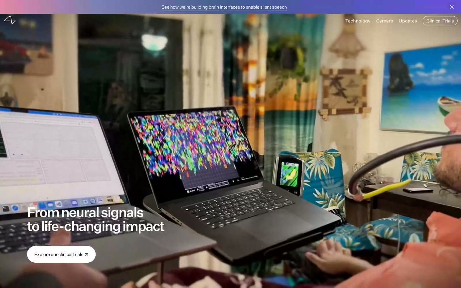
Neuralink operates as a near-pure monochrome system: a near-black canvas, a white surface, and one off-white band, with no chromatic brand color at all. A single spectrum gradient — pink to violet — appears only as the announcement bar and as photo-card overlays, acting as the system's sole injection of warmth and life. Typography carries almost all of the brand voice: a geometric sans at weight 300 for display sizes with aggressively tight tracking (-0.165em at 48px) that gives headlines a compressed, engineered density. Pill-shaped controls (80px radius) sit against full-bleed black and white blocks, creating a cinematic, almost editorial rhythm where the only color signal is a faint synaptic glow.
Neuralink design system

Accent1
The only chromatic element in the entire system. A four-stop spectrum (warm rose → cool lavender → indigo → violet) used exclusively for the announcement bar and photo-card overlays. The dominant anchor color is the violet end (#6452d8), giving the gradient a cool, neurological character
Neutrals4
Page hero canvas, primary text, section dividers, dark-mode blocks. The dominant structural color — used 931 times as backgrounds, borders, and text. Creates a void-like base that makes white type and the single gradient feel electric by contrast
Muted nav text and low-emphasis dividers. A desaturated mid-gray for inactive navigation labels and subtle hairline borders where black would feel too heavy
Soft off-white surface for the footer and secondary bands. Separates Paper from true white when a gentler contrast is needed — used for the meet-our-pioneers section background and the footer
Content section background, card surfaces, ghost-button text and border. The light counterpart to Obsidian — every content section sits on Paper, and outlined/ghost buttons invert to Paper stroke on Obsidian backgrounds
Try a pairing
Pick any two colors from the palette to check whether text stays readable on top.
Aa
Paper on Obsidian
21.00 : 1 contrast
- Body textPasses AA 4.5
- Large textPasses AA 3
- StrictPasses AAA 7