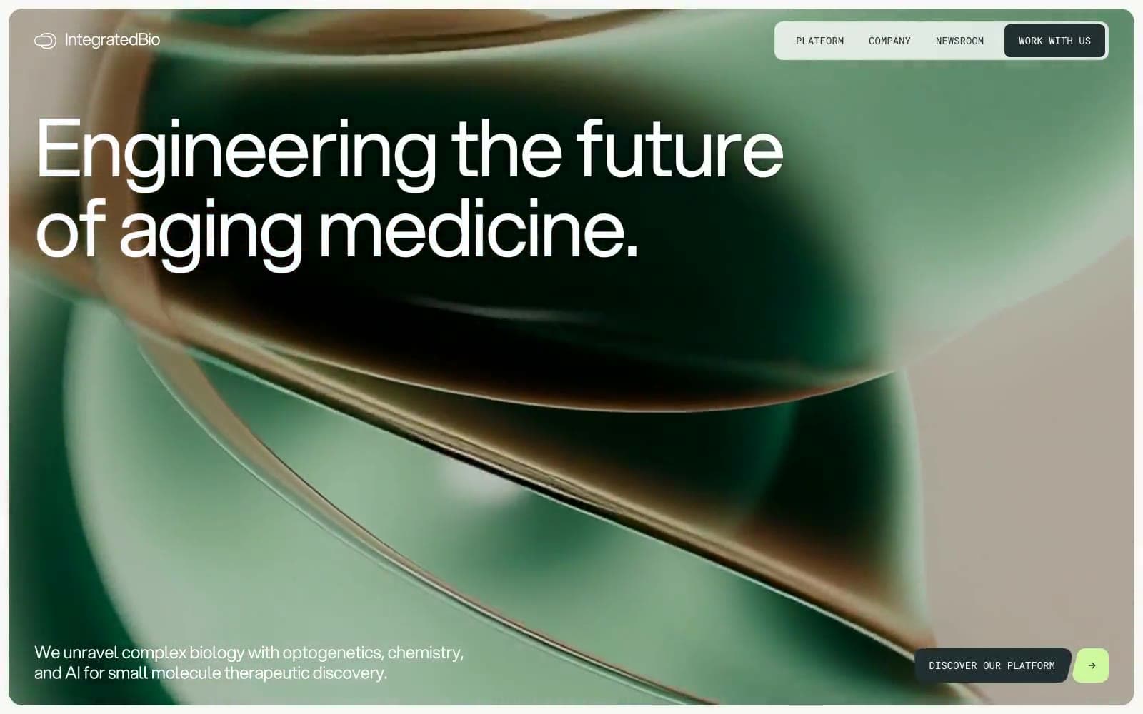
Integrated Biosciences. Bioluminescent laboratory at midnight.
- AI
- Mixed theme
- 9 colors
- 2 typefaces
Integrated Biosciences operates in a darkroom-laboratory visual language: a near-black canvas with cool green undertones, restrained white typography, and a single bioluminescent lime accent that activates only on small interactive elements like arrow buttons, tag dots, and progress indicators. The entire type system runs on a single weight of Aspekta — hierarchy is sculpted purely through size and aggressive negative letter-spacing, which makes 111px and 158px display lines feel architectural rather than decorative. Roboto Mono is reserved for technical labels, nav items, and metadata, reinforcing the instrumentation-bench character of the brand. Surfaces stay mostly flat — no shadows, no gradients — with thin hairline borders in #c9cbbe or #4d5757 doing all the delineation. Light sections flip to a warm off-white canvas (#f7f7f5) with white cards, but the green accent persists as a constant biological signal.
Integrated Biosciences design system

Accent1
Green wash for highlight backgrounds, decorative bands, and soft emphasis behind content
Neutrals8
Footer background, pure black anchors. Used sparingly as a true neutral when the Abyssal Ink is too colored
Primary text, borders, dark canvas sections, nav backgrounds. Near-black with a cool green undertone — it is not pure black, it carries the same green note as the accent. Darkest content surface
Secondary body text, muted metadata, subdued borders, ghost button outlines. Mid-tone with a green undertone matching the system
Hairline borders, subtle dividers, placeholder metadata text. Warm desaturated green-beige that disappears on white but is visible on #f7f7f5
Alternate card surface — warmer light gray used to differentiate secondary cards or muted content blocks from the white primary surface
Neutral light card surface when a non-warm alternate is needed
Light-section page canvas, hero/section backgrounds when in light mode. Warm off-white with the faintest cream cast
Card surfaces on light sections, elevated containers, icon fills, body text on dark surfaces. The brightest surface in the system
Try a pairing
Pick any two colors from the palette to check whether text stays readable on top.
Aa
Void on Bioluminescent Lime
17.42 : 1 contrast
- Body textPasses AA 4.5
- Large textPasses AA 3
- StrictPasses AAA 7