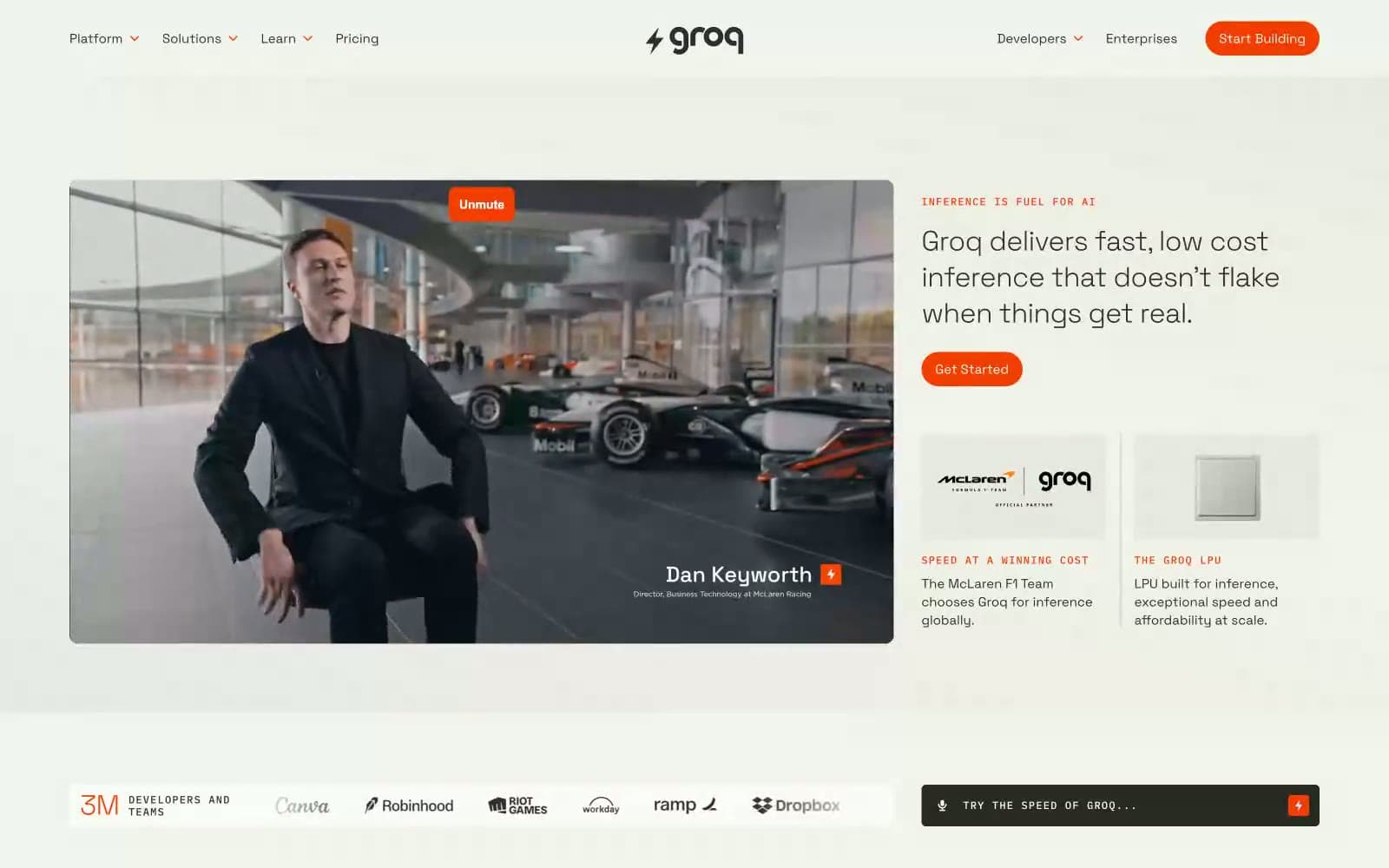
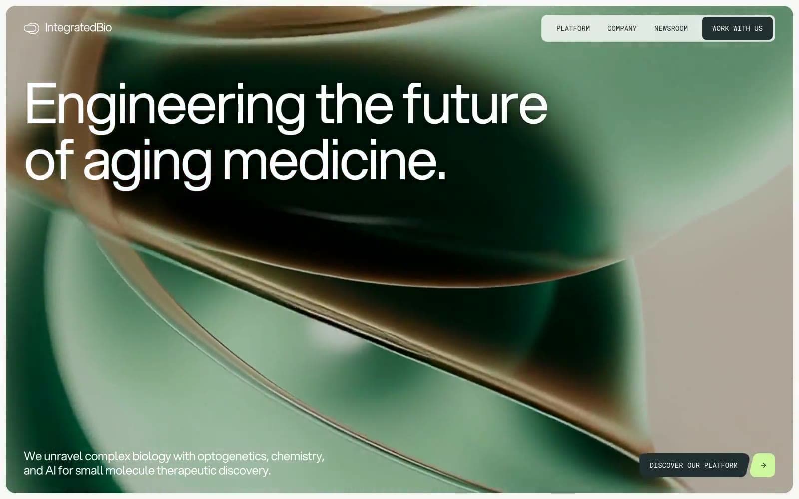
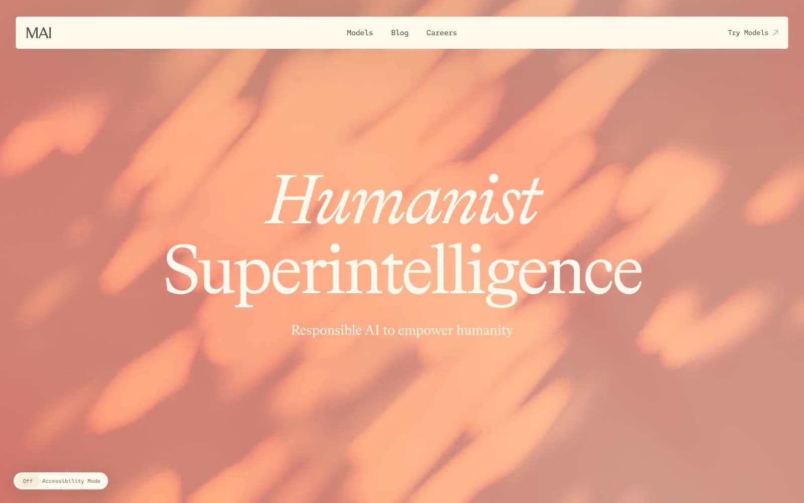
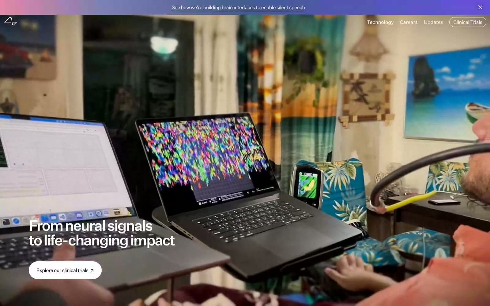
Together AI. Research console on glacier paper.
- AI
- Mixed theme
- 10 colors
- 2 typefaces
Together AI reads as a research-grade console on glacier-white paper: stark black-on-white typography, near-zero chrome, and pastel data cards (blush, peach, sky, mint) that act as colored sticky-notes on an otherwise monochrome page. The single dark band — a near-black navy research section — is the dramatic inversion that gives the system its contrast and signals depth-of-work. Hierarchy is built through type weight and scale rather than color, and a thin periwinkle accent (#bdbbff) appears as small dashes and underlines to mark active states. Pastel backgrounds are decorative, not decorative-only: they tag metric categories. Components are sharp-cornered (4px), low-elevation, and rely on the monospace label family to feel like a lab notebook.

Together AI design system

Accent5
Accent dashes, active indicators, small UI punctuation — the system's only mid-saturation chromatic accent, used sparingly as underlines and section markers
Gray supporting accent for decorative details and low-frequency emphasis.
Gray supporting accent for decorative details and low-frequency emphasis.
Light supporting surface for subtle backgrounds and section separation.
Card background — used for the third stat tile, warm counterweight to the cool pinks and blues
Neutrals5
Dark supporting neutral for text, icons, and strong contrast. Do not promote it to the primary CTA color
Dark surface (research section background) — near-black navy that reads as deeper than pure black, giving the dark band a tinted, on-brand cast
Muted secondary text, subdued metadata, low-emphasis body copy
Hairline borders, table dividers, input outlines
Page canvas, card surfaces on light theme, text on dark surfaces
Try a pairing
Pick any two colors from the palette to check whether text stays readable on top.
Aa
Obsidian on Periwinkle
11.72 : 1 contrast
- Body textPasses AA 4.5
- Large textPasses AA 3
- StrictPasses AAA 7