
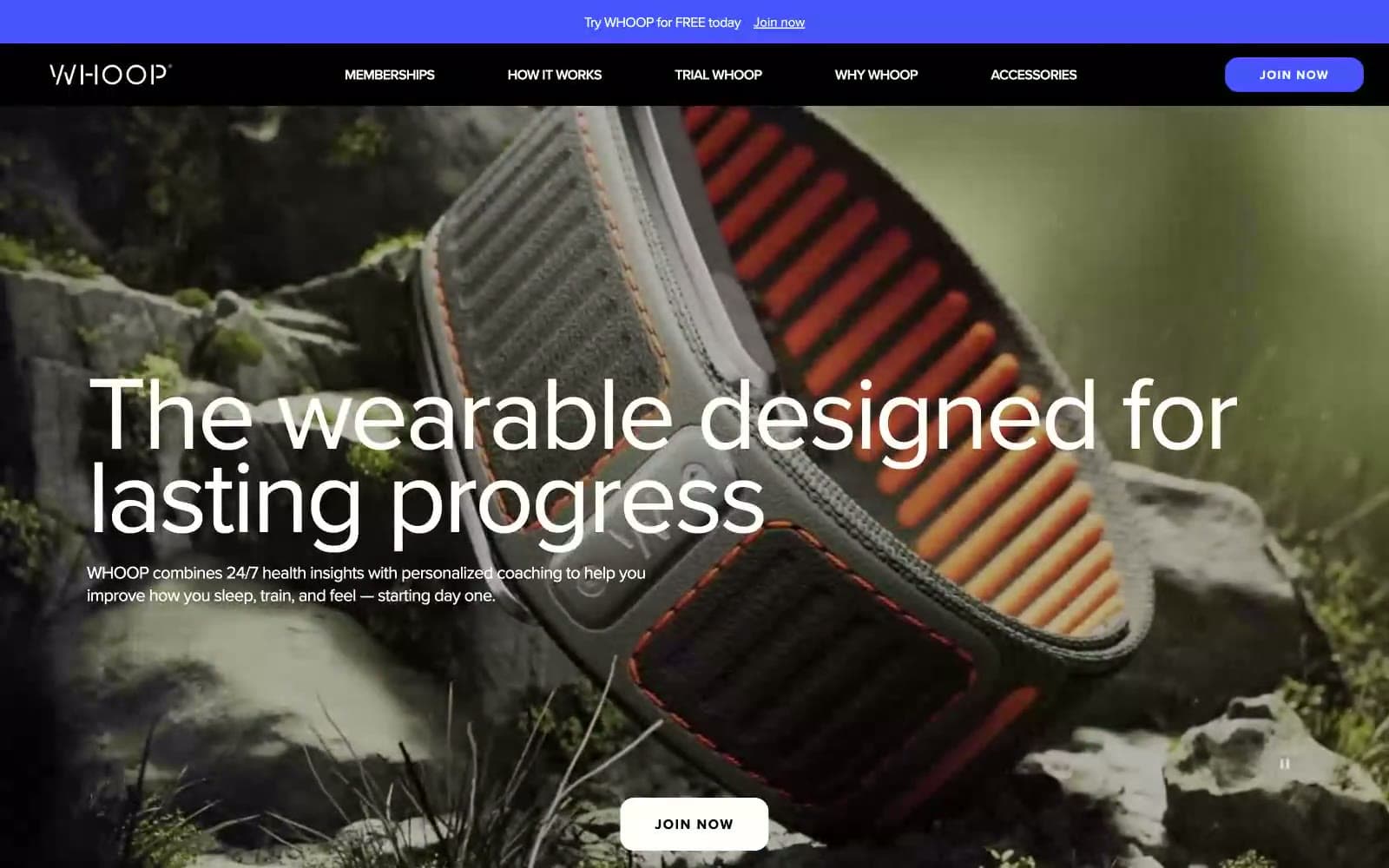
WHOOP. Clinical white lab benches beneath a black theatrical void, one violet pulse of electricity.
- SaaS
- Mixed theme
- 8 colors
- 1 typeface
WHOOP operates on a high-contrast split-canvas system: full-bleed black theatrical heroes alternate with clinical white content sections, creating a rhythm that mimics the alternation between effort and recovery. Typography is the dominant voice — oversized Proxima Nova display type at 120px with aggressive negative tracking carries the brand, while body copy stays compact and neutral. A single vivid violet (#4a53ff) acts as the lone chromatic accent against an otherwise achromatic palette, appearing only on primary actions and the announcement bar. Components are large, confident, and rounded: 24px-radius cards, fully pill-shaped buttons, and photographic overlays with heavy text treatment replace the typical SaaS card grid. The result feels less like a product page and more like a premium performance lab at night — scientific, dramatic, and focused on data over decoration.
WHOOP design system

Brand1
Violet supporting accent for decorative details and low-frequency emphasis. Do not promote it to the primary CTA color
Neutrals7
Primary text on light surfaces, dark hero/section backgrounds, filled neutral buttons, icon strokes
Secondary dark surface (footer band, alternating black sections), heading text on light surfaces
Muted body text, secondary descriptions, placeholder copy on light surfaces
Tertiary text, inactive button labels, disabled icon strokes — sits one step below Fog Gray for de-emphasized metadata
Borders, dividers, outlined button strokes, input frames — the most-used neutral in the system (2560 occurrences)
Soft elevated surface for light cards and feature panels — a cool off-white that distinguishes cards from the page without using shadow
Primary page canvas, card surfaces on dark sections, text on dark backgrounds, filled white pill buttons
Try a pairing
Pick any two colors from the palette to check whether text stays readable on top.
Aa
Paper White on Pulse Violet
5.29 : 1 contrast
- Body textPasses AA 4.5
- Large textPasses AA 3
- StrictFails AAA 7
More DESIGN.md files. Same web, different personalities.
8returns
SaaS
Customer.io
SaaS
Fiverr.com
SaaS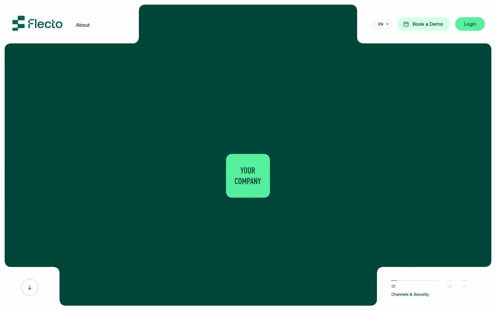
Flecto
SaaS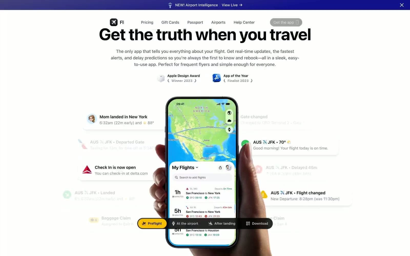
Flighty
SaaS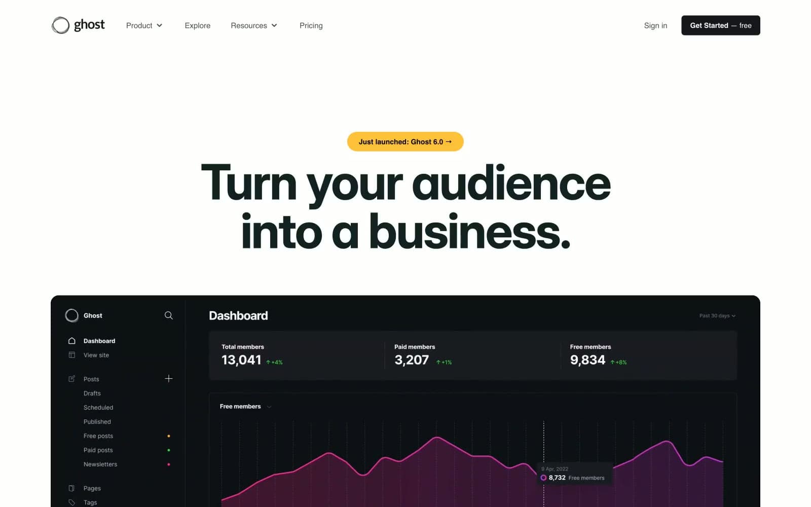
Ghost
SaaS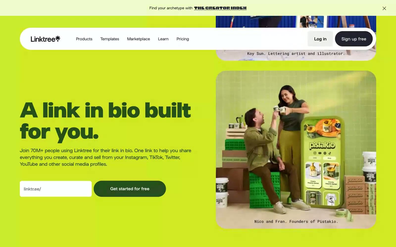
Linktr
SaaS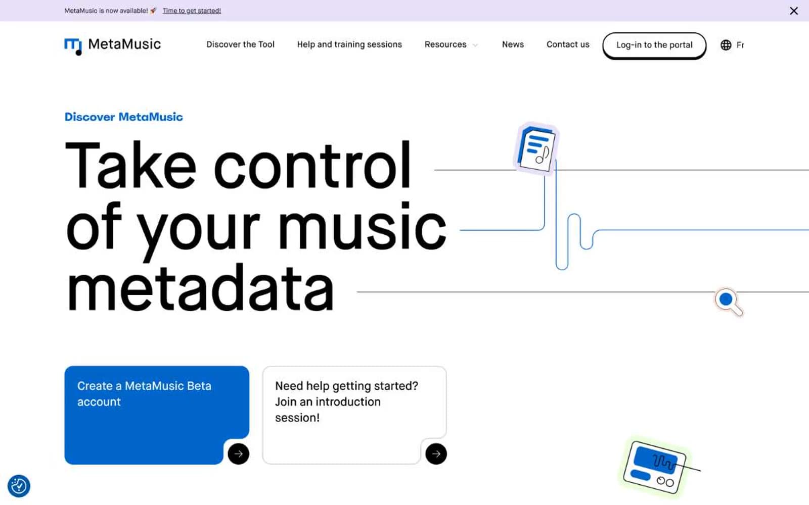
MetaMusic
SaaS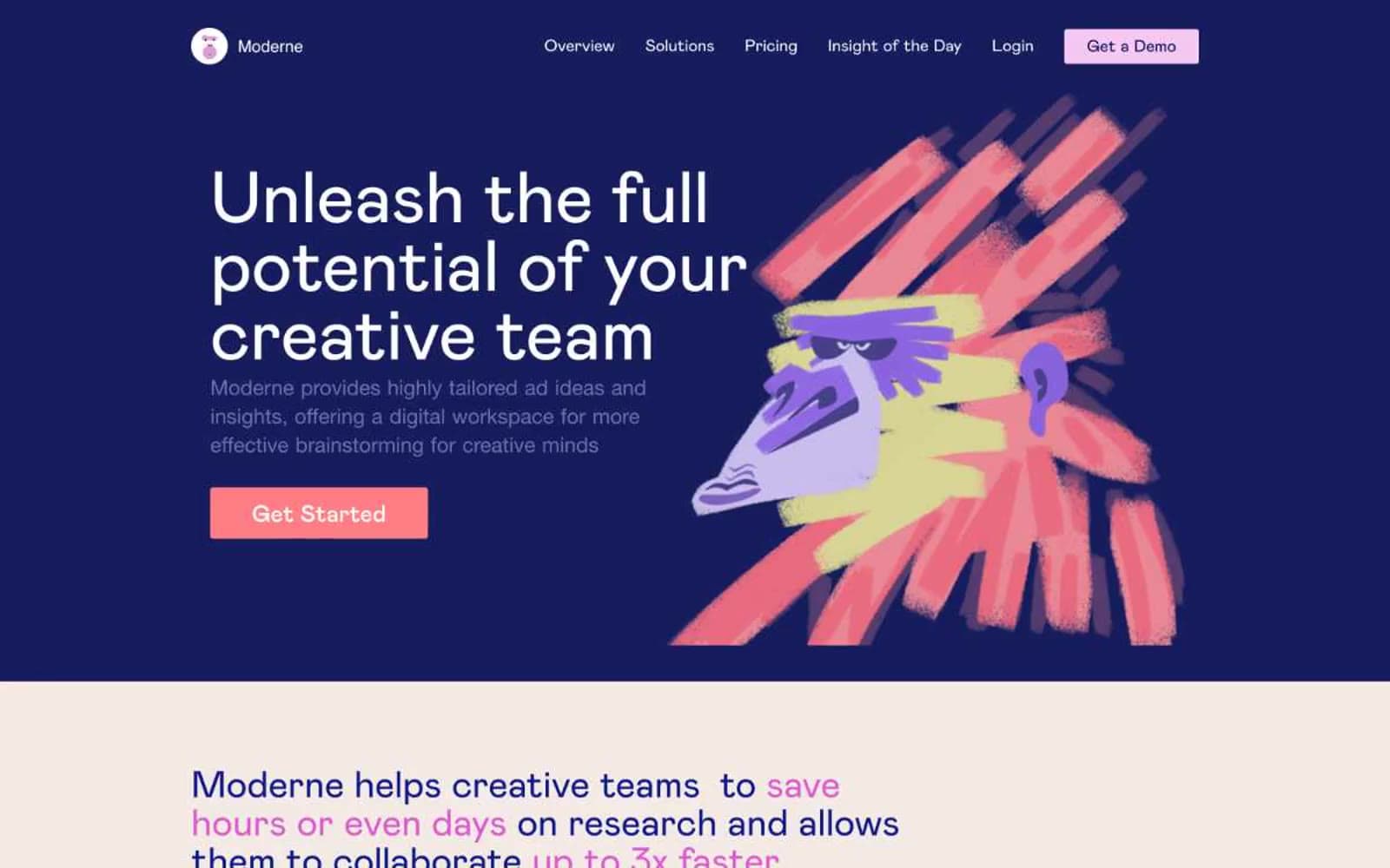
Moderne
SaaS
Passionfroot
SaaS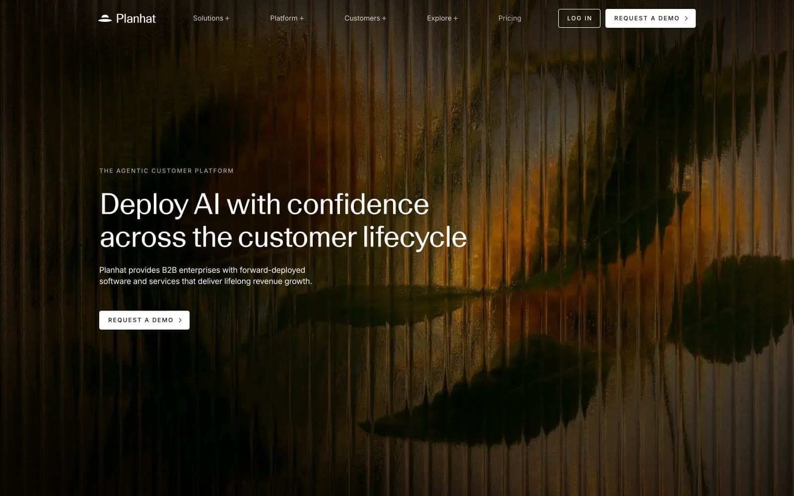
Planhat
SaaS
Prevalent
SaaS


