
MetaMusic. A warm-paper canvas where oversized type and hard-offset shadows replace all decoration.
- SaaS
- Mixed theme
- 10 colors
- 2 typefaces
MetaMusic speaks in a paper-warm, editorial tone: a cream canvas (#f4f1ea) hosts oversized display headlines (up to 120px) that read like a museum wall label, while one vivid blue (#0066cc) and one deep indigo (#0e2575) carry all functional weight. Surfaces stack from cream → white → light-blue wash → indigo panel, creating a gentle warm-to-cool gradient as the eye scrolls. The defining texture is a hard 4px solid black offset shadow (zero blur) — a flat, almost sticker-like treatment that gives buttons and cards a tactile, printed feel rather than a soft Material elevation. Typography is monolinear and quiet: Maison Neue at every UI role, Spoof reserved for a single 22px accent heading, all set tight with negative tracking at display sizes. Components stay spacious (24px card radius, 40px internal padding) and never compete with the massive hero type; illustrated document and music icons float on warm peach circles as the only decorative voice.
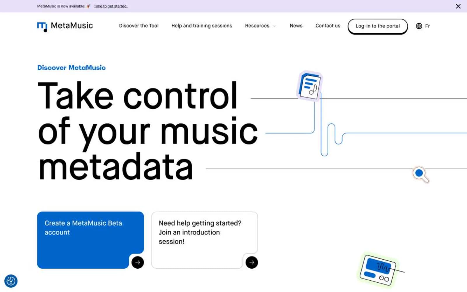
MetaMusic design system

Brand3
Primary action background, link underlines, heading accents, card fills on light surfaces — the single chromatic voice that powers CTAs, active states, and iconography
Dark section backgrounds (feature/why panels), hero image frames — the only place a full-bleed surface goes deep and saturated
Elevated card surface when sitting on Deep Indigo backgrounds — one step lighter than the panel to separate without using shadow
Accent3
Neutral form states, badge text, and quiet UI feedback where color should stay understated. Do not promote it to the primary CTA color
Alternate light surface wash, subtle card background variant — the cool counterpoint to Paper Cream
Icon circle backgrounds in audience/feature cards — the only warm accent that breaks the cream-on-cream
Neutrals4
Body text and dark-surface secondary fills — slightly cooler than pure black, anchors reading text without harshness
Hairline dividers, subtle borders on neutral surfaces — the quietest structural line
Primary page canvas — the warm base that gives the whole site its editorial, printed feel
Card surfaces, nav background, button text on blue, input fills — the clean highlight layer above cream
Try a pairing
Pick any two colors from the palette to check whether text stays readable on top.
Aa
White on Brand Blue
5.57 : 1 contrast
- Body textPasses AA 4.5
- Large textPasses AA 3
- StrictFails AAA 7
More DESIGN.md files. Same web, different personalities.
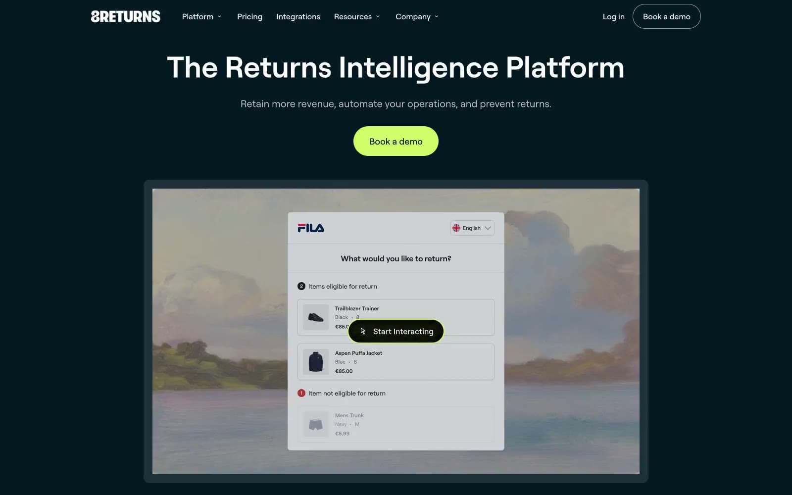
8returns
SaaS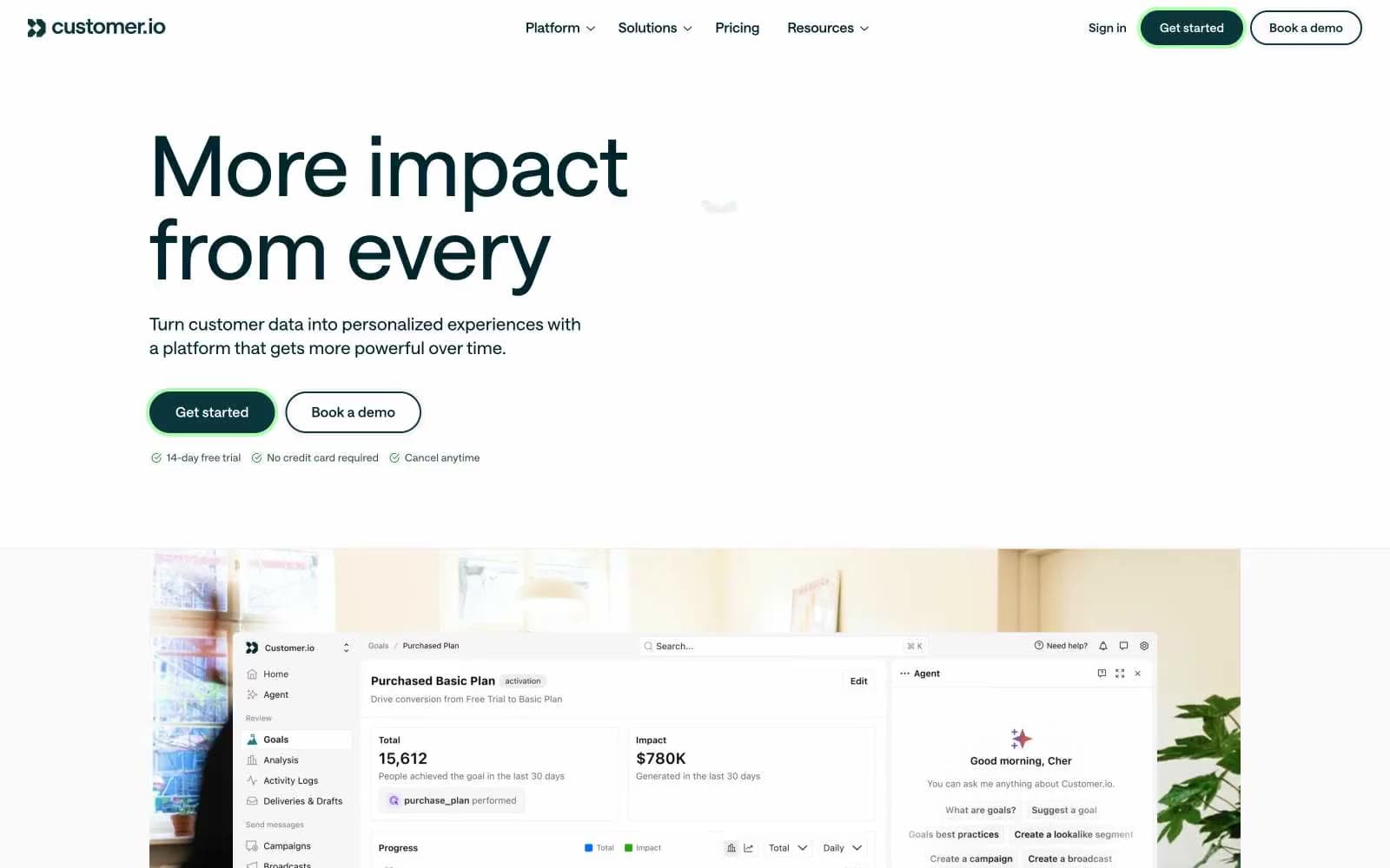
Customer.io
SaaS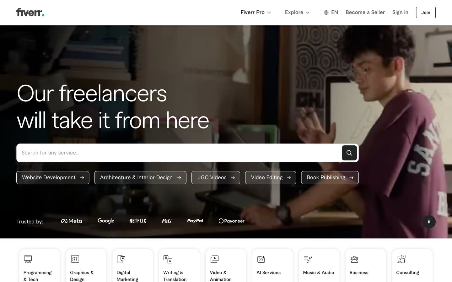
Fiverr.com
SaaS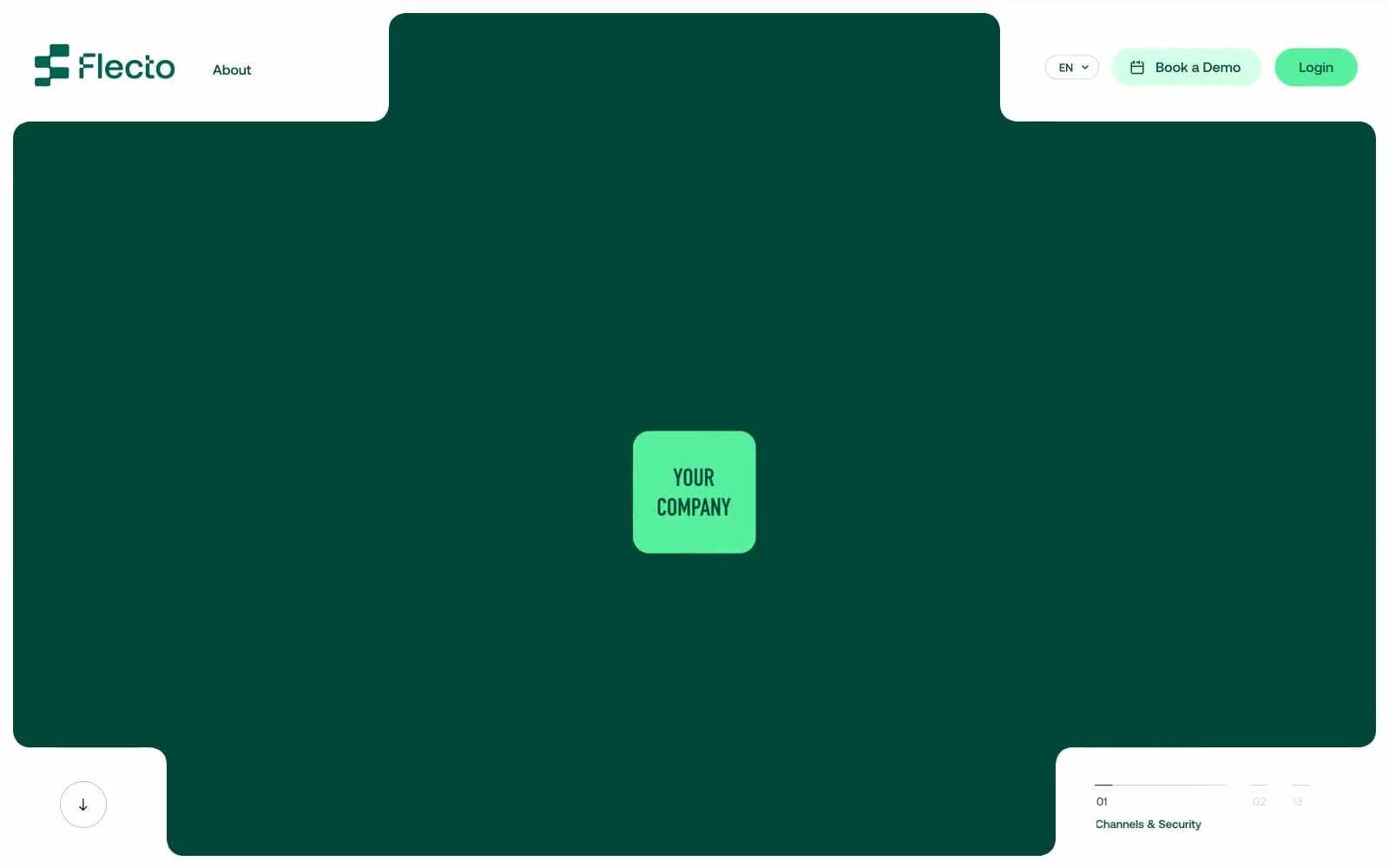
Flecto
SaaS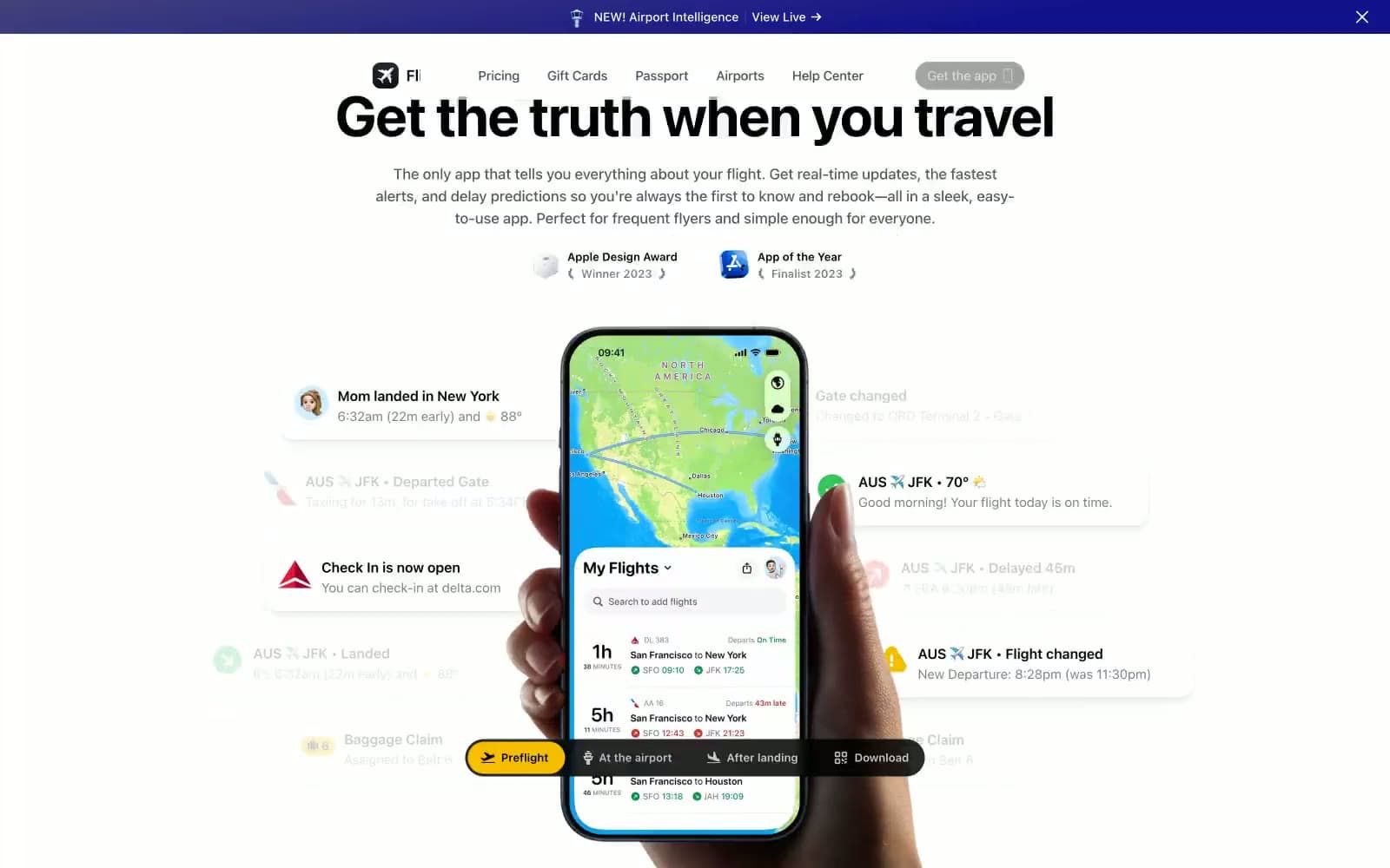
Flighty
SaaS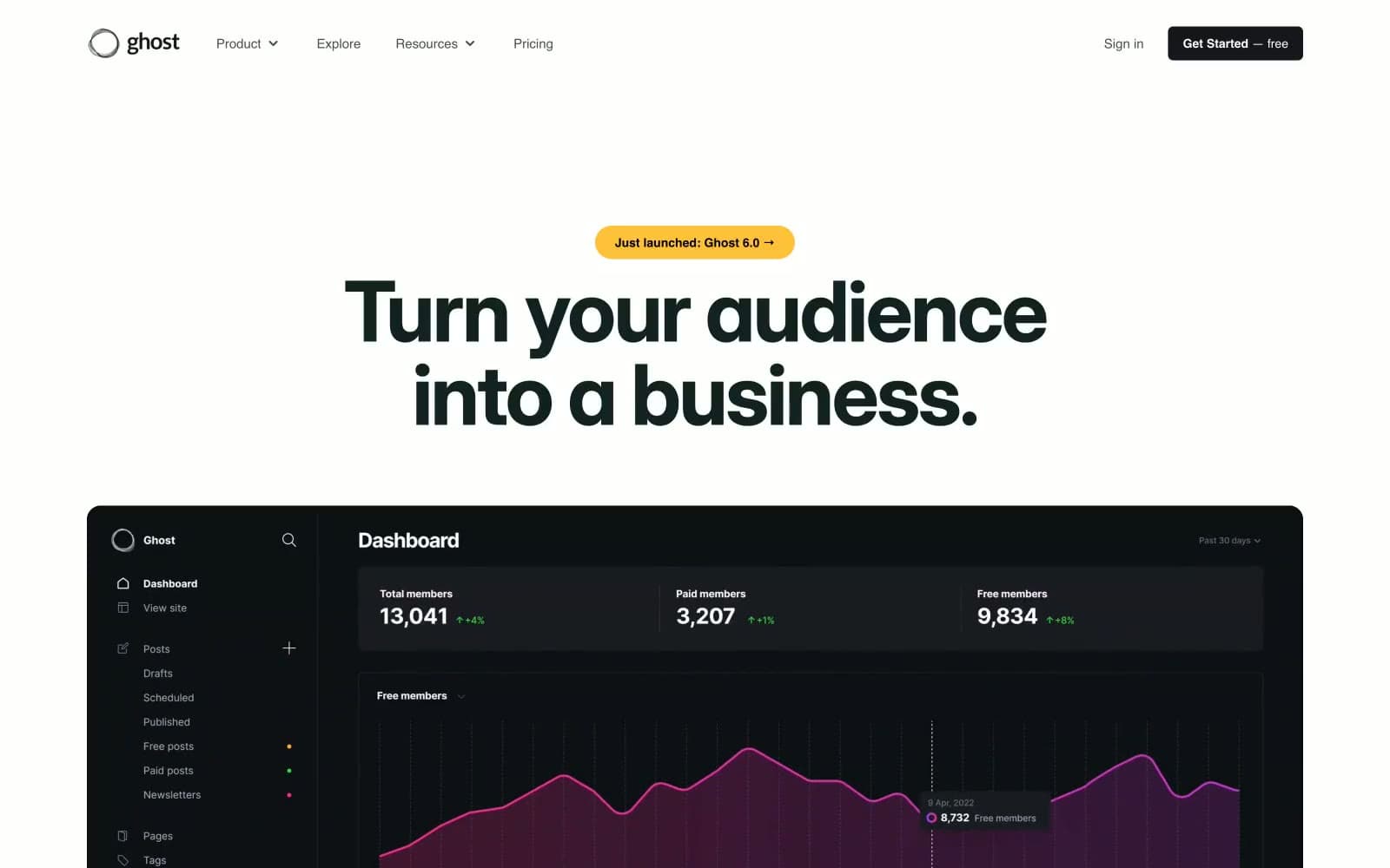
Ghost
SaaS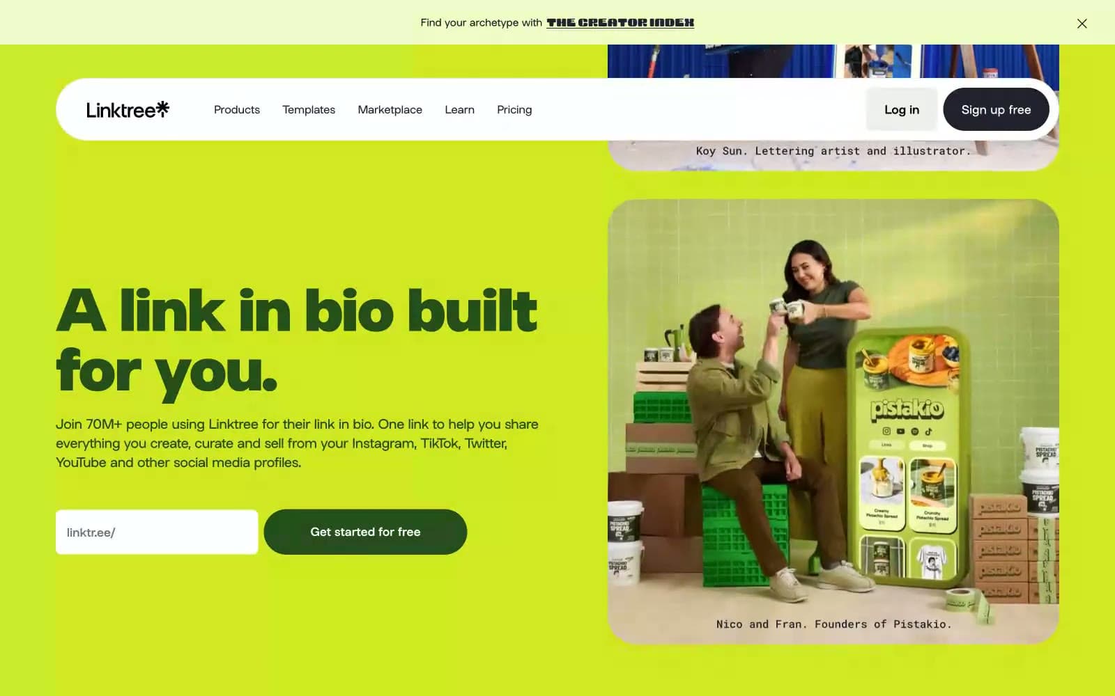
Linktr
SaaS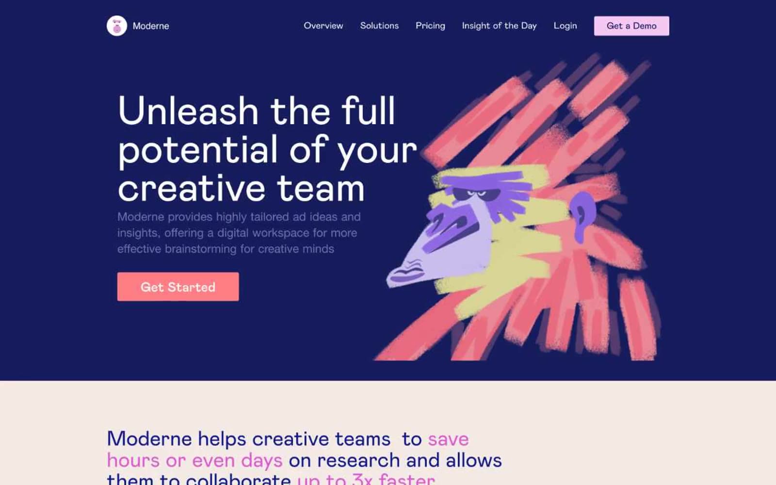
Moderne
SaaS
Passionfroot
SaaS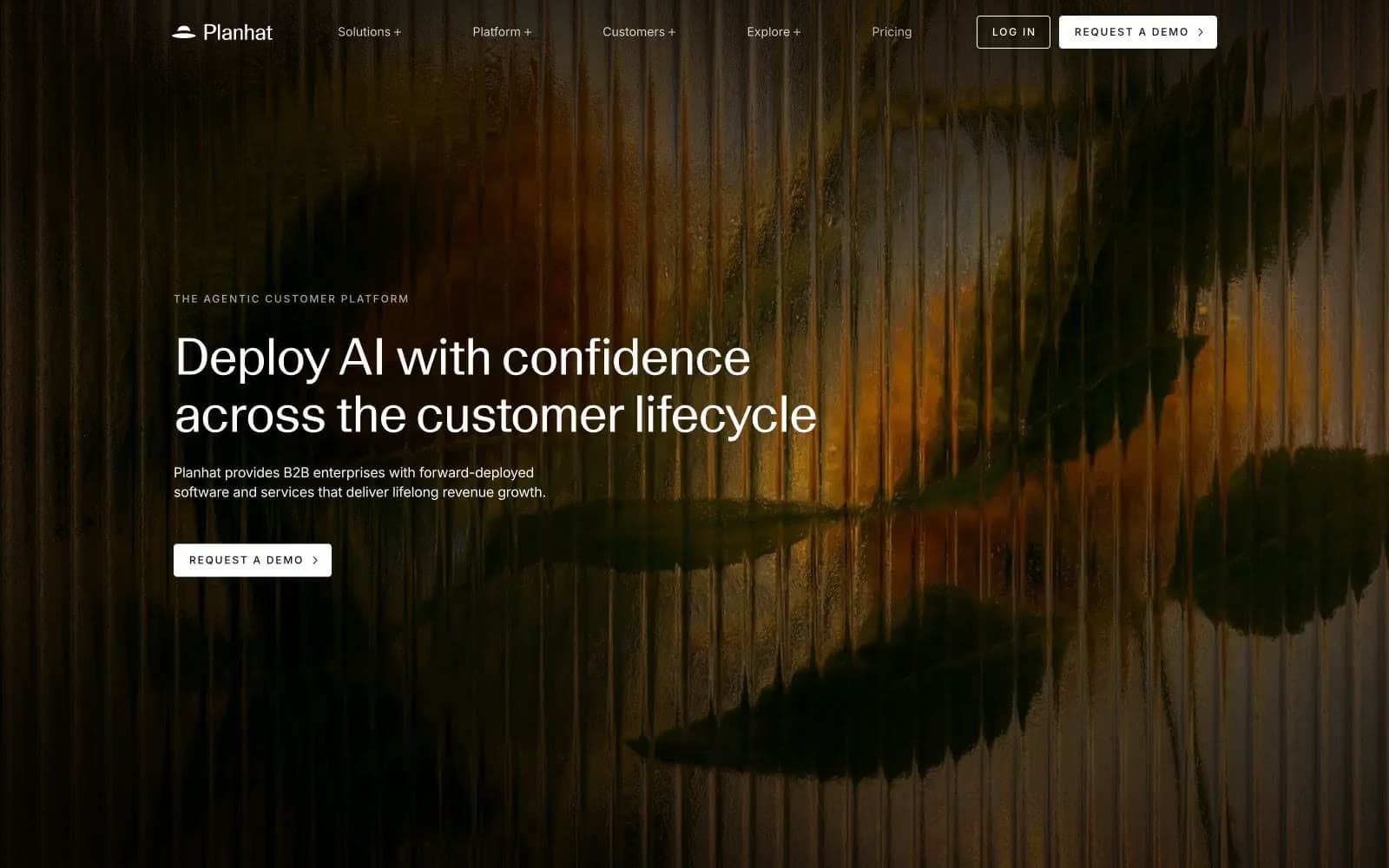
Planhat
SaaS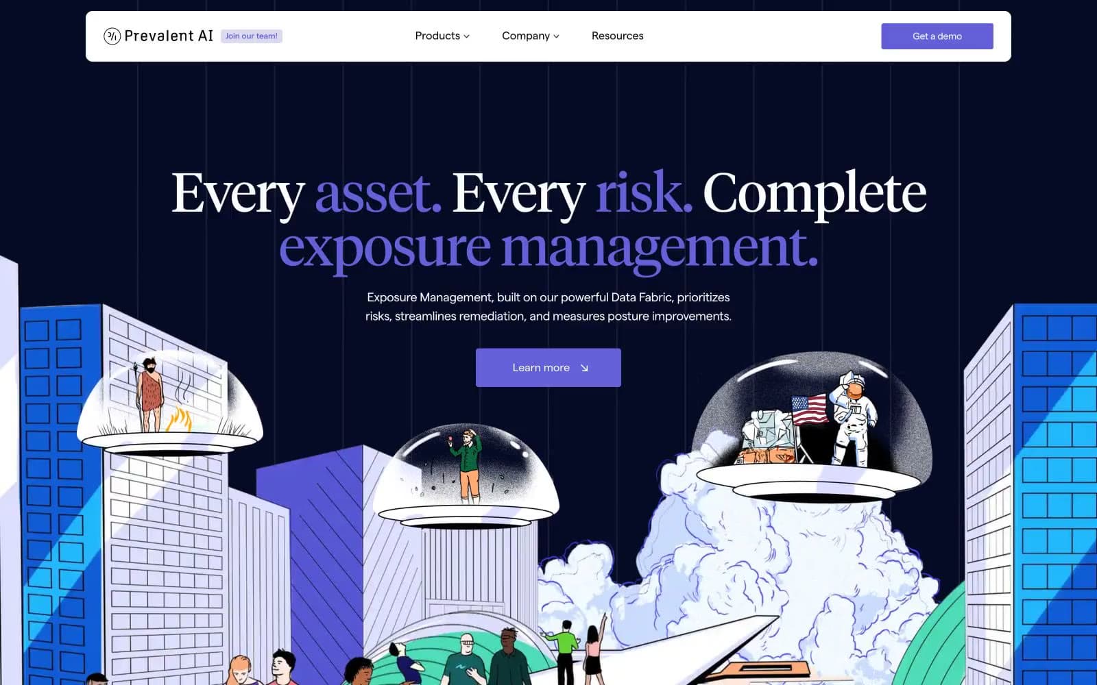
Prevalent
SaaS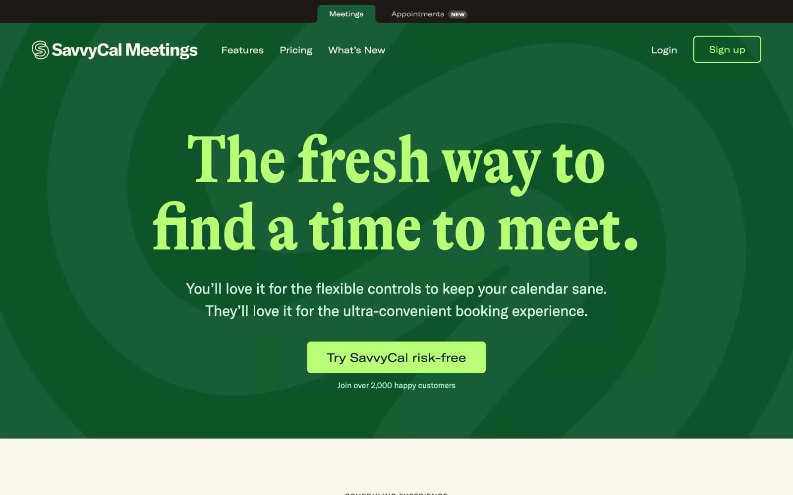
Savvycal
SaaS


